How to Create a Timeline with Pure CSS

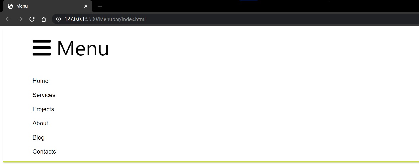
Designing a vertical timeline structure using pure CSS3 and HTML.

Creating Timeline using Pure CSS and HTML

Goals:

  1. To demonstrate flexibility using CSS
  2. Making a static timeline component using HTML and CSS.

Implementation:

Step 1: Creating the skeleton HTML file

Designing the basic HTML skeleton file and naming the classes where CSS have to be implemented is the basic first step.

I have divided it into the main wrapper i.e. timeline then content and time inside the <body> tag

It is demonstrated below.

With respect to this class(es) and the tags I have written the CSS styling as shown from the next steps.

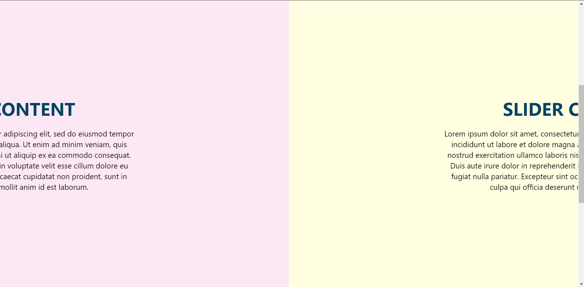
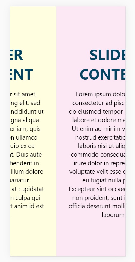
<div class=”timeline”>
<ul>
<li>
<div class=”content”>
<h3>What is Lorem Ipsum?</h3>
<p>
Lorem ipsum dolor sit amet, consectetur adipiscing elit, sedo
eiusmod tempor incididunt ut labore et dolore magna aliqua.Ut
enim ad minim veniam, quis nostrud exercitation ullamclaboris
nisi ut aliquip ex ea commodo consequat. Duis autiruredolorin
reprehenderit in voluptate velit esse cillum dolore eu fugiat
nulla pariatur. Excepteur sint occaecat cupidatat noproident,
sunt in culpa qui officia deserunt mollit anim id estlaborum.
</p>
</div>
<div class=”time”>
<h4>April 2021</h4>
</div>
</li>

Step 2: Vertical design using the selector :before

I had to decide between creating a vertical timeline or a horizontal one. I opted for a horizontal design structure as shown below.

.timeline::before {
content: “”;
position: absolute;
left: 50%;
width: 2px;
height: 100%;
background: black;
}

Step 3: Designing the <ul> and <li> and creating variations.

.timeline ul {
margin: 0;
padding: 0;
}.timeline ul li {
line-height: none;
position: relative;
width: 50%;
padding: 20px 40px;
box-sizing: border-box;
}

The <ul> and the <li> tags are pretty straightforward, after to make variations for them to appear on an interval of left and right dynamically. I have used the :nth-child(even) and :nth-child(odd) property in CSS

.timeline ul li:nth-child(odd):before {
content: “”;
position: absolute;
top: 25px;
right: -6px;
width: 10px;
height: 10px;
background: rgba(206, 122, 26, 1);
border-radius: 50%;
box-shadow: 0 0 0 3px rgba(206, 122, 26, 0.2);
}.timeline ul li:nth-child(even):before {
content: “”;
position: absolute;
top: 25px;
left: -4px;
width: 10px;
height: 10px;
background: rgba(206, 122, 26, 1);
border-radius: 50%;
box-shadow: 0 0 0 3px rgba(206, 122, 26, 0.2);}
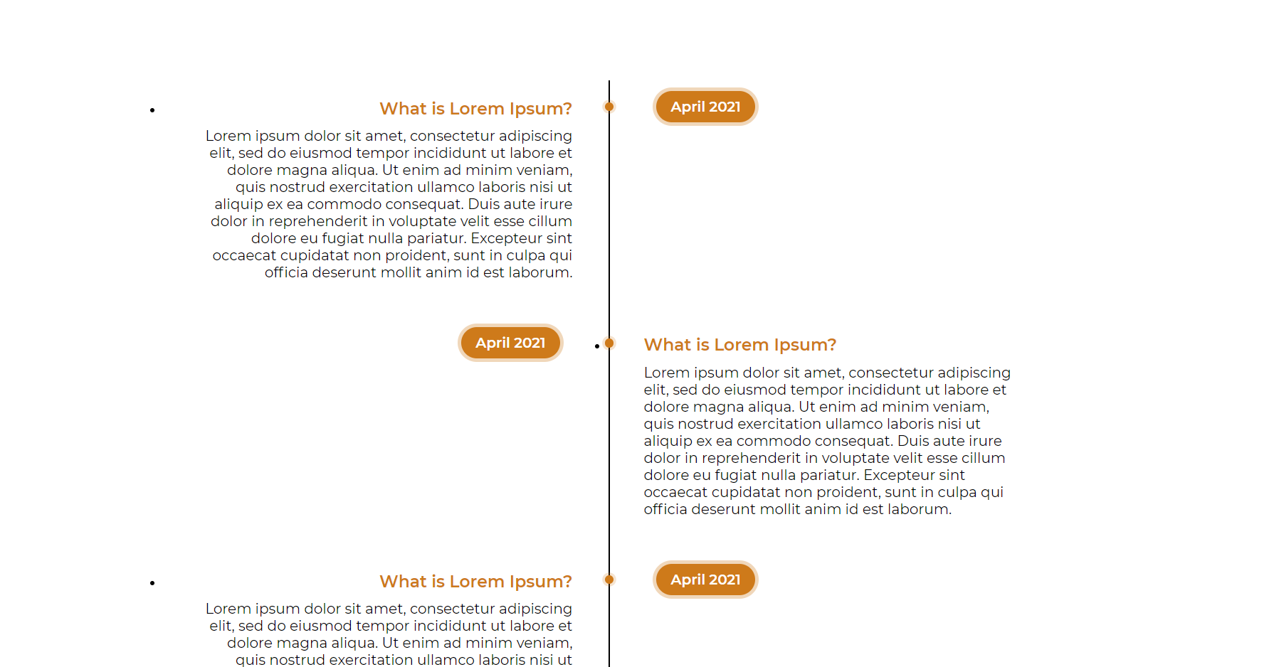
Result:

Creating Timeline using Pure CSS and HTML

Categories CSS

Improve Page Rendering Speed using CSS

Consumers love fast websites as it takes less time to load and show the consumers their desired content as fast as possible. Even if there are numerous amount of media and animations the page should be snappy and fast.

Optimizing CSS for faster page loads

Using CSS attributes to render the web pages as fast as possible.

Goals

  1. Use different CSS attributes to make the page as much snappy as possible with less rendering time.

Work Process

Step 1: Take a Single Web Page or Make one

Designing a web page for demonstration is so much simpler with basic HTML files and CSS files linked with it for styling purposes. For this particular demonstration, I used a template website which is linked in the references below. I chose this template as it has many animations and sections.

Take a Single Web Page or Make one

Step 2: Looking for the parts that are below the viewport of our screen

By looking through the template I found that everything below the carousel is out of our viewport, so it’s not necessary to render it ahead of time but will render as soon as the user scrolls to that section.

Step 3: Add content-visibility property to the parts that are outside of the viewport

Everything outside the viewport that is about, testimonials, etc, there added an extra property of content-visibility: auto.

Add content-visibility property to the parts that are outside of the viewport

Content Visibility skips the rendering of the elements that are outside of the viewport and explicitly modifies the height to 0px before rendering but as soon as the user scrolls to that part it renders back to the original height. Without the property, the webpage was taking approximately 100ms to render but after adding that particular property we can reduce the rendering time to about 82ms. It’s small but an improvement. The figures show before(left) and after(right) adding the property.

Add content-visibility property to the parts that are outside of the viewport 2

As it is a fairly new property, sometimes on some browsers it’s a bit janky as it makes the height to 0px, to set a minimum height before full rendering contain-intrinsic-size: <size> is used that will set the elements to a specific size before rendering. By using this property we reduce a little bit more rendering time(below).

Add content-visibility property to the parts that are outside of the viewport 3

Step 4: Add will-change property to the parent element of animation/ transitions

By looking in the template of the website I see multiple blocks where there are transitions. I added the will-change property to the parent element of those blocks for less rendering time.

Change the CSS import module by using link CSS tags inside the HTML document

Step 5: Change the CSS import module by using link CSS tags inside the HTML document

If I use the import module inside the .css files to import multiple other CSS files it acts as respective loading the files which refer to loading one after another.

But to further improve the loading time we can import those at HTML document for parallel loading that means all the files will at a certain time rather than respectively.

Change the CSS import module by using link CSS tags inside the HTML document 2

Conclusion

There are numerous ways to reduce the render time but the three mentioned give us the best result. Especially the content-visibility with contain-intrinsic-size gave use the best result. One thing to keep in mind that all the reduction of the render time we implemented are without using any javascript

Categories CSS

How to Create Horizontal Scrolling Containers

Making a scrollbar with or without using the in-built function of CSS is always a good challenge, and making a responsive horizontal scrollbar is taking it further towards perfection. In this blog, you will learn how to make a responsive scroll bar (slider) using CSS library. Let’s get started.

Creating Horizontal Scrolling Containers the Right Way

We all like learning how to make new designs using CSS, but still it is recommended to know some basics of CSS and HTML beforehand before progressing further towards our blog.

Note: There are two ways to make a horizontal scrollbar, one is using the webkit that is included in the CSS library, and the method that we are going to use, that is manual manipulation method using CSS properties as we are aiming on a responsive horizontal scrollbar.

But just for the sake of knowledge, here is the easy way to make a horizontal scrollbar presuming you have written a skeleton HTML code and assigned class(es).

::-webkit-scrollbar {
  width: 10px;
}


::-webkit-scrollbar-track {
  background: #f1f1f1;
}


::-webkit-scrollbar-thumb {
  background: #888;
}


::-webkit-scrollbar-thumb:hover {
  background: #555;
}

So, now getting this out of our way, let’s get started towards making our own.

Skelton HTML

First we shall create a basic HTML file where the CSS styling will be implemented, a skeleton design of a HTML file is more than enough to cater our needs.
I have made a section to keep the container component which is to be displayed on the page.

<section>
        <div class="card">
          <h2>Slider Content</h2>
          <p>
            Lorem ipsum dolor sit amet, consectetur adipiselisdo
            eiusmod tempor incididunt ut labore et dolorealienim
            ad minim veniam, quis nostrud exercitation nisi ut
            aliquip ex ea commodo consequat. Duis aute dolor in
            reprehenderit in voluptate velit esseu fugiat nulla
            pariatur. Excepteur sint occaecat cupidataprosunt in
            culpa qui officia deserunt mollit anim id laborum.
          </p>
        </div>
 </section>

This is just one section, but there are copies of many of the similar sections, to display while scrolling.

data-0="transform:translateX(0%)"
data-1000="transform:translateX(-300%)"

This is the code to make the animation smoother, I used skrollr.
Please refer to the documentation to the references link attached below.

Container Styling

.container {
  position: fixed;
  top: 0;
  left: 0;
  width: 100%;
  display: flex;
}

Making it a flex display with position fixed.

Section Styling

.container section {
  min-width: 100%;
  height: auto;
  display: flex;
  justify-content: center;
  align-items: center;
  height: 100vh;
  background-color: #fffee1;
}

Also flex sectional content with items on the center and height to fit the screen.

N-th Child Property

This is used for randomising the background without writing much code, as even and odd can differentiate and put the background accordingly. In our small project it is written as:

.container section:nth-child(odd) {
  background-color: #fffee1;
}
.container section:nth-child(even) {
  background-color: #fce8f4;
}

Heading and Content Styling

.card h2 {
  margin: 0 0 20px;
  padding: 0;
  font-size: 48px;
  text-transform: uppercase;
  color: #044463;
}

.card p {
  font-size: 20px;
  line-height: 1.4em;
  color: black;
}

This is basic CSS styling for the contents of the card component to scroll through.

Responsive Design:

@media (max-width: 800px) {
  .container {
    position: absolute;
    display: flex;
    flex-direction: column;
    height: auto;
    transform: none !important;
  }
}

So that it is accessible via mobile/tablet devices also.

Result

How to Make a Collapsible Menu using only CSS

There are many ways to design a menubar (or sometimes called as a navbar) with CSS, and it is quite simple and easy to understand. The requirements are that you should know the basic fundamentals of HTML and CSS and you are good to go with the article.

Implementing A Pure CSS Collapsible

In this article, I will show a simple way to make a collapsible menu bar using CSS

Skelton HTML

<div class="collapsible-menu">
    <div class="menu-content">
        <ul>
            <li><a href="#"></a>Home</li>
            <li><a href="#"></a>Services</li>
            <li><a href="#"></a>Projects</li>
            <li><a href="#"></a>About</li>
            <li><a href="#"></a>Blog</li>
            <li><a href="#"></a>Contacts</li>
         </ul>
     </div>
</div>

Next, we’ll add a checkbox with a label of Menu above the div that holds the menu content. We’ll style this later to trigger the opening and closing of the menu.

<body>
        <div class="collapsible-menu">
            <input type="checkbox" id="menu">
            <label for="menu">Menu</label>
            <div class="menu-content">
                <ul>
                    <li><a href="#"></a>Home</li>
                    <li><a href="#"></a>Services</li>
                    <li><a href="#"></a>Projects</li>
                    <li><a href="#"></a>About</li>
                    <li><a href="#"></a>Blog</li>
                    <li><a href="#"></a>Contacts</li>
                </ul>
            </div>
        </div>
    </body>

Here’s what the menu looks like without any style indented.

Let’s add some padding, borders and styles to look more like a menu.

.menu-content {
    font-family: -apple-system, BlinkMacSystemFont, "Segoe UI", Roboto, Oxygen,
         Ubuntu, Cantarell, "Open Sans", "Helvetica Neue", sans-serif;
    padding: 0 0 0 50px;
}
.collapsible-menu {
    background-color: rgb(255, 255, 255);
    padding: 0px 30px;
    border-bottom: 3px solid #CDE700;
    box-shadow: 1px 2px 3px rgba(0,0,0,0.2);
}
.collapsible-menu ul {
    list-style-type: none;
    padding: 0;
}
.collapsible-menu a {
    display:block;
    padding: 10px;
    text-decoration: none;
}

It looks similar to this

We’ll style the label for the checkbox by adding a background image for the hamburger menu. We also want to make the label look like it’s a link even though it’s not, so we’ll use . Lastly, we’ll hide the checkbox using .

.collapsible-menu label {
    font-family: -apple-system, BlinkMacSystemFont, "Segoe UI", Roboto, Oxygen,
     Ubuntu, Cantarell, "Open Sans", "Helvetica Neue", sans-serif;
    font-size: 56px;
    display: block;
    cursor: pointer;
    background: url(menu.png) no-repeat left center;
    padding: 10px 0 10px 50px;
}
input#menu {
    display: none;
}

After implementation, the result will look similar to this.

NOTE: I have used the menu bar icon from font awesome CDN.

Collapse and Expand

Now we just have to set the default state of the menu to be collapsed when when checkbox is not checked. We do this by changing the max-height of  to , but have it display a  of  when the checkbox is checked.

.menu-content {
    max-height: 0;
    overflow: hidden;
    padding: 0 0 0 50px;
}
/* Toggle Effect */
input:checked ~ label {
}
input:checked ~ .menu-content {
    max-height: 100%;
}

Unchecked:


Checked:

Conclusion

That’s it! It’s a really quick and easy way to add a collapsible menubar using only HTML and CSS.


Embed responsive youtube video – Responsive YouTube Video Embeds | Embed Responsive YouTube Videos with Tailwind CSS, Flexbox

Responsive YouTube Video Embeds

Embed responsive youtube video: Are you wonder how to embed a YouTube video on your site and have it responsive, so that it scales down on a mobile device? Then, this page is the best choice. Here, we have shared the explanation about Responsive YouTube Video Embeds with Flexbox in HTML & CSS example codes. Look at this tutorial and make use of the code at the required time.

Embed Responsive YouTube Videos with Tailwind CSS

Embedding YouTube videos into your responsive website may be trouble. iframes are used by YouTube for their embeds and these iFrames require a fixed width and height specified. This is distant from ideal for responsive websites.

And Certainly, even in 2021 YouTube doesn’t provide a method to inevitably resize and scale their embeds, why don’t we take a glance at how we can fix this with Tailwind CSS.

The Aspect Ratio Plugin

May by you don’t have any idea about this but there is a way that you can extend Tailwind’s basic functionality with plugins. Simply install the wanted plugin with npm and insert it in your tailwind.config.js file. Make use of this official @tailwindcss/aspect-ratio plugin and do your YouTube embeds too.

npm install @tailwindcss/aspect-ratio@latest --save-dev

Afterward, enter it in our tailwind.config.js file.

// tailwind.config.js
module.exports = {
  theme: {
    // ...
  },
  plugins: [
    require('@tailwindcss/aspect-ratio'),
    // ...
  ],
}

The above code, provide us a whole set of aspect ratio width and height classes to work with. By default, there are 16 generated aspect-ratio classes. In case those 16 utility classes are not enough for you, you can always extend them.

Default aspect-ratio classes

Width Height
aspect-w-1 aspect-h-1
aspect-w-2 aspect-h-2
aspect-w-3 aspect-h-3
aspect-w-4 aspect-h-4
aspect-w-5 aspect-h-5
aspect-w-6 aspect-h-6
aspect-w-7 aspect-h-7
aspect-w-8 aspect-h-8
aspect-w-9 aspect-h-9
aspect-w-10 aspect-h-10
aspect-w-11 aspect-h-11
aspect-w-12 aspect-h-12
aspect-w-13 aspect-h-13
aspect-w-14 aspect-h-14
aspect-w-15 aspect-h-15
aspect-w-16 aspect-h-16

Responsive Youtube Video Embeds with Flexbox

HTML Code:

<div class="video-media-youtube">
              <ul class="video__container">
                  <li class="video__content">
                      <h2>Twin Souls</h2>
                      <ul class="video-media-youtube-inner">
      					<li class="media__embed">
        						<h3>Twin Souls - Autori - sesja poświęcona Miłości Absolutnej</h3>
        						<div class="video-media-youtube-inner-vi video-media-youtube-inner-vi--ratio">
          						<iframe src="https://www.youtube.com/embed/6iHarkg-SkM" frameborder="0" allow="autoplay; encrypted-media" allowfullscreen></iframe>
        						</div>
      					</li>
      
      					<li class="media__embed">
        						<h3>Twin Souls - Autori - Medytacji Miłości Płomieni </h3>
        						<div class="video-media-youtube-inner-vi video-media-youtube-inner-vi--ratio">
          						<iframe src="https://www.youtube.com/embed/L96UCc0RmdQ" frameborder="0" allow="autoplay; encrypted-media" allowfullscreen></iframe>
        						</div>
      					</li>
    					</ul> 
  				</li>
  
      			<li class="video__content">
    					<h2>Świadomość</h2>
    					<ul class="video-media-youtube-inner">
      					<li class="media__embed">
        						<h3>Siła spokoju</h3>
        						<div class="video-media-youtube-inner-vi video-media-youtube-inner-vi--ratio">
          						<iframe src="https://www.youtube.com/embed/63_lwapPTTY" frameborder="0" allow="autoplay; encrypted-media" allowfullscreen></iframe>
        						</div>
      					</li>
      
      					<li class="media__embed">
        						<h3>David Hawkins</h3>
        						<div class="video-media-youtube-inner-vi video-media-youtube-inner-vi--ratio">
          						<iframe src="https://www.youtube.com/embed/OnQc_GOa57Q?list=PLU6k1z0ryVkqISAOtWMUXm06ez3DmwU_l" frameborder="0" allow="autoplay; encrypted-media" allowfullscreen>
          						</iframe>
        						</div>
      					</li>
    					</ul> 
  				</li>

  				<li class="video__content">
                      <h2>Ciąg Fibonacciego</h2>
                        <ul class="video-media-youtube-inner">
      					<li class="media__embed">
        						<h3>Złota liczba. Boska proporcja</h3>
        						<div class="video-media-youtube-inner-vi video-media-youtube-inner-vi--ratio">
          						<iframe src="https://www.youtube.com/embed/wb7kPaM8cfg" frameborder="0" allow="autoplay; encrypted-media" allowfullscreen></iframe>
        						</div>
      					</li>
      
      					<li class="media__embed">
        						<h3>W naturze ...</h3>
        						<div class="video-media-youtube-inner-vi video-media-youtube-inner-vi--ratio">
          						<iframe src="https://www.youtube.com/embed/M16GINf8A50" frameborder="0" allow="autoplay; encrypted-media" allowfullscreen></iframe>
        						</div>
      					</li>
    					</ul> 
  				</li>

  				<li class="video__content">
            <h2>Medytacje video</h2>
                          <ul class="video-media-youtube-inner">
      					<li class="media__embed">
        						<h3>Zen Meditation Video Warm Japanese Pond</h3>
        						<div class="video-media-youtube-inner-vi video-media-youtube-inner-vi--ratio">
          						<iframe src="https://www.youtube.com/embed/Zawg8nmUpaw" frameborder="0" allow="autoplay; encrypted-media" allowfullscreen></iframe>
        						</div>
      					</li>
      
      					<li class="media__embed">
        						<h3>Sunrise Meditation Video Stunning Colours Mt Fuji</h3>
        						<div class="video-media-youtube-inner-vi video-media-youtube-inner-vi--ratio">
          						<iframe src="https://www.youtube.com/embed/9eRx_XowP1I" frameborder="0" allow="autoplay; encrypted-media" allowfullscreen></iframe>
        						</div>
      					</li>

      					<li class="media__embed">
        						<h3>The Light of The Soul</h3>
        						<div class="video-media-youtube-inner-vi video-media-youtube-inner-vi--ratio">
          						<iframe src="https://www.youtube.com/embed/-3bMgp11HGo" frameborder="0" allow="autoplay; encrypted-media" allowfullscreen></iframe>
        						</div>
      					</li>
      
      					<li class="media__embed">
        						<h3>Ho'oponopono medytacja</h3>
        						<div class="video-media-youtube-inner-vi video-media-youtube-inner-vi--ratio">
          						<iframe src="https://www.youtube.com/embed/2psxMTlFvlA" frameborder="0" allow="autoplay; encrypted-media" allowfullscreen></iframe>
        						</div>
      					</li>
    					</ul> 
  				</li>
                  
                  <li class="video__content">
                      <h2>Święta geometria</h2>
                      <ul class="video-media-youtube-inner">
      					<li class="media__embed">
        						<h3>Boska matematyka</h3>
        						<div class="video-media-youtube-inner-vi video-media-youtube-inner-vi--ratio">
          						<iframe src="https://www.youtube.com/embed/xjCBC-d3kdg?list=PLx9elHolWWO8QVH3EBr3xvyo2sefhocZz" frameborder="0" allow="autoplay; encrypted-media" allowfullscreen></iframe>
        						</div>
      					</li>
      
      					<li class="media__embed">
        						<h3>Wszechświat</h3>
        						<div class="video-media-youtube-inner-vi video-media-youtube-inner-vi--ratio">
          						<iframe src="https://www.youtube.com/embed/X97qVGsOW1Q" frameborder="0" allow="autoplay; encrypted-media" allowfullscreen></iframe>
        						</div>
      					</li>
    					</ul> 
  				</li>

                  <li class="video__content">
                      <h2>Gregg Braden - Przestrzeń Serca</h2>
                      <ul class="video-media-youtube-inner">
      					<li class="media__embed">
        						<h3>Inteligencja i Moc naszych Serc</h3>
        						<div class="video-media-youtube-inner-vi video-media-youtube-inner-vi--ratio">
          						<iframe src="https://www.youtube.com/embed/dw20FTLS8GI" frameborder="0" allow="autoplay; encrypted-media" allowfullscreen></iframe>
        						</div>
      					</li>
      
      					<li class="media__embed">
        						<h3>Serce ma mózg</h3>
        						<div class="video-media-youtube-inner-vi video-media-youtube-inner-vi--ratio">
          						<iframe src="https://www.youtube.com/embed/rZ2qrgdzkJ4" frameborder="0" allow="autoplay; encrypted-media" allowfullscreen></iframe>
        						</div>
      					</li>

      					<li class="media__embed">
        						<h3>Globalna Inicjatywa Koherencji</h3>
        						<div class="video-media-youtube-inner-vi video-media-youtube-inner-vi--ratio">
          						<iframe src="https://www.youtube.com/embed/pa0ML4w87yc?list=PLeYr3xi_RH075sYcxIdi1l7-vhK7IugRK" frameborder="0" allow="autoplay; encrypted-media" allowfullscreen></iframe>
        						</div>
      					</li>
    					</ul> 
  				</li>
				</ul>     
          </div>

CSS Code:

* {
  margin: 0;
  padding: 0;
  box-sizing: border-box;
}

*::before, *::after {
  box-sizing: border-box;
}

html, body {
  width: 100%;
  height: 100%; 
}

li {
  list-style: none;
}

.video-media-youtube {
  width: 100%;
  max-width: 1400px;
  margin: 0 auto;
}

.video__container {
  display: flex;
  flex-direction: column;
  width: 100%; 
  padding: 0 .9375rem;
}

.video__content {
  padding-bottom:  1.25rem;
}

h2 {
  width: 100%;
  text-transform: uppercase;
}

h3::before {
  content: "\f111";
  display: inline-block;
  font-family: 'Font Awesome 5 Free';
  font-size: .375rem;
  font-weight: 900;
  vertical-align: middle;
  transform: translateY(-.125rem);
  padding-right: .9375rem;
}

h3 {
  display: inline-block;
  padding: 20px 0;
}

.video-media-youtube-inner {
  display: flex;
  flex-direction: row;
  flex-wrap: wrap;
  justify-content: center;
  width: 100%;
}

.media__embed {
  flex-basis: 100%;
  padding-bottom: 1.25rem;
}

.video-media-youtube-inner-vi {
  display: block;
  overflow: hidden;
  position: relative;
  height: 0;
  padding: 0;
}

.video-media-youtube-inner-vi--ratio {
  padding-bottom: 75%;
}

.video-media-youtube-inner-vi iframe {
  position: absolute;
  top: 0;
  left: 0;
  bottom: 0;
  width: 100%;
  height: 100%;
}

@media only screen and (min-width: 1024px) {

  .video__container {
    padding: 0 1.25rem;
  }
  
  .video-media-youtube-inner {
    justify-content: space-between;
  }
  
  .media__embed {
    flex-basis: calc(50% - .9375rem);
    padding-bottom: 1.875rem;
  }
}

Responsive YouTube Video Embeds

The problem with embedding YouTube videos is that they are an iframe and iframes need to be given an exact height and width otherwise they will look funky.

And we need to keep the proportions, based on the video aspect ratio.

To have a YouTube video be displayed responsive in your page, first wrap it into a container div:

<div class="video-container">
  <iframe src="https://www.youtube.com/embed/klZNNUz4wPQ" frameborder="0" allow="accelerometer; autoplay; encrypted-media; gyroscope; picture-in-picture" allowfullscreen></iframe>
</div>
.video-container {
    overflow: hidden;
    position: relative;
    width:100%;
}

.video-container::after {
    padding-top: 56.25%;
    display: block;
    content: '';
}

.video-container iframe {
    position: absolute;
    top: 0;
    left: 0;
    width: 100%;
    height: 100%;
}

Calculating aspect ratios

See that magic number56.25%? That’s needed as padding when the aspect ratio of a video is 16:9. (9 is 56.25% of 16).

If your video is 4:3 for example, set it to 75%.

Categories CSS

How to write comments in css – CSS Comments | What You Need to Know About Comments in CSS | How to Work with it?

CSS Comments

How to write comments in css: Comments can assist you to explain and organize your CSS and manage which parts of your stylesheet get used on the front end. Discover how to add them to your code along with the definition, syntax and sample code on CSS Comments.

This Tutorial of CSS Comments includes the following:

Comments in CSS

CSS comments one line: A CSS comment is applied to attach explanatory notes to the code or to stop the browser from interpreting specific parts of the style sheet. By design, comments do not affect the layout of a document.

However, CSS is missing the “line comment” syntax that those languages have, where everything from // to the end of the line is commented out.

Syntax for CSS Comments

Comments can be located wherever white space is provided within a style sheet. They can be utilized on a single line, or traverse multiple lines.

/* Comment */

Example of Comments in Cascading Style Sheet (CSS)

/* A one-line comment */

/*
A comment
which stretches
over several
lines
*/

/* The comment below is used to
   disable specific styling */
/*
span {
  color: blue;
  font-size: 1.5em;
}
*/

Also Refer:

How to work with comments in CSS?

Comments are utilized to explain the code and may improve when you edit the source code at a later date.

Comments are neglected by browsers. A CSS comment is located inside the<style>element, and begins with /* and ends with */:

/* This is a single-line comment */
p {
  color: blue;
}
/* This is
a multi-line
comment */

p {
  color: blue;
}

HTML and CSS Comments

From the HTML tutorial, you studied that you can add comments to your HTML source by using the <!--...-->syntax.

In the below example, we use a mixture of HTML and CSS comments:

<!DOCTYPE html>
<html>
<head>
<style>
p {
  color: red; /* Set text color to red */
}
</style>
</head>
<body>

<h2>My Heading</h2>

<!-- These paragraphs will be red -->
<p>Hello World!</p>
<p>This paragraph is styled with CSS.</p>
<p>CSS comments are not shown in the output.</p>

</body>
</html>

Output:

My Heading

Hello World!

This paragraph is styled with CSS.

HTML and CSS comments are not shown in the output.
Categories CSS

React js alternatives – Lightweight Alternatives to React

Lightweight Alternatives to React

React js alternatives: React.js is a marvelous JavaScript library that employs Virtual DOM. React is the prime choice of developers when it comes to building single-page applications.

Why do you need an alternative to React.js?

  • Most of the React developers find it challenging to manage the huge library size of the React.js framework. Surely you can not afford to invest in a framework that demands an exquisite memory space.
  • Secondly, React lacks MVC architecture, especially since the View functionality is not managed by its Model and Controller. Hence, you need an alternative React framework, which is view-oriented.
  • React has a steep learning curve, and developers need to invest a lot of time to learn new technology. Project ignition is delayed.
  • Many React.js developers find it hard to grasp the documentation of JSX React. Beginners are never comfortable with this framework.

In this blog, I am recalling and bringing in front of you the list of React.js alternatives that those experts realized in the tech-talk show. Along with the javascript frameworks, I have mentioned the pros and cons of each of the frameworks and their comparison with React.js.

Preact

Alternatives to react: Jason Miller introduced Preact under the open-source MIT license. You can think of Preact as a lightweight alternative to the React library for developing mobile or web applications, and progressive web apps PWA.

Preact Pros

React js alternatives: It is much compact, precise, and lightweight in size (3KB) so your application can perform faster.

  • Preact uses ES6 API, which enables you to uplift your application from React to Preact very easily. You can even adapt it as a library to create fantastic user interfaces for your project.
  • Entrepreneurs can create new projects easily by using the official CLI without the trouble of getting into Babel and Webpack configuration.
  • You can get all the help from the official website examples and Preact documentation to kick-start your application development.
  • Along with all the inspiring features of React, the Preact library also consists of some special features like the LinkedState.

Preact Cons

You do not get the context support.

  • For the stateful functionalities of your application, the createClass function is missing. Preact only allows you to use ES6 class and stateless components.
  • Preact doesn’t care about the React propTypes.
  • The community size is yet to reach the competition with React.
  • Preact lacks innovation and mostly mimics React.

Preact Vs. React

  • API: Not all the React features are present in Preact; it contains only a small part of the React Application Interface functionality.
  • Size: As I mentioned in the beginning, Preact is much lighter than React. React is 5.3 KB, whereas Preact is only 3 KB.
  • Performance: Because of being lightweight, Preact is faster as compared to React applications.

Svelte

React alternatives: Svelte is a free and open-source front-end compiler created by Rich Harris and maintained by the Svelte core team members. Svelte applications do not include framework references.

Svelte Pros

  • The building time is blazing fast when compared to React or even other frameworks. Usage of the rollup plugin as the bundler might be the secret here.
  • Bundle size is smaller and tiny when gzipped when compared to React, and this is a huge plus point. Even with the shopping cart application I built, the initial load time and the duration to render the UI is extremely low, only the chunky images I have added takes some time :).
  • Binding classes and variables are relatively easy, and custom logic is not needed when binding classes.
  • Scoping CSS <style> within the component itself allows flexible styling.
  • Easier to understand and get started when compared to other frameworks as the significant portion of Svelte is plain JavaScript, HTML, and CSS.
  • More straightforward store implementation when compared to React’s context API, granted context API provides more features, and Svelte might be simple enough for common scenarios.

Svelte Cons

  • Svelte won’t listen for reference updates and array mutations, which is a bummer, and developers need to actively lookout for this and make sure arrays are reassigned so the UI will be updated.
  • Usage style for DOM events can also be annoying, as we need to follow Svelte’s specific syntax instead of using the predefined JS syntax. Cannot directly use onClick like in React, but instead, have to use special syntax such as on:click.
  • Svelte is a new and young framework with minimal community support, thereby doesn’t have support for a wide range of plugins and integrations that might be required by a heavy production application. React is a powerful contender here.
  • No additional improvements. Ex- React suspense actively controls your code and how it runs and tries to optimize when the DOM is updated and sometimes even provides automatic loading spinners when waiting for data. These extra features and continued improvements are relatively low in Svelte.
  • Some developers might not prefer using special syntaxes such as #if and #each within their templates and instead would want to use plain JavaScript, which React allows. This might come down to personal preferences.

Svelte Vs. React

Svelte does provide noticeable improvements in certain features when compared to React. But it may not still be significant or large enough to replace React completely. React is still robust and broadly adopted. Svelte has quite some catching up to do. But concept-wise, the compiling approach taken by Svelte has proven that virtual DOM diffing isn’t the only approach to build fast reactive applications, and a good enough compiler can get the same job done as well as it gets.

Vanilla JS

Vanilla JS is nothing but plain JS without any external libraries or frameworks. Using this we can build powerful and cross-platform applications.

The major differences

Since there are so many ways to write vanilla JS, it can be difficult to pin down a list of differences that applies to 100% of apps. But here we’ll define some key differences that apply to many plain JS apps that are written without a framework.

Those differences are:

  • How the user interface is first created
  • How functionality is split up across the app
  • How data is stored on the browser
  • How the UI is updated

Is Vanilla JS worth over React

Vanilla JS is awesome but it’s not a great alternative when it comes to building huge applications with complex dynamic functionalities. Besides, it cannot create complex and efficient UIs. So if you have an app that changes frequently and drastically with thousands of pages, it is better to use a modern Javascript framework.

On the other hand, React which allows us to use reusable components and is capable of keeping the UI in sync with the state can definitely solve this problem.

Multiple transforms css – CSS Transforms | List of Property Values of CSS Transform | Definition, Syntax & Example Programs

Multiple transforms css: The transform property implements a 2D or 3D transformation to an element. This property permits you to rotate, scale, move, skew, etc., elements. Here, in this tutorial, we will be learning what is CSS transform property, its syntax, and few examples with outputs.

CSS transform Property

The transform property enables you to visually manipulate an element by skewing, rotating, translating, or scaling.

Transform Syntax:

/* Keyword values */
transform: none;

/* Function values */
transform: matrix(1.0, 2.0, 3.0, 4.0, 5.0, 6.0);
transform: matrix3d(1, 0, 0, 0, 0, 1, 0, 0, 0, 0, 1, 0, 0, 0, 0, 1);
transform: perspective(17px);
transform: rotate(0.5turn);
transform: rotate3d(1, 2.0, 3.0, 10deg);
transform: rotateX(10deg);
transform: rotateY(10deg);
transform: rotateZ(10deg);
transform: translate(12px, 50%);
transform: translate3d(12px, 50%, 3em);
transform: translateX(2em);
transform: translateY(3in);
transform: translateZ(2px);
transform: scale(2, 0.5);
transform: scale3d(2.5, 1.2, 0.3);
transform: scaleX(2);
transform: scaleY(0.5);
transform: scaleZ(0.3);
transform: skew(30deg, 20deg);
transform: skewX(30deg);
transform: skewY(1.07rad);

/* Multiple function values */
transform: translateX(10px) rotate(10deg) translateY(5px);
transform: perspective(500px) translate(10px, 0, 20px) rotateY(3deg);

/* Global values */
transform: inherit;
transform: initial;
transform: unset;

The CSStransformproperty may be defined as either the keyword valuenoneor as one or more<transform-function>values.

Ifperspective()is one of the multiple function values, so it must be listed first.

Also Check:

Example Using CSS Transform Property

<img style="transform: rotate(90deg);
            transform-origin: bottom left;"
     src="/en-US/docs/Web/CSS/CSS_Transforms/Using_CSS_transforms/logo.png">

Output:

using css transform property result

2D transform Properties in CSS

The functions for 2D transforms are:

  • translate() helps us to move elements around.
  • rotate() helps to rotate elements.
  • scale() is used to scale elements in size.
  • skew() is used to twist or slant an element.
  • matrix() it is a way to perform the above operations using a matrix of 6 elements.

Also, there are functions for axis-specific actions:

  • translateX() is used to move elements around on the X axis.
  • translateY() is used to move elements around on the Y axis.
  • scaleX() is used to scale elements in size on the X axis.
  • scaleY() is used to scale elements in size on the Y axis.
  • skewX() is used to twist or slant an element on the X axis.
  • skewY() is used to twist or slant an element on the Y axis.

Example Program on 2D Transforms:

HTML:

<figure class="box-1">Box 1</figure>
<figure class="box-2">Box 2</figure>

CSS:

.box-1 {
transform: rotate(20deg);
}
.box-2 {
transform: rotate(-55deg);
}

Result:

css 2d transform property output

Combining multiple transforms

Multiple transform css: We can combine multiple properties into one by separating them with space.

transform: rotateY(20deg) scaleX(3) translateY(100px);

CSS 3D transform Properties

The 2D functions have an alternative 3D version too. By using 3D we can add another axis that is the Z-axis.

The perspective property can specify how far the 3D object is from the viewer.

.3Delement {
  perspective: 100px;
}

perspective-origin determines the appearance of the position of the viewer, how are we looking at it in the X and Y-axis.

Functions that control the Z-axis are:

  • translateZ()
  • rotateZ()
  • scaleZ()
  • translate3d()
  • rotate3d()
  • scale3d()
Categories CSS

CSS url() Function – Definition, Syntax | CSS url Image Path | Examples for Absolute, Relative URL() Function in CSS

url() css: If we are talking about background images, we can use @import. CSS has a wide range of properties that can reference an image file, display that file on the image as a part of the element’s background. Of all those, we use CSS Image Syntax url() to load up a resource. From this tutorial, you will find the full details about the CSS URL() function like definition, syntax, supported browsers, properties that accept URL as a Value, and example programs.

CSS url() Function

CSS url function: To include a file, we use the inbuilt function ie., url() CSS function. The parameter is an absolute URL, a relative URL, or a data URL. The url() function can be passed as a parameter of another CSS function, like the attr() function. Based on the property for which it is a value, the resource queried can be an image, font, or stylesheet. The url() functional representation is the value for the <url> data type.

Syntax

url( <string> <url-modifier>* )

css url: String indicates the URL or ID of an SVG Shape. (*) asterisk denotes that the preceding group occurs zero or more times.

<URL> 

css url(): An URL is a relative or Absolute Address or Pointer for which the web resource is included or a data uri in single or double-quotes. Quotes are necessary if an URL includes Parentheses, whitespace, or quotes unless these characters are escaped, or if addresses include control characters above 0x7e. Double Quotes can’t occur inside double quotes and single quotes can’t occur within single quotes unless escaped.

If you want to write an URL without Quotes, you can use a backslash(\) before any paratheses, whitespace characters or single quotes, double quotes that are part of the URL.

Path

It References SVG Shape’s ID — circle, ellipse, line, path, polygon, polyline, or rect by using the shape’s geometry as the path.

<url-modifier>

In the coming future url() function can support specifying a modifier, functional notation, or identifier that alters the URL String Meaning. As of now, it is not fully defined and supported.

Parameters

This function allows a single parameter url that holds the url in string format. The following examples of url are such as:

<css_property>: url("https://btechgeeks.com/image.png")
<css_property>: url('https://btechgeeks.com/image.png')
<css_property>: url(https://betchgeeks.com/image.png)

Values

The url() function can be added as a value for background, background-image, list-style, list-style-image,content, cursor, border, border-image,border-image-source, mask, mask-image, src in the context of a @font-face block, and @counter-style/symbol

Some times url() is Optional

At times, url() functional notation is optional. For suppose when you use the @import rule, you can omit the URL() and simply provide a <string> for the url.

Absolute Vs Relatieve URL

You can choose between Absolute URL, Relative URL, and Root-Relative URL as the Parameter as all of them are valid.

/* Absolute URL */
background-image: url(http://www.btechgeeks.com/images/image.png);
​
/* Relative URLs */
background-image: url(image.png);
background-image: url(../images/image.png);
​
/* Root-relative URL */
background-image: url(/images/image.png);

Also Check:

Supported Browsers

The browsers supported by url() function are as follows:

  • Google Chrome
  • Internet Explorer
  • Firefox
  • Safari
  • Opera

Properties that accept URL as a Value

  • background-image
  • border-image
  • content
  • list-style-image

Usage of CSS url() function in Filter

If you use an URL as a path for filter the URL needs to meet the following criteria and they are as below

  • The Path to an SVG File should be appended with filter ID.
  • Should consist ID of the filter if an SVG already exists on the page.
.blur {
filter: url(my-file.svg#svg-blur); /* the URL of an SVG file used as a filter */
}

.inline-blur {
filter: url(#svg-blur); /* the ID of an SVG that is embedded in the HTML page */
}

Examples using url() in CSS

section {
  background-image: url(picture.png);
}

This is a relative URL which means that it will search for the file inside the same folder.

Relative url() Usage in CSS

We can go back to one folder:

section { 
    background-image: url(../picture.png); 
}

Or can go into a folder

section { 
    background-image: url(someFolder/picture.png); 
}

Or can directly load from the root folder of the CSS

section { 
    background-image: url(/picture.png); 
}

Or we can directly fetch from some website

section { 
    background-image: url(https://example.com/picture.png); 
}

Example of Usage in the Content Property

HTML

<ul>
  <li>Item 1</li>
  <li>Item 2</li>
  <li>Item 3</li>
</ul>

CSS

li::after {
  content: ' - ' url(https://mdn.mozillademos.org/files/16761/star.gif);
}

OUTPUT

css url() function example result

Pre tag wrap – Responsive pre tags in CSS | How to Make Pre Tags 100% Responsive in CSS

Responsive pre tags in CSS

<pre>: The Preformatted Text element

Pre tag wrap: The “pre” of a <pre> tag actually signifies “preformatted text” – which doesn’t say anything regarding what that text is. A <code> tag, semantically, says the text within is code. The demo code of Pre tag using CSS is given below:

pre {
    font-size: .7rem;
    margin: 0;
}

Output:

  L          TE
    A       A
      C    V
       R A
       DOU
       LOU
      REUSE
      QUE TU
      PORTES
    ET QUI T'
    ORNE O CI
     VILISÉ
    OTE-  TU VEUX
     LA    BIEN
    SI      RESPI
            RER       - Apollinaire

Also, this tutorial covers the following stuff regarding Responsive pre tags in CSS:

Attributes of Pre Element

CSS preformatted: This preformatted element (Pre Tag) only involves the global attributes and they are as follows:

cols: Includes the preferred count of characters that a line should have. It was a non-standard synonym of width. To accomplish such an effect, use CSS width instead.
width: Holds the preferred count of characters that a line must-have. However, technically still implemented, this attribute has no visual effect; to accomplish such an effect, use CSS width instead.
wrap: Is a hint indicating how the overflow must happen. In modern browsers, this hint is neglected and no visual effect results in its presence; to achieve such an effect, use CSS white-space instead.

Example on Pre Tag using CSS

<p>Using CSS to change the font color is easy.</p>
<pre>
body {
  color: red;
}
</pre>

Result:

pre tag example result

Do Check:

How to Make Pre Tags 100% Responsive in CSS?

By default the CSS white-space property on the pre tag is set to normal, and to fix this problem we set it to pre-wrap:

pre {
  white-space: pre-wrap;
}

When some words are too long they can still break the layout. To fix this, also add:

pre {
  word-break: break-all;
}

Make “Pre” Text Wrap

By default, Text in <pre> tags doesn’t wrap. For instance, see the code snippet below! If this is making layout problems, one solution is to give the pre block an overflow property to cover the excess or make it scroll. Another solution is to have it wrap.

/* Browser specific (not valid) styles to make preformatted text wrap */		

pre {
 white-space: pre-wrap;       /* css-3 */
 white-space: -moz-pre-wrap;  /* Mozilla, since 1999 */
 white-space: -pre-wrap;      /* Opera 4-6 */
 white-space: -o-pre-wrap;    /* Opera 7 */
 word-wrap: break-word;       /* Internet Explorer 5.5+ */
}
Categories CSS