How to comment in HTML, CSS and JavaScript

Programming languages (or any markdown languages) offer an option of leaving notes for yourself or others. The comment feature simplifies the production of more readable code. Code or other text that is commented out is ignored by the browser.

Comments in HTML, CSS, JavaScript

Write comments in HTML

  • The <!– –> is a HTML comment tag.
  • To comment out in HTML, insert information between <!– and –> tags.
    • The browser won’t show these comments/ notes.

Single-line HTML comments

To add a single line comment, write the information between <!– –>  tags.

Example

<!-- Comment line-->
<p>single-line comment</p>

Multi-line HTML comments

In a few cases you need to add many information inside the comment tags which will require more lines to deal with, there you’ll need multi-line comments.

Example

<!--
multi
comment line
-->
<p>multi-line comment</p>

Write comments in CSS

  • The /* */ is a comment tag in CSS.

Single-line CSS comments

To add a single line CSS comment put the information between the /* and */ tag.

Example:

h1{
font-size: 2rem /* 1rem =5px */
}

Multi-line CSS comments

To write a multi-line CSS comment or to add more information, write those lines in between the /* and */ tags.

Example

/* 
This font
size will
be used 
*/

h1{ 
font-size: 2rem 
}

Write comments in JavaScript

  • Comments can also be used to prevent some code lines from being executed. This is useful when testing.

Comment out

In javascript comment out means block a single line of code as it will not be executed by the app/browser. This can help you debugging the code without erasing part of your codes.

Example

//document.getElementById('root')

Single-line comments

It is used to write some very specific information or block a line of code for debugging purposes.

Example

//This is a single-line comment
document.getElementById('root')

Multi-line comments

The multi-line comment has the same purpose as the single-line comment. It is used to give much more detailed information about the code. To use a multi-line comment you have to write the information in between the /* and */ tag.

Example

/*
function fun
returns a string value
*/

const fun = () =>{
    return 'string'
}

Conclusion

Comments are really helpful during debugging the code in a testing environment as they will disable some lines of code without actually removing them. But make sure to remove every possible comment line during deployment in the production field.

How to print your HTML with style | CSS Printing with Examples

How to print your HTML with style

Here is the complete tutorial on How to print your HTML with style using CSS. By viewing this page, you will get perfect knowledge on CSS printing, @media print rule, and many more concepts related to it. Just click on the links provided below and start learning regarding print CSS.

CSS Printing

There is a possibility to use CSS for altering the appearance of your web page when it’s printed on paper. You can define one font for the screen version and another for the print version.

The following piece of code defines various font families for screen and print in CSS.

<link rel="stylesheet"
      src="print.css"
      type="text/css"
      media="print" />

CSS @media Print

If you’ve prepared any responsive design, you’ll then know about the@mediarule. As well as diverse screen sizes, @media also let you target “print” media. Here’s an example:

@media print {
  /* These styles will only be used when the page is printed or saved to PDF. */
  h1 { font-size: 16pt; }
}

Using this rule, you can define your standard CSS as normal and then join some custom styles that will only be utilized when printing.

p { margin: 1em 0; }

@media print {
  /* Hide related article links when printing. */
  .related-articles { display: none; }
}

If you want to “zero out” all your standard screen styles and begin from scratch, you can wrap your screen styles in another @media rule:

@media screen {
  /* standard styles here. */
}

@media print {
  /* print styles here. */
}

Do Read:

Page break properties

To ensure the content flows evenly over pages, you’ll require control when content gets split among pages. For instance, it looks awkward if a large heading resembles at the bottom of a page – you want it to commence on a new page rather. Likewise, you may want to evade a table spanning multiple pages if possible.

You can make this using page-break-beforepage-break-after, and page-break-inside. Also, You can set the value for these properties to always or avoid.

h1 {
  /* h1 elements always start on the top of a new page. */
  page-break-before: always;
}

section.city-map {
  /* this section always occupies it's own page or pages. */
  page-break-before: always;
  page-break-after: always;
}

table {
  /* tables don't split across pages if possible. */
  page-break-inside: avoid;
}

Repeat table headings

If your document has tables that span many pages, it’ll be difficult to read when printed except the table headers are repeated at the origin of each page. This is moderately easy to accomplish – simply use the thead and tbody elements in your table.

<table>
  <thead>
    <tr>
      <th>City</th>
      <th>Population</th>
  </thead>
  <tbody>
    <tr>
      <td>Sydney</td>
      <td>4.627 million (2018)</td>
    </tr>
  </tbody>
</table>

thead

Adding or removing content

Sometimes you may require to add content that’s only displayed when printing. For instance- you might want to link URLs to be printed. You can accomplish this with the help of:after pseudo-element:

@media print {
  a[href]:after {
    content: " (" attr(href) ")";
  }
}

You may also desire to hide or show specific elements only when printing. By combining @media and display this can be made pretty quickly.

/* hide the watermark on screens. */
.watermark {
  display: none;
}

@media print {
  /* hide the navidation when printing. */
  nav {
    display: hide;
  }
  /* show the watermark when printing */
  .watermark {
    display: initial;
  }
}

Use emulate CSS media for the development.

In order to fasten up your feedback loop while developing, you can arrange your browser to display print styles. To perform this in Chrome on Mac, open developer tools, later use the command-shift-P shortcut for “Run Command” and search for “Emulate CSS print media type”.

emulate

Other browsers will have a related feature in their dev tools.

Unfortunately, to view page breaks you’ll require to print to PDF manually every moment.

Orphans and Widows

The orphans and widows properties manage how the text in an element is split over pages. Sometimes tweaking these values can increase the readability of your printed document.

p {
  /* if there aren't at least three lines before the page
     break, move the element to the start of a new page. */
  orphans: 3;
}

widows-orphans

The below-left side orphans is set to 2, so the second paragraph starts before the page break. By settingorphansto 3, as on the right, the paragraph is taken down to the start of the next page.

The widows property is the inverse of orphans – it defines the minimum number of lines that can be at the origin of a new page.

Advanced tip: the @page rule

With the @page rule, you can tailor-made the page margin for particular pages.

@page:first {
  /* No margin on the first page. */
  margin: 0;
}

@page {
  /* Set a margin on all other pages. */
  margin: 2cm;
}

Unfortunately, browser support for this is currently a little inadequate and you can only use the :first:last:left, :right, and:blank pseudo-selectors to choose pages.

CSS Specificity | Definition, Syntax, Examples | Specificity Rules and Hierarchy of CSS Specificity

In this tutorial, beginners and experienced CSS learners can find the complete guide on Specificity in CSS. Just take a look at the below available direct links and have a quick reference on CSS Specificity.

What is Specificity in CSS?

CSS Specificity is the set of rules applied to CSS selectors in order to determine which style is applied to an element. The more specific a CSS style is, the higher the point value it accrues, and the likelier it is to be present on the element’s style.

Example:

<p class="container">Roger</p>

In CSS, we can specify like:

.container {
  color: yellow;
}

also, we can target the paragraph tags like:

p {
  color: red;
}

By understanding how styles are applied, we can ensure the styles we want to display are being rendered.

CSS can quickly become unruly when we don’t stop to think about architecture for our style sheets, and instead throw a ton of CSS selectors around without thinking about specificity.

By making the most of CSS Specificity, we ensure that our code is organized, and our selectors won’t conflict with one another.

Also Read:

Specificity Rules

Inline CSS>Internal CSS>External CSS

  • CSS style implemented by referencing outside stylesheet that has the lowest precedence and is overridden by Internal and inline CSS.
  • Internal CSS is overridden by inline CSS.
  • Inline CSS has the highest priority and overrides all other selectors.

Example:

<html>
  
<head>
    <link rel="stylesheet" type="text/css" href="external.css">
    <style type="text/css">
        h1 {
            background-color: red;
            color: white;
        }
          
        h2 {
            color: blue;
        }
    </style>
</head>
  
<body>
    <h1>
        Internal CSS overrides external CSS
    </h1>
    <h2 style="color: green;">
        Inline CSS overrides internal CSS
    </h2>
</body>
  
</html>

Output:

css specificity rules example

Hierarchy of CSS Specificity

Every element selector has a position in the Hierarchy of specificity in CSS. The following four categories determine the specificity level of a selector:

  • An inline style is connected directly to the element to be styled. Example: <h1 style=”color: #ffffff;”>.
  • IDs – An ID is a unique identifier for the page elements, like #navbar.
  • Classes, attributes and pseudo-classes – This category contains .classes, [attributes] and pseudo-classes like :hover, :focus etc.
  • Elements and pseudo-elements – This category consists of element names and pseudo-elements, for instance: h1, div, :before and :after.

How to Calculate Specificity?

Remember the process of calculating specificity by having a glance at the below point.

Begin at 0, add 1000 for style attribute, add 100 for each ID, add 10 for each attribute, class, or pseudo-class, add 1 for each element name or pseudo-element.

Examine these three code fragments:

A: h1
B: #content h1
C: <div id="content"><h1 style="color: #ffffff">Heading</h1></div>

Then, the result will produce like this:

The specificity of A is 1 (one element)
The specificity of B is 101 (one ID reference and one element)
The specificity of C is 1000 (inline styling)

As 1 < 101 < 1000, the third rule (C) has a greater level of specificity, and hence it will be implemented.

How Does it Work?

By following the three buckets of CSS specificity, you can learn at a high level of knowledge on how it falls under:

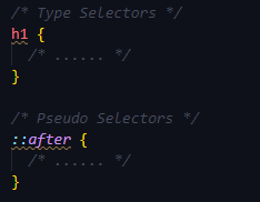
1. Type Selectors & Pseudo-Element

type pseudo

For Example:

p {
} /* 0 0 0 1 */
span {
} /* 0 0 0 1 */
p span {
} /* 0 0 0 2 */
p > span {
} /* 0 0 0 2 */
div p > span {
} /* 0 0 0 3 */

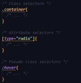
2. Class Selectors, attribute selectors, and pseudo-class selectors

class pseudo class attribute

Example:

.name {
} /* 0 0 1 0 */
.users .name {
} /* 0 0 2 0 */
[href$='.pdf'] {
} /* 0 0 1 0 */
:hover {
} /* 0 0 1 0 */

3. ID selectors

id selector

Example:

#name {
} /* 0 1 0 0 */
.user #name {
} /* 0 1 1 0 */
#name span {
} /* 0 1 0 1 */

Also, there is in-line styling which doesn’t use any CSS rather specify the style in-line with the HTML.

Example:

<p style="color: red">Test</p> /* 1 0 0 0 */

!important Rule

There is another property !important that doesn’t follow any specificity rather it is applied overriding all the CSS properties and specificities.

p {
  font-size: 20px !important;
}

Tips on CSS Specificity

  • The universal selector (*) has no specificity value (0,0,0,0)
  • Pseudo-elements (e.g. :first-line) get 0,0,0,1 unlike their psuedo-class brethren which get 0,0,1,0
  • There’s a highly debatable topic related to using !importantas it overrides all the CSS values. It is also a good practice not to use any id selectors but class selectors.
  • The pseudo-class : not() adds no specificity by itself, only what’s inside its parentheses.

How to Setup Tailwind with PurgeCSS and PostCSS? | Tailwind Installation and Usage

How to Setup Tailwind with PurgeCSS and PostCSS

In this tutorial, we will learn how to use Tailwind with any kind of project. Know how to set up Tailwind with PurgeCSS and PostCSS, how to create a Tailwind File, what do PurgeCSS and PostCSS mean. This tutorial makes you familiar with the concept of How to Remove Unused CSS using the PurgeCSS.

Tailwind Installation

We have to install tailwind via npm or yarn:

npm init -y (if its a barebone project, -y stands for yes)
npm install tailwindcss

Create the Configuration File

We have to create a configuration for a tailwind to use:

npx tailwind init

This will create a file named tailwind.config.js in the root location of our project folder.

PostCSS Config Tailwind

Tailwind needs PostCSS (PostCSS is a software development tool that uses JavaScript-based plugins to automate routine CSS operations) and autoprefixer (Autoprefixer will use the data based on current browser popularity and property support to apply prefixes for you) to work. So we need to apply that in the postcss.config.js file:

module.exports = {
  plugins: [
    require('tailwindcss'),
    require('autoprefixer')
  ]
}

Note: If the postcss.config.js doesn’t exist, we have to create one.

We need to install PostCSS and autoprefixer from npm too:

npm install autoprefixer
npm install -g postcss-cli (-g stands for global)

How to Create the Tailwind CSS File?

Now, we will create a CSS file (style.css) and add these lines at the top:

@tailwind base;
@tailwind components;
@tailwind utilities;

Create the build command

We need to specify a build command that will help us to generate the actual CSS file after compiling with PostCSS and autoprefixer. For that, we need to add the command to the package.json file at scripts like:

"scripts": {
  "build:css": "postcss src/tailwind.css -o static/dist/tailwind.css"
}

Build Tailwind

For building the final CSS file we need to run the command npm run build in the root of the project folder.

The resulting file is in static/dist/tailwind.css

Automatically regenerate the CSS upon file changes

There is a great npm package that will compile our CSS in real-time without running the build command every time after edits. For that we need to install the watch using the command:

npm install watch

Then we need to edit the package.json file at scripts like:

"scripts": {
  "build:css": "postcss src/tailwind.css -o static/dist/tailwind.css",
  "watch": "watch 'npm run build:css' ./layouts"
}

Now for running we simply need to execute the command npm run watch and it’s all good.

Trim the File Size

If we check the final CSS file i.e after building, we can see that it’s huge in size. That large file is never appropriate for web pages. For that, we can actually trim the file to make it smaller than the original.

We need to install two more npm packages:

npm install cssnano
npm install @fullhuman/postcss-purgecss

What is PurgeCSS?

PurgeCSS is a development tool used for removing the unused CSS in a Project. It is the default library to control the Tailwind CSS Bundle Sizes. It removes unused styles and optimizes CSS Build Sizes.

How to Remove Unused Classes from Tailwind with PurgeCSS?

To remove unused CSS we use the following code. Then we add this to our PostCSS configuration file postcss.config.js:

const purgecss = require('@fullhuman/postcss-purgecss')
const cssnano = require('cssnano')

module.exports = {
  plugins: [
    require('tailwindcss'),
    require('autoprefixer'),
    cssnano({
      preset: 'default'
    }),
    purgecss({
      content: ['./layouts/**/*.html', './src/**/*.vue', './src/**/*.jsx'],
      defaultExtractor: content => content.match(/[\w-/:]+(?<!:)/g) || []
    })
  ]
}

In development, avoid too much processing

In development, we can use this just to add prefixes and remove comments. We need to edit the postcss.config.js like:

const purgecss = require('@fullhuman/postcss-purgecss')
const cssnano = require('cssnano')

module.exports = {
  plugins: [
    require('tailwindcss'),
    process.env.NODE_ENV === 'production' ? require('autoprefixer') : null,
    process.env.NODE_ENV === 'production'
      ? cssnano({ preset: 'default' })
      : null,
    purgecss({
      content: ['./layouts/**/*.html', './src/**/*.vue', './src/**/*.jsx'],
      defaultExtractor: content => content.match(/[\w-/:]+(?<!:)/g) || []
    })
  ]
}


CSS Attribute Selectors | Definition of Attribute selectors in CSS | Syntax & Example Program with Attribute Selectors

CSS Attribute Selectors

In CSS, to target elements with certain attributes, there is a possibility by using attribute selectors. The CSS [attribute] selector matches elements on the basis of the presence or value of a given attribute. Let’s get complete knowledge on attribute selectors on CSS by going through these quick links available below.

Attribute selectors in CSS

CSS Attribute Selector is a specific type of selector that is applied to select the HTML elements with a specific attribute and/or attribute(s) value that are associated with it.

An attribute selector can be made by putting the attribute — (not obligatory) with a value — within the square brackets ([….]). Let’s check the syntax of CSS Attribute Selectors from the below section.

Syntax:

The following syntax is classified on the basis of an attribute or attribute value while styling a specific HTML element:

[attribute]
[attribute="value"]
[attribute~="value"]
[attribute|="value"]
[attribute^="value"]
[attribute$="value"]
[attribute*="value"]

Attribute presence selectors

One of the first attribute selectors is Attribute presence selectors. By using this attribute selector in CSS, we will check if an element has an attribute using the square brackets[]syntax.

p[key] will select all p (paragraph) tags in the page that have an key attribute, regardless of its value of the content:

p[key] {
  /* ... */
}

Do Read:

Exact attribute value selectors

We can check for an attribute value using the =, then the CSS will only be applied to the attribute matching the exact content:

p[key="my-key"] {
  /* ... */
}

Match an attribute value portion

There are some operators that are used to match an attribute value portion like as follows:

  • = it checks for the exact value, and other operators are listed under
  • *= notes if the attribute contains the partial
  • ^= notes if the attribute starts with the partial
  • $= checks if the attribute ends with the partial
  • |= checks if the attribute starts with the partial and it’s followed by a dash (common in classes, for example), or just contains the partial
  • ~= checks if the partial is contained in the attribute, but separated by spaces from the rest

If we add anisimply before the closing bracket, the check will be case insensitive. Otherwise, all the checks above are case-sensitive.

Styling Forms with Attribute Selectors

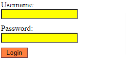
The attribute selectors are especially helpful for styling forms without class or id. For example, let’s look at the below code:

input[type="text"], input[type="password"] {
    width: 150px;
    display: block;
    margin-bottom: 10px;
    background: yellow;
}
input[type="submit"] {
    padding: 2px 10px;
    border: 1px solid #804040;
    background: #ff8040;
}

Output:

CSS Attribute Selectors example output

CSS Colors | Named Colors in CSS | Ultimate Guide to Learn CSS Color Names with Example

CSS Colors

The default HTML pages that are rendered into the browser are pretty bland. For example, it’s just a web page using black and white content and blue links.

We can add colors to CSS to make the webpage more attractive.

For colors in CSS, we have properties like:

  • color
  • background-color
  • border-color

All of them accept the color value when it has in various forms.

This Tutorial of CSS Colors includes the following: 

CSS <color> Keyword

A <color> can be determined in any of the following ways:

  • Applying a keyword (such as blue or transparent)
  • Using the HSL cylindrical-coordinate system (through the hsl() and hsla() functional notations)
  • Using the RGB cubic-coordinate system (via the #-hexadecimal or the rgb() and rgba()functional notations)

The list of 17 original CSS Colors are listed as follows:

Color Keyword Hex Value
black #000000
gray #808080
silver #c0c0c0
white #ffffff
maroon #800000
red #ff0000
purple #800080
fuchsia #ff00ff
green #008000
lime #00ff00
olive #808000
yellow #ffff00
navy #000080
blue #0000ff
teal #008080
aqua #0000ff
orange #ffa500

Syntax

The syntax of the <color> datatype is defined using one of the options enlisted below.

For Example:

p {
  color: red;
}

Read More:

Named colors

Previously, CSS started with 16 colors but now we have a wide range of color names list. There are some predefined colors that we can just assign to the CSS, like:

  • aliceblue
  • antiquewhite
  • aqua
  • aquamarine
  • azure
  • beige
  • bisque
  • black
  • blanchedalmond
  • blue
  • blueviolet
  • brown
  • burlywood
  • cadetblue
  • chartreuse
  • chocolate
  • coral
  • cornflowerblue
  • cornsilk
  • crimson
  • cyan
  • darkblue
  • darkcyan
  • darkgoldenrod
  • darkgray
  • darkgreen
  • darkgrey
  • darkkhaki
  • darkmagenta
  • darkolivegreen
  • darkorange
  • darkorchid
  • darkred
  • darksalmon
  • darkseagreen
  • darkslateblue
  • darkslategray
  • darkslategrey
  • darkturquoise
  • darkviolet
  • deeppink
  • deepskyblue
  • dimgray
  • dimgrey
  • dodgerblue
  • firebrick
  • floralwhite
  • forestgreen
  • fuchsia
  • gainsboro
  • ghostwhite
  • gold
  • goldenrod
  • gray
  • green
  • greenyellow
  • grey
  • honeydew
  • hotpink
  • indianred
  • indigo
  • ivory
  • khaki
  • lavender
  • lavenderblush
  • lawngreen
  • lemonchiffon
  • lightblue
  • lightcoral
  • lightcyan
  • lightgoldenrodyellow
  • lightgray
  • lightgreen
  • lightgrey
  • lightpink
  • lightsalmon
  • lightseagreen
  • lightskyblue
  • lightslategray
  • lightslategrey
  • lightsteelblue
  • lightyellow
  • lime
  • limegreen
  • linen
  • magenta
  • maroon
  • mediumaquamarine
  • mediumblue
  • mediumorchid
  • mediumpurple
  • mediumseagreen
  • mediumslateblue
  • mediumspringgreen
  • mediumturquoise
  • mediumvioletred
  • midnightblue
  • mintcream
  • mistyrose
  • moccasin
  • navajowhite
  • navy
  • oldlace
  • olive
  • olivedrab
  • orange
  • orangered
  • orchid
  • palegoldenrod
  • palegreen
  • paleturquoise
  • palevioletred
  • papayawhip
  • peachpuff
  • peru
  • pink
  • plum
  • powderblue
  • purple
  • rebeccapurple
  • red
  • rosybrown
  • royalblue
  • saddlebrown
  • salmon
  • sandybrown
  • seagreen
  • seashell
  • sienna
  • silver
  • skyblue
  • slateblue
  • slategray
  • slategrey
  • snow
  • springgreen
  • steelblue
  • tan
  • teal
  • thistle
  • tomato
  • turquoise
  • violet
  • wheat
  • white
  • whitesmoke
  • yellow
  • yellowgreen

also transparent and currentColor which inherits the border-color for example.

We have plenty of options instead of these Named colors.

RGB and RGBa Color Values

We can usergb()function to get color in the form of RGB which is base on three different colors i.e red, green, and blue. From 0 to 255:

a {
  color: rgb(255, 125, 25);
    background-color: rgb(125,100, 200);
}

The below table is an example to display few colors utilizing RGB values.

Color Color RGB
rgb(0,0,0)
rgb(255,0,0)
rgb(0,255,0)
rgb(0,0,255)
rgb(255,255,0)
rgb(0,255,255)
rgb(255,0,255)
rgb(192,192,192)
rgb(255,255,255)

rgba() lets us use the alpha channel that creates a transparency effect. That can be a number from 0 to 1:

a {
    background-color: rgba(100, 200, 150, 0.5);
}

Hexadecimal notation

Probably the most common (yet least intuitive) way to specify colors in CSS is to use their hexadecimal (or hex) values. Hex values are actually just a different way to represent RGB values. Instead of using three numbers between 0 and 255, you use six hexadecimal numbers. Hex numbers can be 0-9 and A-F. Hex values are always prefixed with a # symbol.

ul { color: #8050c8; }    /* purple */

Shorthand Notation for Hex Values

For instance, in case both digits of the red, green, and blue values are the same, then you may utilize the short three-digit notation as shown in the below example codes.

p { color: #000; }     /* black same as #000000 */
p { color: #fff; }    /* white same as #ffffff */
p { color: #f00; }     /* red: same as #ff0000 */
h1 { color: #0f0; }    /* lime: same as #00ff00 */
ul { color: #ff0; }    /* yellow: same as #ffff00 */

HSL and HSLa color codes

The HSL color model is one of the least used, but gaining traction because can be more intuitive to use when working with shades and color adjustments.

HSL stands for hue, saturation, and lightness. Hue is defined by a color wheel. Each color represents a degree on the wheel.

Example:

a { background-color: hsl(240,100%, 75%); } /* shade of blue */

HSLA is simply the HSL color model with the addition of an alpha channel. This works exactly the same way as the alpha channel in RGBA.

a { background-color: hsla(240,100%, 75%, 0.5); } /* shade of blue */

Example Program using CSS Colors Properties

Let’s see an example of CSS colors, which covers the above properties from below.

<html>   
    <head>   
        <title>CSS hsl color property</title>   
        <style>   
            h1{   
                text-align:center;   
            }   
            #rgb{  
              color:rgb(255,0,0);  
            }  
            #rgba{  
              color:rgba(255,0,0,0.5);  
            }  
            #hex{  
              color:#EE82EE;  
            }  
            #short{  
              color: #E8E;  
            }  
            #hsl{  
              color:hsl(0,50%,50%);  
            }  
            #hsla{                
              color:hsla(0,50%,50%,0.5);  
            }  
            #built{  
              color:green;  
            }  
        </style>   
    </head>   
    <body>   
        <h1 id="rgb">   
             Hello World. This is RGB format.  
        </h1>   
        <h1 id="rgba">   
          Hello World. This is RGBA format.  
     </h1>   
     <h1 id="hex">   
      Hello World. This is Hexadecimal format.  
 </h1>   
 <h1 id="short">   
  Hello World. This is Short-hexadecimal format.  
</h1>   
 <h1 id="hsl">   
  Hello World. This is HSL format.  
</h1>   
<h1 id="hsla">   
  Hello World. This is HSLA format.  
</h1>   
<h1 id="built">   
  Hello World. This is Built-in color format.  
</h1>   
    </body>   
</html>

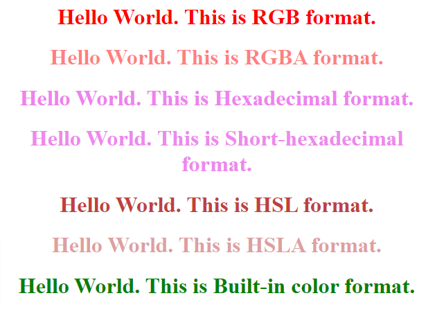
Output:

css colors example output

Making a Table Responsive Using CSS | How to Create a Responsive Table using CSS?

Making a Table Responsive Using CSS

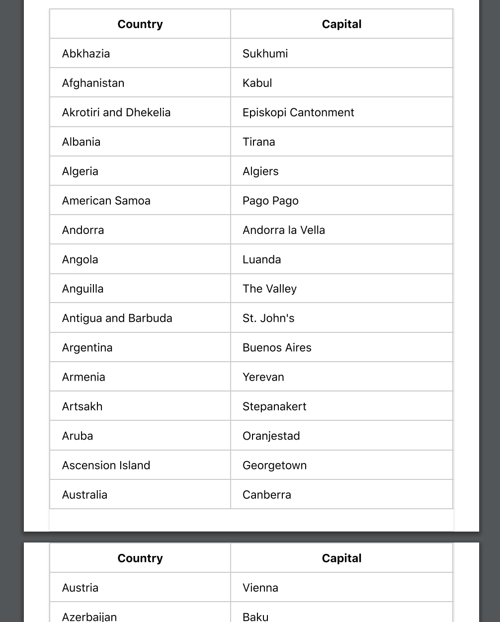
Creating a Table can be a quite challenging task especially if we are to make it responsive. Styling the tables can be hectic as not all themes support responsive designs. There is a solution to overcome this and we can use CSS to create responsive designs that fit all screen types. In this tutorial, we have mentioned what is a Responsive Table and How to Create One using CSS by considering necessary syntax, example programs.

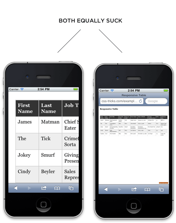
no responsive

Responsive Tables

Responsive design is completely about adjusting designs to fit screens of different sizes. A Responsive Table will display a horizontal scroll bar if the screen is small to fit the entire content. You can resize the browser window to see the effect.

Read More:

How to Create a Responsive Table using CSS?

In order to create a Responsive Table, you need to add the container element with overflow-x:auto around the <table>

<div style="overflow-x:auto;">
<table>
...
</table>
</div>

CSS Table Properties

Property Description
border Sets the complete border properties in one declaration
border-collapse It indicates whether or not table borders should be collapsed
border-spacing It specifies the distance between adjacent cells borders
caption-side Indicates the placement of a table caption
empty-cells Indicates whether or not to display borders,  background on the table’s empty cells.
table-layout Indicates the layout algorithm to use for a table

Workaround

We’re going to use “responsive design” principles to detect if the screen is smaller than the maximum height and width of our table. If it is, we will reformat the table.

Just a normal table in HTML is like:

<table>
    <thead>
    <tr>
        <th>First Name</th>
        <th>Last Name</th>
        <th>Job Title</th>
    </tr>
    </thead>
    <tbody>
    <tr>
        <td>Mainak</td>
        <td>Das</td>
        <td>Intern</td>
    </tr>
    <tr>
        <td>Soham</td>
        <td>Debnath</td>
        <td>Intern</td>
    </tr>
    </tbody>
</table>

Some style for the table (particularly for desktops and laptops):

table { 
  width: 100%; 
  border-collapse: collapse; 
}
/* Zebra striping */
tr:nth-of-type(odd) { 
  background: #eee; 
}
th { 
  background: #333; 
  color: white; 
  font-weight: bold; 
}
td, th { 
  padding: 6px; 
  border: 1px solid #ccc; 
  text-align: left; 
}

The small screen i.e the screen smaller than the desktop and/or laptop responsive stuff comes in now. We are aware that our minimum table width is about 760px so we will set up our media query to take effect if it is narrower than that. We will focus on iPads as they are right in that zone.

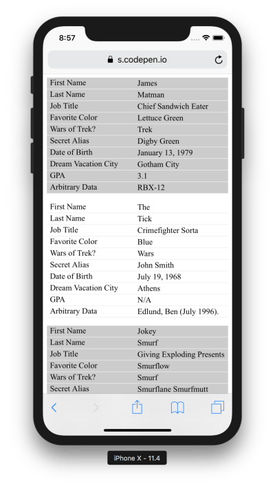
We are going to force the table not to behave as a table by setting every table-related element to be block-level. Then by placing the zebra striping, we have added, it is like each table row becomes a table in itself, and is as wide as the screen. There will be no more horizontal scrolling! For each “cell”, we’ll use CSS generated content (:before) to apply the label, so that we are aware of what each bit of data means.

/* 
Max width before this PARTICULAR table gets nasty
This query will take effect for any screen smaller than 760px
and also iPads specifically.
*/
@media 
only screen and (max-width: 760px),
(min-device-width: 768px) and (max-device-width: 1024px)  {

    /* Force table to not be like tables anymore */
    table, thead, tbody, th, td, tr { 
        display: block; 
    }
    
    /* Hide table headers (but not display: none;, for accessibility) */
    thead tr { 
        position: absolute;
        top: -9999px;
        left: -9999px;
    }
    
    tr { border: 1px solid #ccc; }
    
    td { 
        /* Behave  like a "row" */
        border: none;
        border-bottom: 1px solid #eee; 
        position: relative;
        padding-left: 50%; 
    }
    
    td:before { 
        /* Now like a table header */
        position: absolute;
        /* Top/left values mimic padding */
        top: 6px;
        left: 6px;
        width: 45%; 
        padding-right: 10px; 
        white-space: nowrap;
    }
    
    /*
    Label the data
    */
    td:nth-of-type(1):before { content: "First Name"; }
    td:nth-of-type(2):before { content: "Last Name"; }
    td:nth-of-type(3):before { content: "Job Title"; }
    td:nth-of-type(4):before { content: "Favorite Color"; }
    td:nth-of-type(5):before { content: "Wars of Trek?"; }
    td:nth-of-type(6):before { content: "Secret Alias"; }
    td:nth-of-type(7):before { content: "Date of Birth"; }
    td:nth-of-type(8):before { content: "Dream Vacation City"; }
    td:nth-of-type(9):before { content: "GPA"; }
    td:nth-of-type(10):before { content: "Arbitrary Data"; }
}

And so, desktops and/ or laptops get the regular table experience. Whereas Mobiles and other smaller screens get reformatted and easier to explore table.

responsive table

CSS Units | CSS Lengths | Absolute & Relative Units in CSS with Example Programs

CSS Units

We can use units like em, rem, pixel, and percentages to set the length, paddings, margins, align elements, and so on. We use those CSS units every day in our life. Go with this tutorial and gain proper knowledge about CSS Units with example codes. Let’s press the below links and directly jump into the units related stuff in CSS.

What are CSS Units?

CSS maintains a number of measurements contain absolute units like inches, centimeters, points, and so on, along with relative measures like percentages and em units.

Various CSS properties consider “length” values, such as width, margin, padding, font-size, etc. However, for some CSS properties, negative lengths are provided.

There are two types of lengths utilized in CSS — absolute and relative.

Absolute Lengths Units

Below the table of units is all absolute length units. These absolute length units are utilized when working on a project where responsiveness is not being viewed. The Absolute Units are the same size despite the parent element or window size. The absolute units are tabulated as follows:

Unit Name Equivalent to
cm Centimeters 1cm = 38px = 25/64in
mm Millimeters 1mm = 1/10th of 1cm
Q Quarter-millimeters 1Q = 1/40th of 1cm
in Inches 1in = 2.54cm = 96px
pc Picas 1pc = 1/6th of 1in
pt Points 1pt = 1/72th of 1in
px Pixels 1px = 1/96th of 1in

Example:

p {
  font-size: 24px;
}
div {
  width: 3in;
  border-width: 3pt;
}

Relative units

  • em: Generally assigned to the element’s font size. It doesn’t depend on the fonts used rather the font size. In typography, this measures the width of the m letter.
  • rem: Similar to em but instead of font size, it varies current element font size. It uses the root element that is HTML. It has to be set once to make it consistent to all the pages.
  • ex: Same as em but instead of measuring the width of m letter, it measures the height of the letter x.
  • ch: Same as ex but instead of measuring the width of x letter, it measures the height of the letter 0.

Example:

div {
font-size: 16px;
}
div h3 {
font-size: 2rem;
}

Do Refer:

Pixels

This is the most used unit in CSS. But it is not that flexible as it depends on device pixel and DPI.

The pixel in units doesn’t have any similarity with the pixels in the device.

Percentages

Another important unit in CSS is a percentage as it can help us to compare some child elements to their parent element.

Example:

.parent-element {
  width: 100px;
}

.child-child {
  width: 50%; /* = 50px */
}

Viewport units

Viewport units are used to control the viewport i.e the area of the screen visible.

Like:

  • vw: Represents the width of the viewport. Like, 50vw = 50% of the width.
  • vh: Represents the height of the viewport. Like, 50vh = 50% of the height.
  • vmin: Represents the minimum between the height or width in terms of percentage. Like, 20vmin = 20% of the current width or height, depending on which one is smaller.
  • vmax: Represents the maximum between the height or width in terms of percentage. Like, 20vmin = 20% of the current width or height, depending on which one is bigger.

Fraction units

We mainly use fr units in the CSS grid for dividing the space into fractions.

CSS units: Time

A few of the properties like animation need values to display in time.

Unit Explanation
s It is the duration of time in seconds.
ms It is the duration of time in milliseconds.
1ms = 1/100 of a second

Example on Time CSS Units

<!DOCTYPE html>  
<html>  
<head>  
<style>   
div  
{  
width: 200px;  
height: 200px;  
background: red;  
border-radius: 50px;  
transition-property: background, width, height;  
transition-duration: 1s, 2s, 3s;  
}  
  
div:hover  
{  
width:300px;  
background: blue;  
height:300px;  
border-radius: 80px;  
}  
</style>  
</head>  
<body>  
<center>  
<h2>Hover to see effects.</h2>  
<div></div>  
</center>  
</body>  
</html>

CSS Typography | What is Typography in CSS? | Typography Properties & Values

CSS Typography

In this tutorial, you will be going to learn completely about CSS Typography and its properties with syntax, values, and some of the example programs. Let’s dive into this tutorial on typography in CSS for better knowledge & fast learnings.

Also Check: 

What is Typography?

First and foremost, typography is about usability. Type is the user interface for conveying information, and conveying information is what we’re here to do on the web. There are many levers we can pull to affect the usability of reading text, and only by being deliberate about these can we create a pleasant experience for our users.

Typography Properties in CSS

Properties for typography are listed below:

text-transform

Transform the case of an element.

The values are:

  • capitalize to make the first letter uppercase.
  • uppercase to make all text uppercase.
  • lowercase to make all text lowercase.
  • none to disable transforming the text, used to avoid inheriting the property.

Example:

p {
  text-transform: uppercase;
}

text-decoration

Used to add decoration to the texts, like:

  • underline
  • overline
  • line-through
  • blink
  • none

Example:

p {
  text-decoration: underline;
}

/* OR */

p {
  text-decoration: underline dashed yellow;  /* Valid are solid, double, dotted, dashed, wavy */
}

Instead of one line, we can use specific properties of text-decoration. Like:

  • text-decoration-line
  • text-decoration-color
  • text-decoration-style

text-align

Specifies the alignment of the text that will be written. The default value is left, but can override with:

  • start
  • end
  • left
  • right
  • center
  • justify

Example:

p {
  text-align: center;
}

vertical-align

Used only on elements that are arranged in inline.

Specifies how the elements are vertically aligned.

The values that we can use here are:

  • baseline (the default), aligns the baseline to the baseline of the parent element.
  • sub makes an element subscripted, simulating the sub HTML element result.
  • super makes an element superscripted, simulating the sup HTML element result.
  • top align the top of the element to the top of the line.
  • text-top align the top of the element to the top of the parent element font.
  • middle align the middle of the element to the middle of the line of the parent.
  • bottom align the bottom of the element to the bottom of the line.
  • text-bottom align the bottom of the element to the bottom of the parent element font.

line-height

Help us to change the height of the line. The height of the lines refers to the empty space between two lines.

p {
  line-height: 0.9rem;
}

text-indent

Just like starting a paragraph, we can indent the first line of it.

p {
  text-indent: -10px; /* can use %, rem, em */
}

text-align-last

We can change the behavior of the line of any paragraph (follows text-align property) by using this property.

p {
  text-align-last: right;
}

word-spacing

Can modify the spaces between words.

The default value is normal.

p {
  word-spacing: 2px; /* can use px, rem, em */
}

letter-spacing

Can modify the spaces between each letter of a word.

The default value is normal.

p { letter-spacing: 2px; /* can use px, rem, em */ }

text-shadow

Use this property to apply a shadow effect over texts.

The shadow can be applied in both the X and Y axis but with an offset. Also, we can add a blur effect.

If no color of the shadow is specified, it will use the color of the text.

p {
  text-shadow: 0.2px 2px;
}

white-space

White spaces are the empty spaces that are added after an indent or next to a line.

Values that collapse whites spaces are:

  • normal Adds new lines when necessary as the text reaches the container end.
  • nowrap Do not add a new line when the text reaches the end of the container and suppresses any line break added to the text.
  • pre-line Adds new lines when necessary as the text reaches the container end.

Values that preserve whites spaces are:

  • pre Do not add a new line when the text reaches the end of the container but preserves the line break added to the text.
  • pre-wrap Adds new lines when necessary as the text reaches the container end.

tab-size

Determines the size/width of the tab character.

The default value is 8 but can set any values of supported units or an integer.

p {
  tab-size: 1;
}

writing-mode

The writing-mode property changes the alignment of the text so that it can be read from top to bottom or from left to right, depending on the language.

Available values are:

  • horizontal-tb (default).
  • vertical-rl content is laid out vertically. New lines are put on the left of the previous.
  • vertical-lr content is laid out vertically. New lines are put on the right of the previous.

hyphens

The hyphens property controls hyphenation of text in block-level elements. You can prevent hyphenation from happening at all, allow it, or only allow it when certain characters are present.

Values are:

  • none (default).
  • manual only add a hyphen when there is already a visible hyphen or a hidden hyphen (a special character).
  • auto add hyphens when determined the text can have a hyphen.

text-orientation

The text-orientation property in CSS aligns text in a line when working with a vertical writing-mode.

Valid values are:

  • mixed is the default, and if a language is vertical (like Japanese) it preserves that orientation while rotating text written in western languages.
  • upright makes all text be vertically oriented.
  • sideways makes all text horizontally oriented.

direction

The direction property in CSS sets the direction of content flow within a block-level element. This applies to text, inline, and inline-block elements. It also sets the default alignment of text and the direction that table cells flow within a table row.

The valid values are:

  • ltr – Left to Right, the default
  • rtl – Right to Left
  • inherit – inherits its value from the parent element
p {
  direction: rtl;
}

word-break

The word-break property in CSS can be used to change when line breaks ought to occur.

Values:

  • normal: use the default rules for word breaking.
  • break-all: any word/letter can break onto the next line.
  • keep-all: for Chinese, Japanese, and Korean text words are not broken. Otherwise, this is the same as normal.

overflow-wrap

The overflow-wrap property in CSS allows you to specify that the browser can break a line of text inside the targeted element onto multiple lines in an otherwise unbreakable place.

.example {
  overflow-wrap: break-word;
}

to break it at the exact length of the line, or

p {
  overflow-wrap: anywhere;
}

word-breakproperty is as same as this property. We might want to pick this one on western languages, as word-breakhas a unique approach for non-western languages.

The CSS Box Model | CSS Layout | How to Work with the Box Model in CSS?

The CSS Box Model

Everything in CSS is essentially a box, which orders from inside to outside. In this tutorial, we will be having a proper look at the CSS Box Model concept in order to build more complex layout tasks with a proper knowledge of how it world and the terminology that refers to it.

What is the CSS Box Model?

A CSS box model is a section that covers numerous properties, such as edge, border, padding, and material. It is utilized to improve the design and structure of a web page. Also, the box model in CSS can be applied as a set of tools to personalize the layout of various components. As per the CSS box model, the web browser provides each element as a square prism.

Parts of a Box

Every box is formed of four parts (or areas), determined by their respective edges. The four parts of a box we have are as follows:

  • Content area – The content of the box, where text and images resemble
  • Padding area – Clears a space around the content. The padding is transparent
  • Border area – A border that goes around the padding and content
  • Margin area – Clears an area outside the border. The margin is transparent

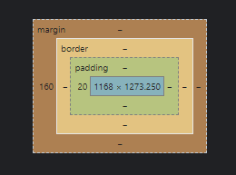
We can watch the box model in action by opening up the browser dev tools.

box model

Here we can see, chrome tells us about the properties of the div element.

The cyan color represents the actual content in the element, surrounding it the green color represents the padding for the content. Then the orange color represents the border and brown represents the margin respectively.

When we mention the height and width of an element, it changes the content area. Any of the padding, border, or margin is calculated outside of that area.

Also Check:

Elements of the width and height

The actual area that an element’s box may take on a web page is measured like this:

Size of the box CSS Properties
Height height + padding-top + padding-bottom + border-top + border-bottom + margin-top + margin-bottom
Width width + padding-left + padding-right + border-left + border-right + margin-left + margin-right

The Standard CSS box model

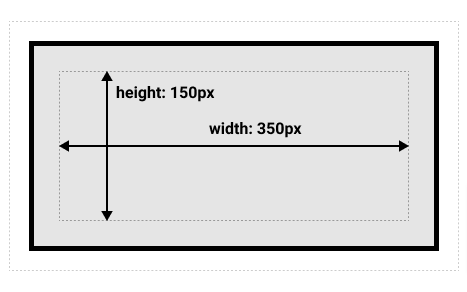
In case you provide a box width and height assets, then it determines the width and height of the content box in the standard CSS box model. Any padding and border are then added to that width and height to get the total size used by the box. This is displayed in the image below.

If we believe that the box has the resulting CSS defining width, height, margin,border, andpadding:

.box {
  width: 350px;
  height: 150px;
  margin: 10px;
  padding: 25px;
  border: 5px solid black;
}

Output Box:

standard css box model example output

Example of margins, padding, and borders

The following example demonstrates how margins, padding, and borders communicate. Let’s take a look:

<!DOCTYPE>
<HTML>
  <HEAD>
    <TITLE>Examples of margins, padding, and borders</TITLE>
    <STYLE type="text/css">
      UL { 
        background: yellow; 
        margin: 12px 12px 12px 12px;
        padding: 3px 3px 3px 3px;
                                     /* No borders set */
      }
      LI { 
        color: white;                /* text color is white */ 
        background: blue;            /* Content, padding will be blue */
        margin: 12px 12px 12px 12px;
        padding: 12px 0px 12px 12px; /* Note 0px padding right */
        list-style: none             /* no glyphs before a list item */
                                     /* No borders set */
      }
      LI.withborder {
        border-style: dashed;
        border-width: medium;        /* sets border width on all sides */
        border-color: lime;
      }
    </STYLE>
  </HEAD>
  <BODY>
    <UL>
      <LI>First element of list
      <LI class="withborder">Second element of list is
           a bit longer to illustrate wrapping.
    </UL>
  </BODY>
</HTML>

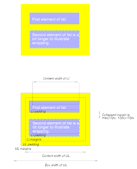
Output:

css box model example result

The first of the following diagrams show what this example would return. The second represents the relationship between the margins, padding, and borders of the UL elements and those of its children LI elements.