The JavaScript Event Loop | What is an Event loop in JavaScript? | How it works with Example

The JavaScript Event Loop

Event Loop in JavaScript

The Event Loop is one of the most important aspects to understand about JavaScript.

This post aims to explain the inner details of how JavaScript works with a single thread, and how it handles asynchronous functions.

Your JavaScript code runs single-threaded. There is just one thing happening at a time.

This is a limitation that’s actually very helpful, as it simplifies a lot how you program without worrying about concurrency issues.

You just need to pay attention to how you write your code and avoid anything that could block the thread, like synchronous network calls or infinite loops.

Do Check: 

In general, in most browsers there is an event loop for every browser tab, to make every process isolated and avoid a web page with infinite loops or heavy processing to block your entire browser.

The environment manages multiple concurrent event loops, to handle API calls for example. Web Workers run in their own event loop as well.

You mainly need to be concerned that your code will run on a single event loop, and write code with this thing in mind to avoid blocking it.

This tutorial of JavaScript Event Loop Include the following:

Blocking the event loop

Any JavaScript code that takes too long to return back control to the event loop will block the execution of any JavaScript code in the page, even block the UI thread, and the user cannot click around, scroll the page, and so on.

Almost all the I/O primitives in JavaScript are non-blocking. Network requests, Node.js filesystem operations, and so on. Blocking is the exception, which is why JavaScript is based so much on callbacks, and more recently on promises and async/await.

The call stack

The call stack is a LIFO queue (Last In, First Out).

The event loop continuously checks the call stack to see if there’s any function that needs to run.

While doing, it adds any function call it finds to the call stack and executes each one in order.

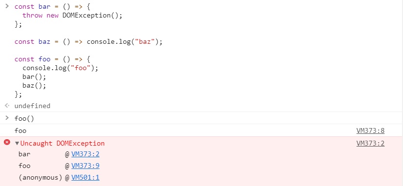
You know the error stack trace you might be familiar with, in the debugger or in the browser console? The browser looks up the function names in the call stack to inform you which function originates the current call:

A simple event loop explanation

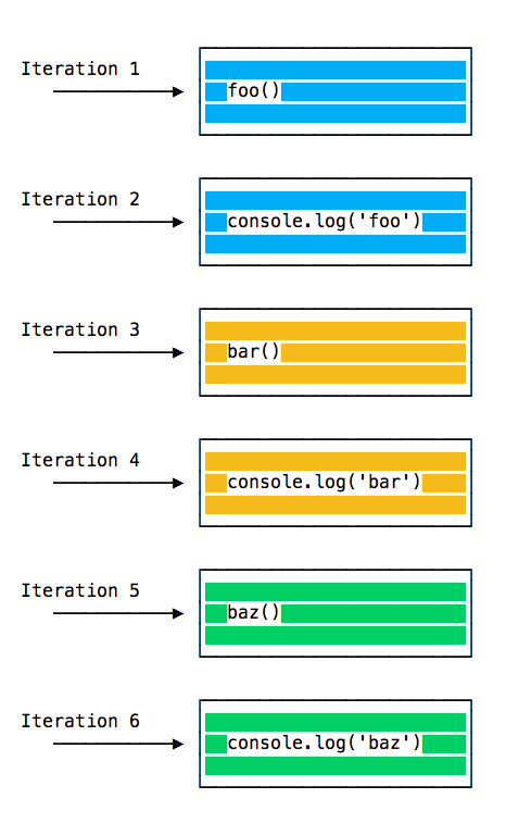
An example to explain it through,

Consider the previous code, but this time not throwing any DOMexception.

const bar = () => {
  console.log("bar")
};

const baz = () => console.log("baz")

const foo = () => {
  console.log("foo")
  bar()
  baz()
};
foo()

The Output would be:

foo
bar
baz

When this code runs, first, foo() is called. Inside foo() we first call, bar() then we call baz().

At this point the call stack looks like this:

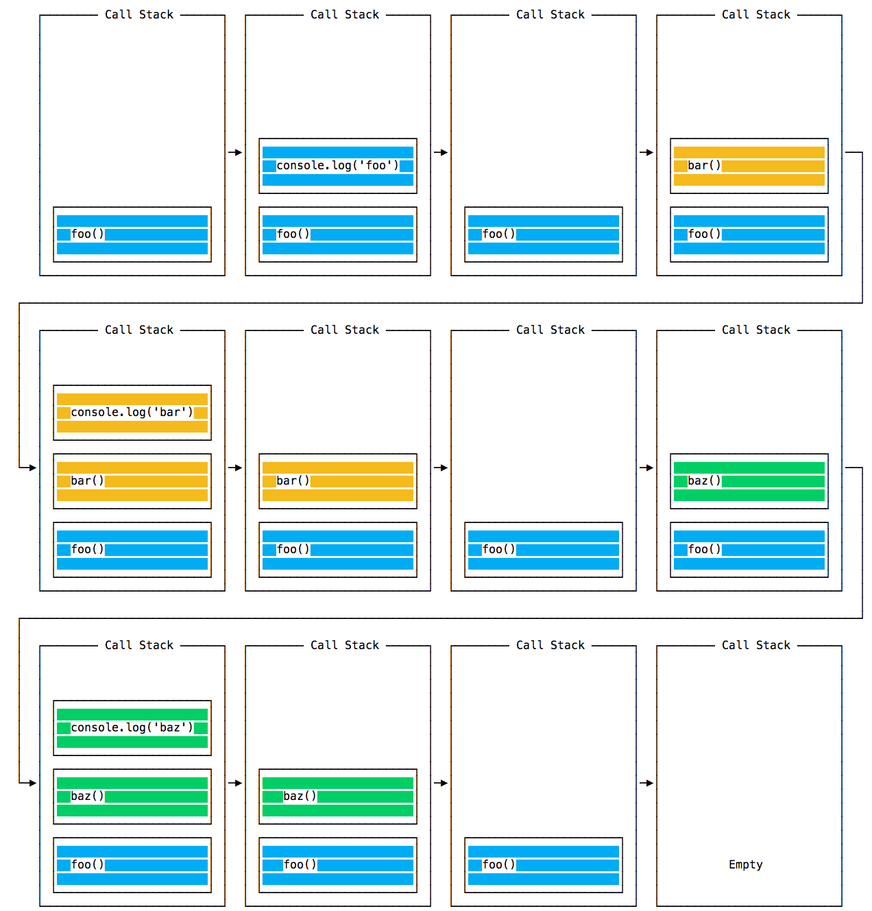
The event loop on every iteration looks if there’s something in the call stack, and executes it until stack is empty.

Queuing function execution

The above example looks normal, there’s nothing special about it: JavaScript finds things to execute, runs them in order.

Let’s see how to defer a function until the stack is clear.

The use case of setTimeout(() => {}), 0) is to call a function, but execute it once every other function in the code has been executed.

Take this example:

const bar = () => console.log('bar')

const baz = () => console.log('baz')

const foo = () => {
  console.log('foo')
  setTimeout(bar, 0)
  baz()
}

foo()

Result:

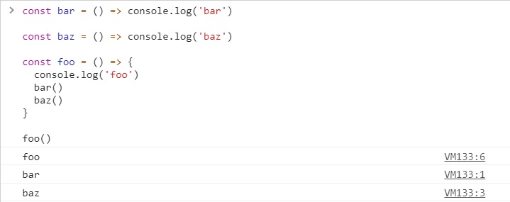
When setTimeout() is called, the Browser or Node.js start the timer. Once the timer expires, in this case immediately as we put 0 as the timeout, the callback function is put in the Message Queue.

The Message Queue is also where user-initiated events like click or keyboard events, or fetch responses are queued before your code has the opportunity to react to them. Or also DOM Events like onLoad.

The loop gives priority to the call stack, and it first processes everything it finds in the call stack, and once there’s nothing in there, it goes to pick up things in the message queue.

We don’t have to wait for functions likesetTimeout, fetch or other things to do their own work, because they are provided by the browser, and they live on their own threads. For example, if you fix thesetTimeouttimeout to 2 seconds, you don’t have to wait 2 seconds – then wait happens elsewhere.
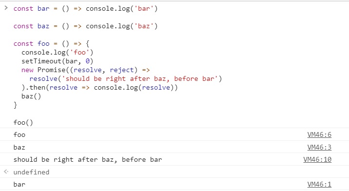
ES6 Job Queue

ECMA introduced the concept of the Job Queue, which is used by Promises (also introduced in ES6/ES2015). It’s a way to execute the result of an async function as soon as possible, rather than being put at the end of the call stack.

Promises that resolve before the current function ends will be executed right after the current function.

I find nice the analogy of a rollercoaster ride at an amusement park: the message queue puts you at the back of the queue, behind all the other people, where you will have to wait for your turn, while the job queue is the Fastpass ticket that lets you take another ride right after you finished the previous one.

Example:

const bar = () => console.log('bar')

const baz = () => console.log('baz')

const foo = () => {
  console.log('foo')
  setTimeout(bar, 0)
  new Promise((resolve, reject) =>
    resolve('should be right after baz, before bar')
  ).then(resolve => console.log(resolve))
  baz()
}

foo()

Output:

CSS Box Sizing | box-sizing Property in CSS | With & Without CSS box-sizing property with Example Programs

CSS Box Sizing

CSS Box Sizing

The CSS box-sizingproperty allows us to include the padding and border in an element’s total width and height. Also, it helps make building CSS layouts easier and a lot more intuitive.

box-sizing Property in CSS

The CSS box-sizing property defines how the width and height of an element are calculated: should they include padding and borders, or not.

CSS Syntax:

box-sizing: content-box|border-box|initial|inherit;

Property Values

Value Description
content-box Default. The width and height properties (and min/max properties) include only the content. Border and padding are not included
border-box The width and height properties (and min/max properties) includes content, padding, and border
initial Sets this property to its default value.
inherit Inherits this property from its parent element.

Supported Browsers

The browser supported by the CSS box-sizing property are enlisted below:

  • Firefox 29.0 2.0 -Moz-
  • Google Chrome 10.0 4.0 -WebKit-
  • Opera 9.5
  • Internet Explorer 8.0
  • Apple Safari 5.1 3.2 -WebKit-

Example Code on CSS box-sizing Property

<!DOCTYPE html>
<html>
<head>
<style> 
div.container {
  width: 100%;
  border: 2px solid black;
}

div.box {
  box-sizing: border-box;
  width: 50%;
  border: 5px solid red;
  float: left;
}
</style>
</head>
<body>

<div class="container">
  <div class="box">This div occupies the left half</div>
  <div class="box">This div occupies the right half</div>
  <div style="clear:both;"></div>
</div>

</body>
</html>

Output:

css box sizing property example output

With the CSS box-sizing Property

If you set box-sizing: border-box; on an element, padding and border are included in the width and height:

The box-sizing property is a great help. It has 2 values:

  • border-box
  • content-box

content-box is the default, the one we had for ages beforebox-sizingbecame a thing.

border-box is the new and great thing we are looking for. If you set that on an element.

Here is the same example as above, withbox-sizing: border-box;added to both <div> elements:

.div1 {
  width: 300px;
  height: 100px;
  border: 1px solid blue;
  box-sizing: border-box;
}

.div2 {
  width: 300px;
  height: 100px;
  padding: 50px;
  border: 1px solid red;
  box-sizing: border-box;
}

Output:

with css box sizing example output

Without the CSS box-sizing Property

By default the width and height of an element is calculated as follows:

width + padding + border = actual width of an element
height + padding + border = actual height of an element

This means: When you fixed the width/height of an element, the element usually appears bigger than you have set (because the element’s border and padding are added to the element’s specified width/height).

The following example shows two<div>elements with the same specified width and height:

<!DOCTYPE html>
<html>
<head>
<style> 
.div1 {
  width: 300px;
  height: 100px;
  border: 1px solid blue;
}

.div2 {
  width: 300px;
  height: 100px;  
  padding: 50px;
  border: 1px solid red;
}
</style>
</head>
<body>

<div class="div1">This div is smaller (width is 300px and height is 100px).</div>
<br>
<div class="div2">This div is bigger (width is also 300px and height is 100px).</div>

</body>
</html>

Here, the output will be

without css box sizing example result

Helpful Tips about CSS Box-Sizing

  1. The CSS box-sizingproperty ensures that padding and borders do not increase the width and height of elements.
  2. Set box-sizing to CSS border-boxto ensure that the element size includes borders and padding.
  3. padding-boxmanaged to apply the width and height of elements to their padding and content. But, Browsers no longer support this property.
  4. Most modern browsers support the box-sizingproperty.
  5. You can let users control the size of certain elements with the help of theresizeproperty.
Categories CSS

The CSS Backgrounds Tutorial | Properties, Values, Syntax & Example Programs on Backgrounds in CSS

The CSS Backgrounds Tutorial

The CSS background property permits you to control the background of any element (what paints underneath the content in that element). Background property in CSS is a shorthand property, which means that it provides you to communicate what would be various CSS properties in one.

Constituent Properties of CSS Background

The background of an element can be changed using several CSS properties:

  • background-color
  • background-image
  • background-clip
  • background-position
  • background-origin
  • background-repeat
  • background-attachment
  • background-size

Syntax

/* Using a <background-color> */
background: green;

/* Using a <bg-image> and <repeat-style> */
background: url("test.jpg") repeat-y;

/* Using a <box> and <background-color> */
background: border-box red;

/* A single image, centered and scaled */
background: no-repeat center/80% url("../img/image.png");

The backgroundproperty is defined as one or more background layers, divided by commas.

The syntax of each layer is as regards:

  • Each layer may consist of zero or one occurrence of any of the following values:
    <attachment>
    <bg-image>
    <position>
    <bg-size>
    <repeat-style>
  • The <bg-size>value may only be covered immediately after<position>, separated with the ‘/’ character, like this: “center/80%”.
  • The <box>value may be included zero, one, or two times. If included once, it hovers bothbackground-originandbackground-clip. If it is included twice, the first occurrence sets background-origin, and the second sets background-clip.
  • The<background-color>value may only be involved in the last layer specified.

Possible Values of CSS Backgrounds

Background in CSS is a shorthand property and stand for the following. This value will vary depending on the actual property.

background-color Sets a solid color for the element’s background, padding, and border background.

background-image − Defines the location of an image to be placed in the element’s background.

background-repeat − Sets a repeat direction for an image in the element’s background.

background-attachment − Sets an attachment state for any images in the element’s background.

background-position − Sets a position for the original image in the element’s background.

background-clip − Specifies the painting area of the background images

Do Check:

CSS background-color

body {
  background-color: cyan;
}

With CSS, a color is most often specified by:

  • a valid color name – like “blue”
  • a HEX value – like “#ffffff”
  • an RGB value – like “rgb(0,0,255)”

You can set the background color for any HTML elements:

h1 {
  background-color: green;
}

div {
  background-color: lightblue;
}

p {
  background-color: yellow;
}

CSS background-image Property

This is used to change the background image of a page, generally from paperwhite to any image (or gif) of your choice.

body {
 background-image: url("peep.jpeg");
 background-color: cyan;
}

CSS background-position Property

How to position a background-image, (with CSS Syntax)

body {
  background-image: url('w3css.gif');
  background-repeat: no-repeat;
  background-attachment: fixed;
  background-position: center;
}
background-position: value;

How to position a background-image using percent?

body {
  background-image: url('peep.jpg');
  background-repeat: no-repeat;
  background-attachment: fixed;
  background-position: 50% 50%;
}

CSS background-origin Property

Let the background-image start from the upper left corner of the content:

.e {
  border: 10px solod black;
  padding: 20px;
  background: url(img.jpeg);
  background-repeat: no-repeat;
  background-origin: content-box;
}

CSS background-repeat Property

Repeat a background-image only horizontally:

body {
  background-image: url("img.jpeg");
  background-repeat: repeat-x;
}

CSS background-size Property’

Specify the size of a background-image with “auto” and in pixels:

.e1{
  background: url(img1.jpg);
  background-repeat: no-repeat;
  background-size: auto;
}

.e2{
  background: url(img2.jpg);
  background-repeat: no-repeat;
  background-size: 300px 100px;
}

CSS background-attachment Property

A background-image that will not scroll with the page (fixed):

body {
  background-image: url("img.jpeg");
  background-repeat: no-repeat;
  background-attachment: fixed;
}
Categories CSS

The CSS Padding Tutorial | CSS Padding Property | Syntax & Example Program of CSS Padding Shorthand Property

The CSS Padding Tutorial

Padding is used to create space around an element’s content, inside of any defined borders. Here, you will get to know & understand completely about the CSS Padding along with syntax and example codes.

CSS Padding Property

The padding CSS property is usually used in CSS to add space in the inner side of an element.

Syntax:

/* Apply to all four sides */
padding: 1em;

/* vertical | horizontal */
padding: 5% 10%;

/* top | horizontal | bottom */
padding: 1em 2em 2em;

/* top | right | bottom | left */
padding: 5px 1em 0 2em;

/* Global values */
padding: inherit;
padding: initial;
padding: unset;

Also Refer: 

Define Paddings for Individual Sides

CSS has properties for specifying the padding for each side of an element:

  • padding-top
  • padding-right
  • padding-bottom
  • padding-left
Property Description
padding It is used to set all the padding properties in one declaration.
padding-left It is used to set the left padding of an element.
padding-right It is used to set the right padding of an element.
padding-top It is used to set Top padding of an element.
padding-bottom It is used to set the bottom padding of an element.

All the padding properties can have the following values:

  • length – specifies padding in px, pt, cm, etc.
  • % – specifies padding in % of the width of the containing element
  • inherit – specifies that the padding should be inherited from the parent element

Note: Negative values are not allowed.

CSS Padding Example

<!DOCTYPE html>
<html>
<head>
<style>
div {
  padding: 50px;
  border: 1px solid #black;
}
</style>
</head>
<body>

<h2>CSS Padding</h2>
<div>This element has a padding of 70px.</div>

</body>
</html>

Output:

Padding – Shorthand Property

In order to shorten the code, it is feasible to define all the padding properties in one property.

The paddingproperty is a shorthand property for the subsequent individual padding properties:

  • padding-top
  • padding-right
  • padding-bottom
  • padding-left

So, here is how it works:

If the padding property has four values:

padding: 100px 70px 50px 25px;

  • top padding is 100px
  • right padding is 75px
  • bottom padding is 50px
  • left padding is 25px

Using the padding shorthand

The usage of those is very simple and cannot be confused, for example:

1 value

Utilizing a single value implements that to all the paddings: top, right, bottom, left.

padding: 20px;

2 values

Working 2 values utilizes the first to bottom & top, and the second to left & right.

padding: 20px 10px;

3 values

Using 3 values practices the first to top, the second to left & right, the third to bottom.

padding: 20px 10px 30px;

4 values

Using 4 values applies the first to top, the second to the right, the third to bottom, the fourth to left.

padding: 20px 10px 5px 0px;
Categories CSS

The CSS Fonts Tutorial | Complete Guide on CSS Font with Example Programs

The CSS Fonts Tutorial

Picking up the right font for your website is important! It leads to the design of attractive web pages and engaging platforms for users. Want to learn more about fonts in CSS? Then, click on the below links and make use of the details clearly while programming in CSS language.

CSS Font Property

The CSS font property allows you to utilize various font properties in a single one, reducing the clutter. Below are some of the CSS fontproperty attributes:

  • CSS Font color: This property is used to change the color of the text. (standalone attribute)
  • CSS Font family: This property is used to change the face of the font.
  • CSS Font size: This property is used to increase or decrease the size of the font.
  • CSS Font style: This property is used to make the font bold, italic, or oblique.
  • CSS Font variant: This property creates a small-caps effect.
  • CSS Font weight: This property is used to increase or decrease the boldness and lightness of the font.

Example on CSS Font

Use font to set several font properties in one declaration:

.a {
  font: 20px Arial, sans-serif;
}
.b {
  font: italic small-caps bold 30px serif;
}

Do Check: 

Why Font Selection is Important?

Selecting the right font has a huge impact on how the readers experience a website.

The right font can create a strong identity for your brand.

Using a font that is easy to read is important. The font adds value to your text. It is also important to choose the correct color and text size for the font.

Font Families

In CSS these are the most used generic font families:

  1. Serif fonts have a small stroke at the edges of each letter. They create a sense of formality and elegance.
  2. Sans-serif fonts have clean lines (no small strokes attached). They create a modern and minimalistic look.
  3. Monospace fonts – here all the letters have the same fixed width. They create a mechanical look.
  4. Cursive fonts imitate human handwriting.

Note: On computer screens, sans-serif fonts are considered easier to read than serif fonts.

Difference Between Serif and Sans-serif Fonts

Difference Between Serif and Sans-serif Fonts

Example

.p1 {
  font-family: "Times New Roman", Times, serif;
}

.p2 {
  font-family: Arial, Helvetica, sans-serif;
}

.p3 {
  font-family: "Lucida Console", "Courier New", monospace;
}

Font-Weight

This property sets the width of a font. You can use those predefined values:

  • normal
  • bold
  • bolder (relative to the parent element)
  • lighter (relative to the parent element)

Example:

p.normal {
  font-weight: normal;
}

p.thick {
  font-weight: bold;
}

p.thicker {
  font-weight: 900;
}

Or using the numeric keywords

  • 100
  • 200
  • 300
  • 400, mapped to normal
  • 500
  • 600
  • 700 mapped to bold
  • 800
  • 900

where 100 is the lightest font, and 900 is the boldest.

Font-Stretch

The font-stretchproperty allows you to make text narrower (condensed) or wider (expanded).

Note: This property has no effect if the selected font does not offer condensed or expanded faces!

Value Description
ultra-condensed Makes the text as narrow as it gets
extra-condensed Makes the text narrower than condensed, but not as narrow as ultra-condensed
condensed Makes the text narrower than semi-condensed, but not as narrow as extra-condensed
semi-condensed Makes the text narrower than normal, but not as narrow as condensed
normal Default value. No font stretching
semi-expanded Makes the text wider than normal, but not as wide as expanded
expanded Makes the text wider than semi-expanded, but not as wide as extra-expanded
extra-expanded Makes the text wider than expanded, but not as wide as ultra-expanded
ultra-expanded Makes the text as wide as it gets
initial Sets this property to its default value.
inherit Inherits this property from its parent element.

Syntax

font-stretch: normal | semi-condensed | condensed | extra-condensed | ultra-condensed | semi-expanded | expanded | extra-expanded | ultra-expanded

Example:

Example
<!DOCTYPE html>  
<html>  
<head>  
<title>  
CSS font-stretch Property  
</title>  
  
<style>  
body{  
text-align: center;  
}  
div{  
font-family: Arial, Helvetica, sans-serif;  
font-size: 20px;  
color: blue;  
}  
.normal {  
font-stretch: normal;  
}  
.semi-condensed {  
font-stretch: semi-condensed;  
}  
.condensed {  
font-stretch: condensed;  
}  
.extra-condensed {  
font-stretch: extra-condensed;  
}  
.ultra-condensed {  
font-stretch: ultra-condensed;  
}  
  
.semi-expanded {  
font-stretch: semi-expanded;  
}  
  
.expanded {  
font-stretch: expanded;  
}  
.extra-expanded {  
font-stretch: extra-expanded;  
}  
  
.ultra-expanded {  
font-stretch: ultra-expanded;  
}  
</style>  
</head>  
  
<body>  
<h1> Example of the font-stretch property </h1>  
<div class = "normal">  
normal  
</div>  
  
<div class = "semi-condensed">  
semi-condensed  
</div>  
<div class = "condensed">  
condensed  
</div>  
  
<div class = "extra-condensed">  
extra-condensed  
</div>  
  
<div class = "ultra-condensed">  
ultra-condensed  
</div>  
<div class = "semi-expanded">  
semi-expanded  
</div>  
  
<div class = "expanded">  
expanded  
</div>  
  
<div class = "extra-expanded">  
extra-expanded  
</div>  
  
<div class = "ultra-expanded">  
ultra-expanded  
</div>  
</body>  
  
</html>

Output:

CSS font-stretch property example output

Font-Size

This property is used to determine the size of the fonts.

Font Size Value Description
xx-small used to display the extremely small text size.
x-small used to display the extra small text size.
small used to display small text size.
medium used to display medium text size.
large used to display large text size.
x-large used to display extra large text size.
xx-large used to display extremely large text size.
smaller used to display comparatively smaller text size.
larger used to display comparatively larger text size.
size in pixels or % used to set value in percentage or in pixels.

Example:

.a {
  font-size: 15px;
}

.b {
  font-size: large;
}

.c {
  font-size: 150%;
}
Categories CSS

The CSS float property and clearing | CSS Floating Property & CSS Clear Property with Examples

The CSS float property and clearing

This tutorial helps you to understand and learn what is CSS float property and CSS clear property with Example programs. The CSS floatproperty defines how an element should float. The CSS clearproperty defines what elements can float beside the cleared element and on which side. Also, collect more information from the direct links available below:

The FLOAT Property

The float property is used for positioning and formatting content e.g. let an image float left to the text in a container.

The float property can have one of the following values:

  • left – The element floats to the left of its container
  • right – The element floats to the right of its container
  • none – The element does not float (will be displayed just where it occurs in the text). This is default
  • inherit – The element inherits the float value of its parent

In its simplest use, thefloatproperty can be used to wrap text around images.

Also Check: 

FLOAT RIGHT Syntax:

img {
  float: right;
}

Example Code (using inline styling)

<!DOCTYPE html>
<html lang="en">
  <head>
    <meta charset="UTF-8" />
    <meta http-equiv="X-UA-Compatible" content="IE=edge" />
    <meta name="viewport" content="width=device-width, initial-scale=1.0" />
    <title>Document</title>
  </head>
  <body>
    <img
      src="https://upload.wikimedia.org/wikipedia/commons/thumb/b/b6/Image_created_with_a_mobile_phone.png/1200px-Image_created_with_a_mobile_phone.png"
      alt=""
      style="float: right; height: 20%; width: 20%"
    />
    <p style="font-size: 20px">
      Lorem ipsum dolor sit amet, consectetur adipiscing elit. Phasellus
      imperdiet, nulla et dictum interdum, nisi lorem egestas odio, vitae
      scelerisque enim ligula venenatis dolor. Maecenas nisl est, ultrices nec
      congue eget, auctor vitae massa. Fusce luctus vestibulum augue ut aliquet.
      Mauris ante ligula, facilisis sed ornare eu, lobortis in odio. Praesent
      convallis urna a lacus interdum ut hendrerit risus congue. Nunc sagittis
      dictum nisi, sed ullamcorper ipsum dignissim
    </p>
  </body>
</html>

So the output would be :

FLOAT LEFT Syntax:

img{
 float:left;
}

Example program (using inline styling)

<!DOCTYPE html>
<html lang="en">
  <head>
    <meta charset="UTF-8" />
    <link rel="stylesheet" href="style.css" />
    <meta http-equiv="X-UA-Compatible" content="IE=edge" />
    <meta name="viewport" content="width=device-width, initial-scale=1.0" />
    <title>Document</title>
  </head>
  <body>
    <img
      src="https://upload.wikimedia.org/wikipedia/commons/thumb/b/b6/Image_created_with_a_mobile_phone.png/1200px-Image_created_with_a_mobile_phone.png"
      alt=""
      style="float: left; height: 20%; width: 20%"
    />
    <p style="font-size: 20px">
      Lorem ipsum dolor sit amet, consectetur adipiscing elit. Phasellus
      imperdiet, nulla et dictum interdum, nisi lorem egestas odio, vitae
      scelerisque enim ligula venenatis dolor. Maecenas nisl est, ultrices nec
      congue eget, auctor vitae massa. Fusce luctus vestibulum augue ut aliquet.
      Mauris ante ligula, facilisis sed ornare eu, lobortis in odio. Praesent
      convallis urna a lacus interdum ut hendrerit risus congue. Nunc sagittis
      dictum nisi, sed ullamcorper ipsum dignissim
    </p>
  </body>
</html>

Output:

Example – Float Next To Each Other

Usually, div elements will be presented on top of each other. But, if we use float: left we can let elements float next to each other. So, check out the below program

div {
  float: left;
  padding: 15px;
}

.div1 {
  background: red;
}

.div2 {
  background: yellow;
}

.div3 {
  background: green;
}

The CLEAR Property

The clearproperty specifies what elements can float beside the cleared element and on which side.

The clearproperty can have one of the following values:

  • none – Allows floating elements on both sides. This is default
  • left – No floating elements allowed on the left side
  • right- No floating elements allowed on the right side
  • both – No floating elements allowed on either the left or the right side
  • inherit – The element inherits the clear value of its parent

The most common way to use the clear property is after you have used a float property on an element.

The following example clears the float to the left. This means that no floating elements are allowed on the left side (of the div):

<!DOCTYPE html>
<html>
  <head>
    <style>
      div {
        border: 3px solid #4caf50;
        padding: 5px;
      }

      .img1 {
        float: right;
      }

      .clearfix {
        overflow: auto;
      }

      .img2 {
        float: right;
      }
    </style>
  </head>
  <body>
    <h2>Clearfix</h2>

    <p>
      In this example, the image is taller than the element containing it, and
      it is floated, so it overflows outside of its container:
    </p>

    <div>
      <img
        class="img1"
        src="https://upload.wikimedia.org/wikipedia/commons/thumb/b/b6/Image_created_with_a_mobile_phone.png/1200px-Image_created_with_a_mobile_phone.png"
        alt="Pineapple"
        width="170"
        height="170"
      />
      Lorem ipsum dolor sit amet, consectetur adipiscing elit. Phasellus
      imperdiet, nulla et dictum interdum, nisi lorem egestas odio, vitae
      scelerisque enim ligula venenatis dolor. Maecenas nisl est, ultrices nec
      congue eget, auctor vitae massa. Fusce luctus vestibulum augue ut aliquet.
      Mauris ante ligula, facilisis sed ornare eu, lobortis in odio. Praesent
      convallis urna a lacus interdum ut hendrerit risus congue. Nunc sagittis
      dictum nisi, sed ullamcorper ipsum dignissim
    </div>

    <p style="clear: right">
      Add a clearfix class with overflow: auto; to the containing element, to
      fix this problem:
    </p>

    <div class="clearfix">
      <img
        class="img2"
        src="https://upload.wikimedia.org/wikipedia/commons/thumb/b/b6/Image_created_with_a_mobile_phone.png/1200px-Image_created_with_a_mobile_phone.png"
        alt="Pineapple"
        width="170"
        height="170"
      />
      Lorem ipsum dolor sit amet, consectetur adipiscing elit. Phasellus
      imperdiet, nulla et dictum interdum, nisi lorem egestas odio, vitae
      scelerisque enim ligula venenatis dolor. Maecenas nisl est, ultrices nec
      congue eget, auctor vitae massa. Fusce luctus vestibulum augue ut aliquet.
      Mauris ante ligula, facilisis sed ornare eu, lobortis in odio. Praesent
      convallis urna a lacus interdum ut hendrerit risus congue. Nunc sagittis
      dictum nisi, sed ullamcorper ipsum dignissim
    </div>
  </body>
</html>
.clearfix {
  overflow: auto;
}

Output image(s), after floating them, explained with margins.

Techniques for Clearing Floats

Below are some of the useful & helpful clearing floats techniques that we need typically at sometimes:

  • The Empty Div Method
  • The Overflow Method
  • The Easy Clearing Method
Categories CSS

CSS Normalizing | Definition, Installation, How to Use it & Difference Between Normalize CSS & Reset CSS

CSS Normalizing

Normalize.css is a small CSS file that provides better cross-browser consistency in the default styling of HTML elements. It’s a modern, HTML5-ready, alternative to the traditional CSS reset. Currently, Normalize.css is used in some form by Twitter Bootstrap, HTML5 Boilerplate, GOV.UK, Rdio, CSS Tricks, and many other frameworks, toolkits, and sites.

In this tutorial, we have shared the complete information about what is CSS Normalizing, how to use it, and Normalize vs Reset CSS.

CSS Normalizing

Normalize.css is a substitute for CSS resets. The project is the product of 100’s of hours of great research by @necolas and @jon_neal. They intended to:

  • Preserve useful browser defaults rather than erasing them.
  • Improve usability with subtle improvements.
  • Normalize styles for a wide range of HTML elements.
  • Explain the code using comments and detailed documentation.
  • Correct bugs and common browser inconsistencies.

It supports a wide range of browsers (including mobile browsers) and includes CSS that normalizes HTML5 elements, typography, lists, embedded content, forms, and tables.

Despite the project being based on the principle of normalization, it uses pragmatic defaults where they are preferable.

The below-written code comes with the library itself:

html {
  line-height: 1.15; /* 1 */
  -webkit-text-size-adjust: 100%; /* 2 */
}

/* Sections
   ========================================================================== */

/**
 * Remove the margin in all browsers.
 */

body {
  margin: 0;
}

/**
 * Render the `main` element consistently in IE.
 */

main {
  display: block;
}

/**
 * Correct the font size and margin on `h1` elements within `section` and
 * `article` contexts in Chrome, Firefox, and Safari.
 */

h1 {
  font-size: 2em;
  margin: 0.67em 0;
}

/* Grouping content
   ========================================================================== */

/**
 * 1. Add the correct box sizing in Firefox.
 * 2. Show the overflow in Edge and IE.
 */

hr {
  box-sizing: content-box; /* 1 */
  height: 0; /* 1 */
  overflow: visible; /* 2 */
}

/**
 * 1. Correct the inheritance and scaling of font size in all browsers.
 * 2. Correct the odd `em` font sizing in all browsers.
 */

pre {
  font-family: monospace, monospace; /* 1 */
  font-size: 1em; /* 2 */
}

/* Text-level semantics
   ========================================================================== */

/**
 * Remove the gray background on active links in IE 10.
 */

a {
  background-color: transparent;
}

/**
 * 1. Remove the bottom border in Chrome 57-
 * 2. Add the correct text decoration in Chrome, Edge, IE, Opera, and Safari.
 */

abbr[title] {
  border-bottom: none; /* 1 */
  text-decoration: underline; /* 2 */
  text-decoration: underline dotted; /* 2 */
}

/**
 * Add the correct font weight in Chrome, Edge, and Safari.
 */

b,
strong {
  font-weight: bolder;
}

/**
 * 1. Correct the inheritance and scaling of font size in all browsers.
 * 2. Correct the odd `em` font sizing in all browsers.
 */

code,
kbd,
samp {
  font-family: monospace, monospace; /* 1 */
  font-size: 1em; /* 2 */
}

/**
 * Add the correct font size in all browsers.
 */

small {
  font-size: 80%;
}

/**
 * Prevent `sub` and `sup` elements from affecting the line height in
 * all browsers.
 */

sub,
sup {
  font-size: 75%;
  line-height: 0;
  position: relative;
  vertical-align: baseline;
}

sub {
  bottom: -0.25em;
}

sup {
  top: -0.5em;
}

/* Embedded content
   ========================================================================== */

/**
 * Remove the border on images inside links in IE 10.
 */

img {
  border-style: none;
}

/* Forms
   ========================================================================== */

/**
 * 1. Change the font styles in all browsers.
 * 2. Remove the margin in Firefox and Safari.
 */

button,
input,
optgroup,
select,
textarea {
  font-family: inherit; /* 1 */
  font-size: 100%; /* 1 */
  line-height: 1.15; /* 1 */
  margin: 0; /* 2 */
}

/**
 * Show the overflow in IE.
 * 1. Show the overflow in Edge.
 */

button,
input { /* 1 */
  overflow: visible;
}

/**
 * Remove the inheritance of text transform in Edge, Firefox, and IE.
 * 1. Remove the inheritance of text transform in Firefox.
 */

button,
select { /* 1 */
  text-transform: none;
}

/**
 * Correct the inability to style clickable types in iOS and Safari.
 */

button,
[type="button"],
[type="reset"],
[type="submit"] {
  -webkit-appearance: button;
}

/**
 * Remove the inner border and padding in Firefox.
 */

button::-moz-focus-inner,
[type="button"]::-moz-focus-inner,
[type="reset"]::-moz-focus-inner,
[type="submit"]::-moz-focus-inner {
  border-style: none;
  padding: 0;
}

/**
 * Restore the focus styles unset by the previous rule.
 */

button:-moz-focusring,
[type="button"]:-moz-focusring,
[type="reset"]:-moz-focusring,
[type="submit"]:-moz-focusring {
  outline: 1px dotted ButtonText;
}

/**
 * Correct the padding in Firefox.
 */

fieldset {
  padding: 0.35em 0.75em 0.625em;
}

/**
 * 1. Correct the text wrapping in Edge and IE.
 * 2. Correct the color inheritance from `fieldset` elements in IE.
 * 3. Remove the padding so developers are not caught out when they zero out
 *    `fieldset` elements in all browsers.
 */

legend {
  box-sizing: border-box; /* 1 */
  color: inherit; /* 2 */
  display: table; /* 1 */
  max-width: 100%; /* 1 */
  padding: 0; /* 3 */
  white-space: normal; /* 1 */
}

/**
 * Add the correct vertical alignment in Chrome, Firefox, and Opera.
 */

progress {
  vertical-align: baseline;
}

/**
 * Remove the default vertical scrollbar in IE 10+.
 */

textarea {
  overflow: auto;
}

/**
 * 1. Add the correct box sizing in IE 10.
 * 2. Remove the padding in IE 10.
 */

[type="checkbox"],
[type="radio"] {
  box-sizing: border-box; /* 1 */
  padding: 0; /* 2 */
}

/**
 * Correct the cursor style of increment and decrement buttons in Chrome.
 */

[type="number"]::-webkit-inner-spin-button,
[type="number"]::-webkit-outer-spin-button {
  height: auto;
}

/**
 * 1. Correct the odd appearance in Chrome and Safari.
 * 2. Correct the outline style in Safari.
 */

[type="search"] {
  -webkit-appearance: textfield; /* 1 */
  outline-offset: -2px; /* 2 */
}

/**
 * Remove the inner padding in Chrome and Safari on macOS.
 */

[type="search"]::-webkit-search-decoration {
  -webkit-appearance: none;
}

/**
 * 1. Correct the inability to style clickable types in iOS and Safari.
 * 2. Change font properties to `inherit` in Safari.
 */

::-webkit-file-upload-button {
  -webkit-appearance: button; /* 1 */
  font: inherit; /* 2 */
}

/* Interactive
   ========================================================================== */

/*
 * Add the correct display in Edge, IE 10+, and Firefox.
 */

details {
  display: block;
}

/*
 * Add the correct display in all browsers.
 */

summary {
  display: list-item;
}

/* Misc
   ========================================================================== */

/**
 * Add the correct display in IE 10+.
 */

template {
  display: none;
}

/**
 * Add the correct display in IE 10.
 */

[hidden] {
  display: none;
}

How to use normalize.css?

First and foremost, install or download normalize.css from GitHub. After that, there are two main approaches to use it.

Method 1: make use of normalize.css as a starting point for your own project’s base CSS, customizing the values to meet the design’s requirements.

Method 2: insert normalize.css untouched and build upon it, overriding the defaults later in your CSS if required.

Installation of Normalise CSS

  • For node package manager, use the following in a terminal npm install normalise.css
  • For yarn packages, yarn normalise.css  use the following in a terminal

Difference Between Normalize.css and Reset CSS

Here are some of the differences between Normalize.css and Reset CSS. Have a look at the below points:

Normalize.css corrects common bugs

It fixes common desktop and mobile browser bugs that are out of scope for resets.

This includes display settings for HTML5 elements, correctingfont-sizefor preformatted text, SVG overflow in IE9, and many form-related bugs across browsers and operating systems.

Normalize.css doesn’t clutter your debugging tools

A common irritation when using resets is the large inheritance chain that is displayed in browser CSS debugging tools.

Normalize.css is modular

The project is broken down into relatively independent sections, making it easy for you to see exactly which elements need specific styles. Furthermore, it gives you the potential to remove sections if you know they will never be needed by your website.

Normalize.css has extensive documentation

This means that you can find out what each line of code is doing, why it was included, what the differences are between browsers, and more easily run your own tests.

The project aims to help educate people on how browsers render elements by default and make it easier for them to be involved in submitting improvements.

Categories CSS

What are good CSS Breakpoint values for Responsive Design? | What is CSS Breakpoint? & How to set them?

What are good CSS Breakpoint values for Responsive Design

Get started learning CSS breakpoints, and want to become a mobile website master! Then, having knowledge of CSS Breakpoints and how to use them is very important. Also, you can learn exactly What are good CSS Breakpoint values for Responsive Design? from this tutorial. So, continue your read by taking the help of these direct links.

What is a CSS breakpoint?

The points where the website content responds in accordance with the device width, enabling you to show the best possible layout to the user are called CSS breakpoints.

CSS breakpoints are also known as media query breakpoints, as they are utilized with a media query.

In the below instance, you can observe how the layout changes to the screen size. The layout at large resolution has a header and two-column body layout but in a small device, it turns into one column layout.

css breakpoints image

Also Check:

How to set CSS Breakpoints to create Responsive Designs?

The complicated part is to choose the breakpoints themselves. There aren’t any standard templates, and many frameworks use distinct breakpoints.

So, it’s time to know what approach need you to adopt for your breakpoints?

Here, there are two feasible approaches to follow:

  • Breakpoints based on device
  • Breakpoints based on content

Breakpoints based on device

Choosing breakpoints on the basis of various devices sounds like a good idea, but in reality, it’s not constantly the most suitable approach. We already have sufficient devices to worry about, and when a new one comes out with another width, going back to your CSS and adding a new breakpoint all over again is time-consuming.

But, it’s still a viable option, as you may discover that runs okay for you. Also, with this strategy, you will end up becoming a huge list of media queries.

Here’s an instance of device-specific breakpoints:

/* ----------- iPhone 6, 6S, 7 and 8 ----------- */
 
/* Portrait */
 
@media only screen
 
and (min-device-width: 375px)
 
and (max-device-width: 667px)
 
and (-webkit-min-device-pixel-ratio: 2)
 
and (orientation: portrait) {
 
}
 
/* Landscape */
 
@media only screen
 
and (min-device-width: 375px)
 
and (max-device-width: 667px)
 
and (-webkit-min-device-pixel-ratio: 2)
 
and (orientation: landscape) {
 
}
 
/* ----------- Google Pixel ----------- */
 
/* Portrait */
 
@media screen
 
and (device-width: 360px)
 
and (device-height: 640px)
 
and (-webkit-device-pixel-ratio: 3)
 
and (orientation: portrait) {
 
}
 
/* Landscape */
 
@media screen
 
and (device-width: 360px)
 
and (device-height: 640px)
 
and (-webkit-device-pixel-ratio: 3)
 
and (orientation: landscape) {
 
}

Breakpoints based on content

The absolute option for deciding breakpoints is based on the content of your site. This method allows you to just add breakpoints where your content requires layout improvement. This will give your media query a lot easier and manageable.

This CSS breakpoint will apply when the device width is 768px and above.

@media only screen (min-width: 768px){
 
...
 
}

Also, you can set a range with breakpoints, so the CSS will only apply within those limits.

@media only screen and (min-width: 768px) and (max-width: 959px){
 
...
 
}

What are good CSS Breakpoint values for Responsive Design?

The optimal CSS breakpoint values we should use in our projects. Personal preferences.

While designing a site, I noticed I was using some pretty random values for my CSS breakpoints. Sometimes a rounded value like 800 or 1200, sometimes a specific value up to the pixel like 672.

I searched for the proper values to apply to my breakpoints going forward.

I had a little bit of time to look this up, and I came to this conclusion.

We have 5 major device sizes to worry about:

  • mobile portrait
  • mobile landscape
  • tablet portrait
  • tablet landscape
  • laptop

Those devices map to those pixel values:

  • mobile portrait: less than 640px
  • mobile landscape: > 640px
  • tablet portrait: > 768px
  • tablet landscape: > 1024px
  • laptop: > 1280px

This means my CSS, without any media query, is going to design for the mobile portrait use case, and then adding breakpoints I’ll design for devices that are bigger and bigger, banning the max-width from media queries.

I think I always went for the opposite route: a design for bigger screens, which is what I use the most, and then go smaller, but designing mobile-first and using min-width seems the most accepted and used solution nowadays.

These are the media queries I will use from now on:

@media (min-width: 640px) {

}

@media (min-width: 768px) {

}

@media (min-width: 1024px) {

}

@media (min-width: 1280px) {

}
Categories CSS

How to align center in flexbox | Properties To Align Text in CSS Flexbox

How to align center in flexbox

The most important reason that flexbox immediately caught the attention of web developers is that it took proper alignment skills to the web for the first time. It allowed proper vertical alignment, so everyone can ultimately easily center a box. In this tutorial, we will take a thorough look at how the alignment and justification properties work and align center in Flexbox.

Properties that control alignment

The properties that are used to control alignment are as follows:

  • justify-content — controls the alignment of all items on the main axis.
  • align-items — controls the alignment of all items on the cross axis.
  • align-self — controls alignment of an individual flex item on the cross axis.
  • align-content — described in the spec as for “packing flex lines”; controls space between flex lines on the cross axis.

How to Center Text in CSS Using text-align?

If you want to utilize CSS to the center text within an element such as a div, header, or paragraph, then you can use the CSS text-align property.

Fixing the text-align property to the center is the most popular method to horizontally align text by CSS. This method is not limited to just text, it can be applied to center most child elements that are smaller than the container element.

There are three things that must be commenced for text-align to properly horizontally center text and child elements.

  • The text or target element needs to be covered or contained by a parent (wider of course) element.
  • The parent element’s text-align CSS property should be set to ‘center’.
  • In case you are centering an element its display property should be ‘inline-block’.

If you hold various child elements they will collectively center within the parent element. Also, text-align has multiple valid properties:

  • center: text is centered
  • left: text is aligned to the container’s left side
  • right: text is aligned to the container’s right side
  • justify: text is forced to line up with the container’s left and right edges, except for the last line
  • justify-all: forces the last line to justify it’s text
  • start: same as left if language text direction is left to right. But right if the language text direction is right to left.
  • end: the opposite of start
  • match-parent: similar to inherit, except start and end are calculated with respect to the parent element

Make use of the above properties to align text within the parent or wrapper div.

Also Refer: How to make a collapsible menu using only CSS

How to Align Center in Flexbox?

Flexbox has become my favorite way to center an element on a page.

You wrap an item in adiv, and you set display: flex and justify-content: center.

<div class="wrapper"> ... </div>
.wrapper {
  display: flex;
  justify-content: center;
}

Using Tailwind CSS it’s easier, all you have to do is to add the flex and justify-center classes:

<div class="flex justify-center">
   ...
</div>
Categories CSS

JavaScript, how to export a function | Export function in Javascript with Example Programs

JavaScript, how to export a function

In this tutorial, you will be learning Javascript, how to export a function, Syntax, Example codes using Export functions. The exportstatement is utilized when building JavaScript modules to export live bindings to functions, objects, or primitive values from the module so they can be done by other programs with the import statement. Export and import functions in Javascript directives have different syntax variants.

JavaScript Export Function

In JavaScript, we can separate a program into separate files. How do we make a function we define in a file available to other files?

You typically write a function, like below

function sum(a, b) {
  return a + b
}

Export Syntax

We have two types of exports in Javascript:

  1. Named Exports (Zero or more exports per module)
  2. Default Exports (One per module)

1. Named Export Syntax

// Export list
export { name1, name2, …, nameN };

2. Default Export Syntax

Also, you can make it possible for any other file with the help of this javascript export function syntax

 export default sum

The above syntax code defines the default export function.

Also Check:

Import Function Syntax

The files that need the function exported will import it using this syntax

import sum from 'myfile'

Sample Code Using Named Exports

// export features declared earlier
export { myFunction, myVariable };

// export individual features (can export var, let,
// const, function, class)
export let myVariable = Math.sqrt(2);
export function myFunction() { ... };

Sample Code using Default Exports

// module "my-module.js"

export default function cube(x) {
  return x * x * x;
}

Export apart from declarations

Moreover, we can place export separately.

Here we first declare, and then export:

// say.js
function sayHi(user) {
  alert(`Hello, ${user}!`);
}

function sayBye(user) {
  alert(`Bye, ${user}!`);
}

export {sayHi, sayBye}; // a list of exported variables

Or, technically we could placeexport above functions as well.

Export before declarations

We can identify any declaration as exported by puttingexportbefore it, be it a variable, function, or a class.

For example, below all exports are valid:

// export an array
export let months = ['Jan', 'Feb', 'Mar','Apr', 'Aug', 'Sep', 'Oct', 'Nov', 'Dec'];

// export a constant
export const MODULES_BECAME_STANDARD_YEAR = 2015;

// export a class
export class User {
  constructor(name) {
    this.name = name;
  }
}