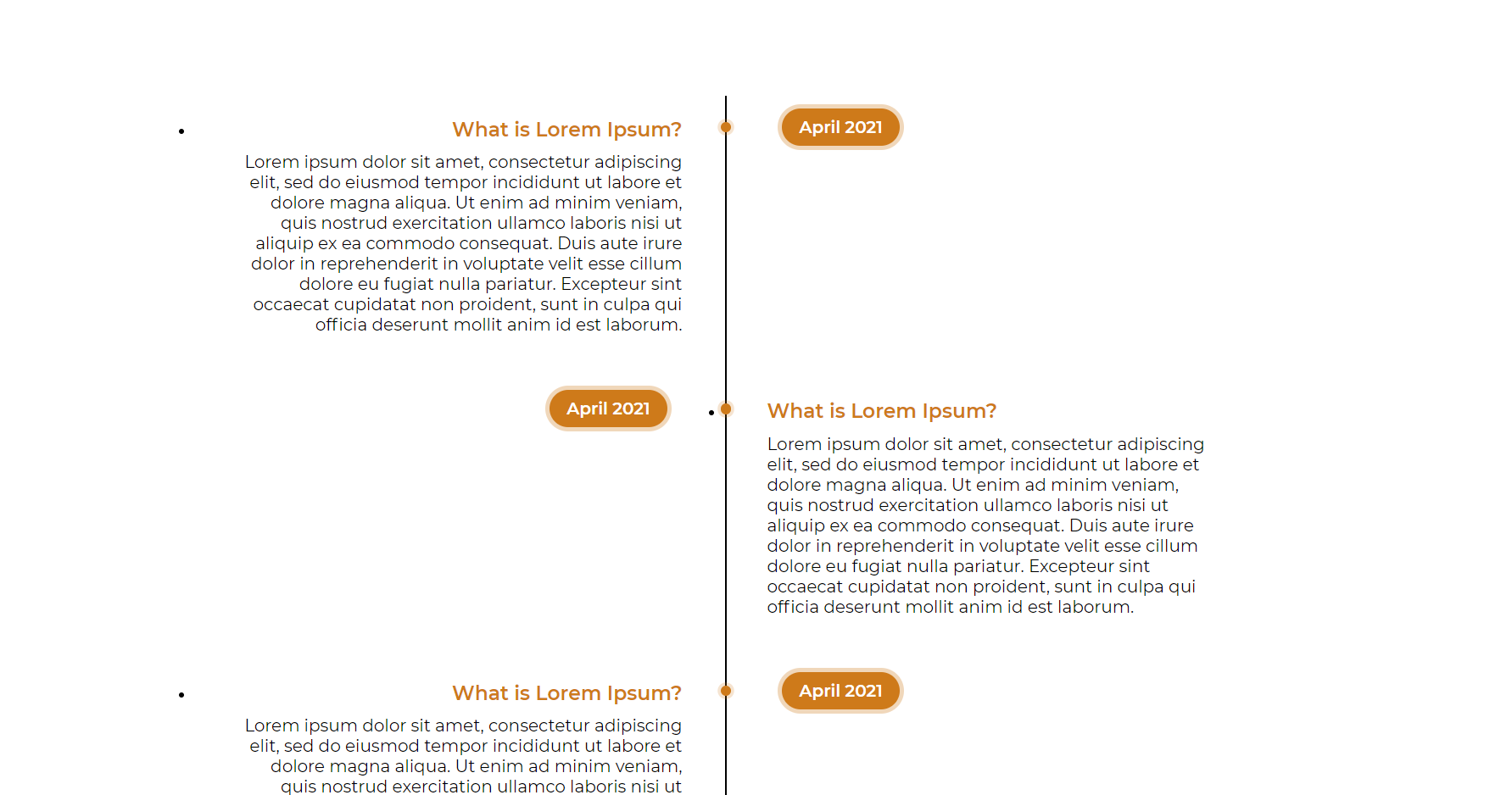
Designing a vertical timeline structure using pure CSS3 and HTML.
Creating Timeline using Pure CSS and HTML
Goals:
- To demonstrate flexibility using CSS
- Making a static timeline component using HTML and CSS.
Implementation:
Step 1: Creating the skeleton HTML file
Designing the basic HTML skeleton file and naming the classes where CSS have to be implemented is the basic first step.
I have divided it into the main wrapper i.e. timeline then content and time inside the <body> tag
It is demonstrated below.
With respect to this class(es) and the tags I have written the CSS styling as shown from the next steps.
| <div class=”timeline”> <ul> <li> <div class=”content”> <h3>What is Lorem Ipsum?</h3> <p> Lorem ipsum dolor sit amet, consectetur adipiscing elit, sedo eiusmod tempor incididunt ut labore et dolore magna aliqua.Ut enim ad minim veniam, quis nostrud exercitation ullamclaboris nisi ut aliquip ex ea commodo consequat. Duis autiruredolorin reprehenderit in voluptate velit esse cillum dolore eu fugiat nulla pariatur. Excepteur sint occaecat cupidatat noproident, sunt in culpa qui officia deserunt mollit anim id estlaborum. </p> </div> <div class=”time”> <h4>April 2021</h4> </div> </li> |
Step 2: Vertical design using the selector :before
I had to decide between creating a vertical timeline or a horizontal one. I opted for a horizontal design structure as shown below.
| .timeline::before { content: “”; position: absolute; left: 50%; width: 2px; height: 100%; background: black; } |
Step 3: Designing the <ul> and <li> and creating variations.
| .timeline ul { margin: 0; padding: 0; }.timeline ul li { line-height: none; position: relative; width: 50%; padding: 20px 40px; box-sizing: border-box; } |
The <ul> and the <li> tags are pretty straightforward, after to make variations for them to appear on an interval of left and right dynamically. I have used the :nth-child(even) and :nth-child(odd) property in CSS
| .timeline ul li:nth-child(odd):before { content: “”; position: absolute; top: 25px; right: -6px; width: 10px; height: 10px; background: rgba(206, 122, 26, 1); border-radius: 50%; box-shadow: 0 0 0 3px rgba(206, 122, 26, 0.2); }.timeline ul li:nth-child(even):before { content: “”; position: absolute; top: 25px; left: -4px; width: 10px; height: 10px; background: rgba(206, 122, 26, 1); border-radius: 50%; box-shadow: 0 0 0 3px rgba(206, 122, 26, 0.2);} |
Result:

