
There are many ways to design a menubar (or sometimes called as a navbar) with CSS, and it is quite simple and easy to understand. The requirements are that you should know the basic fundamentals of HTML and CSS and you are good to go with the article.
Implementing A Pure CSS Collapsible
In this article, I will show a simple way to make a collapsible menu bar using CSS
Skelton HTML
<div class="collapsible-menu">
    <div class="menu-content">
        <ul>
            <li><a href="#"></a>Home</li>
            <li><a href="#"></a>Services</li>
            <li><a href="#"></a>Projects</li>
            <li><a href="#"></a>About</li>
            <li><a href="#"></a>Blog</li>
            <li><a href="#"></a>Contacts</li>
         </ul>
     </div>
</div>
Next, we’ll add a checkbox with a label of Menu above the div that holds the menu content. We’ll style this later to trigger the opening and closing of the menu.
<body>
        <div class="collapsible-menu">
            <input type="checkbox" id="menu">
            <label for="menu">Menu</label>
            <div class="menu-content">
                <ul>
                    <li><a href="#"></a>Home</li>
                    <li><a href="#"></a>Services</li>
                    <li><a href="#"></a>Projects</li>
                    <li><a href="#"></a>About</li>
                    <li><a href="#"></a>Blog</li>
                    <li><a href="#"></a>Contacts</li>
                </ul>
            </div>
        </div>
    </body>
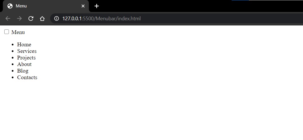
Here’s what the menu looks like without any style indented.
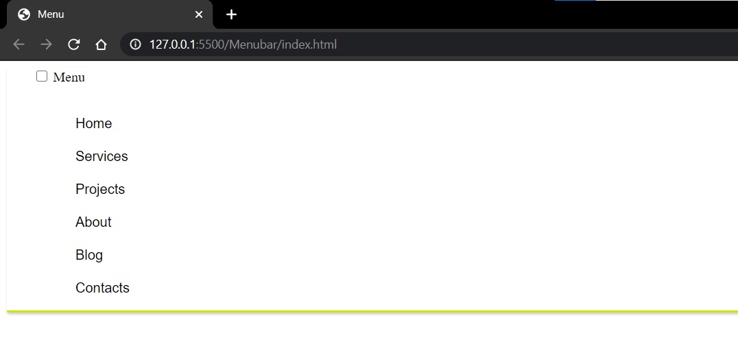
Let’s add some padding, borders and styles to look more like a menu.
.menu-content {
    font-family: -apple-system, BlinkMacSystemFont, "Segoe UI", Roboto, Oxygen,
         Ubuntu, Cantarell, "Open Sans", "Helvetica Neue", sans-serif;
    padding: 0 0 0 50px;
}
.collapsible-menu {
    background-color: rgb(255, 255, 255);
    padding: 0px 30px;
    border-bottom: 3px solid #CDE700;
    box-shadow: 1px 2px 3px rgba(0,0,0,0.2);
}
.collapsible-menu ul {
    list-style-type: none;
    padding: 0;
}
.collapsible-menu a {
    display:block;
    padding: 10px;
    text-decoration: none;
}
It looks similar to this
We’ll style the label for the checkbox by adding a background image for the hamburger menu. We also want to make the label look like it’s a link even though it’s not, so we’ll use cursor:pointer. Lastly, we’ll hide the checkbox using display:none.
.collapsible-menu label {
    font-family: -apple-system, BlinkMacSystemFont, "Segoe UI", Roboto, Oxygen,
     Ubuntu, Cantarell, "Open Sans", "Helvetica Neue", sans-serif;
    font-size: 56px;
    display: block;
    cursor: pointer;
    background: url(menu.png) no-repeat left center;
    padding: 10px 0 10px 50px;
}
input#menu {
    display: none;
}
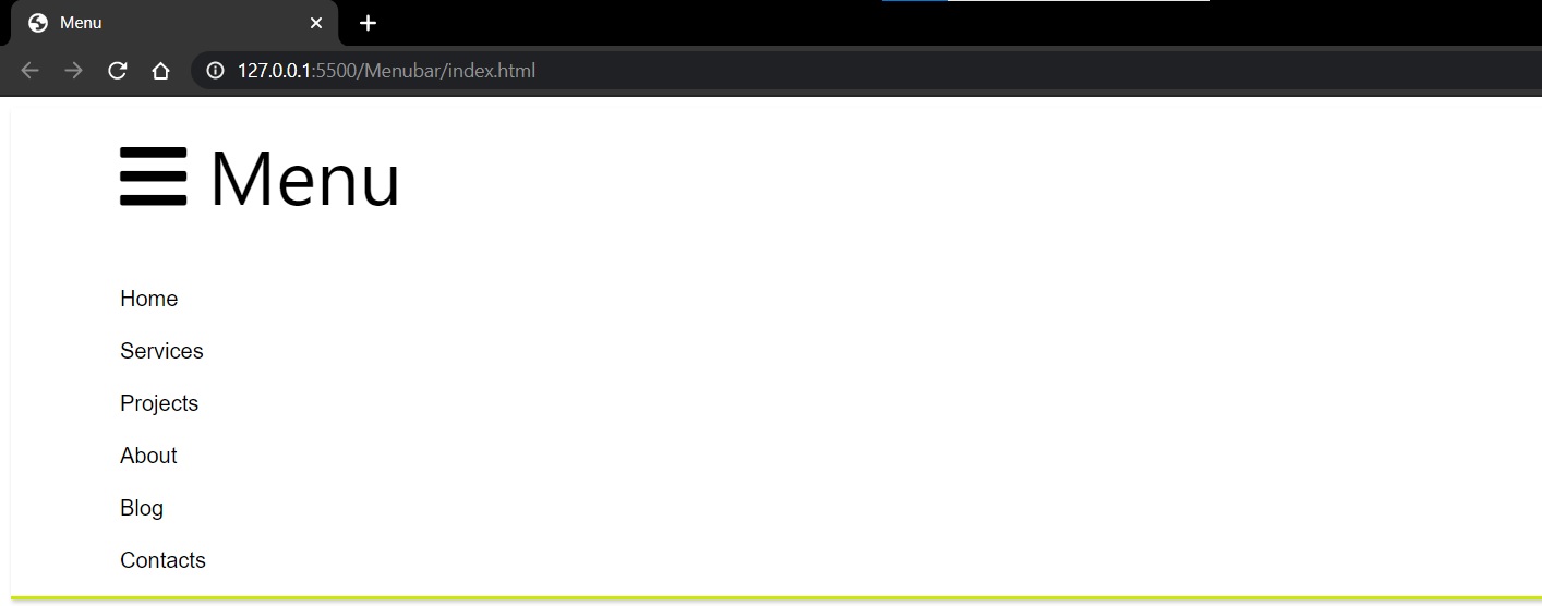
After implementation, the result will look similar to this.
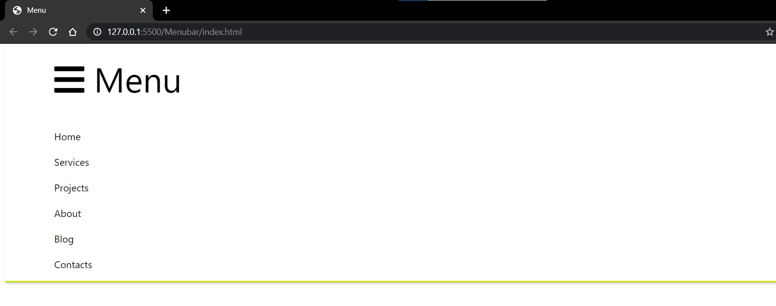
NOTE: I have used the menu bar icon from font awesome CDN.
Collapse and Expand
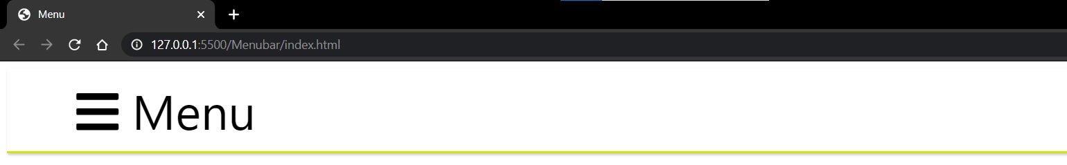
Now we just have to set the default state of the menu to be collapsed when when checkbox is not checked. We do this by changing the max-height of .menu-content to 0, but have it display a max-height of 100% when the checkbox is checked.
.menu-content {
    max-height: 0;
    overflow: hidden;
    padding: 0 0 0 50px;
}
/* Toggle Effect */
input:checked ~ label {
}
input:checked ~ .menu-content {
    max-height: 100%;
}
Unchecked:
Checked:
Conclusion
That’s it! It’s a really quick and easy way to add a collapsible menubar using only HTML and CSS.