If you are working with CSS you might have known by now how difficult it is to keep the Code neat in CSS. Using the Same Values in Different Rules can be a difficult task and there are chances of errors. In the case of bigger projects, making changes can mess up something else. You might have a question why use it if it is messy? You can overcome it using the CSS Variables and we have covered all of them in this tutorial.
Reasons to Use Variables in CSS
- Legible code
- You can make changes in larger projects too with ease.
- Overcome or avoid typos
- Can Make Changes during the Runtime.
What are Custom CSS Properties?
In general, these two features are added
- You will have the ability to assign arbitrary values to properties with completely customizable names
- Obtain the value of these properties using the var() function.
Here’s a simple example,
root {
    --brand-color: #666;
}

#main {
    color: var(--brand-color);
}
--brand-color is a property we defined with a value #666. And var() is the function by which we can access the previously defined function, resulting in color: #666;.
Syntax
The syntax is much simple and all the properties should begin with the double hyphen (--).
Properties are case sensitive thus, --brand-color is different from --Brand-color and these both are different from --Brand-Color.
You might be thinking that this syntax is not right. However, the double hyphen present ensures retro compatibility with browsers that don’t support these kinds of functions.
Do Check:
Cascades/Scoping
We can define the properties as local or global. We can access the variables within the scope of the elements in which they are defined. All Child Elements can access the Parents Properties but it’s not the same with parents’ properties.
Custom Properties do follow similar rules as in cascading styles. We can define the same property at various levels of specificity.
tyle>
    :root { --text-color: green; }
    div { --text-color: blue; }
    .error { --text-color: network; }

    * {
        color: var(--text-color);
    }
</style>

<p> I'm green because I got my color from root</p>
<div>I got blue from div selector</div>
<div class="error">
    I'm red because of the .error rule
    <p>Another red here because of inheritance!</p>
</div>
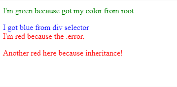
Note that :root is the topmost element (equivalent to the global scope). We can assign the same property name to a different value within a child element. Isn’t it interesting?
We can even change values within media queries,
root {
    --gutter: 10px 0;
}
main {
    padding: var(--gutter);
}
@media (min-width: 600px) {
    :root {
        --gutter: 0 0 0 16px;
    }
}
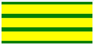
Example:
HTML:
<main>
  <article></article>
  <article></article>
  <article></article>
</main>
CSS:
:root {
  --gutter: 10px 0;
}

main {
  padding: var(--gutter);
  display: flex;
  flex-flow: wrap;
  background-color: green;
}

@media (min-width: 600px) {
  :root {
    --gutter: 16px;
  }
}

article {
  padding: var(--gutter);
  background-color: yellow;
  height: 1rem;
  margin-bottom: 1rem;
  width: 100%;
}

article:last-of-type {
  margin-bottom: 0;
}
Output:
The majority of the CSS preprocessors won’t allow you to define variables within media queries.
It is even possible to define properties from other existing ones,
:root {
    --brand-color: red;
    --header-text-color: var(--brand-color);
}
Note that this doesn’t work with Microsoft Edge 15 due to a known bug.
Although not highly recommended, you can define properties in style tags, <html style = "--color: red;">.
var()
As per the MDN, the var() function has the below syntax,
ar( <custom-property-name>[, <declaration-value>]? )
Where custom-property-name is the name of the property that you are defining. If this is invalid or not present, declaration-value will be used instead.
We can state more than one comma-separated-values, same as font-family. However, be particular with your commas. For example, In order to specify more two values for padding, do it like this,
foo {
    padding: var(--gutter, 10px 0 0 5px);
}
--gutter is the primary value, and “10px 0 0 5px” is used if --gutter is not valid or non-existent.
Limitations
The var() function will not support string interpolation or concatenation.
As opposed to the current preprocessor, we can’t use var() function to define property names.
Circular Dependencies
There are possibilities to have dependencies between properties as in the following example,
root {
    --main-color: #c06;
    --accent-background: linear-gradient(to top, var(--main-color), white);
}
However circular dependencies are not allowed. For example,
:root {
    --one: #c06;
    --two: #ccc;
    --one: calc(var(--two) + 20px);
    --two: calc(var(--one) - 20px);
}
In this case, both –one and –two would be considered invalid. The initial values are not overwritten and remain the same., so they would have their initial value instead of the specified value.
Building Values with calc()
The calc() function is used to perform calculations and determine CSS values. All modern browsers support this function. We can eve combine this with var() to build values on the fly.
header {
    --gutter: 20;
    padding: calc(var(--gutter) * 1px);
}
In this case, --gutter is defined as a single token with the numeric value 20, a numeric. But padding requires a unit as well (e.g., px). Since you can’t concatenate strings, you can instead multiply by “1px” to have a syntactically correct value.
Building with JavaScript
To obtain the value of a custom property in JavaScript, we use the getPropertyValue() method of the CSSStyleDeclaration object.
tyle>
    :root {--brand-color: cyan; }
    p { color: var(--brand-color); }
</style>

<p>This text is cyan</p>

<script>
    const styles = getComputedStyle(document.documentElement);
    const colorValue = styles.getPropertyValue('--brand-color');
    // colorValue = 'cyan';
</script>
In addition, to define a given value, we use the setProperty() method also of the CSSStyleDeclaration object.
<style>
    :root {--brand-color: cyan; }
    p { color: var(--brand-color); }
</style>

<p>This text is red</ p>

<script>
    document.documentElement.style.setProperty ('--brand-color', 'red');
</script>
We can also define property values from the value of others using var() within setProperty() ?.
<style>
    :root {
        --brand-color: cyan;
        --secondary-color: yellow;
    }
</style>

p { color: var (--brand-color); }

<p>I'm yellow!</p>

<script>
    document.documentElement.style.setProperty ('--brand-color', 'var (--secondary-color)');
</script>
