Making a scrollbar with or without using the in-built function of CSS is always a good challenge, and making a responsive horizontal scrollbar is taking it further towards perfection. In this blog, you will learn how to make a responsive scroll bar (slider) using CSS library. Let’s get started.
Creating Horizontal Scrolling Containers the Right Way
We all like learning how to make new designs using CSS, but still it is recommended to know some basics of CSS and HTML beforehand before progressing further towards our blog.
Note: There are two ways to make a horizontal scrollbar, one is using the webkit that is included in the CSS library, and the method that we are going to use, that is manual manipulation method using CSS properties as we are aiming on a responsive horizontal scrollbar.
But just for the sake of knowledge, here is the easy way to make a horizontal scrollbar presuming you have written a skeleton HTML code and assigned class(es).
::-webkit-scrollbar {
  width: 10px;
}


::-webkit-scrollbar-track {
  background: #f1f1f1;
}


::-webkit-scrollbar-thumb {
  background: #888;
}


::-webkit-scrollbar-thumb:hover {
  background: #555;
}
So, now getting this out of our way, let’s get started towards making our own.
Skelton HTML
First we shall create a basic HTML file where the CSS styling will be implemented, a skeleton design of a HTML file is more than enough to cater our needs.
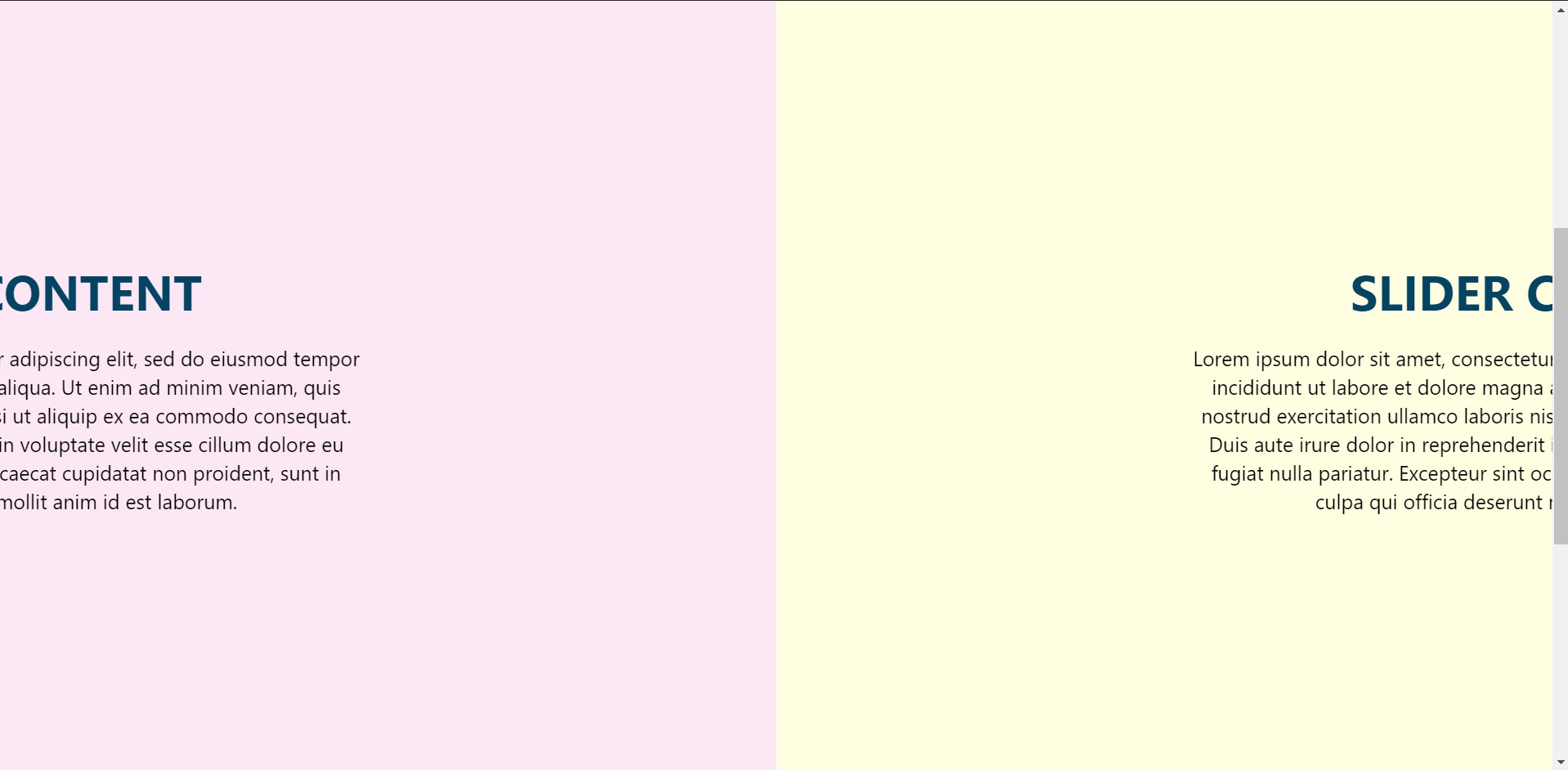
I have made a section to keep the container component which is to be displayed on the page.
<section>
        <div class="card">
          <h2>Slider Content</h2>
          <p>
            Lorem ipsum dolor sit amet, consectetur adipiselisdo
            eiusmod tempor incididunt ut labore et dolorealienim
            ad minim veniam, quis nostrud exercitation nisi ut
            aliquip ex ea commodo consequat. Duis aute dolor in
            reprehenderit in voluptate velit esseu fugiat nulla
            pariatur. Excepteur sint occaecat cupidataprosunt in
            culpa qui officia deserunt mollit anim id laborum.
          </p>
        </div>
 </section>
This is just one section, but there are copies of many of the similar sections, to display while scrolling.
data-0="transform:translateX(0%)"
data-1000="transform:translateX(-300%)"
This is the code to make the animation smoother, I used skrollr.
Please refer to the documentation to the references link attached below.
Container Styling
.container {
  position: fixed;
  top: 0;
  left: 0;
  width: 100%;
  display: flex;
}
Making it a flex display with position fixed.
Section Styling
.container section {
  min-width: 100%;
  height: auto;
  display: flex;
  justify-content: center;
  align-items: center;
  height: 100vh;
  background-color: #fffee1;
}
Also flex sectional content with items on the center and height to fit the screen.
N-th Child Property
This is used for randomising the background without writing much code, as even and odd can differentiate and put the background accordingly. In our small project it is written as:
.container section:nth-child(odd) {
  background-color: #fffee1;
}
.container section:nth-child(even) {
  background-color: #fce8f4;
}
Heading and Content Styling
.card h2 {
  margin: 0 0 20px;
  padding: 0;
  font-size: 48px;
  text-transform: uppercase;
  color: #044463;
}

.card p {
  font-size: 20px;
  line-height: 1.4em;
  color: black;
}
This is basic CSS styling for the contents of the card component to scroll through.
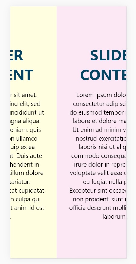
Responsive Design:
@media (max-width: 800px) {
  .container {
    position: absolute;
    display: flex;
    flex-direction: column;
    height: auto;
    transform: none !important;
  }
}
So that it is accessible via mobile/tablet devices also.
Result