How to comment in HTML, CSS and JavaScript

Programming languages (or any markdown languages) offer an option of leaving notes for yourself or others. The comment feature simplifies the production of more readable code. Code or other text that is commented out is ignored by the browser.

Comments in HTML, CSS, JavaScript

Write comments in HTML

  • The <!– –> is a HTML comment tag.
  • To comment out in HTML, insert information between <!– and –> tags.
    • The browser won’t show these comments/ notes.

Single-line HTML comments

To add a single line comment, write the information between <!– –>  tags.

Example

<!-- Comment line-->
<p>single-line comment</p>

Multi-line HTML comments

In a few cases you need to add many information inside the comment tags which will require more lines to deal with, there you’ll need multi-line comments.

Example

<!--
multi
comment line
-->
<p>multi-line comment</p>

Write comments in CSS

  • The /* */ is a comment tag in CSS.

Single-line CSS comments

To add a single line CSS comment put the information between the /* and */ tag.

Example:

h1{
font-size: 2rem /* 1rem =5px */
}

Multi-line CSS comments

To write a multi-line CSS comment or to add more information, write those lines in between the /* and */ tags.

Example

/* 
This font
size will
be used 
*/

h1{ 
font-size: 2rem 
}

Write comments in JavaScript

  • Comments can also be used to prevent some code lines from being executed. This is useful when testing.

Comment out

In javascript comment out means block a single line of code as it will not be executed by the app/browser. This can help you debugging the code without erasing part of your codes.

Example

//document.getElementById('root')

Single-line comments

It is used to write some very specific information or block a line of code for debugging purposes.

Example

//This is a single-line comment
document.getElementById('root')

Multi-line comments

The multi-line comment has the same purpose as the single-line comment. It is used to give much more detailed information about the code. To use a multi-line comment you have to write the information in between the /* and */ tag.

Example

/*
function fun
returns a string value
*/

const fun = () =>{
    return 'string'
}

Conclusion

Comments are really helpful during debugging the code in a testing environment as they will disable some lines of code without actually removing them. But make sure to remove every possible comment line during deployment in the production field.

A CSS Animations Tutorial | animation Property in CSS Definition & Example | List of CSS Animation Properties

A CSS Animations Tutorial

In this tutorial, we will be learning completely about CSS Animations. This CSS Animations Tutorial covers basic details like definitions, animation property, and some other mostly used CSS Animation Properties along with JavaScript events for CSS Animations. Simply press on the links available here and understand the concept easily.

What are CSS Animations?

Basically, Animation allows an element to constantly change from one style to another style. So, you can alter as many CSS Properties as many times according to your requirement. In order to utilize CSS Animation, you should define a few keyframes for the animation at first. Keyframes include what styles the element will have at specific times.

animation Property in CSS

The CSSanimation property can be applied to animate several other CSS properties like colorbackground-colorheight, or width. Each animation requires to be determined with the @keyframes at-rule which is then known with the animation property, like so:

.element {
  animation: pulse 5s infinite;
}

@keyframes pulse {
  0% {
    background-color: #001F3F;
  }
  100% {
    background-color: #FF4136;
  }
}

CSS Animation Properties

The illustrated table offers you to check out the CSS Animation Properties:

Property Description
@keyframes Specifies the animation code
animation A shorthand property for setting all the animation properties
animation-delay Specifies a delay for the start of an animation
animation-direction Specifies whether an animation should be played forwards, backwards, or in alternate cycles
animation-duration Specifies how long time an animation should take to complete one cycle
animation-fill-mode Specifies a style for the element when the animation is not playing (before it starts after it ends, or both)
animation-iteration-count Specifies the number of times an animation should be played
animation-name Specifies the name of the @keyframes animation
animation-play-state Specifies whether the animation is running or paused
animation-timing-function Specifies the speed curve of the animation

Do Read:

Animation Shorthand Property

Let’s consider the below example which uses six of the CSS animation properties to animation shorthand property:

div {
  animation-name: example;
  animation-duration: 5s;
  animation-timing-function: linear;
  animation-delay: 2s;
  animation-iteration-count: infinite;
  animation-direction: alternate;
}

Now, you can get the same effect by applying the shorthand animation property:

div {
  animation: example 5s linear 2s infinite alternate;
}

JavaScript events for CSS Animations

With the help of JavaScript, you can accept and perform the following events:

  • animationstart
  • animationend
  • animationiteration

Pay attention withanimationstart, as it starts on page load then you can always execute your code of javascript after the processing of the CSS. Hence the animation is previously commenced and you can’t stop the event.

const container = document.querySelector('.container')
container.addEventListener(
  'animationstart',
  (e) => {
    //do something
  },
  false
)
container.addEventListener(
  'animationend',
  (e) => {
    //do something
  },
  false
)
container.addEventListener(
  'animationiteration',
  (e) => {
    //do something
  },
  false
)

Which Properties You Can Animate using CSS Animations?

The following list of properties can be animated with the help of CSS Animations. Take a look at the provided list:

  • background
  • background-color
  • background-position
  • background-size
  • border
  • border-color
  • border-width
  • border-bottom
  • border-bottom-color
  • border-bottom-left-radius
  • border-bottom-right-radius
  • border-bottom-width
  • border-left
  • border-left-color
  • border-left-width
  • border-radius
  • border-right
  • border-right-color
  • border-right-width
  • border-spacing
  • border-top
  • border-top-color
  • border-top-left-radius
  • border-top-right-radius
  • border-top-width
  • bottom
  • box-shadow
  • caret-color
  • clip
  • color
  • column-count
  • column-gap
  • column-rule
  • column-rule-color
  • column-rule-width
  • column-width
  • columns
  • content
  • filter
  • flex
  • flex-basis
  • flex-grow
  • flex-shrink
  • font
  • font-size
  • font-size-adjust
  • font-stretch
  • font-weight
  • grid-area
  • grid-auto-columns
  • grid-auto-flow
  • grid-auto-rows
  • grid-column-end
  • grid-column-gap
  • grid-column-start
  • grid-column
  • grid-gap
  • grid-row-end
  • grid-row-gap
  • grid-row-start
  • grid-row
  • grid-template-areas
  • grid-template-columns
  • grid-template-rows
  • grid-template
  • grid
  • height
  • left
  • letter-spacing
  • line-height
  • margin
  • margin-bottom
  • margin-left
  • margin-right
  • margin-top
  • max-height
  • max-width
  • min-height
  • min-width
  • opacity
  • order
  • outline
  • outline-color
  • outline-offset
  • outline-width
  • padding
  • padding-bottom
  • padding-left
  • padding-right
  • padding-top
  • perspective
  • perspective-origin
  • quotes
  • right
  • tab-size
  • text-decoration
  • text-decoration-color
  • text-indent
  • text-shadow
  • top
  • transform.
  • vertical-align
  • visibility
  • width
  • word-spacing
  • z-index
Categories CSS

How to Center an Element with CSS? | Centering in CSS – Horizontally, Vertically

How to center an element with CSS

Centering Things in CSS is a bit hard. The problem is which way to reach for among the different ways available to Center Elements in CSS. In this tutorial, we have explained How to Center an Element with CSS Vertically, Horizontally, at Block Levels.

How to Center Horizontally?

Centering Elements Horizontally is quite simple compared to vertical centering. We have present different ways to center the elements horizontally. To change the text to center horizontally is quite simple. You can simply set the text-align property to center in order to center an element horizontally.

p {
text-align: center;
}

How to Center Horizontally with Flexbox?

The modern way to center anything is to use Flexbox rather than going with the text.

#mysection {
display: flex;
justify-content: center;
}

Any element within my section will be centered horizontally by using the above code. There is an alternative method to go with if you don’t want to use the Flexbox.

Also, See:

How to Center Horizontally using CSS Margin Auto?

Anything which is not text can be centered by applying an automatic margin on the left and right and set the width of the element.

section {
margin: 0 auto;
width: 50%;
}

The above margin: 0 auto; is a shorthand for

section {
margin-top: 0;
margin-bottom: 0;
margin-left: auto;
margin-right: auto;
}

Do remember to set the item to display: block if it is an inline element.

How to Center Vertically using Flexbox?

Centering an Element Vertically can be a difficult task. Flexbox gives us a simple way to center alignment vertically.

#mysection {
display: flex;
align-items: center;
}

Any Element within my section will be centered vertically.

How to Center Both Vertically and Horizontally using Flexbox?

You can combine the Flexbox techniques to center both vertically and horizontally for an element in the page.

#mysection {
display: flex;
align-items: center;
justify-content: center;
}

How to Center Vertically and Horizontally using CSS Grid?

We can perform the same using CSS Grid.

body {
display: grid;
place-items: center;
height: 100vh;
}
Categories CSS

Introduction to PostCSS – Installation, Plugins Supported | Why Use PostCSS?

Introduction to PostCSS

In this tutorial of PostCSS, you will learn What Exactly is PostCSS, the Advantages of using PostCSS, what are the Plugins supported by the PostCSS. You will be well versed with details such as How Different is PostCSS from Saas, etc. We have covered the PostCSS Installation using the yarn or npm.

What is PostCSS?

PostCSS is a tool for transforming CSS with JavaScript plugins. It provides features via its extensive plugin ecosystem to help improve your CSS writing experience. You can pick the plugins you need or even write a custom one for yourself.

Do note, however, that there are PostCSS plugins that do not transform plain CSS, but operate on Sass-like syntax. One example is the PostCSS Simple Variables plugin, which allows you to implement variables (just like in Sass) that you can reuse throughout your code, as shown below.

$color-brand: darkgrey;
$font-size: 1em;
body {
 color: $color-brand;
 font-size: $font-size;
}

PostCSS Installation

You can use yarn or npm to install PostCSS.

yarn global add postcss-cli
npm install -g postcss-cli

Once you are done, the postcss command would be available in your command line.

Why use PostCSS?

Let’s take a look at a few use cases for PostCSS via the power of its plugins.

Autoprefixing

As previously mentioned, the Autoprefixer plugin will add vendor prefixes to CSS properties using values from Can I Use. This reduces clutter in your code and improves readability. For example, this input:

:fullscreen {
}

Gives this output:

:-webkit-:full-screen {}
:-moz-:full-screen {}
:full-screen {}

Using CSSNext features that browsers understand

With the PostCSS Preset Env plugin, you can write future CSS syntax, and the plugin will convert it to CSS that browsers will understand by working out the necessary polyfill. For example, this input:

@custom-media --med (width <= 50rem);
@media (--med) {
  a { 
    &:hover {
      color: color-mod(black alpha(54%));
    }
  }
}

Gives this output:

@media (max-width: 50rem) {
  a:hover  { 
    color: rgba(0, 0, 0, 0.54);
  }
}

Avoiding errors in your CSS

The stylelint plugin points out errors in your CSS code. It supports the latest CSS syntax. For example, this input:

a { 
  color: #d3;
}

Gives this output:

app.css
2:10 Invalid hex color

Using locally scoped CSS class names

With the CSS Modules plugin, you can write CSS that is locally scoped to components, meaning there won’t be any conflicts between your CSS class names no matter how generic they are. For example, this input:

.name {
  color: grey;
}

Gives this output:

.Logo__name__SVK0g {
  color: gray;
}

Creating stunning grids

The LostGrid plugin uses calc() to create grids based on fractions you define without the need to pass a lot of options. For example, this input:

div {
  lost-column: 1/3 
}

Gives this output:

div {
  width: calc(99.9% * 1/3 -  
  (30px - 30px * 1/3)); 
}
div:nth-child(1n) {
  float: left; 
  margin-right: 30px; 
  clear: none; 
}
div:last-child {
  margin-right: 0; 
}
div:nth-child(3n) {
  margin-right: 0; 
  float: right; 
}
div:nth-child(3n + 1) {
  clear: both; 
}

PostCSS Plugins

PostCSS provides various tools for CSS Processing. Below is the list of popular plugins so that you can have an overview of what’s possible to do with PostCSS.

AutoPrefixer: It Parses your CSS and finds if some rules need a vendor prefix. Autoprefixer do so as per the Can I Use Data so you need not bother whether a feature needs a prefix, or if prefixes you use are unneeded because obsolete. You can write cleaner CSS with the help of the plugin.

cssnext: This is a Babel of CSS and permits you to use modern CSS features and takes care of transpiling them to a CSS digestible to older browsers.

  • Adds prefixes taking help of Autoprefixer.
  • You can use CSS Variables.
  • You can even use nesting same as in Sass.

CSS Modules: PostCSS allows you to use CSS Modules. These Modules aren’t a part of CSS Standard and are a build-step process to have a scoped selectors.

csslint: Linting allows us to write correct CSS and avoid errors. stylint plugin permits you to lint CSS during the build time.

cssnano: cssnano minimizes CSS and makes code optimizations so that the least amount of code is delivered in the production.

How PostCSS is different from Sass and Less?

PostCSS can do the same work as preprocessors like Sass, Less, and Stylus, but PostCSS is modular and, in my experience, faster.

The main difference between PostCSS and CSS preprocessors is that you can pick the features you need. Sass and Less give you lots of features you may or may not use, and which you can’t extend.

There are also PostCSS plugins like PostCSS Sass and PreCSS, which are essentially complete replacements for Sass. This means you could literally write your own preprocessor powered by PostCSS.

Categories CSS

CSS Variables (Custom Properties) – Syntax, Limitations | Reasons to Use Variables in CSS

CSS Variables (Custom Properties)

If you are working with CSS you might have known by now how difficult it is to keep the Code neat in CSS. Using the Same Values in Different Rules can be a difficult task and there are chances of errors. In the case of bigger projects, making changes can mess up something else. You might have a question why use it if it is messy? You can overcome it using the CSS Variables and we have covered all of them in this tutorial.

Reasons to Use Variables in CSS

  • Legible code
  • You can make changes in larger projects too with ease.
  • Overcome or avoid typos
  • Can Make Changes during the Runtime.

What are Custom CSS Properties?

In general, these two features are added

  1. You will have the ability to assign arbitrary values ​​to properties with completely customizable names
  2. Obtain the value of these properties using the var() function.

Here’s a simple example,

root {
    --brand-color: #666;
}

#main {
    color: var(--brand-color);
}

--brand-color is a property we defined with a value #666. And var() is the function by which we can access the previously defined function, resulting in color: #666;.

Syntax

The syntax is much simple and all the properties should begin with the double hyphen (--).

Properties are case sensitive thus,  --brand-color is different from --Brand-color and these both are different from --Brand-Color.

You might be thinking that this syntax is not right. However, the double hyphen present ensures retro compatibility with browsers that don’t support these kinds of functions.

Do Check:

Cascades/Scoping

We can define the properties as local or global. We can access the variables within the scope of the elements in which they are defined. All Child Elements can access the Parents Properties but it’s not the same with parents’ properties.

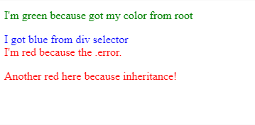
Custom Properties do follow similar rules as in cascading styles. We can define the same property at various levels of specificity.

tyle>
    :root { --text-color: green; }
    div { --text-color: blue; }
    .error { --text-color: network; }

    * {
        color: var(--text-color);
    }
</style>

<p> I'm green because I got my color from root</p>
<div>I got blue from div selector</div>
<div class="error">
    I'm red because of the .error rule
    <p>Another red here because of inheritance!</p>
</div>
css properties

Note that :root is the topmost element (equivalent to the global scope).  We can assign the same property name to a different value within a child element. Isn’t it interesting?

We can even change values ​​within media queries,

root {
    --gutter: 10px 0;
}
main {
    padding: var(--gutter);
}
@media (min-width: 600px) {
    :root {
        --gutter: 0 0 0 16px;
    }
}

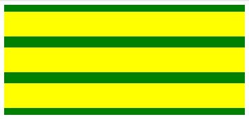
Example:

HTML:

<main>
  <article></article>
  <article></article>
  <article></article>
</main>

CSS:

:root {
  --gutter: 10px 0;
}

main {
  padding: var(--gutter);
  display: flex;
  flex-flow: wrap;
  background-color: green;
}

@media (min-width: 600px) {
  :root {
    --gutter: 16px;
  }
}

article {
  padding: var(--gutter);
  background-color: yellow;
  height: 1rem;
  margin-bottom: 1rem;
  width: 100%;
}

article:last-of-type {
  margin-bottom: 0;
}

Output:
media custom css props

The majority of the CSS preprocessors won’t allow you to define variables within media queries.

It is even possible to define properties from other existing ones,

:root {
    --brand-color: red;
    --header-text-color: var(--brand-color);
}

Note that this doesn’t work with Microsoft Edge 15 due to a known bug.

Although not highly recommended, you can define properties in style tags, <html style = "--color: red;">.

var()

As per the MDN, the var() function has the below syntax,

ar( <custom-property-name>[, <declaration-value>]? )

Where custom-property-name is the name of the property that you are defining. If this is invalid or not present, declaration-value will be used instead.

We can state more than one comma-separated-values, same as font-family. However, be particular with your commas. For example, In order to specify more two values for padding, do it like this,

foo {
    padding: var(--gutter, 10px 0 0 5px);
}

--gutter is the primary value, and “10px 0 0 5px” is used if --gutter is not valid or non-existent.

Limitations

The var() function will not support string interpolation or concatenation.

As opposed to the current preprocessor, we can’t use var() function to define property names.

Circular Dependencies

There are possibilities to have dependencies between properties as in the following example,

root {
    --main-color: #c06;
    --accent-background: linear-gradient(to top, var(--main-color), white);
}

However circular dependencies are not allowed. For example,

:root {
    --one: #c06;
    --two: #ccc;
    --one: calc(var(--two) + 20px);
    --two: calc(var(--one) - 20px);
}

In this case, both –one and –two would be considered invalid. The initial values are not overwritten and remain the same., so they would have their initial value instead of the specified value.

Building Values ​​with calc()

The  calc() function is used to perform calculations and determine CSS values. All modern browsers support this function. We can eve combine this with var() to build values on the fly.

header {
    --gutter: 20;
    padding: calc(var(--gutter) * 1px);
}

In this case, --gutter is defined as a single token with the numeric value 20, a numeric. But padding requires a unit as well (e.g., px). Since you can’t concatenate strings, you can instead multiply by “1px” to have a syntactically correct value.

Building with JavaScript

To obtain the value of a custom property in JavaScript, we use the getPropertyValue() method of the CSSStyleDeclaration object.

tyle>
    :root {--brand-color: cyan; }
    p { color: var(--brand-color); }
</style>

<p>This text is cyan</p>

<script>
    const styles = getComputedStyle(document.documentElement);
    const colorValue = styles.getPropertyValue('--brand-color');
    // colorValue = 'cyan';
</script>

In addition, to define a given value, we use the setProperty() method also of the CSSStyleDeclaration object.

Categories CSS

CSS System Fonts | Web Fonts in CSS | Definition, Syntax & Example Programs on CSS @font-face Property

CSS System Fonts

In this tutorial, we will learn What is CSS System Fonts. Also, you may know web fonts in CSS with Syntax. Moreover, this tutorial makes you familiar with the concept of system fonts in CSS by the available direct links.

System Fonts in CSS

CSS System fonts are worth viewing if you need to develop your website speed to give a better user experience. Since 2008 developers have been ready for using the @font-faceCSS property to do custom fonts on websites. Later more browsers like Safari and Firefox supported the @font-face property and it earns more traction in the developer community. After that, we have seen Typekit pop up in 2009 and later Google Fonts commenced offering a range of serif, sans-serif, and other typefaces for free of charge.

Now the @font-face is fully supported over browsers, and you can embed various fonts on your website. However, you can either host the fonts yourself or embed them from external sources such as Google Fonts.

CSS Web Fonts

Web fonts in CSS are applied to support the use of fonts in CSS, which are not placed on the local system. Once picking the not installed font, simply add the font file on the webserver and it will be spontaneously downloaded when required.

Syntax:

@font-face {
    font details
}

Read More:

Everything appears with a (performance) cost

Although it’s fabulous we’ve seen enough choice and flexibility with fonts, embedding fonts on web pages does occur because of the website speed. Notably, on mobile devices utilizing 3G or 4G connections, it signifies that your website is fast and utilizes the most limited amount of data possible.

While applying custom fonts the problem is the font needs to load before the content is performed so the user is waiting on those resources to load before they are ready to do their task. While system fonts are installed on the device it’s more responsive to access those fonts so it’s a great user experience.

Who uses system fonts?

We can see that plenty of well-known websites using systems fonts are as follows:

  • Medium
  • Bootstrap
  • GitHub
  • Booking.com

Usually, a lot of big websites are driving more towards system fonts at recent times.

Example code for the CSS system font stack

body {
  font-family: -apple-system, BlinkMacSystemFont, "Segoe UI",
  "Roboto", "Oxygen", "Ubuntu", "Helvetica Neue", Arial, sans-serif;
}

The above code will perform like this, the browser will go through each of these fonts from left to right, it’ll understand if the device has any of these fonts installed and once it gets one it’ll display that font. In case it can’t obtain any of those font families then it’ll simply display a sans-serif font.

Emojis

In case you need to allow emojis then you have to ask for the system fonts that are used too in CSS with the help of the following code snippet:

body {
  font-family: -apple-system, BlinkMacSystemFont, "Segoe UI", "Roboto",
  "Oxygen", "Ubuntu", "Helvetica Neue", Arial, sans-serif, "Apple Color Emoji",
  "Segoe UI Emoji", "Segoe UI Symbol";
}
Categories CSS

The CSS Margin Property – Right, Left, Top, Bottom, Shorthand | CCS Margin Values

The CSS Margin Property

CSS Margin Property is used to define space around elements. It is entirely transparent and doesn’t have any background color. Margin Property Values are not inherited by the Child Elements. There are several properties to set an element margin such as margin-left, margin-right, margin-top, margin-bottom, etc. We can change all properties at once using the shorthand margin property. This tutorial explains all the CSS Margin Properties and the Margin Values in detail.

CSS Margin Properties

Property Description
margin It is used to set all properties in one declaration.
margin-left Used for specifying the left margin of an element.
margin-right Used for indicating the right margin of an element.
margin-top Specifies the top margin of an element.
margin-bottom Sets the bottom margin of an element.

CSS Margin Values

Value Description
auto It allows the browser to calculate a margin.
length It indicates a margin pt, px, cm, etc. Default value of length is 0px.
% Used for defining a margin in percent of the width of containing element.
inherit Inherits the margin from the parent element.

Margin Property

The margin property defines the outermost portion of the box model, creating space around an element, outside of any defined borders.

Margins are set using lengths, percentages, or the keyword auto and can have negative values. Here’s an example:

.box {
  margin: 0 3em 0 3em;
}

Do Read:

CSS Margin Example

<!DOCTYPE html> 
<html> 
<head> 
<style> 
p { 
background-color: pink; 
} 
p.ex { 
margin-top: 50px; 
margin-bottom: 50px; 
margin-right: 100px; 
margin-left: 100px; 
} 
</style> 
</head> 
<body> 
<p>This paragraph is not displayed with specified margin. </p> 
<p class="ex">This paragraph is displayed with specified margin.</p> 
</body> 
</html>

Margin Shorthand Property

Margin is a shorthand to denote multiple margins at a time, depending on the number of values entered. It behaves differently. It accepts up to four values, shown here:

.box {
    margin: <margin-top> || <margin-right> || <margin-bottom> || <margin-left>
}

If fewer than four values are set, the missing values are assumed based on the ones that are defined. For example, the following two rule sets would get identical results:

.box {
  margin: 0 1.5em;
}

.box {
  margin: 0 1.5em 0 1.5em;
}

Thus, if only one value is defined, this sets all four margins to the same value. If three values are declared, it is margin: [top] [left-and-right] [bottom];.

Any of the individual margins can be declared using longhand, in which case you would define only one value per property:

.box {
  margin-top: 20px;
  margin-right: 10px;
  margin-bottom: 20px;
  margin-left: 10px;
}

Values Accepted by Margin Property

Margin accepts any kind of length unit and the most common ones are px, rem, em. It even accepts percentage values and a special value named auto.

Using Auto to Center Elements

Each of the margin properties can also accept a value of auto. A value of auto basically tells the browser to define the margin for you. In most cases, a value of auto will be equivalent to a value of 0 (which is the initial value for each margin property) or else whatever space is available on that side of the element. However, auto is handy for horizontal centering:

.container {
  width: 980px;
  margin: 0 auto;
}

In this example, two things are done to center this element horizontally within the available space:

  • The element is given a specified width
  • The left and right margins are set to auto

Without the specified width, the auto values would essentially have no effect, setting the left and right margins to 0 or else to whatever is the available space inside the parent element.

It should also be pointed out that auto is useful only for horizontal centering, and so using auto for top and bottom margins will not center an element vertically, which can be confusing for beginners.

Collapsing Margins

Vertical margins on different elements that touch each other (thus have no content, padding, or borders separating them) will collapse, forming a single margin that is equal to the greater of the adjoining margins. This does not happen on horizontal margins (left and right), only vertical (top and bottom).

Negative Margins

As you might suspect, while a positive margin value pushes other elements away, a negative margin will either pull the element itself in that direction or pull other elements toward it.

Browser Compatability

CSS Margin Property supports the following browsers.

  • Chrome
  • Android
  • IE Phone
  • Firefox Mobile (Gecko)
  • Internet Explorer (IE)
  • Firefox (Gecko)
  • Safari (WebKit)
  • Safari Mobile
  • Opera
  • Opera Mobile
Categories CSS

How to print your HTML with style | CSS Printing with Examples

How to print your HTML with style

Here is the complete tutorial on How to print your HTML with style using CSS. By viewing this page, you will get perfect knowledge on CSS printing, @media print rule, and many more concepts related to it. Just click on the links provided below and start learning regarding print CSS.

CSS Printing

There is a possibility to use CSS for altering the appearance of your web page when it’s printed on paper. You can define one font for the screen version and another for the print version.

The following piece of code defines various font families for screen and print in CSS.

<link rel="stylesheet"
      src="print.css"
      type="text/css"
      media="print" />

CSS @media Print

If you’ve prepared any responsive design, you’ll then know about the@mediarule. As well as diverse screen sizes, @media also let you target “print” media. Here’s an example:

@media print {
  /* These styles will only be used when the page is printed or saved to PDF. */
  h1 { font-size: 16pt; }
}

Using this rule, you can define your standard CSS as normal and then join some custom styles that will only be utilized when printing.

p { margin: 1em 0; }

@media print {
  /* Hide related article links when printing. */
  .related-articles { display: none; }
}

If you want to “zero out” all your standard screen styles and begin from scratch, you can wrap your screen styles in another @media rule:

@media screen {
  /* standard styles here. */
}

@media print {
  /* print styles here. */
}

Do Read:

Page break properties

To ensure the content flows evenly over pages, you’ll require control when content gets split among pages. For instance, it looks awkward if a large heading resembles at the bottom of a page – you want it to commence on a new page rather. Likewise, you may want to evade a table spanning multiple pages if possible.

You can make this using page-break-beforepage-break-after, and page-break-inside. Also, You can set the value for these properties to always or avoid.

h1 {
  /* h1 elements always start on the top of a new page. */
  page-break-before: always;
}

section.city-map {
  /* this section always occupies it's own page or pages. */
  page-break-before: always;
  page-break-after: always;
}

table {
  /* tables don't split across pages if possible. */
  page-break-inside: avoid;
}

Repeat table headings

If your document has tables that span many pages, it’ll be difficult to read when printed except the table headers are repeated at the origin of each page. This is moderately easy to accomplish – simply use the thead and tbody elements in your table.

<table>
  <thead>
    <tr>
      <th>City</th>
      <th>Population</th>
  </thead>
  <tbody>
    <tr>
      <td>Sydney</td>
      <td>4.627 million (2018)</td>
    </tr>
  </tbody>
</table>

thead

Adding or removing content

Sometimes you may require to add content that’s only displayed when printing. For instance- you might want to link URLs to be printed. You can accomplish this with the help of:after pseudo-element:

@media print {
  a[href]:after {
    content: " (" attr(href) ")";
  }
}

You may also desire to hide or show specific elements only when printing. By combining @media and display this can be made pretty quickly.

/* hide the watermark on screens. */
.watermark {
  display: none;
}

@media print {
  /* hide the navidation when printing. */
  nav {
    display: hide;
  }
  /* show the watermark when printing */
  .watermark {
    display: initial;
  }
}

Use emulate CSS media for the development.

In order to fasten up your feedback loop while developing, you can arrange your browser to display print styles. To perform this in Chrome on Mac, open developer tools, later use the command-shift-P shortcut for “Run Command” and search for “Emulate CSS print media type”.

emulate

Other browsers will have a related feature in their dev tools.

Unfortunately, to view page breaks you’ll require to print to PDF manually every moment.

Orphans and Widows

The orphans and widows properties manage how the text in an element is split over pages. Sometimes tweaking these values can increase the readability of your printed document.

p {
  /* if there aren't at least three lines before the page
     break, move the element to the start of a new page. */
  orphans: 3;
}

widows-orphans

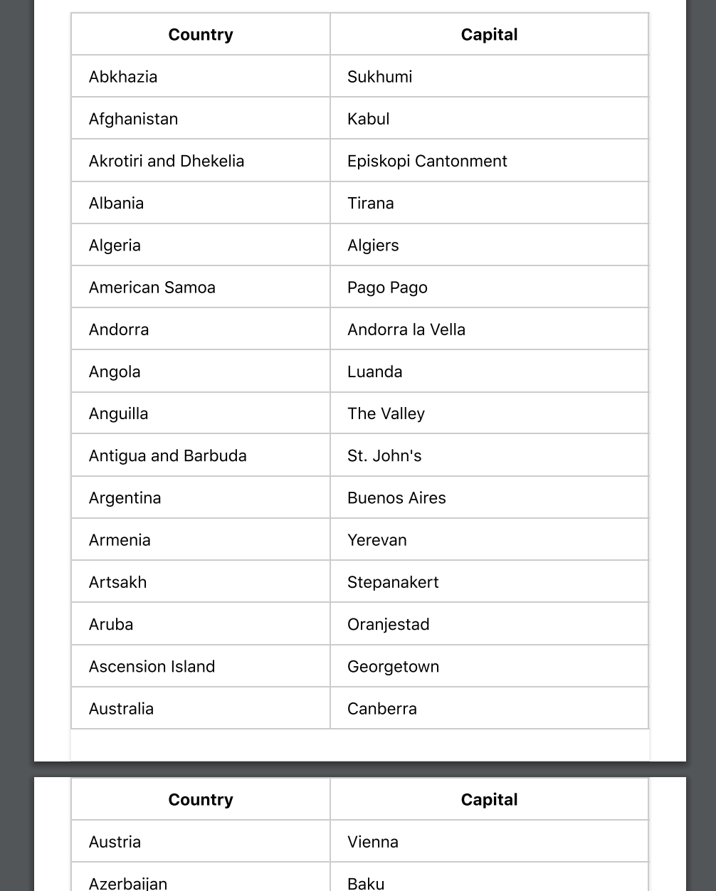
The below-left side orphans is set to 2, so the second paragraph starts before the page break. By settingorphansto 3, as on the right, the paragraph is taken down to the start of the next page.

The widows property is the inverse of orphans – it defines the minimum number of lines that can be at the origin of a new page.

Advanced tip: the @page rule

With the @page rule, you can tailor-made the page margin for particular pages.

@page:first {
  /* No margin on the first page. */
  margin: 0;
}

@page {
  /* Set a margin on all other pages. */
  margin: 2cm;
}

Unfortunately, browser support for this is currently a little inadequate and you can only use the :first:last:left, :right, and:blank pseudo-selectors to choose pages.

CSS Selectors | Types of Selectors in CSS | Ultimate Guide on CSS3 Selectors

CSS Selectors

In this tutorial, CSS developers will come to learn completely about CSS Selectors from basic level to advanced level. So, stay tuned to this page and collect every bit of knowledge on Selectors in CSS like CSS element selector, id selector, class selector, universal selector, grouping selector, etc. Just go with the links available below and grab the concept of CSS Selectors with ease.

Every CSS selector, taken from the latest CSS3 standard.

CSS Selectors

CSS selectors are utilized to select the content you need to style. In CSS Rule Set, Selectors are the part. CSS selectors select HTML elements as per their id, class, type, attribute, etc.

CSS selectors are divided into five categories:

  • Simple/Basic selectors (select elements based on name, id, class)
  • Combinator selectors (select elements based on a specific relationship between them)
  • Pseudo-classes selectors (select elements based on a certain state)
  • Pseudo-elements selectors (select and style a part of an element)
  • Attribute selectors (select elements based on an attribute or attribute value)

On this page, you will learn about all these five categories of CSS Selectors in detail. So, let’s dive into this tutorial without any delay.

All CSS Simple Selectors

Selector Example Example description
#id #firstname Selects the element with id=”firstname”
.class .intro Selects all elements with class=”intro”
element.class p.intro Selects only <p> elements with class=”intro”
* * Selects all elements
element p Selects all <p> elements
element,element,.. div, p Selects all <div> elements and all <p> elements

Basic Selectors

Selector Description Example
element Type selector. Matches an element. p { color: red }
/* matches paragraphs */
.class Class selector. Matches the value of anclassattribute. .warning { color: red }
/* matches elements containing class="warning" */
#id ID selector. Matches the value of an id attribute. #warning { color: red }
/* matches elements containing id="warning" */
* Universal selector. Matches everything. * { color: red }
/* matches everything */

Attribute selectors

Selector Description Example
[attribute] Matches elements containing a given attribute. a[href] { color: red }
/* matches a elements with an href attribute */
[attribute="x"] Matches elements containing a given attribute with a given value. a[href="/sitemap/"] { color: red }
/* matches a elements with the attribute and value href="/sitemap/" */
[attribute~="x"] Matches elements containing a given attribute with a value that contains a sub-value within a space-separated list. abbr[title~="Style"] { color: red }
/* matches abbr elements with a title that contains 'Style' (such as in title="Cascading Style Sheets") */
[attribute|="x"] Matches elements containing a given attribute with a value that contains a sub-value within a hyphen-separated list. html[lang|="en"] { color: red }
/* matches html elements with a lang attribute that contains 'en' (such as in lang="en-gb") */
[attribute^="x"] Matches elements containing a given attribute with a value that starts with something. a[href^="http://"] { color: red }
/* matches a elements with an href attribute, the value of which begins with 'http://' */
[attribute$="x"] Matches elements containing a given attribute with a value that ends with something. a[href$=".com"] { color: red }
/* matches a elements with an href attribute, the value of which ends with '.com' */
[attribute*="x"] Matches elements containing a given attribute with a value that contains something. a[href*="htmldog"] { color: red }
/* matches a elements with an href attribute, the value of which contains 'htmldog' */

Pseudo-classes Selectors

Selector Description Example
:link Matches a link that has not been visited. a:link { color: blue }
:visited Matches a link that has been visited. a:visited { color: purple }
:active Matches an element that is being activated, such as a link being clicked on. a:active { color: red }
:hover Matches an element whose box is being hovered over by a cursor. a:hover { text-decoration: none }
:focus Matches an element that has focus, such as one that has been tabbed to. a:focus { border: 1px solid yellow }
:target Matches an element that has been linked to (via<a href="#x"…,for example). h2:target { color: red }
/* matches a second-level heading that has been linked to */
:lang() Matches an element of a given language. p:lang(fr) { color: red }
/* matches paragraphs that are declared, or otherwise considered, as French */
:first-child Matches the first child of an element. p:first-child { color: red }
/* matches the first child, if it is a paragraph, of an element */
:last-child Matches the last child of an element. div p:last-child { color: blue }
/* matches the last child, if it is a paragraph, of an element */
:first-of-type Matches the first sibling of its type in an element. li:first-of-type { color: red }
/* matches the first instance of a list item inside an element */
:last-of-type Matches the last sibling of its type in an element. li:last-of-type { color: blue }
/* matches the last instance of a list item inside an element */
:nth-child() Matches an element that is the ordinal number child of its parent. p:nth-child(3) { color: red }
/* matches the third child, if it is a paragrpah, of an element */
:nth-last-child() Matches an element that is the ordinal number child, in reverse order, of its parent. p:nth-last-child(2) { color: blue }
/* matches the next-to-last child, if it is a paragraph, of an element */
:nth-of-type() Matches an element that is the ordinal number sibling of its type. li:nth-of-type(5) { color: red }
/* matches the fifth instance of a list item inside an element */
:nth-last-of-type() Matches an element that is the ordinal number sibling, in reverse order, of its type. li:nth-of-type(5) { color: red }
/* matches the next-to-last instance of a list item inside an element */
:only-child Matches an element if it is the only child of its parent. article p:only-child { color: red }
/* matches a paragraph if it is the only child of an article element */
:only-of-type Matches an element if it is the only sibling of its type. article aside:only-of-type { color: blue }
/* matches an aside element if it is the only aside element in an article element */
:empty Matches an element with no children, or content. td:empty { border-color: red }
/* matches table data cells with nothing in 'em */
:root Matches the root element of a document. This will be the html element in HTML. :root { background: yellow }
:enabled Matches form control elements that are not disabled. input:enabled { border-color: lime }
/* matches input elements that are not disabled */
:disabled Matches form control elements that are disabled. input:enabled { border-color: red }
/* matches input elements that are disabled */
:checked Matches a radio or checkbox type input element that is checked. input:checked { outline: 3px solid yellow }
/* matches checked input elements */
:not() Negotiation pseudo-class. Matches an element that does not match a selector. p:not(:first-child) { color: orange }
/* matches paragraphs that are not first children */

Pseudo-elements Selectors

Selector Description Example
::first-line Matches the first textual line in an element. p::first-line { font-weight: bold }
/* matches the first line in a paragraph */
::first-letter Matches the first letter in an element. p::first-letter { font-size: 2em }
/* matches the first letter in a paragraph */
::before Used with the content property to generate content before the initial content of an element. h1::before { content: "*" }
/* places an asterisk at the start of a top-level heading */
::after Used with the content property to generate content after the initial content of an element. h1::after { content: "+" }
/* places a plus-sign at the end of a top-level heading */

Combinator Selectors

Selector Description Example
selector selector Descendant combinator. Matches elements that are descendants of another element. aside p { color: red }
/* matches paragraphs inside elements containing class="warning" */
selector > selector Child combinator. Matches elements that are children of another element. .warning > p { color: red }
/* matches paragraphs that are children of elements containing class="warning" */
selector + selector Adjacent sibling combinator. Matches elements that immediately follow another element. h1 + * { color: red }
/* matches the first element to follow a top-level heading */
selector ~ selector General sibling combinator. Matches elements that follow another element. h2 ~ p { color: red }
/* matches every paragraph that follows a second-level heading */

The CSS Grouping Selector

The grouping selector in CSS picks all the HTML elements with the same style definitions.

Let’s take a look at the below CSS code (with the same style definitions ie., h1, h2, and p elements):

h1 {
  text-align: center;
  color: red;
}

h2 {
  text-align: center;
  color: red;
}

p {
  text-align: center;
  color: red;
}

To minimize the code, just apply the CSS grouping selectors. Simply group the selectors by separating each selector with a comma. Let’s see the following code after CSS Grouping Selectors:

h1, h2, p {
  text-align: center;
  color: red;
}
Categories CSS

Introduction to CSS – Syntax, Selectors, Benefits | How Does CSS Work with HTML?

Introduction to CSS

CSS is simple to learn and understand and provides powerful control over an HTMLDocument Presentation. We use CSS to define styles, layouts, variations in display for our Webpages. You can alter the look of an entire website by changing just one file. In this tutorial, we tried explaining why to use CSS and How does CSS works with HTML, the Benefits of CSS, etc. all in one place.

What is CSS?

CSS stands for cascading style sheets. In short, CSS is a design language that makes a website look more appealing than just plain or uninspiring pieces of text. Whereas HTML largely determines textual content, CSS determines visual structure, layout, and aesthetics. HTML is a markup language, and CSS is a style sheet language. Think “look and feel” when you think CSS.

CSS Syntax

A CSS includes style rules interpreted by the browser and then applies to all the elements in the document. Usually, a style rule includes a selector and a declaration block.

Selector => h1
Declaration => {color:blue;font size:12px;}
  • Selector always points to the HTML element we want to style.
  • Declaration block includes one or more declarations separated by semicolons.
  • Each declaration includes a CSS property name, value, separated by a colon.
    For Example:
    -> color is property and green is value.
    -> font size is property and 16px is value.

CSS declaration will always end with a semicolon, and declaration blocks are enclosed within curly braces.

Read More:

CSS Selectors

CSS Selectors will find the HTML elements based on the element name, id, class, attribute, and more.

Universal Selectors: Instead of selecting any element of a specific type universal selector matches the name of any element type

* { 
color: #000000; 
}

It renders every element of our document in black.

Element Selector: Element Selector selects elements depending on the element name. You can choose all p elements on a page. Here all p elements are center-aligned with a text color red.

p {
text-align: center;
color: red;
}

Descendant Selector: If you want to apply a style to a particular element only when it is present in a particular element. Style Rule is applicable to em element only if it is present inside the ul tag

ul em {
color: #000000;
}

ID Selector: 

  • ID Selector utilizes the ID Attribute of an HTML Element to choose a specific element.
  • ID needs to be unique and should be present within a page. Thus, the ID Selector selects one unique element.
  • In order to choose an element with a specific ID, write a hash(#) Character followed by the element ID.

Style Rule is applicable to the HTML Element having id=”para1″;

#para1 {
text-align: center;
color: red;
}

Note: An ID Name can’t begin with a number.

Class Selectors: Class Selectors select the elements having a specific class attribute. In order to choose elements having a specific class write a period(.) character followed by class name.

Here all the HTML Elements having class=”center” will be in red and center aligned.
.center {
text-align: center;
color: red;
}

You can apply more than one class selector to a particular element.

Grouping Selectors: 

In case of having same style definitions as such

h1 {
text-align: center;
color: blue;
}

h2 {
text-align: center;
color: blue;
}

p {
text-align: center;
color: blue;
}

In order to minimalize the code, we can group the selectors. To group, selectors separate each selector with a comma. We have grouped selectors from the code above.

h1, h2, p {
text-align: center;
color: red;
}

Example Program using CSS

body {
background-color: lightblue;
}

h1 {
color: white;
text-align: center;
}

p {
font-family: verdana;
font-size: 20px;
}

How Does CSS Work with HTML?

If HTML were the engine components of a car, CSS would be the body style and the paint job. A website can run without CSS, but it certainly isn’t pretty. CSS makes the front-end of a website shine and it creates a great user experience. Without CSS, websites would be less pleasing to the eye and likely much harder to navigate. In addition to layout and format, CSS is responsible for font color and more.

What are the Benefits of CSS?

There are a number of benefits of CSS and we have outlined some of them as such

1) Faster Page Speed: More code means slower page speed. And CSS enables you to use less code. CSS allows you to use one CSS rule and apply it to all occurrences of a certain tag within an HTML document.

2) Better User Experience: CSS not only makes web pages easy on the eye, it also allows for user-friendly formatting. When buttons and text are in logical places and well organized, user experience improves.

3) Quicker Development Time:  With CSS, you can apply specific formatting rules and styles to multiple pages with one string of code. One cascading style sheet can be replicated across several website pages. If, for instance, you have product pages that should all have the same formatting, look, and feel, writing CSS rules for one page will suffice for all pages of that same type.

4) Easy Formatting Changes: If you need to change the format of a specific set of pages, it’s easy to do so with CSS. There’s no need to fix every individual page. Just edit the corresponding CSS stylesheet and you’ll see changes applied to all the pages that are using that style sheet.

5) Compatibility Across Devices: Responsive web design matters. In today’s day and age, web pages must be fully visible and easily navigable on all devices. Whether mobile or tablet, desktop, or even smart TV, CSS combines with HTML to make responsive design possible.

Some topics of CSS are

  • Flexbox
  • CSS Grid
  • Centering with CSS
  • The CSS margin property
  • CSS Variables
  • CSS Transitions
  • CSS Animations
Categories CSS