display: block css – The CSS Display Property | CSS Display Block, Inline, None Property Definitions, Syntax & Examples

The CSS Display property

Display: block css: In this tutorial, all you will gonna learn about the CSS Display property and its syntax with an example program. In HTML, the default display property value is obtained from the HTML specifications or from the browser/user default style sheet. The default value in XML is inline, including SVG elements. In CSS, the most important property for controlling layout is the CSS Display property. Gain more knowledge from the below links and become a good developer in CSS.

CSS Display Property

The display property determines how the elements are rendered onto the screen itself. The default display value for most elements is block or inline.

Syntax for Display Property in CSS

display: value;

The CSS display property is defined using keyword values:

  • block
  • inline
  • none
  • contents
  • flow
  • flow-root
  • table (and all the table-* ones)
  • flex
  • grid
  • list-item
  • inline-block
  • inline-table
  • inline-flex
  • inline-grid
  • inline-list-item

plus others you will not likely use, like ruby.

Syntax:

/* legacy values */
display: block;
display: inline;
display: inline-block;
display: flex;
display: inline-flex;
display: grid;
display: inline-grid;
display: flow-root;

/* Global values */
display: inherit;
display: initial;
display: unset;

/* box generation */
display: none;
display: contents;

/* two-value syntax */
display: block flow;
display: inline flow;
display: inline flow-root;
display: block flex;
display: inline flex;
display: block grid;
display: inline grid;
display: block flow-root;

/* other values */
display: table;
display: table-row; /* all table elements have an equivalent CSS display value */
display: list-item;

Each one of these will alter the behavior of how the elements are rendered onto the screen.

CSS Display Values

Value Description
inline It is used to displays an element as an inline element.
block It is used to displays an element as a block element
contents It is used to disappear the container.
flex It is used to display an element as a block-level flex container.
grid It is used to display an element as a block-level grid container.
inline-block It is used to display an element as an inline-level block container.
inline-flex It is used to display an element as an inline-level flex container.
inline-grid It is used to display an element as an inline-level grid container.
inline-table It is used to display an inline-level table
list-item It is used to display all the elements in <li> element.
run-in It is used to display an element inline or block level, depending on the context.
table It is used to set the behavior as <table> for all elements.
table-caption It is used to set the behavior as <caption> for all elements.
table-column-group It is used to set the behavior as <column> for all elements.
table-header-group It is used to set the behavior as <header> for all elements.
table-footer-group It is used to set the behavior as <footer> for all elements.
table-row-group It is used to set the behavior as <row> for all elements.
table-cell It is used to set the behavior as <td> for all elements.
table-column It is used to set the behavior as <col> for all elements.
table-row It is used to set the behavior as <tr> for all elements.
none It is used to remove the element.
initial It is used to set the default value.
inherit It is used to inherit the property from its parents’ elements.

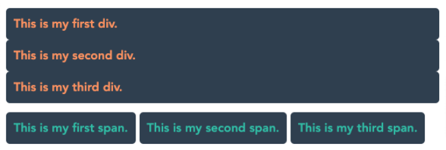
By default, browsers render specific elements on different levels. For instance, <div> elements are represented as blocks by default, while <span> elements seem inline by default, as shown below:

<body>

<div id="div-0"> This is my first div.</div>

<div id="div-1"> This is my second div.</div>

<div id="div-2"> This is my third div.</div>

<br>

<span id="span-0">This is my first span.</span>

<span id="span-1">This is my second span.</span>

<span id="span-2">This is my third span.</span>

</body>

<style type="text/css">

body { font-family: "Avenir Heavy"; }

div, span {

background-color: #2e3f50;

padding: 10px;

border-radius: 5px;

}

div { color: #fd8f59; }

span { color: #1ebda5; }

</style>

Output:

display property values example output

In this post, we’ll analyze the most important ones:

  • block
  • inline
  • inline-block
  • none

CSS Display: Inline

It is the default value of every HTML element.

All the HTML tags are displayed inline out of the box except some elements like divp andsection, which are set asblockby the user-agent (the browser).

Inline elements don’t have any margin or padding applied.

Same for height and width.

inline-block

Similar toinline, but withinline-block width and height are applied as we specified.

Block

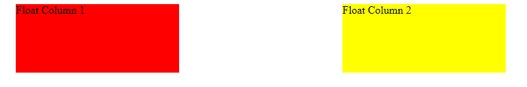
All the elements are inline elements except these:

  • div
  • p
  • section
  • ul

which are set as block by the browser.

Example:

span {
    display: block;
}
a {
    display: block;
}
Note: Changing

With display: block, elements are stacked one after each other, vertically, and every element takes up 100% of the page.

The values assigned to the width and height properties are respected, if you set them, along with marginandpadding.

None

With the help of display: none, elements will be made disappeared from the browser.

Example:

h1 {
    display: none;
}
p {
    display: none;
}

Font family inherit – CSS Inheritance | What is CSS Inherit Keyword? | List of CSS Properties that are Inherited

CSS Inheritance

Font family inherit: In CSS, inheritance manages what occurs when no value is named for a property on an element. This tutorial helps you more in learning about the CSS inherit Keyword along with the inherited and non-inherited properties. Click on the below available links and understand the concept of Inheritance in CSS.

CSS Inheritance

There are some CSS selectors that actually inherit styles from their parent element.

This helps us to specify the style of a particular element explicitly.

Some other properties make more sense to not be inherited.

For example, fonts, when we set the font-family to the body element, all other element inside the body tags get the same font. In better words, the children of the body elements inherit the CSS style/ font.

The background-color property, on the other hand, makes little sense to be inherited.

CSS properties can be classified into two types:

  • inherited properties, which by default are set to the computed value of the parent element
  • non-inherited properties, which by default are set to the initial value of the property

CSS inherit Keyword Definition & Syntax

In CSS, the inherit keyword defines that a property should inherit its value from its parent element. However, it can be used for any CSS property, and on any HTML element.

Syntax:

property

: inherit;

Example:

* {
  font-family: inherit;
  line-height: inherit;
  color: inherit;
}

html {
  font-size: 125%;
  font-family: sans-serif;
  line-height: 1.5;
  color: #222;
}

List of CSS Properties that are Inherited

List of the properties that inherit their parent style:

  • border-collapse
  • border-spacing
  • caption-side
  • color
  • cursor
  • direction
  • empty-cells
  • font-family
  • font-size
  • font-style
  • font-variant
  • font-weight
  • font-size-adjust
  • font-stretch
  • font
  • letter-spacing
  • line-height
  • list-style-image
  • list-style-position
  • list-style-type
  • list-style
  • orphans
  • quotes
  • tab-size
  • text-align
  • text-align-last
  • text-decoration-color
  • text-indent
  • text-justify
  • text-shadow
  • text-transform
  • visibility
  • white-space
  • widows
  • word-break
  • word-spacing

Forcing properties to inherit

Suppose one of the elements doesn’t inherit their parent, then we can explicitly state that to inherit their parent.

Example:

body {
    background-color: yellow;
}

p {
  background-color: inherit;
}

Forcing properties to NOT inherit

With contradiction, we also want some element not to inherit their parent.

We can use revert property value to explicitly tell not to inherit their parent.

This is very rarely used though.

Other special values

In addition to the keywords, inherit and revert, we can also set values like:

  • initial: use the default browser stylesheet if available. If not, and if the property inherits by default, inherit the value. Otherwise do nothing.
  • unset: if the property inherits by default, inherit. Otherwise do nothing.

Fancy html table – Styling HTML Tables with CSS | Stylish CSS Tables | HTML Table CSS Examples

Styling HTML Tables with CSS

fancy html table: In this tutorial, we will be learning how to style HTML tables with CSS properties or functions. Also, you can check some HTML Table CSS Examples from the below sections via using direct links available below:

How to Set Different Properties of an HTML table using CSS

You can set the following properties of a table:

  • The border-collapse defines whether the browser needs to control the appearance of the adjacent borders that touch each other or whether each cell should maintain its style.
  • The border-spacing names the width that should appear between table cells.
  • The caption-side captions are shown in the<caption>element. By default, these are rendered above the table in the document. You use the caption-side property to control the placement of the table caption.
  • The empty-cells specify whether the border should be shown if a cell is empty.
  • The table-layout permits browsers to speed up the layout of a table with the help of the first width properties it comes across for the rest of a column rather than having to load the whole table before rendering it.

Also Check:

How to Style a Table with CSS

By using Tables with CSS we can create a fancy page layout.

At first, let’s watch the table in HTML:

<table>
      <thead>
        <tr>
          <th scope="col">Name</th>
          <th scope="col">Age</th>
        </tr>
      </thead>
      <tbody>
        <tr>
          <th scope="row">Mainak</th>
          <td>22</td>
        </tr>
        <tr>
          <th scope="row">Soham</th>
          <td>22</td>
        </tr>
      </tbody>
    </table>

The default browser style is not very much attractive.

table default

We can use CSS on the table element to modify it for an even better look.

We can start with a border for the table.

We can apply it on thetableelement, and on the inner elements too, like th and td:

table,
th,
td {
  border: 1px dashed #333;
}

After putting a border we get a nice result.

table border

One common thing with tables is the ability to add color to one row, and a different color to another row. This is possible using the :nth-child(odd) or :nth-child(even) selector:

tbody tr:nth-child(odd) {
  background-color: greenyellow;
}

That gives us:

table border color

If we add border-collapse: collapse; to the table element, all borders are collapsed into one:

table border collapse

Image rotate css – How to Continuously Rotate an Image using CSS? | CSS Continuous Image Rotation

How to Continuously Rotate an Image using CSS

Image rotate css: If you are searching for a code in CSS that can rotate any image? Then this is the right tutorial you are looking for. We have covered everything like How to Continuously Rotate an Image using CSS Animations.

Image Element has three classes namely rotate, linear, infinite. In CSS Stylesheet we need to create a declaration block for each class. These classes are called utility or helper classes.

.rotate Code Block Declaration

.rotate {
animation: rotation 2s;
}

This will not make anything. We can add an animation property to the element to rotate it:

animation: rotation 2s infinite linear;

Or we can add a class namely rotate to a particular element to target that:

.rotate {
  animation: rotation 2s infinite linear;
}

We can tweak the 2s to slow down or speed up the rotation period of the element.

Then we can add the keyframes with transform property for it to make rotation:

@keyframes rotation {
  from {
    transform: rotate(0deg);
  }
  to {
    transform: rotate(359deg);
  }
}

Now the element should rotate. If you reload your browser you will see the image rotating a single time over 2 seconds. If you want to rotate the image continuously you need to change the animation transition timing from default ease to a consistent speed curve known as linear.

Do Check:

.Linear Code Block Declaration

.linear {
animation-timing-function: linear;
}

Reload your browser tab so that image will rotate to spin from start to end with a consistent speed rate.

.infinite Code Block Declaration

css rotate image animation: Let’s us make our image rotate infinitely by declaring our .infinite code block

.infinite {
animation-iteration-count: infinite;
}

We can declare all our animation properties in a single line and a single class as follows

.rotate-image {
animation: rotation 2s linear infinite;
}

This can save a lot of code but for learning purposes, it is better to break things into smaller pieces. You can understand how individual components work.

React bootstrap side navbar – How to Create a Navigation Bar and Sidebar Using React

INTRODUCTION

React bootstrap side navbar: The navbar I focus on will be a sidebar via React. I will guide you through the React project creation. Make sure you have node.js installed in your system.

  1. Make a workspace folder and name it.
  2. Use npx create-react-app navbar to create a new project in the directory.
  3. Navigate inside it by using cd navbar in your IDE, I would recommend using Visual Studio Code.
  4. npm start in terminal to start the localhost server in your browser, I would recommend using Google Chrome.


DEPENDENCIES REQUIRED

React sidebar navigation: Go into package.json file and paste these dependencies in there:

"bootstrap": "^4.3.1",
"react": "^16.10.2",
"react-bootstrap": "^1.0.0-beta.14",
"react-dom": "^16.10.2",
"react-router-dom": "^5.0.1",
"react-scripts": "3.1.1",
"styled-components": "^4.3.2"

Now actually install these dependencies by opening a terminal and typing:

npm install

Paste this CDN link in the <head> tag inside index.html. It is for Font Awesome icons.

<link rel="stylesheet" href="https://use.fontawesome.com/releases/v5.15.3/css/all.css" integrity="sha384-SZXxX4whJ79/gErwcOYf+zWLeJdY/qpuqC4cAa9rOGUstPomtqpuNWT9wdPEn2fk" crossorigin="anonymous">


MAKING COMPONENT STRUCTURE

React menu bar: Right click on the src folder and create a folder called components.

Right click on the components folder and create a Navbar.js file. Paste the code written below.

import React from "react";

export const NavigationBar = () => (
  <nav class="navbar navbar-expand-lg navbar-light bg-light">
    <div class="container-fluid">
      <a class="navbar-brand" href="#">
        Navbar
      </a>
      <button
        class="navbar-toggler"
        type="button"
        data-bs-toggle="collapse"
        data-bs-target="#navbarSupportedContent"
        aria-controls="navbarSupportedContent"
        aria-expanded="false"
        aria-label="Toggle navigation"
      >
        <span class="navbar-toggler-icon"></span>
      </button>
      <div class="collapse navbar-collapse" id="navbarSupportedContent">
        <ul class="navbar-nav me-auto mb-2 mb-lg-0">
          <li class="nav-item">
            <a class="nav-link active" aria-current="page" href="#">
              Home
            </a>
          </li>
          <li class="nav-item">
            <a class="nav-link" href="#">
              Link
            </a>
          </li>
          <li class="nav-item dropdown">
            <a
              class="nav-link dropdown-toggle"
              href="#"
              id="navbarDropdown"
              role="button"
              data-bs-toggle="dropdown"
              aria-expanded="false"
            >
              Dropdown
            </a>
          </li>
          <li class="nav-item">
            <a
              class="nav-link disabled"
              href="#"
              tabindex="-1"
              aria-disabled="true"
            >
              Disabled
            </a>
          </li>
        </ul>
        <form class="d-flex">
          <input
            class="form-control me-2"
            type="search"
            placeholder="Search"
            aria-label="Search"
          />
          <button class="btn btn-outline-success" type="submit">
            Search
          </button>
        </form>
      </div>
    </div>
  </nav>
);

Now the header will look similar to the picture mentioned below.

Routing is how you get from page to page, so paste the code below inside <Router>. It basically says, if on this path, render this particular component:

<Switch>
  <Route exact path="/" component={Home} />
  <Route path="/about" component={About} />
  <Route component={NoMatch} />
</Switch>

This currently breaks the app because we do not have these components. So, let’s add these pages to make sure navigation will work.

Inside of src/components/Pages, create Home.js and paste this inside:

import React from "react";
import styled from "styled-components";
const GridWrapper = styled.div`
  display: grid;
  grid-gap: 10px;
  margin-top: 1em;
  margin-left: 6em;
  margin-right: 6em;
  grid-template-columns: repeat(12, 1fr);
  grid-auto-rows: minmax(25px, auto);
`;
export const Home = (props) => (
  <GridWrapper>
    <p>This is a paragraph and I am writing on the home page</p>
    <p>This is another paragraph, hi hey hello whatsup yo</p>
  </GridWrapper>
);

Inside of src/components/Pages, create About.js and paste this inside:

import React from "react";
import styled from "styled-components";
const GridWrapper = styled.div`
  display: grid;
  grid-gap: 10px;
  margin-top: 1em;
  margin-left: 6em;
  margin-right: 6em;
  grid-template-columns: repeat(12, 1fr);
  grid-auto-rows: minmax(25px, auto);
`;
export const About = () => (
  <GridWrapper>
    <h2>About Page</h2>
    <p>
      State at ceiling lay on arms while you're using the keyboard so this human
      feeds me.
    </p>
    <p>I am a kitty cat, sup, feed me, no cares in the world</p>
    <p>Meow meow, I tell my human purr for no reason but to chase after</p>
  </GridWrapper>
);

Inside of src/components/Pages, create Nomatch.js and paste this inside:

import React from 'react';
import styled from 'styled-components';
const Wrapper = styled.div`
  margin-top: 1em;
  margin-left: 6em;
  margin-right: 6em;
`;
export const NoMatch = () => (
  <Wrapper>
    <h2>No Match</h2>
  </Wrapper>
)

Do not forget to include the components in App.js file.

import { Home } from "./components/Pages/Home";
import { About } from "./components/Pages/About";
import { Nomatch } from "./components/Pages/Nomatch";

Alright, we can actually create the sidebar now.

Inside of components, create Sidebar.js

We know that we want to create a Sidebar component and export it for use inside of App.js. Put this inside Sidebar.js:

import React, { Component } from 'react'

export class Sidebar extends Component {
    render() {
        return (
            <div>
                
            </div>  
        )
    }
}

export default Sidebar

This basically is a class component, which renders a given code.

Then paste the code given below inside the return statement.

<SideNav></SideNav>

Now creating all the components required in separate files namely,  SideNav.js and NavItem.js.

NavItem.js

class NavItem extends React.Component {
  render() {
    return (
    );
  }
}

Inside of render, but above return, type:

const { active } = this.props;

This gets the active variable out of NavItem’s props. Now import the following

import { BrowserRouter as Router, Route, Link } from "react-router-dom";

Inside NavItem’s return, add this:

<StyledNavItem active={active}>
  <Link to={this.props.path} className={this.props.css} onClick={this.handleClick}>
    <NavIcon></NavIcon>
  </Link>
</StyledNavItem>

If you look at the props on <Link>, to is the path to go to, className passes in the CSS for the Font Awesome icon, and onClick will call the handleClick() method. Let’s create that method. Put it above render:

handleClick = () => {
  const { path, onItemClick } = this.props;
  onItemClick(path);
}

This arrow function gets path and onItemClick from NavItem’s props and then calls onItemClick().

Create StyledNavItem. The <Link> tag uses an anchor, so, the anchor selector is used. The only confusing part about the CSS is the part that uses props. It says: using the active prop, decide which of the colors to choose. So, if the home page is active, make the home page icon white:

const StyledNavItem = styled.div`
  height: 70px;
  width: 75px; /* width must be same size as NavBar to center */
  text-align: center; /* Aligns <a> inside of NavIcon div */
  margin-bottom: 0;   /* Puts space between NavItems */
  a {
    font-size: 2.7em;
    color: ${(props) => props.active ? "white" : "#9FFFCB"};
    :hover {
      opacity: 0.7;
      text-decoration: none; /* Gets rid of underlining of icons */
    }  
  }
`;


SideNav.js

Styled components used for styling the sidenav component.

const StyledSideNav = styled.div`
  position: fixed; /* Fixed Sidebar (stay in place on scroll and position relative to viewport) */
  height: 100%;
  width: 75px; /* Set the width of the sidebar */
  z-index: 1; /* Stay on top of everything */
  top: 3.4em; /* Stay at the top */
  background-color: #222; /* Black */
  overflow-x: hidden; /* Disable horizontal scroll */
  padding-top: 10px;
`;

We want SideNav to be a stateful component. This is because it needs to store what the current path is and based on that decide which icon should be selected and colored white.

Create a constructor. In there, create a state that holds the activePath, which we will set to the home path for now, and items that holds the information for our selectable icons

constructor(props) {
  super(props);
  this.state = {
    activePath: '/',
    items: [
      {
        path: '/', 
        name: 'Home',
        css: 'fa fa-fw fa-home',
        key: 1 
      },
      {
        path: '/about',
        name: 'About',
        css: 'fa fa-fw fa-clock',
        key: 2
      },
      {
        path: '/NoMatch',
        name: 'NoMatch',
        css: 'fas fa-hashtag',
        key: 3
      },
    ]
  }  
}
onItemClick = (path) => {
  this.setState({ activePath: path }); /* Sets activePath which causes rerender which causes CSS to change */
}

All this code says is change the activePath by setting the state. If you do not know, whenever you call setState(), React will rerender your component, which will render the change to show you selected a different icon.

Change your render to look like this:

render() {
  const { items, activePath } = this.state;
  return (
    <StyledSideNav>
      {
        /* items = just array AND map() loops thru that array AND item is param of that loop */
        items.map((item) => {
          /* Return however many NavItems in array to be rendered */
          return (
            <NavItem path={item.path} name={item.name} css={item.css} onItemClick={this.onItemClick} /* Simply passed an entire function to onClick prop */ active={item.path === activePath} key={item.key}/>
          )
        })
      }
    </StyledSideNav>
  );
}

Before return, items and activePath are retrieved from the state. In order to render out all NavItems, we loop through all of the items using map().


NOTE: Remember to import all required imports that are used in the files, specially the custom HTML tags.


Invert colors css – How to invert colors using CSS | Invert() CSS Function Definition, Syntax, Parameter, Example Program

How to invert colors using CSS

Invert colors css: Do you know there is an option to invert the color of every element on a page? The invert()CSS function inverts the color samples in the input image. And its conclusion is a <filter-function>. In this tutorial, you can easily learn How to invert colors of elements and images using CSS? So, stay continued with this tutorial and grasp the concept thoroughly.

CSS Invert() Function

CSS invert colors: The invert() function in CSS is an inbuilt function that is utilized to implement a filter to the image to produce the invert of the color of the example image.

Syntax:

invert (amount)

Parameter:

Invert color css: This function allows a single parameter amount that holds the amount of conversion. The value of the invert is estimated in the context of value and percentage. The value 0% draws the original image and 100% draws the inverted image.

Theinvert()function inside utilizes the following formula, to computer the inverse of the image:

amount * (255 - value) + (1 - amount) * value

The inversion value is measured by the variable amount, the variable value range lies between 0 – 1(floating) (this is accomplished by converting the passed percentage of color inversion to a value between 0-1). The value is the color value of the pixel. (255-value) provides the color after subtracting the color value with the max pixel value, estimates that the value of the pixel is in the range 0 – 255 (though input image representation space could be stretched /scaled to satisfy the specified criteria).

The following table contains a list of inversion percentages and the result they produce.

Inversion Result
0% Original Image
50% Image with each pixel having grey color
100% Completely inverted Image

Example of CSS Invert Color

CSS invert color: Here, we are changing the color of white to back by using the Invert color in CSS:

div {
    width: 100px;
    height: 100px;
    background-color: white;
    -webkit-filter: invert(100%);
    filter: invert(100%);
}

Output:

invert color css output image

Supported Browsers:

CSS invert image: The browsers supported by the invert() function in CSS are as follows:

  • Internet Explorer
  • Google Chrome
  • Safari
  • Firefox
  • Opera

How to Invert Colors Using CSS?

CSS invert: There is an issue i.e., I added a “black on white” image on a page, only to realize that with dark mode, my page correctly changes the background to black, but the image remains white on black.

So I added this rule to my CSS to detect dark mode and automatically invert the color of the image:

@media (prefers-color-scheme: dark) {
  .my-image {
    filter: invert(100%);
  }
}

It’s not 100% accurate in my case, because my dark background color is not perfectly black, but it’s better than nothing.

To make things perfect you could also add the image using a CSS background image instead of an img tag in HTML, and I could easily swap that in dark mode.

Background image opacity without affecting text – How to Change Background Image Opacity in CSS without Affecting Text | HTML/CSS

Background image opacity without affecting text: In today’s generation, when making a website, we need to have all the visual effects we can induce in it to make it look more presentable and pleasing to the eyes of all the users who access it. So here I will be writing a blog for developers who are looking to implement background image transparency using CSS and HTML.

CSS Background Opacity Without Affecting the Child Elements

CSS background image opacity without affecting text: We all like learning how to make new designs using CSS, but still, it is recommended to know some basics of CSS and HTML beforehand before progressing further towards our blog.

NOTE:

There is no CSS property that can be used to change the opacity ONLY of the background image.

background: url('img.jpeg');
opacity: 0.5;

The result will be similar to : (faded image)

If we try to use it then it produces blurred unpleasant views which are very displeasing to look at and not production ready. So to overcome it we have to manipulate it indirectly using other CSS properties described below. From the next steps we start designing the HTML and implementing the CSS on how we should do it.

Skelton HTML

Background image opacity without affecting text: First we shall create a basic HTML file where the CSS styling will be implemented, a skeleton design of a HTML file is more than enough to cater our needs. I have made a section to keep the box/card component which is to be displayed on the page.

<section>
      <div class="box">
        <h2>CSS Transparent Background</h2>
        <p>
          Lorem ipsum dolor sit amet, consectetur adipiscing elit, sed do
          eiusmod tempor incididunt ut labore et dolore magna aliquaenim ad
          minim veniam, quis nostrud exercitation ullamco laboris nisi ut
          aliquip ex ea commodo consequat. Duis aute irure dolor in
          reprehenderit in voluptate velit esse cillum dolore eu fuginulla
          pariatur. Excepteur sint occaecat cupidatat non proident, sunt in
          culpa qui officia deserunt mollit anim id est laborum.
        </p>
      </div>
  </section>

Section Styling

section {
  padding: 0, 100px;
  background: url("//some_image");
  height: 100vh;
  /* opacity: 0.25; */
  display: flex;
  justify-content: center;
  align-items: center;
}

Here we could have used opacity property to make it look opaque but we all have seen the discrepancies that it causes while using it directly (refer NOTE). We have made it a flex and justify-content: centre to highlight it with a background.
Moving on to the next section.

Box/Card Component Styling

.box {
  position: relative;
  max-width: 600px;
  padding: 50px;
  /* background: url("img.jpeg"); */
  /* opacity: 0.75; */
  background: rgba(255, 255, 255, 0.2);
  box-shadow: 12px 2px 30px 10px rgba(0, 0, 0, 0.77);
  -webkit-box-shadow: 12px 2px 30px 10px rgba(0, 0, 0, 0.77);
  -moz-box-shadow: 12px 2px 30px 10px rgba(0, 0, 0, 0.77);
}

.box h2 {
  margin: 0 0 20px;
  padding: 0;
  font-size: 48px;
  text-transform: uppercase;
  color: #044463;
}

The box-shadow property one or more shadows to the element.
The -WebKit-box-shadow applies a drop shadow effect to the border-box/card of an object.

In the .box section of the CSS, we use the transparency effect to counter the opacity effect of the overall background to make it look readable.

Conclusion

CSS background opacity without affecting text: This is, in my opinion, one of the best solutions to have a work around for not having a dedicated property for background image transparency (and or opacity).

BONUS: we also learned the box-shadowing property in CSS.

The CSS calc() function | Definition, Syntax & Example | Nested calc() with CSS Variables

The CSS calc() function

CSS calc variables: The calc() functions help us to perform the basic mathematic operations in the stylesheet itself. It specifically helps us to calculate, suppose, the size of the body except for the header and footer. Also, it supports us to subtract or add some absolute value with a percentage value. Just dive into this tutorial and get a good grip on the CSS calc() function. 

CSS calc() Function

The calc() function is an inbuilt function in CSS that is utilized to do calculations based on CSS property. It can be used anywhere a <length>, <frequency>, <angle>, <time>, <percentage>, <number>, or <integer> is allowed.

Syntax:

calc( Expression )

Parameters:

The CSS calc() function allows a mandatory single parameter Expression that results in a value. This parameter contains a mathematical expression that needs to implement. The following operators can be returned any expression by using standard operator precedence rules:

(+)Addition
(-)Subtraction
(*)Multiplication: At least one of the arguments must be a <number>.
(/)Division: The right-hand side must be a <number>.

The operands in the expression may be any <length> syntax value. You can use various units for each value in your expression if needed. Also, you may utilize parentheses to establish computation order when required.

Also Refer:

Example:

div {
    max-width: calc(80% - 100px)
}

This returns a length value.

Example Using calc() Function:

Below example code, illustrates the calc() function in CSS

<!DOCTYPE html>
<html>
    <head>
        <title>calc function</title>
        <style>
            .geeks {
                position: absolute;
                left: 50px;
                width: calc(100% - 20%);
                height:calc(500px - 300px);
                background-color: green;
                padding-top:30px;
                text-align: center;
            }
            .bg {
                font-size:40px;
                font-weight:bold;
                color:white
            }
            h1 {
                color:white;
            }
        </style>
    </head>
    <body>
        <div class = "geeks">
            <div class = "bg">BtechGeeks</div>
            <h1>The calc() Function</h1>
        </div>
    </body>
</html>

Formal syntax

calc( <calc-sum> )

where 
<calc-sum> = <calc-product> [ [ '+' | '-' ] <calc-product> ]*

where 
<calc-product> = <calc-value> [ '*' <calc-value> | '/' <number> ]*

where 
<calc-value> = <number> | <dimension> | <percentage> | ( <calc-sum> )

Useful points on calc() in CSS

  • The arithmetic operators add (+) and subtract (-) must constantly be surrounded by whitespace. Unless the expression will be addressed as an invalid expression. As an instance, calc(60%-4px) will be invalid because it is parsed as a percentage, accompanied by a negative length. At the same time, the expression calc(60% – 4px) will be parsed as a subtraction operator and a length.
  • Although the operators * and / does not needs whitespace, but it is urged to add it for consistency.
  • Nesting of calc() function can be possible.

Nested calc() with CSS Variables

By considering the following code, you can easily usecalc()function with CSS variables:

.foo {
  --widthA: 100px;
  --widthB: calc(var(--widthA) / 2);
  --widthC: calc(var(--widthB) / 2);
  width: var(--widthC);
}

Once all variables are expanded, widthC's value will be calc( calc( 100px / 2) / 2), then when it’s assigned to.foo'swidth property, all inner calc()s (no matter how deeply nested) will be grounded to just parentheses, so the width property’s value will be eventually calc( ( 100px / 2) / 2), i.e. 25px. In a nutshell: a calc() inside of a calc()is equal to just parentheses.

Categories CSS

Two divs side by side flexbox – 3 ways to display two divs side by side (float, flexbox, CSS grid)

Two divs side by side flexbox: There are several ways to place HTML divs side-by-side. The simplest and most efficient way to do this is to make use of a handful of CSS properties (i.e., float, grid, and flex).

Float Method

Float two divs side by side: In the float method, we will be using the following HTML markup:

HTML:

<div class="float-parent-element">
      <div class="float-child-element">
        <div class="red">Float Column 1</div>
      </div>

      <div class="float-child-element">
        <div class="yellow">Float Column 2</div>
      </div>
    </div>

The .float-parent-element is simply the parent element that contains both .float-child-element elements.

To get the divs side by side, we will use the following CSS rules:

.float-parent-element {
  width: 50%;
}
.float-child-element {
  float: left;
  width: 50%;
}
.red {
  background-color: red;
  margin-left: 50%;
  height: 100px;
}
.yellow {
  margin-left: 50%;
  height: 100px;
  background-color: yellow;
}

The resulting code will look like this:

using float

I’ve added an initial width of 50% to the .float-parent-element so that it will get some width at first.

Then I have added each of the .float-child-element a property of float left to position then side by side and a width of 50% of the parent div.

Finally, for the .float-child-element I have added their respective colors with some height of 100px and margin to better differentiate them.

Flexbox Method

Float divs side by side: With flexbox, we can use a more intuitive way of aligning our two div elements.

HTML:

<div class="flex-parent-element">
      <div class="flex-child-element magenta">Flex Column 1</div>

      <div class="flex-child-element green">Flex Column 2</div>
    </div>

CSS:

.flex-parent-element {
  display: flex;
  width: 50%;
}

.flex-child-element {
  flex: 1;
  border: 2px solid blueviolet;
  margin: 10px;
}

.flex-child-element:first-child {
  margin-right: 20px;
}

With flexbox, we have set display: flex on the parent .flex-parent-element. This turns on flexbox.

Then in each .flex-child-element, we are setting flex: 1. This number is like a ratio comparing the widths of each child in the parent flex element.

Since they are the same, the available space will be divided up equally. And since we have two child elements, they will each take up 50%.

Here’s what the resulting code will look like:

flex css

Space between divs by using a margin, and it will still fit

How to make two divs side by side: Notice that we’ve added space by adding margin: 10px to .flex-child-element. However, flexbox is intelligent enough to take that extra 20px into consideration when dividing up the rest of the available width.

This means you can add space with margin without having to calculate the exact pixels. Flexbox will fit the content for you!

CSS Grid Method

2 div side by side: And here’s how you can place the two divs side by side, using CSS grid:

HTML:

<div class="grid-container-element">
      <div class="grid-child-element purple">Grid Column 1</div>

      <div class="grid-child-element green">Grid Column 2</div>
    </div>

CSS:

.grid-container-element {
  display: grid;
  grid-template-columns: 1fr 1fr;
  grid-gap: 20px;
  border: 1px solid black;
  width: 50%;
}
.grid-child-element {
  margin: 10px;
  border: 1px solid red;
}

And here’s what the code will look like:

grid css

One big change with the grid is that you first determine what the grid template will look like. Meaning how many columns and/or rows you want in your layout.

In our case, we want two columns of equal width. So in the parent .grid-container-element, we turn the grid on with display: grid. Then we add in how many columns we want in our layout with the grid-template-columns property.

We want two columns of equal width, so we set it to 1fr 1fr. This tells the browser to create a two-column layout, and each column takes up 1fr (fr = fractional unit) of space.

The fr unit is a ratio of each column to another, similar to the flex: 1 rule we used in the flexbox method. Having the columns set to 1fr 1fr means that each column will take up the same amount of space.

Space between grid items with the grid-gap property

make 2 divs side by side: One big benefit to using a CSS grid is that you don’t need to use padding or margin to add space between grid items.

You can use the grid-gap (or gap in newer browsers) to automatically add space in your grid template.

We’ve set grid-gap to 20px, so the browser will know to add 20px of space between all items, whether they are side by side or stacked.