In this tutorial, we will be learning completely about the CSS Position Property and its syntax along with some examples. These details will help you a lot to understand the concept of position property in CSS.
- What is the CSS position property?
- Syntax
- Property Values
- Types of Positioning in CSS
- Static
- Absolute
- Relative
- Fixed
- Sticky
- All CSS Position Properties
What is the CSS position property?
The CSS position property determines the position of an element in a document. This property runs with the left, right, top, bottom, and z-index properties to define the final position of an element on a page.
Syntax:
position: static|absolute|fixed|relative|sticky|initial|inherit;
The position property can help us to manipulate the location of an element, for example:
.element {
  position: relative;
  top: 20px;
}
Relative to its original position the element above will now be nudged down from the top by 20px.
relative is only one of six values for thepositionproperty. Other values are:
Property Values
static: every element has a static position by default, so the element will stick to the normal page flow.relative: an element’s original position remains in the flow of the document, just like thestaticvalue.absolute: the element is removed from the flow of the document and other elements will behave as if it’s not even there whilst all the other positional properties will work on it.fixed: the element is removed from the flow of the document like absolutely positioned elements.sticky(experimental): the element is treated as arelativevalue until the scroll location of the viewport reaches a specified threshold, at which point the element takes afixedposition where it is told to stick.inherit: thepositionvalue doesn’t cascade, so this can be used to specifically force it to, andinheritthe positioning value from its parent.
Also Read: The CSS Display property
Types of Positioning in CSS
A positioned element is an element whose computed position value is eitherrelative, absolute, fixed, or sticky. The default one isstatic, let’s see about it first.
Static
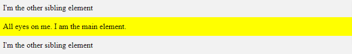
This is a by default position for HTML elements. It constantly positions an element as pert the normal flow of the page. It is not affected by the top, bottom, left, and right properties. Let’s use an example to show thatposition: statichas no effect on the position of an element.
<html>
    <body>
        <div class="parent-element">
            <div class="sibling-element">
                I'm the other sibling element.
            </div>

            <div class="main-element">
                All eyes on me. I am the main element.
            </div>

            <div class="sibling-element">
                I'm the other sibling element.
            </div>
        </div>
    </body>
<html>
Now, we will addposition: staticto the div with the class main-element and left, top values to it.
.main-element {
    position: static;
    left: 10px;
    bottom: 10px;
    background-color: yellow;
    padding: 10px;
}

.sibling-element {
    padding: 10px;
    background-color: #f2f2f2;
}
Result:
Absolute
If a child element has an absolute value then the parent element will behave as if the child isn’t there at all:
.element {
  position: absolute;
}
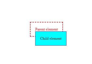
And when we try to set other values such as left, bottom, and right we’ll find that the child element is responding not to the dimensions of its parent, but the document:
.element {
  position: absolute;
  left: 0;
  right: 0;
  bottom: 0;
}
Relative
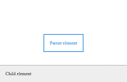
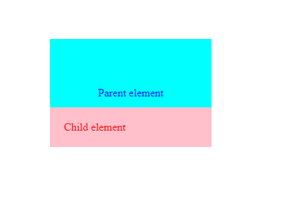
We can use position relative to make the child element positioned absolutely from its parent element we need to set this on the parent element itself:
.parent {
  position: relative;
}
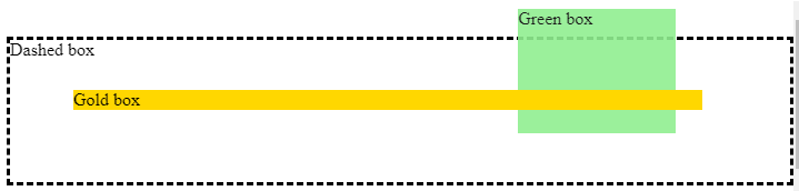
Now properties such as left, right, bottom and top will refer to the parent element, so that if we make the child element transparent we can see it sitting right at the bottom of the parent:
Fixed
It is very similar to absolute as it can help us to position an element anywhere relative to the document.
But this value is unaffected by scrolling.
Example:
.sibling-element {
    background: #f2f2f2;
    padding: 10px;
  border: 1px solid #81adc8;
}

.main-element {
    position: fixed;
    bottom: 10px;
    left: 10px;
    background-color: yellow;
    padding: 10px;
}

.parent-element {
    position: relative;
    height: 100px;
    padding: 10px;
    background-color: #81adc8;
}

html {
    height: 800px;
}
Sticky
This one is introduced recently and the browser support for this is very poor.
The one case where this property is very useful is Navbar where the navbar will appear to the top even after we scroll to the bottom of the page.
#one { position: sticky; top: 10px; }
All CSS Position Properties
| No. | Property | Description | Values |
|---|---|---|---|
| 1) | bottom | It is used to set the bottom margin edge for a positioned box. | auto, length, %, inherit |
| 2) | clip | It is used to clip an absolutely positioned element. | shape, auto, inherit |
| 3) | cursor | It is used to specify the type of cursors to be displayed. | url, auto, crosshair, default, pointer, move, e-resize, ne-resize, nw-resize, n-resize, se-resize, sw-resize, s-resize, w-resize, text, wait, help |
| 4) | left | It sets a left margin edge for a positioned box. | auto, length, %, inherit |
| 5) | overflow | This property is used to define what happens if content overflow an element’s box. | auto, hidden, scroll, visible, inherit |
| 6) | position | It is used to specify the type of positioning for an element. | absolute, fixed, relative, static, inherit |
| 7) | right | It is used to set a right margin edge for a positioned box. | auto, length, %, inherit |
| 8) | top | It is used to set a top margin edge for a positioned box. | auto, length, %, inherit |
| 9) | z-index | It is used to set stack order of an element. | number, auto, inherit |