
Get started learning CSS breakpoints, and want to become a mobile website master! Then, having knowledge of CSS Breakpoints and how to use them is very important. Also, you can learn exactly What are good CSS Breakpoint values for Responsive Design? from this tutorial. So, continue your read by taking the help of these direct links.
- What is a CSS breakpoint?
- How to set CSS breakpoints?
- Breakpoints based on device
- Breakpoints based on content
- What are good CSS Breakpoint values for Responsive Design?
What is a CSS breakpoint?
The points where the website content responds in accordance with the device width, enabling you to show the best possible layout to the user are called CSS breakpoints.
CSS breakpoints are also known as media query breakpoints, as they are utilized with a media query.
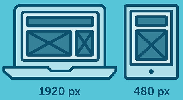
In the below instance, you can observe how the layout changes to the screen size. The layout at large resolution has a header and two-column body layout but in a small device, it turns into one column layout.
Also Check:
How to set CSS Breakpoints to create Responsive Designs?
The complicated part is to choose the breakpoints themselves. There aren’t any standard templates, and many frameworks use distinct breakpoints.
So, it’s time to know what approach need you to adopt for your breakpoints?
Here, there are two feasible approaches to follow:
- Breakpoints based on device
- Breakpoints based on content
Breakpoints based on device
Choosing breakpoints on the basis of various devices sounds like a good idea, but in reality, it’s not constantly the most suitable approach. We already have sufficient devices to worry about, and when a new one comes out with another width, going back to your CSS and adding a new breakpoint all over again is time-consuming.
But, it’s still a viable option, as you may discover that runs okay for you. Also, with this strategy, you will end up becoming a huge list of media queries.
Here’s an instance of device-specific breakpoints:
/* ----------- iPhone 6, 6S, 7 and 8 ----------- */

/* Portrait */

@media only screen

and (min-device-width: 375px)

and (max-device-width: 667px)

and (-webkit-min-device-pixel-ratio: 2)

and (orientation: portrait) {

}

/* Landscape */

@media only screen

and (min-device-width: 375px)

and (max-device-width: 667px)

and (-webkit-min-device-pixel-ratio: 2)

and (orientation: landscape) {

}

/* ----------- Google Pixel ----------- */

/* Portrait */

@media screen

and (device-width: 360px)

and (device-height: 640px)

and (-webkit-device-pixel-ratio: 3)

and (orientation: portrait) {

}

/* Landscape */

@media screen

and (device-width: 360px)

and (device-height: 640px)

and (-webkit-device-pixel-ratio: 3)

and (orientation: landscape) {

}
Breakpoints based on content
The absolute option for deciding breakpoints is based on the content of your site. This method allows you to just add breakpoints where your content requires layout improvement. This will give your media query a lot easier and manageable.
This CSS breakpoint will apply when the device width is 768px and above.
@media only screen (min-width: 768px){

...

}
Also, you can set a range with breakpoints, so the CSS will only apply within those limits.
@media only screen and (min-width: 768px) and (max-width: 959px){

...

}
What are good CSS Breakpoint values for Responsive Design?
The optimal CSS breakpoint values we should use in our projects. Personal preferences.
While designing a site, I noticed I was using some pretty random values for my CSS breakpoints. Sometimes a rounded value like 800 or 1200, sometimes a specific value up to the pixel like 672.
I searched for the proper values to apply to my breakpoints going forward.
I had a little bit of time to look this up, and I came to this conclusion.
We have 5 major device sizes to worry about:
- mobile portrait
- mobile landscape
- tablet portrait
- tablet landscape
- laptop
Those devices map to those pixel values:
- mobile portrait: less than 640px
- mobile landscape: > 640px
- tablet portrait: > 768px
- tablet landscape: > 1024px
- laptop: > 1280px
This means my CSS, without any media query, is going to design for the mobile portrait use case, and then adding breakpoints I’ll design for devices that are bigger and bigger, banning the max-width from media queries.
I think I always went for the opposite route: a design for bigger screens, which is what I use the most, and then go smaller, but designing mobile-first and using min-width seems the most accepted and used solution nowadays.
These are the media queries I will use from now on:
@media (min-width: 640px) {

}

@media (min-width: 768px) {

}

@media (min-width: 1024px) {

}

@media (min-width: 1280px) {

}