Background image opacity without affecting text: In today’s generation, when making a website, we need to have all the visual effects we can induce in it to make it look more presentable and pleasing to the eyes of all the users who access it. So here I will be writing a blog for developers who are looking to implement background image transparency using CSS and HTML.
CSS Background Opacity Without Affecting the Child Elements
CSS background image opacity without affecting text: We all like learning how to make new designs using CSS, but still, it is recommended to know some basics of CSS and HTML beforehand before progressing further towards our blog.
NOTE:
There is no CSS property that can be used to change the opacity ONLY of the background image.
background: url('img.jpeg');
opacity: 0.5;
The result will be similar to : (faded image)
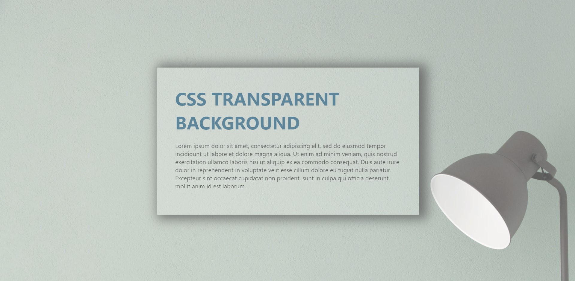
If we try to use it then it produces blurred unpleasant views which are very displeasing to look at and not production ready. So to overcome it we have to manipulate it indirectly using other CSS properties described below. From the next steps we start designing the HTML and implementing the CSS on how we should do it.
Skelton HTML
Background image opacity without affecting text: First we shall create a basic HTML file where the CSS styling will be implemented, a skeleton design of a HTML file is more than enough to cater our needs. I have made a section to keep the box/card component which is to be displayed on the page.
<section>
<div class="box">
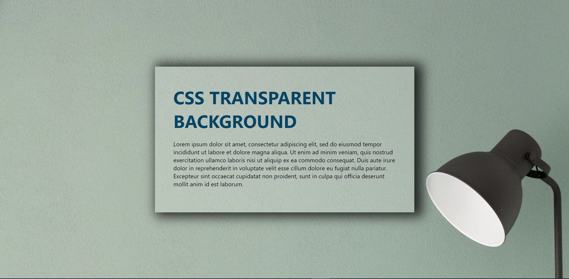
<h2>CSS Transparent Background</h2>
<p>
Lorem ipsum dolor sit amet, consectetur adipiscing elit, sed do
eiusmod tempor incididunt ut labore et dolore magna aliquaenim ad
minim veniam, quis nostrud exercitation ullamco laboris nisi ut
aliquip ex ea commodo consequat. Duis aute irure dolor in
reprehenderit in voluptate velit esse cillum dolore eu fuginulla
pariatur. Excepteur sint occaecat cupidatat non proident, sunt in
culpa qui officia deserunt mollit anim id est laborum.
</p>
</div>
</section>
Section Styling
section {
  padding: 0, 100px;
  background: url("//some_image");
  height: 100vh;
  /* opacity: 0.25; */
  display: flex;
  justify-content: center;
  align-items: center;
}
Here we could have used opacity property to make it look opaque but we all have seen the discrepancies that it causes while using it directly (refer NOTE). We have made it a flex and justify-content: centre to highlight it with a background.
Moving on to the next section.
Box/Card Component Styling
.box {
  position: relative;
  max-width: 600px;
  padding: 50px;
  /* background: url("img.jpeg"); */
  /* opacity: 0.75; */
  background: rgba(255, 255, 255, 0.2);
  box-shadow: 12px 2px 30px 10px rgba(0, 0, 0, 0.77);
  -webkit-box-shadow: 12px 2px 30px 10px rgba(0, 0, 0, 0.77);
  -moz-box-shadow: 12px 2px 30px 10px rgba(0, 0, 0, 0.77);
}

.box h2 {
  margin: 0 0 20px;
  padding: 0;
  font-size: 48px;
  text-transform: uppercase;
  color: #044463;
}
The box-shadow property one or more shadows to the element.
The -WebKit-box-shadow applies a drop shadow effect to the border-box/card of an object.
In the .box section of the CSS, we use the transparency effect to counter the opacity effect of the overall background to make it look readable.
Conclusion
CSS background opacity without affecting text: This is, in my opinion, one of the best solutions to have a work around for not having a dedicated property for background image transparency (and or opacity).
BONUS: we also learned the box-shadowing property in CSS.