CSS Selectors | Types of Selectors in CSS | Ultimate Guide on CSS3 Selectors

CSS Selectors

In this tutorial, CSS developers will come to learn completely about CSS Selectors from basic level to advanced level. So, stay tuned to this page and collect every bit of knowledge on Selectors in CSS like CSS element selector, id selector, class selector, universal selector, grouping selector, etc. Just go with the links available below and grab the concept of CSS Selectors with ease.

Every CSS selector, taken from the latest CSS3 standard.

CSS Selectors

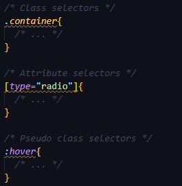
CSS selectors are utilized to select the content you need to style. In CSS Rule Set, Selectors are the part. CSS selectors select HTML elements as per their id, class, type, attribute, etc.

CSS selectors are divided into five categories:

  • Simple/Basic selectors (select elements based on name, id, class)
  • Combinator selectors (select elements based on a specific relationship between them)
  • Pseudo-classes selectors (select elements based on a certain state)
  • Pseudo-elements selectors (select and style a part of an element)
  • Attribute selectors (select elements based on an attribute or attribute value)

On this page, you will learn about all these five categories of CSS Selectors in detail. So, let’s dive into this tutorial without any delay.

All CSS Simple Selectors

Selector Example Example description
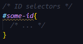
#id #firstname Selects the element with id=”firstname”
.class .intro Selects all elements with class=”intro”
element.class p.intro Selects only <p> elements with class=”intro”
* * Selects all elements
element p Selects all <p> elements
element,element,.. div, p Selects all <div> elements and all <p> elements

Basic Selectors

Selector Description Example
element Type selector. Matches an element. p { color: red }
/* matches paragraphs */
.class Class selector. Matches the value of anclassattribute. .warning { color: red }
/* matches elements containing class="warning" */
#id ID selector. Matches the value of an id attribute. #warning { color: red }
/* matches elements containing id="warning" */
* Universal selector. Matches everything. * { color: red }
/* matches everything */

Attribute selectors

Selector Description Example
[attribute] Matches elements containing a given attribute. a[href] { color: red }
/* matches a elements with an href attribute */
[attribute="x"] Matches elements containing a given attribute with a given value. a[href="/sitemap/"] { color: red }
/* matches a elements with the attribute and value href="/sitemap/" */
[attribute~="x"] Matches elements containing a given attribute with a value that contains a sub-value within a space-separated list. abbr[title~="Style"] { color: red }
/* matches abbr elements with a title that contains 'Style' (such as in title="Cascading Style Sheets") */
[attribute|="x"] Matches elements containing a given attribute with a value that contains a sub-value within a hyphen-separated list. html[lang|="en"] { color: red }
/* matches html elements with a lang attribute that contains 'en' (such as in lang="en-gb") */
[attribute^="x"] Matches elements containing a given attribute with a value that starts with something. a[href^="http://"] { color: red }
/* matches a elements with an href attribute, the value of which begins with 'http://' */
[attribute$="x"] Matches elements containing a given attribute with a value that ends with something. a[href$=".com"] { color: red }
/* matches a elements with an href attribute, the value of which ends with '.com' */
[attribute*="x"] Matches elements containing a given attribute with a value that contains something. a[href*="htmldog"] { color: red }
/* matches a elements with an href attribute, the value of which contains 'htmldog' */

Pseudo-classes Selectors

Selector Description Example
:link Matches a link that has not been visited. a:link { color: blue }
:visited Matches a link that has been visited. a:visited { color: purple }
:active Matches an element that is being activated, such as a link being clicked on. a:active { color: red }
:hover Matches an element whose box is being hovered over by a cursor. a:hover { text-decoration: none }
:focus Matches an element that has focus, such as one that has been tabbed to. a:focus { border: 1px solid yellow }
:target Matches an element that has been linked to (via<a href="#x"…,for example). h2:target { color: red }
/* matches a second-level heading that has been linked to */
:lang() Matches an element of a given language. p:lang(fr) { color: red }
/* matches paragraphs that are declared, or otherwise considered, as French */
:first-child Matches the first child of an element. p:first-child { color: red }
/* matches the first child, if it is a paragraph, of an element */
:last-child Matches the last child of an element. div p:last-child { color: blue }
/* matches the last child, if it is a paragraph, of an element */
:first-of-type Matches the first sibling of its type in an element. li:first-of-type { color: red }
/* matches the first instance of a list item inside an element */
:last-of-type Matches the last sibling of its type in an element. li:last-of-type { color: blue }
/* matches the last instance of a list item inside an element */
:nth-child() Matches an element that is the ordinal number child of its parent. p:nth-child(3) { color: red }
/* matches the third child, if it is a paragrpah, of an element */
:nth-last-child() Matches an element that is the ordinal number child, in reverse order, of its parent. p:nth-last-child(2) { color: blue }
/* matches the next-to-last child, if it is a paragraph, of an element */
:nth-of-type() Matches an element that is the ordinal number sibling of its type. li:nth-of-type(5) { color: red }
/* matches the fifth instance of a list item inside an element */
:nth-last-of-type() Matches an element that is the ordinal number sibling, in reverse order, of its type. li:nth-of-type(5) { color: red }
/* matches the next-to-last instance of a list item inside an element */
:only-child Matches an element if it is the only child of its parent. article p:only-child { color: red }
/* matches a paragraph if it is the only child of an article element */
:only-of-type Matches an element if it is the only sibling of its type. article aside:only-of-type { color: blue }
/* matches an aside element if it is the only aside element in an article element */
:empty Matches an element with no children, or content. td:empty { border-color: red }
/* matches table data cells with nothing in 'em */
:root Matches the root element of a document. This will be the html element in HTML. :root { background: yellow }
:enabled Matches form control elements that are not disabled. input:enabled { border-color: lime }
/* matches input elements that are not disabled */
:disabled Matches form control elements that are disabled. input:enabled { border-color: red }
/* matches input elements that are disabled */
:checked Matches a radio or checkbox type input element that is checked. input:checked { outline: 3px solid yellow }
/* matches checked input elements */
:not() Negotiation pseudo-class. Matches an element that does not match a selector. p:not(:first-child) { color: orange }
/* matches paragraphs that are not first children */

Pseudo-elements Selectors

Selector Description Example
::first-line Matches the first textual line in an element. p::first-line { font-weight: bold }
/* matches the first line in a paragraph */
::first-letter Matches the first letter in an element. p::first-letter { font-size: 2em }
/* matches the first letter in a paragraph */
::before Used with the content property to generate content before the initial content of an element. h1::before { content: "*" }
/* places an asterisk at the start of a top-level heading */
::after Used with the content property to generate content after the initial content of an element. h1::after { content: "+" }
/* places a plus-sign at the end of a top-level heading */

Combinator Selectors

Selector Description Example
selector selector Descendant combinator. Matches elements that are descendants of another element. aside p { color: red }
/* matches paragraphs inside elements containing class="warning" */
selector > selector Child combinator. Matches elements that are children of another element. .warning > p { color: red }
/* matches paragraphs that are children of elements containing class="warning" */
selector + selector Adjacent sibling combinator. Matches elements that immediately follow another element. h1 + * { color: red }
/* matches the first element to follow a top-level heading */
selector ~ selector General sibling combinator. Matches elements that follow another element. h2 ~ p { color: red }
/* matches every paragraph that follows a second-level heading */

The CSS Grouping Selector

The grouping selector in CSS picks all the HTML elements with the same style definitions.

Let’s take a look at the below CSS code (with the same style definitions ie., h1, h2, and p elements):

h1 {
  text-align: center;
  color: red;
}

h2 {
  text-align: center;
  color: red;
}

p {
  text-align: center;
  color: red;
}

To minimize the code, just apply the CSS grouping selectors. Simply group the selectors by separating each selector with a comma. Let’s see the following code after CSS Grouping Selectors:

h1, h2, p {
  text-align: center;
  color: red;
}
Categories CSS

CSS Vendor Prefixes | Definition, List of CSS Prefixes, Syntax & Sample Programs

CSS Vendor Prefixes

When CSS3 became popular, all sorts of new features started appearing. Unfortunately, not all of them were supported across all browsers. Vendor prefixes helped developers use those new features, and have them supported instantly without having to wait for each of them to become available for every browser. Let’s learn and understand what are vendor prefixes in CSS with examples from this tutorial.

What are CSS Vendor Prefixes?

CSS vendor prefixes are a string of characters concerning particular browser engines that we set before a CSS property name. They can have either of the resulting formats –

'-' + vendor identifier + '-' + meaningful name
'_' + vendor identifier + '-' + meaningful name

List of CSS Prefixes

Major browsers use the following prefixes:

  • -webkit- Chrome, Safari, newer versions of Opera, almost all iOS browsers.
  • -moz- Firefox.
  • -o- Old versions of Opera.
  • -ms- Microsoft Edge and Internet Explorer.

When using vendor prefixes, keep in mind that they are only temporary. A lot of properties that needed to have vendor prefixes attached to them are now fully supported and don’t need them.

Also Check:

How Should We Use Them?

Instead of using transition property, we can use:

.myElement {
    -webkit-transition: all 1s linear;
    -moz-transition: all 1s linear;
    -ms-transition: all 1s linear;
    -o-transition: all 1s linear;
    transition: all 1s linear;
}

Now, we use:

.myElement {
    transition: all 1s linear;
}

Since Opera and Edge are Chromium based, -o- and -ms- will probably go soon out of fashion. But as we said, vendor prefixes as a whole are going out of fashion, too.

Adding a Prefix

For instance, if you need to add a CSS3 transition to your document, you would use the transition property as given below:

-webkit-transition: all 4s ease;
-moz-transition: all 4s ease;
-ms-transition: all 4s ease;
-o-transition: all 4s ease;
transition: all 4s ease; 
Categories CSS

Introduction to CSS – Syntax, Selectors, Benefits | How Does CSS Work with HTML?

Introduction to CSS

CSS is simple to learn and understand and provides powerful control over an HTMLDocument Presentation. We use CSS to define styles, layouts, variations in display for our Webpages. You can alter the look of an entire website by changing just one file. In this tutorial, we tried explaining why to use CSS and How does CSS works with HTML, the Benefits of CSS, etc. all in one place.

What is CSS?

CSS stands for cascading style sheets. In short, CSS is a design language that makes a website look more appealing than just plain or uninspiring pieces of text. Whereas HTML largely determines textual content, CSS determines visual structure, layout, and aesthetics. HTML is a markup language, and CSS is a style sheet language. Think “look and feel” when you think CSS.

CSS Syntax

A CSS includes style rules interpreted by the browser and then applies to all the elements in the document. Usually, a style rule includes a selector and a declaration block.

Selector => h1
Declaration => {color:blue;font size:12px;}
  • Selector always points to the HTML element we want to style.
  • Declaration block includes one or more declarations separated by semicolons.
  • Each declaration includes a CSS property name, value, separated by a colon.
    For Example:
    -> color is property and green is value.
    -> font size is property and 16px is value.

CSS declaration will always end with a semicolon, and declaration blocks are enclosed within curly braces.

Read More:

CSS Selectors

CSS Selectors will find the HTML elements based on the element name, id, class, attribute, and more.

Universal Selectors: Instead of selecting any element of a specific type universal selector matches the name of any element type

* { 
color: #000000; 
}

It renders every element of our document in black.

Element Selector: Element Selector selects elements depending on the element name. You can choose all p elements on a page. Here all p elements are center-aligned with a text color red.

p {
text-align: center;
color: red;
}

Descendant Selector: If you want to apply a style to a particular element only when it is present in a particular element. Style Rule is applicable to em element only if it is present inside the ul tag

ul em {
color: #000000;
}

ID Selector: 

  • ID Selector utilizes the ID Attribute of an HTML Element to choose a specific element.
  • ID needs to be unique and should be present within a page. Thus, the ID Selector selects one unique element.
  • In order to choose an element with a specific ID, write a hash(#) Character followed by the element ID.

Style Rule is applicable to the HTML Element having id=”para1″;

#para1 {
text-align: center;
color: red;
}

Note: An ID Name can’t begin with a number.

Class Selectors: Class Selectors select the elements having a specific class attribute. In order to choose elements having a specific class write a period(.) character followed by class name.

Here all the HTML Elements having class=”center” will be in red and center aligned.
.center {
text-align: center;
color: red;
}

You can apply more than one class selector to a particular element.

Grouping Selectors: 

In case of having same style definitions as such

h1 {
text-align: center;
color: blue;
}

h2 {
text-align: center;
color: blue;
}

p {
text-align: center;
color: blue;
}

In order to minimalize the code, we can group the selectors. To group, selectors separate each selector with a comma. We have grouped selectors from the code above.

h1, h2, p {
text-align: center;
color: red;
}

Example Program using CSS

body {
background-color: lightblue;
}

h1 {
color: white;
text-align: center;
}

p {
font-family: verdana;
font-size: 20px;
}

How Does CSS Work with HTML?

If HTML were the engine components of a car, CSS would be the body style and the paint job. A website can run without CSS, but it certainly isn’t pretty. CSS makes the front-end of a website shine and it creates a great user experience. Without CSS, websites would be less pleasing to the eye and likely much harder to navigate. In addition to layout and format, CSS is responsible for font color and more.

What are the Benefits of CSS?

There are a number of benefits of CSS and we have outlined some of them as such

1) Faster Page Speed: More code means slower page speed. And CSS enables you to use less code. CSS allows you to use one CSS rule and apply it to all occurrences of a certain tag within an HTML document.

2) Better User Experience: CSS not only makes web pages easy on the eye, it also allows for user-friendly formatting. When buttons and text are in logical places and well organized, user experience improves.

3) Quicker Development Time:  With CSS, you can apply specific formatting rules and styles to multiple pages with one string of code. One cascading style sheet can be replicated across several website pages. If, for instance, you have product pages that should all have the same formatting, look, and feel, writing CSS rules for one page will suffice for all pages of that same type.

4) Easy Formatting Changes: If you need to change the format of a specific set of pages, it’s easy to do so with CSS. There’s no need to fix every individual page. Just edit the corresponding CSS stylesheet and you’ll see changes applied to all the pages that are using that style sheet.

5) Compatibility Across Devices: Responsive web design matters. In today’s day and age, web pages must be fully visible and easily navigable on all devices. Whether mobile or tablet, desktop, or even smart TV, CSS combines with HTML to make responsive design possible.

Some topics of CSS are

  • Flexbox
  • CSS Grid
  • Centering with CSS
  • The CSS margin property
  • CSS Variables
  • CSS Transitions
  • CSS Animations
Categories CSS

CSS Cascade | Check Origin & Importance, Rules, and Order of CSS Cascading

CSS Cascade

The full form of CSS is Cascading Style Sheet. So, Cascading is a very important topic in CSS. Know every bit of CSS Cascade from this tutorial and gain enough knowledge to code anything in CSS.

What does it mean?

“Cascading” in this context means that because more than one stylesheet declaration could apply to a particular piece of HTML, there has to be a known way of determining which specific stylesheet rule applies to which piece of HTML.

The rule used is chosen by cascading down from the more general declarations to the specific rule required. The most specific declaration is chosen.

It works taking into consideration:

Some resolving conflicts are also can be taken care of by cascading.

Suppose one or two styles in CSS applied on a specific part of HTML are competing over one another for which one to be applied.

Also, if we use our custom CSS then also there will be a conflict as the browser provides a default CSS or default set of rules. After the browser CSS, our CSS comes into play. The browser then applies our custom CSS to the webpage.

All those rules come into play while rendering the page.

Cascading Origins & Importance

Each style practice has a cascade origin, which defines where it starts the cascade. CSS describes three core origins:

1. Author Origin: The author defines style sheets for a source document as per the conventions of the document language. For example, in HTML, style sheets may be involved in the document or connected externally.

2. User Origin: The User may define style information for a particular document. For illustration, the user may specify a file that includes a style sheet or the user agent may implement an interface that creates a user style sheet (or acts as if it did).

3. User-Agent Origin: Submitting user agents need to apply a default style sheet (or act as if they did). A user agent’s default style sheet must exhibit the elements of the document language in ways that meet general presentation expectations for the document language.

Read More: 

The Cascade Rules

Following points are some of the important rules of Cascade in CSS:

  • Find all declarations whose selectors match a particular element.
  • Sort the selectors by specificity
  • Sort these declarations by weight and origin
  • Sort by order specified

Cascading order

The algorithm of cascading discovers how to obtain the value to implement for each property as each document element.

  • It originally filters all the laws from the various sources to retain only the rules that connect to a given element. That implies rules whose selector resembles the given element and which are part of a relevantmediaat-rule.
  • Later it orders these rules as per their importance, such, whether or not they are supported by!important, and by their origin. The cascade is in ascending order, which indicates that!importantvalues from a user-defined style sheet have precedence over normal values started from a user-agent style sheet:
Origin Importance
1 user agent normal
2 user normal
3 author normal
4 animations
5 author !important
6 user !important
7 user agent !important
8 transitions
  • In the case of equality, the specificity of a value is estimated to pick one or the another.
Categories CSS

The CSS Fonts Tutorial | Complete Guide on CSS Font with Example Programs

The CSS Fonts Tutorial

Picking up the right font for your website is important! It leads to the design of attractive web pages and engaging platforms for users. Want to learn more about fonts in CSS? Then, click on the below links and make use of the details clearly while programming in CSS language.

CSS Font Property

The CSS font property allows you to utilize various font properties in a single one, reducing the clutter. Below are some of the CSS fontproperty attributes:

  • CSS Font color: This property is used to change the color of the text. (standalone attribute)
  • CSS Font family: This property is used to change the face of the font.
  • CSS Font size: This property is used to increase or decrease the size of the font.
  • CSS Font style: This property is used to make the font bold, italic, or oblique.
  • CSS Font variant: This property creates a small-caps effect.
  • CSS Font weight: This property is used to increase or decrease the boldness and lightness of the font.

Example on CSS Font

Use font to set several font properties in one declaration:

.a {
  font: 20px Arial, sans-serif;
}
.b {
  font: italic small-caps bold 30px serif;
}

Do Check: 

Why Font Selection is Important?

Selecting the right font has a huge impact on how the readers experience a website.

The right font can create a strong identity for your brand.

Using a font that is easy to read is important. The font adds value to your text. It is also important to choose the correct color and text size for the font.

Font Families

In CSS these are the most used generic font families:

  1. Serif fonts have a small stroke at the edges of each letter. They create a sense of formality and elegance.
  2. Sans-serif fonts have clean lines (no small strokes attached). They create a modern and minimalistic look.
  3. Monospace fonts – here all the letters have the same fixed width. They create a mechanical look.
  4. Cursive fonts imitate human handwriting.

Note: On computer screens, sans-serif fonts are considered easier to read than serif fonts.

Difference Between Serif and Sans-serif Fonts

Difference Between Serif and Sans-serif Fonts

Example

.p1 {
  font-family: "Times New Roman", Times, serif;
}

.p2 {
  font-family: Arial, Helvetica, sans-serif;
}

.p3 {
  font-family: "Lucida Console", "Courier New", monospace;
}

Font-Weight

This property sets the width of a font. You can use those predefined values:

  • normal
  • bold
  • bolder (relative to the parent element)
  • lighter (relative to the parent element)

Example:

p.normal {
  font-weight: normal;
}

p.thick {
  font-weight: bold;
}

p.thicker {
  font-weight: 900;
}

Or using the numeric keywords

  • 100
  • 200
  • 300
  • 400, mapped to normal
  • 500
  • 600
  • 700 mapped to bold
  • 800
  • 900

where 100 is the lightest font, and 900 is the boldest.

Font-Stretch

The font-stretchproperty allows you to make text narrower (condensed) or wider (expanded).

Note: This property has no effect if the selected font does not offer condensed or expanded faces!

Value Description
ultra-condensed Makes the text as narrow as it gets
extra-condensed Makes the text narrower than condensed, but not as narrow as ultra-condensed
condensed Makes the text narrower than semi-condensed, but not as narrow as extra-condensed
semi-condensed Makes the text narrower than normal, but not as narrow as condensed
normal Default value. No font stretching
semi-expanded Makes the text wider than normal, but not as wide as expanded
expanded Makes the text wider than semi-expanded, but not as wide as extra-expanded
extra-expanded Makes the text wider than expanded, but not as wide as ultra-expanded
ultra-expanded Makes the text as wide as it gets
initial Sets this property to its default value.
inherit Inherits this property from its parent element.

Syntax

font-stretch: normal | semi-condensed | condensed | extra-condensed | ultra-condensed | semi-expanded | expanded | extra-expanded | ultra-expanded

Example:

Example
<!DOCTYPE html>  
<html>  
<head>  
<title>  
CSS font-stretch Property  
</title>  
  
<style>  
body{  
text-align: center;  
}  
div{  
font-family: Arial, Helvetica, sans-serif;  
font-size: 20px;  
color: blue;  
}  
.normal {  
font-stretch: normal;  
}  
.semi-condensed {  
font-stretch: semi-condensed;  
}  
.condensed {  
font-stretch: condensed;  
}  
.extra-condensed {  
font-stretch: extra-condensed;  
}  
.ultra-condensed {  
font-stretch: ultra-condensed;  
}  
  
.semi-expanded {  
font-stretch: semi-expanded;  
}  
  
.expanded {  
font-stretch: expanded;  
}  
.extra-expanded {  
font-stretch: extra-expanded;  
}  
  
.ultra-expanded {  
font-stretch: ultra-expanded;  
}  
</style>  
</head>  
  
<body>  
<h1> Example of the font-stretch property </h1>  
<div class = "normal">  
normal  
</div>  
  
<div class = "semi-condensed">  
semi-condensed  
</div>  
<div class = "condensed">  
condensed  
</div>  
  
<div class = "extra-condensed">  
extra-condensed  
</div>  
  
<div class = "ultra-condensed">  
ultra-condensed  
</div>  
<div class = "semi-expanded">  
semi-expanded  
</div>  
  
<div class = "expanded">  
expanded  
</div>  
  
<div class = "extra-expanded">  
extra-expanded  
</div>  
  
<div class = "ultra-expanded">  
ultra-expanded  
</div>  
</body>  
  
</html>

Output:

CSS font-stretch property example output

Font-Size

This property is used to determine the size of the fonts.

Font Size Value Description
xx-small used to display the extremely small text size.
x-small used to display the extra small text size.
small used to display small text size.
medium used to display medium text size.
large used to display large text size.
x-large used to display extra large text size.
xx-large used to display extremely large text size.
smaller used to display comparatively smaller text size.
larger used to display comparatively larger text size.
size in pixels or % used to set value in percentage or in pixels.

Example:

.a {
  font-size: 15px;
}

.b {
  font-size: large;
}

.c {
  font-size: 150%;
}
Categories CSS

CSS Attribute Selectors | Definition of Attribute selectors in CSS | Syntax & Example Program with Attribute Selectors

CSS Attribute Selectors

In CSS, to target elements with certain attributes, there is a possibility by using attribute selectors. The CSS [attribute] selector matches elements on the basis of the presence or value of a given attribute. Let’s get complete knowledge on attribute selectors on CSS by going through these quick links available below.

Attribute selectors in CSS

CSS Attribute Selector is a specific type of selector that is applied to select the HTML elements with a specific attribute and/or attribute(s) value that are associated with it.

An attribute selector can be made by putting the attribute — (not obligatory) with a value — within the square brackets ([….]). Let’s check the syntax of CSS Attribute Selectors from the below section.

Syntax:

The following syntax is classified on the basis of an attribute or attribute value while styling a specific HTML element:

[attribute]
[attribute="value"]
[attribute~="value"]
[attribute|="value"]
[attribute^="value"]
[attribute$="value"]
[attribute*="value"]

Attribute presence selectors

One of the first attribute selectors is Attribute presence selectors. By using this attribute selector in CSS, we will check if an element has an attribute using the square brackets[]syntax.

p[key] will select all p (paragraph) tags in the page that have an key attribute, regardless of its value of the content:

p[key] {
  /* ... */
}

Do Read:

Exact attribute value selectors

We can check for an attribute value using the =, then the CSS will only be applied to the attribute matching the exact content:

p[key="my-key"] {
  /* ... */
}

Match an attribute value portion

There are some operators that are used to match an attribute value portion like as follows:

  • = it checks for the exact value, and other operators are listed under
  • *= notes if the attribute contains the partial
  • ^= notes if the attribute starts with the partial
  • $= checks if the attribute ends with the partial
  • |= checks if the attribute starts with the partial and it’s followed by a dash (common in classes, for example), or just contains the partial
  • ~= checks if the partial is contained in the attribute, but separated by spaces from the rest

If we add anisimply before the closing bracket, the check will be case insensitive. Otherwise, all the checks above are case-sensitive.

Styling Forms with Attribute Selectors

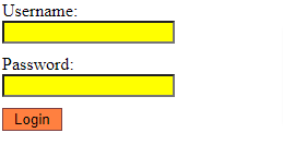
The attribute selectors are especially helpful for styling forms without class or id. For example, let’s look at the below code:

input[type="text"], input[type="password"] {
    width: 150px;
    display: block;
    margin-bottom: 10px;
    background: yellow;
}
input[type="submit"] {
    padding: 2px 10px;
    border: 1px solid #804040;
    background: #ff8040;
}

Output:

CSS Attribute Selectors example output

The CSS float property and clearing | CSS Floating Property & CSS Clear Property with Examples

The CSS float property and clearing

This tutorial helps you to understand and learn what is CSS float property and CSS clear property with Example programs. The CSS floatproperty defines how an element should float. The CSS clearproperty defines what elements can float beside the cleared element and on which side. Also, collect more information from the direct links available below:

The FLOAT Property

The float property is used for positioning and formatting content e.g. let an image float left to the text in a container.

The float property can have one of the following values:

  • left – The element floats to the left of its container
  • right – The element floats to the right of its container
  • none – The element does not float (will be displayed just where it occurs in the text). This is default
  • inherit – The element inherits the float value of its parent

In its simplest use, thefloatproperty can be used to wrap text around images.

Also Check: 

FLOAT RIGHT Syntax:

img {
  float: right;
}

Example Code (using inline styling)

<!DOCTYPE html>
<html lang="en">
  <head>
    <meta charset="UTF-8" />
    <meta http-equiv="X-UA-Compatible" content="IE=edge" />
    <meta name="viewport" content="width=device-width, initial-scale=1.0" />
    <title>Document</title>
  </head>
  <body>
    <img
      src="https://upload.wikimedia.org/wikipedia/commons/thumb/b/b6/Image_created_with_a_mobile_phone.png/1200px-Image_created_with_a_mobile_phone.png"
      alt=""
      style="float: right; height: 20%; width: 20%"
    />
    <p style="font-size: 20px">
      Lorem ipsum dolor sit amet, consectetur adipiscing elit. Phasellus
      imperdiet, nulla et dictum interdum, nisi lorem egestas odio, vitae
      scelerisque enim ligula venenatis dolor. Maecenas nisl est, ultrices nec
      congue eget, auctor vitae massa. Fusce luctus vestibulum augue ut aliquet.
      Mauris ante ligula, facilisis sed ornare eu, lobortis in odio. Praesent
      convallis urna a lacus interdum ut hendrerit risus congue. Nunc sagittis
      dictum nisi, sed ullamcorper ipsum dignissim
    </p>
  </body>
</html>

So the output would be :

FLOAT LEFT Syntax:

img{
 float:left;
}

Example program (using inline styling)

<!DOCTYPE html>
<html lang="en">
  <head>
    <meta charset="UTF-8" />
    <link rel="stylesheet" href="style.css" />
    <meta http-equiv="X-UA-Compatible" content="IE=edge" />
    <meta name="viewport" content="width=device-width, initial-scale=1.0" />
    <title>Document</title>
  </head>
  <body>
    <img
      src="https://upload.wikimedia.org/wikipedia/commons/thumb/b/b6/Image_created_with_a_mobile_phone.png/1200px-Image_created_with_a_mobile_phone.png"
      alt=""
      style="float: left; height: 20%; width: 20%"
    />
    <p style="font-size: 20px">
      Lorem ipsum dolor sit amet, consectetur adipiscing elit. Phasellus
      imperdiet, nulla et dictum interdum, nisi lorem egestas odio, vitae
      scelerisque enim ligula venenatis dolor. Maecenas nisl est, ultrices nec
      congue eget, auctor vitae massa. Fusce luctus vestibulum augue ut aliquet.
      Mauris ante ligula, facilisis sed ornare eu, lobortis in odio. Praesent
      convallis urna a lacus interdum ut hendrerit risus congue. Nunc sagittis
      dictum nisi, sed ullamcorper ipsum dignissim
    </p>
  </body>
</html>

Output:

Example – Float Next To Each Other

Usually, div elements will be presented on top of each other. But, if we use float: left we can let elements float next to each other. So, check out the below program

div {
  float: left;
  padding: 15px;
}

.div1 {
  background: red;
}

.div2 {
  background: yellow;
}

.div3 {
  background: green;
}

The CLEAR Property

The clearproperty specifies what elements can float beside the cleared element and on which side.

The clearproperty can have one of the following values:

  • none – Allows floating elements on both sides. This is default
  • left – No floating elements allowed on the left side
  • right- No floating elements allowed on the right side
  • both – No floating elements allowed on either the left or the right side
  • inherit – The element inherits the clear value of its parent

The most common way to use the clear property is after you have used a float property on an element.

The following example clears the float to the left. This means that no floating elements are allowed on the left side (of the div):

<!DOCTYPE html>
<html>
  <head>
    <style>
      div {
        border: 3px solid #4caf50;
        padding: 5px;
      }

      .img1 {
        float: right;
      }

      .clearfix {
        overflow: auto;
      }

      .img2 {
        float: right;
      }
    </style>
  </head>
  <body>
    <h2>Clearfix</h2>

    <p>
      In this example, the image is taller than the element containing it, and
      it is floated, so it overflows outside of its container:
    </p>

    <div>
      <img
        class="img1"
        src="https://upload.wikimedia.org/wikipedia/commons/thumb/b/b6/Image_created_with_a_mobile_phone.png/1200px-Image_created_with_a_mobile_phone.png"
        alt="Pineapple"
        width="170"
        height="170"
      />
      Lorem ipsum dolor sit amet, consectetur adipiscing elit. Phasellus
      imperdiet, nulla et dictum interdum, nisi lorem egestas odio, vitae
      scelerisque enim ligula venenatis dolor. Maecenas nisl est, ultrices nec
      congue eget, auctor vitae massa. Fusce luctus vestibulum augue ut aliquet.
      Mauris ante ligula, facilisis sed ornare eu, lobortis in odio. Praesent
      convallis urna a lacus interdum ut hendrerit risus congue. Nunc sagittis
      dictum nisi, sed ullamcorper ipsum dignissim
    </div>

    <p style="clear: right">
      Add a clearfix class with overflow: auto; to the containing element, to
      fix this problem:
    </p>

    <div class="clearfix">
      <img
        class="img2"
        src="https://upload.wikimedia.org/wikipedia/commons/thumb/b/b6/Image_created_with_a_mobile_phone.png/1200px-Image_created_with_a_mobile_phone.png"
        alt="Pineapple"
        width="170"
        height="170"
      />
      Lorem ipsum dolor sit amet, consectetur adipiscing elit. Phasellus
      imperdiet, nulla et dictum interdum, nisi lorem egestas odio, vitae
      scelerisque enim ligula venenatis dolor. Maecenas nisl est, ultrices nec
      congue eget, auctor vitae massa. Fusce luctus vestibulum augue ut aliquet.
      Mauris ante ligula, facilisis sed ornare eu, lobortis in odio. Praesent
      convallis urna a lacus interdum ut hendrerit risus congue. Nunc sagittis
      dictum nisi, sed ullamcorper ipsum dignissim
    </div>
  </body>
</html>
.clearfix {
  overflow: auto;
}

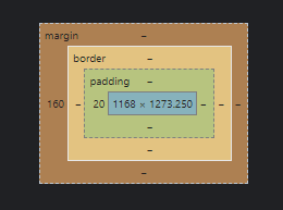
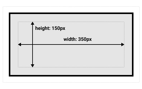
Output image(s), after floating them, explained with margins.

Techniques for Clearing Floats

Below are some of the useful & helpful clearing floats techniques that we need typically at sometimes:

  • The Empty Div Method
  • The Overflow Method
  • The Easy Clearing Method
Categories CSS

CSS Colors | Named Colors in CSS | Ultimate Guide to Learn CSS Color Names with Example

CSS Colors

The default HTML pages that are rendered into the browser are pretty bland. For example, it’s just a web page using black and white content and blue links.

We can add colors to CSS to make the webpage more attractive.

For colors in CSS, we have properties like:

  • color
  • background-color
  • border-color

All of them accept the color value when it has in various forms.

This Tutorial of CSS Colors includes the following: 

CSS <color> Keyword

A <color> can be determined in any of the following ways:

  • Applying a keyword (such as blue or transparent)
  • Using the HSL cylindrical-coordinate system (through the hsl() and hsla() functional notations)
  • Using the RGB cubic-coordinate system (via the #-hexadecimal or the rgb() and rgba()functional notations)

The list of 17 original CSS Colors are listed as follows:

Color Keyword Hex Value
black #000000
gray #808080
silver #c0c0c0
white #ffffff
maroon #800000
red #ff0000
purple #800080
fuchsia #ff00ff
green #008000
lime #00ff00
olive #808000
yellow #ffff00
navy #000080
blue #0000ff
teal #008080
aqua #0000ff
orange #ffa500

Syntax

The syntax of the <color> datatype is defined using one of the options enlisted below.

For Example:

p {
  color: red;
}

Read More:

Named colors

Previously, CSS started with 16 colors but now we have a wide range of color names list. There are some predefined colors that we can just assign to the CSS, like:

  • aliceblue
  • antiquewhite
  • aqua
  • aquamarine
  • azure
  • beige
  • bisque
  • black
  • blanchedalmond
  • blue
  • blueviolet
  • brown
  • burlywood
  • cadetblue
  • chartreuse
  • chocolate
  • coral
  • cornflowerblue
  • cornsilk
  • crimson
  • cyan
  • darkblue
  • darkcyan
  • darkgoldenrod
  • darkgray
  • darkgreen
  • darkgrey
  • darkkhaki
  • darkmagenta
  • darkolivegreen
  • darkorange
  • darkorchid
  • darkred
  • darksalmon
  • darkseagreen
  • darkslateblue
  • darkslategray
  • darkslategrey
  • darkturquoise
  • darkviolet
  • deeppink
  • deepskyblue
  • dimgray
  • dimgrey
  • dodgerblue
  • firebrick
  • floralwhite
  • forestgreen
  • fuchsia
  • gainsboro
  • ghostwhite
  • gold
  • goldenrod
  • gray
  • green
  • greenyellow
  • grey
  • honeydew
  • hotpink
  • indianred
  • indigo
  • ivory
  • khaki
  • lavender
  • lavenderblush
  • lawngreen
  • lemonchiffon
  • lightblue
  • lightcoral
  • lightcyan
  • lightgoldenrodyellow
  • lightgray
  • lightgreen
  • lightgrey
  • lightpink
  • lightsalmon
  • lightseagreen
  • lightskyblue
  • lightslategray
  • lightslategrey
  • lightsteelblue
  • lightyellow
  • lime
  • limegreen
  • linen
  • magenta
  • maroon
  • mediumaquamarine
  • mediumblue
  • mediumorchid
  • mediumpurple
  • mediumseagreen
  • mediumslateblue
  • mediumspringgreen
  • mediumturquoise
  • mediumvioletred
  • midnightblue
  • mintcream
  • mistyrose
  • moccasin
  • navajowhite
  • navy
  • oldlace
  • olive
  • olivedrab
  • orange
  • orangered
  • orchid
  • palegoldenrod
  • palegreen
  • paleturquoise
  • palevioletred
  • papayawhip
  • peachpuff
  • peru
  • pink
  • plum
  • powderblue
  • purple
  • rebeccapurple
  • red
  • rosybrown
  • royalblue
  • saddlebrown
  • salmon
  • sandybrown
  • seagreen
  • seashell
  • sienna
  • silver
  • skyblue
  • slateblue
  • slategray
  • slategrey
  • snow
  • springgreen
  • steelblue
  • tan
  • teal
  • thistle
  • tomato
  • turquoise
  • violet
  • wheat
  • white
  • whitesmoke
  • yellow
  • yellowgreen

also transparent and currentColor which inherits the border-color for example.

We have plenty of options instead of these Named colors.

RGB and RGBa Color Values

We can usergb()function to get color in the form of RGB which is base on three different colors i.e red, green, and blue. From 0 to 255:

a {
  color: rgb(255, 125, 25);
    background-color: rgb(125,100, 200);
}

The below table is an example to display few colors utilizing RGB values.

Color Color RGB
rgb(0,0,0)
rgb(255,0,0)
rgb(0,255,0)
rgb(0,0,255)
rgb(255,255,0)
rgb(0,255,255)
rgb(255,0,255)
rgb(192,192,192)
rgb(255,255,255)

rgba() lets us use the alpha channel that creates a transparency effect. That can be a number from 0 to 1:

a {
    background-color: rgba(100, 200, 150, 0.5);
}

Hexadecimal notation

Probably the most common (yet least intuitive) way to specify colors in CSS is to use their hexadecimal (or hex) values. Hex values are actually just a different way to represent RGB values. Instead of using three numbers between 0 and 255, you use six hexadecimal numbers. Hex numbers can be 0-9 and A-F. Hex values are always prefixed with a # symbol.

ul { color: #8050c8; }    /* purple */

Shorthand Notation for Hex Values

For instance, in case both digits of the red, green, and blue values are the same, then you may utilize the short three-digit notation as shown in the below example codes.

p { color: #000; }     /* black same as #000000 */
p { color: #fff; }    /* white same as #ffffff */
p { color: #f00; }     /* red: same as #ff0000 */
h1 { color: #0f0; }    /* lime: same as #00ff00 */
ul { color: #ff0; }    /* yellow: same as #ffff00 */

HSL and HSLa color codes

The HSL color model is one of the least used, but gaining traction because can be more intuitive to use when working with shades and color adjustments.

HSL stands for hue, saturation, and lightness. Hue is defined by a color wheel. Each color represents a degree on the wheel.

Example:

a { background-color: hsl(240,100%, 75%); } /* shade of blue */

HSLA is simply the HSL color model with the addition of an alpha channel. This works exactly the same way as the alpha channel in RGBA.

a { background-color: hsla(240,100%, 75%, 0.5); } /* shade of blue */

Example Program using CSS Colors Properties

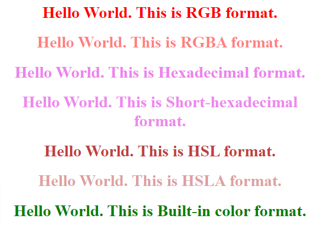
Let’s see an example of CSS colors, which covers the above properties from below.

<html>   
    <head>   
        <title>CSS hsl color property</title>   
        <style>   
            h1{   
                text-align:center;   
            }   
            #rgb{  
              color:rgb(255,0,0);  
            }  
            #rgba{  
              color:rgba(255,0,0,0.5);  
            }  
            #hex{  
              color:#EE82EE;  
            }  
            #short{  
              color: #E8E;  
            }  
            #hsl{  
              color:hsl(0,50%,50%);  
            }  
            #hsla{                
              color:hsla(0,50%,50%,0.5);  
            }  
            #built{  
              color:green;  
            }  
        </style>   
    </head>   
    <body>   
        <h1 id="rgb">   
             Hello World. This is RGB format.  
        </h1>   
        <h1 id="rgba">   
          Hello World. This is RGBA format.  
     </h1>   
     <h1 id="hex">   
      Hello World. This is Hexadecimal format.  
 </h1>   
 <h1 id="short">   
  Hello World. This is Short-hexadecimal format.  
</h1>   
 <h1 id="hsl">   
  Hello World. This is HSL format.  
</h1>   
<h1 id="hsla">   
  Hello World. This is HSLA format.  
</h1>   
<h1 id="built">   
  Hello World. This is Built-in color format.  
</h1>   
    </body>   
</html>

Output:

css colors example output

Making a Table Responsive Using CSS | How to Create a Responsive Table using CSS?

Making a Table Responsive Using CSS

Creating a Table can be a quite challenging task especially if we are to make it responsive. Styling the tables can be hectic as not all themes support responsive designs. There is a solution to overcome this and we can use CSS to create responsive designs that fit all screen types. In this tutorial, we have mentioned what is a Responsive Table and How to Create One using CSS by considering necessary syntax, example programs.

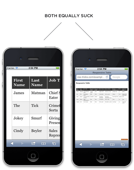
no responsive

Responsive Tables

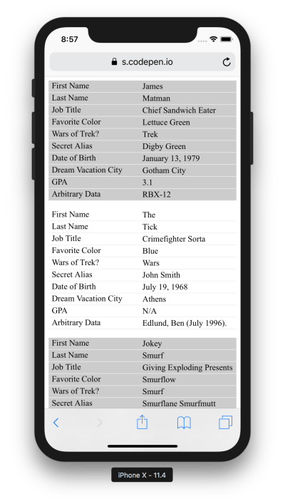
Responsive design is completely about adjusting designs to fit screens of different sizes. A Responsive Table will display a horizontal scroll bar if the screen is small to fit the entire content. You can resize the browser window to see the effect.

Read More:

How to Create a Responsive Table using CSS?

In order to create a Responsive Table, you need to add the container element with overflow-x:auto around the <table>

<div style="overflow-x:auto;">
<table>
...
</table>
</div>

CSS Table Properties

Property Description
border Sets the complete border properties in one declaration
border-collapse It indicates whether or not table borders should be collapsed
border-spacing It specifies the distance between adjacent cells borders
caption-side Indicates the placement of a table caption
empty-cells Indicates whether or not to display borders,  background on the table’s empty cells.
table-layout Indicates the layout algorithm to use for a table

Workaround

We’re going to use “responsive design” principles to detect if the screen is smaller than the maximum height and width of our table. If it is, we will reformat the table.

Just a normal table in HTML is like:

<table>
    <thead>
    <tr>
        <th>First Name</th>
        <th>Last Name</th>
        <th>Job Title</th>
    </tr>
    </thead>
    <tbody>
    <tr>
        <td>Mainak</td>
        <td>Das</td>
        <td>Intern</td>
    </tr>
    <tr>
        <td>Soham</td>
        <td>Debnath</td>
        <td>Intern</td>
    </tr>
    </tbody>
</table>

Some style for the table (particularly for desktops and laptops):

table { 
  width: 100%; 
  border-collapse: collapse; 
}
/* Zebra striping */
tr:nth-of-type(odd) { 
  background: #eee; 
}
th { 
  background: #333; 
  color: white; 
  font-weight: bold; 
}
td, th { 
  padding: 6px; 
  border: 1px solid #ccc; 
  text-align: left; 
}

The small screen i.e the screen smaller than the desktop and/or laptop responsive stuff comes in now. We are aware that our minimum table width is about 760px so we will set up our media query to take effect if it is narrower than that. We will focus on iPads as they are right in that zone.

We are going to force the table not to behave as a table by setting every table-related element to be block-level. Then by placing the zebra striping, we have added, it is like each table row becomes a table in itself, and is as wide as the screen. There will be no more horizontal scrolling! For each “cell”, we’ll use CSS generated content (:before) to apply the label, so that we are aware of what each bit of data means.

/* 
Max width before this PARTICULAR table gets nasty
This query will take effect for any screen smaller than 760px
and also iPads specifically.
*/
@media 
only screen and (max-width: 760px),
(min-device-width: 768px) and (max-device-width: 1024px)  {

    /* Force table to not be like tables anymore */
    table, thead, tbody, th, td, tr { 
        display: block; 
    }
    
    /* Hide table headers (but not display: none;, for accessibility) */
    thead tr { 
        position: absolute;
        top: -9999px;
        left: -9999px;
    }
    
    tr { border: 1px solid #ccc; }
    
    td { 
        /* Behave  like a "row" */
        border: none;
        border-bottom: 1px solid #eee; 
        position: relative;
        padding-left: 50%; 
    }
    
    td:before { 
        /* Now like a table header */
        position: absolute;
        /* Top/left values mimic padding */
        top: 6px;
        left: 6px;
        width: 45%; 
        padding-right: 10px; 
        white-space: nowrap;
    }
    
    /*
    Label the data
    */
    td:nth-of-type(1):before { content: "First Name"; }
    td:nth-of-type(2):before { content: "Last Name"; }
    td:nth-of-type(3):before { content: "Job Title"; }
    td:nth-of-type(4):before { content: "Favorite Color"; }
    td:nth-of-type(5):before { content: "Wars of Trek?"; }
    td:nth-of-type(6):before { content: "Secret Alias"; }
    td:nth-of-type(7):before { content: "Date of Birth"; }
    td:nth-of-type(8):before { content: "Dream Vacation City"; }
    td:nth-of-type(9):before { content: "GPA"; }
    td:nth-of-type(10):before { content: "Arbitrary Data"; }
}

And so, desktops and/ or laptops get the regular table experience. Whereas Mobiles and other smaller screens get reformatted and easier to explore table.

responsive table

CSS Normalizing | Definition, Installation, How to Use it & Difference Between Normalize CSS & Reset CSS

CSS Normalizing

Normalize.css is a small CSS file that provides better cross-browser consistency in the default styling of HTML elements. It’s a modern, HTML5-ready, alternative to the traditional CSS reset. Currently, Normalize.css is used in some form by Twitter Bootstrap, HTML5 Boilerplate, GOV.UK, Rdio, CSS Tricks, and many other frameworks, toolkits, and sites.

In this tutorial, we have shared the complete information about what is CSS Normalizing, how to use it, and Normalize vs Reset CSS.

CSS Normalizing

Normalize.css is a substitute for CSS resets. The project is the product of 100’s of hours of great research by @necolas and @jon_neal. They intended to:

  • Preserve useful browser defaults rather than erasing them.
  • Improve usability with subtle improvements.
  • Normalize styles for a wide range of HTML elements.
  • Explain the code using comments and detailed documentation.
  • Correct bugs and common browser inconsistencies.

It supports a wide range of browsers (including mobile browsers) and includes CSS that normalizes HTML5 elements, typography, lists, embedded content, forms, and tables.

Despite the project being based on the principle of normalization, it uses pragmatic defaults where they are preferable.

The below-written code comes with the library itself:

html {
  line-height: 1.15; /* 1 */
  -webkit-text-size-adjust: 100%; /* 2 */
}

/* Sections
   ========================================================================== */

/**
 * Remove the margin in all browsers.
 */

body {
  margin: 0;
}

/**
 * Render the `main` element consistently in IE.
 */

main {
  display: block;
}

/**
 * Correct the font size and margin on `h1` elements within `section` and
 * `article` contexts in Chrome, Firefox, and Safari.
 */

h1 {
  font-size: 2em;
  margin: 0.67em 0;
}

/* Grouping content
   ========================================================================== */

/**
 * 1. Add the correct box sizing in Firefox.
 * 2. Show the overflow in Edge and IE.
 */

hr {
  box-sizing: content-box; /* 1 */
  height: 0; /* 1 */
  overflow: visible; /* 2 */
}

/**
 * 1. Correct the inheritance and scaling of font size in all browsers.
 * 2. Correct the odd `em` font sizing in all browsers.
 */

pre {
  font-family: monospace, monospace; /* 1 */
  font-size: 1em; /* 2 */
}

/* Text-level semantics
   ========================================================================== */

/**
 * Remove the gray background on active links in IE 10.
 */

a {
  background-color: transparent;
}

/**
 * 1. Remove the bottom border in Chrome 57-
 * 2. Add the correct text decoration in Chrome, Edge, IE, Opera, and Safari.
 */

abbr[title] {
  border-bottom: none; /* 1 */
  text-decoration: underline; /* 2 */
  text-decoration: underline dotted; /* 2 */
}

/**
 * Add the correct font weight in Chrome, Edge, and Safari.
 */

b,
strong {
  font-weight: bolder;
}

/**
 * 1. Correct the inheritance and scaling of font size in all browsers.
 * 2. Correct the odd `em` font sizing in all browsers.
 */

code,
kbd,
samp {
  font-family: monospace, monospace; /* 1 */
  font-size: 1em; /* 2 */
}

/**
 * Add the correct font size in all browsers.
 */

small {
  font-size: 80%;
}

/**
 * Prevent `sub` and `sup` elements from affecting the line height in
 * all browsers.
 */

sub,
sup {
  font-size: 75%;
  line-height: 0;
  position: relative;
  vertical-align: baseline;
}

sub {
  bottom: -0.25em;
}

sup {
  top: -0.5em;
}

/* Embedded content
   ========================================================================== */

/**
 * Remove the border on images inside links in IE 10.
 */

img {
  border-style: none;
}

/* Forms
   ========================================================================== */

/**
 * 1. Change the font styles in all browsers.
 * 2. Remove the margin in Firefox and Safari.
 */

button,
input,
optgroup,
select,
textarea {
  font-family: inherit; /* 1 */
  font-size: 100%; /* 1 */
  line-height: 1.15; /* 1 */
  margin: 0; /* 2 */
}

/**
 * Show the overflow in IE.
 * 1. Show the overflow in Edge.
 */

button,
input { /* 1 */
  overflow: visible;
}

/**
 * Remove the inheritance of text transform in Edge, Firefox, and IE.
 * 1. Remove the inheritance of text transform in Firefox.
 */

button,
select { /* 1 */
  text-transform: none;
}

/**
 * Correct the inability to style clickable types in iOS and Safari.
 */

button,
[type="button"],
[type="reset"],
[type="submit"] {
  -webkit-appearance: button;
}

/**
 * Remove the inner border and padding in Firefox.
 */

button::-moz-focus-inner,
[type="button"]::-moz-focus-inner,
[type="reset"]::-moz-focus-inner,
[type="submit"]::-moz-focus-inner {
  border-style: none;
  padding: 0;
}

/**
 * Restore the focus styles unset by the previous rule.
 */

button:-moz-focusring,
[type="button"]:-moz-focusring,
[type="reset"]:-moz-focusring,
[type="submit"]:-moz-focusring {
  outline: 1px dotted ButtonText;
}

/**
 * Correct the padding in Firefox.
 */

fieldset {
  padding: 0.35em 0.75em 0.625em;
}

/**
 * 1. Correct the text wrapping in Edge and IE.
 * 2. Correct the color inheritance from `fieldset` elements in IE.
 * 3. Remove the padding so developers are not caught out when they zero out
 *    `fieldset` elements in all browsers.
 */

legend {
  box-sizing: border-box; /* 1 */
  color: inherit; /* 2 */
  display: table; /* 1 */
  max-width: 100%; /* 1 */
  padding: 0; /* 3 */
  white-space: normal; /* 1 */
}

/**
 * Add the correct vertical alignment in Chrome, Firefox, and Opera.
 */

progress {
  vertical-align: baseline;
}

/**
 * Remove the default vertical scrollbar in IE 10+.
 */

textarea {
  overflow: auto;
}

/**
 * 1. Add the correct box sizing in IE 10.
 * 2. Remove the padding in IE 10.
 */

[type="checkbox"],
[type="radio"] {
  box-sizing: border-box; /* 1 */
  padding: 0; /* 2 */
}

/**
 * Correct the cursor style of increment and decrement buttons in Chrome.
 */

[type="number"]::-webkit-inner-spin-button,
[type="number"]::-webkit-outer-spin-button {
  height: auto;
}

/**
 * 1. Correct the odd appearance in Chrome and Safari.
 * 2. Correct the outline style in Safari.
 */

[type="search"] {
  -webkit-appearance: textfield; /* 1 */
  outline-offset: -2px; /* 2 */
}

/**
 * Remove the inner padding in Chrome and Safari on macOS.
 */

[type="search"]::-webkit-search-decoration {
  -webkit-appearance: none;
}

/**
 * 1. Correct the inability to style clickable types in iOS and Safari.
 * 2. Change font properties to `inherit` in Safari.
 */

::-webkit-file-upload-button {
  -webkit-appearance: button; /* 1 */
  font: inherit; /* 2 */
}

/* Interactive
   ========================================================================== */

/*
 * Add the correct display in Edge, IE 10+, and Firefox.
 */

details {
  display: block;
}

/*
 * Add the correct display in all browsers.
 */

summary {
  display: list-item;
}

/* Misc
   ========================================================================== */

/**
 * Add the correct display in IE 10+.
 */

template {
  display: none;
}

/**
 * Add the correct display in IE 10.
 */

[hidden] {
  display: none;
}

How to use normalize.css?

First and foremost, install or download normalize.css from GitHub. After that, there are two main approaches to use it.

Method 1: make use of normalize.css as a starting point for your own project’s base CSS, customizing the values to meet the design’s requirements.

Method 2: insert normalize.css untouched and build upon it, overriding the defaults later in your CSS if required.

Installation of Normalise CSS

  • For node package manager, use the following in a terminal npm install normalise.css
  • For yarn packages, yarn normalise.css  use the following in a terminal

Difference Between Normalize.css and Reset CSS

Here are some of the differences between Normalize.css and Reset CSS. Have a look at the below points:

Normalize.css corrects common bugs

It fixes common desktop and mobile browser bugs that are out of scope for resets.

This includes display settings for HTML5 elements, correctingfont-sizefor preformatted text, SVG overflow in IE9, and many form-related bugs across browsers and operating systems.

Normalize.css doesn’t clutter your debugging tools

A common irritation when using resets is the large inheritance chain that is displayed in browser CSS debugging tools.

Normalize.css is modular

The project is broken down into relatively independent sections, making it easy for you to see exactly which elements need specific styles. Furthermore, it gives you the potential to remove sections if you know they will never be needed by your website.

Normalize.css has extensive documentation

This means that you can find out what each line of code is doing, why it was included, what the differences are between browsers, and more easily run your own tests.

The project aims to help educate people on how browsers render elements by default and make it easier for them to be involved in submitting improvements.

Categories CSS