CSS Box Sizing
The CSS box-sizingproperty allows us to include the padding and border in an element’s total width and height. Also, it helps make building CSS layouts easier and a lot more intuitive.
- box-sizing Property in CSS
- CSS Syntax
- Property Values
- Supported Browsers
- Example Code on CSS box-sizing Property
- With the CSS box-sizing Property
- Without the CSS box-sizing Property
- Helpful Tips about CSS Box-Sizing
box-sizing Property in CSS
The CSS box-sizing property defines how the width and height of an element are calculated: should they include padding and borders, or not.
CSS Syntax:
box-sizing: content-box|border-box|initial|inherit;
Property Values
| Value | Description |
|---|---|
| content-box | Default. The width and height properties (and min/max properties) include only the content. Border and padding are not included |
| border-box | The width and height properties (and min/max properties) includes content, padding, and border |
| initial | Sets this property to its default value. |
| inherit | Inherits this property from its parent element. |
Supported Browsers
The browser supported by the CSS box-sizing property are enlisted below:
- Firefox 29.0 2.0 -Moz-
- Google Chrome 10.0 4.0 -WebKit-
- Opera 9.5
- Internet Explorer 8.0
- Apple Safari 5.1 3.2 -WebKit-
Example Code on CSS box-sizing Property
<!DOCTYPE html>
<html>
<head>
<style>
div.container {
  width: 100%;
  border: 2px solid black;
}

div.box {
  box-sizing: border-box;
  width: 50%;
  border: 5px solid red;
  float: left;
}
</style>
</head>
<body>

<div class="container">
  <div class="box">This div occupies the left half</div>
  <div class="box">This div occupies the right half</div>
  <div style="clear:both;"></div>
</div>

</body>
</html>
Output:

With the CSS box-sizing Property
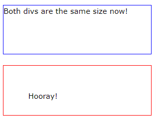
If you set box-sizing: border-box; on an element, padding and border are included in the width and height:
The box-sizing property is a great help. It has 2 values:
border-boxcontent-box
content-box is the default, the one we had for ages beforebox-sizingbecame a thing.
border-box is the new and great thing we are looking for. If you set that on an element.
Here is the same example as above, withbox-sizing: border-box;added to both <div> elements:
.div1 {
  width: 300px;
  height: 100px;
  border: 1px solid blue;
  box-sizing: border-box;
}

.div2 {
  width: 300px;
  height: 100px;
  padding: 50px;
  border: 1px solid red;
  box-sizing: border-box;
}
Output:

Without the CSS box-sizing Property
By default the width and height of an element is calculated as follows:
width + padding + border = actual width of an element
height + padding + border = actual height of an element
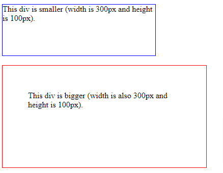
This means: When you fixed the width/height of an element, the element usually appears bigger than you have set (because the element’s border and padding are added to the element’s specified width/height).
The following example shows two<div>elements with the same specified width and height:
<!DOCTYPE html>
<html>
<head>
<style>
.div1 {
  width: 300px;
  height: 100px;
  border: 1px solid blue;
}

.div2 {
  width: 300px;
  height: 100px;
  padding: 50px;
  border: 1px solid red;
}
</style>
</head>
<body>

<div class="div1">This div is smaller (width is 300px and height is 100px).</div>
<br>
<div class="div2">This div is bigger (width is also 300px and height is 100px).</div>

</body>
</html>
Here, the output will be

Helpful Tips about CSS Box-Sizing
- The CSS
box-sizingproperty ensures that padding and borders do not increase the width and height of elements. - Set box-sizing to CSS
border-boxto ensure that the element size includes borders and padding. padding-boxmanaged to apply the width and height of elements to their padding and content. But, Browsers no longer support this property.- Most modern browsers support the
box-sizingproperty. - You can let users control the size of certain elements with the help of the
resizeproperty.

