Creating a Table can be a quite challenging task especially if we are to make it responsive. Styling the tables can be hectic as not all themes support responsive designs. There is a solution to overcome this and we can use CSS to create responsive designs that fit all screen types. In this tutorial, we have mentioned what is a Responsive Table and How to Create One using CSS by considering necessary syntax, example programs.
Responsive Tables
Responsive design is completely about adjusting designs to fit screens of different sizes. A Responsive Table will display a horizontal scroll bar if the screen is small to fit the entire content. You can resize the browser window to see the effect.
Read More:
How to Create a Responsive Table using CSS?
In order to create a Responsive Table, you need to add the container element with overflow-x:auto around the <table>
<div style="overflow-x:auto;">
<table>
...
</table>
</div>
CSS Table Properties
| Property | Description |
|---|---|
| border | Sets the complete border properties in one declaration |
| border-collapse | It indicates whether or not table borders should be collapsed |
| border-spacing | It specifies the distance between adjacent cells borders |
| caption-side | Indicates the placement of a table caption |
| empty-cells | Indicates whether or not to display borders, background on the table’s empty cells. |
| table-layout | Indicates the layout algorithm to use for a table |
Workaround
We’re going to use “responsive design” principles to detect if the screen is smaller than the maximum height and width of our table. If it is, we will reformat the table.
Just a normal table in HTML is like:
<table>
    <thead>
    <tr>
        <th>First Name</th>
        <th>Last Name</th>
        <th>Job Title</th>
    </tr>
    </thead>
    <tbody>
    <tr>
        <td>Mainak</td>
        <td>Das</td>
        <td>Intern</td>
    </tr>
    <tr>
        <td>Soham</td>
        <td>Debnath</td>
        <td>Intern</td>
    </tr>
    </tbody>
</table>
Some style for the table (particularly for desktops and laptops):
table {
  width: 100%;
  border-collapse: collapse;
}
/* Zebra striping */
tr:nth-of-type(odd) {
  background: #eee;
}
th {
  background: #333;
  color: white;
  font-weight: bold;
}
td, th {
  padding: 6px;
  border: 1px solid #ccc;
  text-align: left;
}
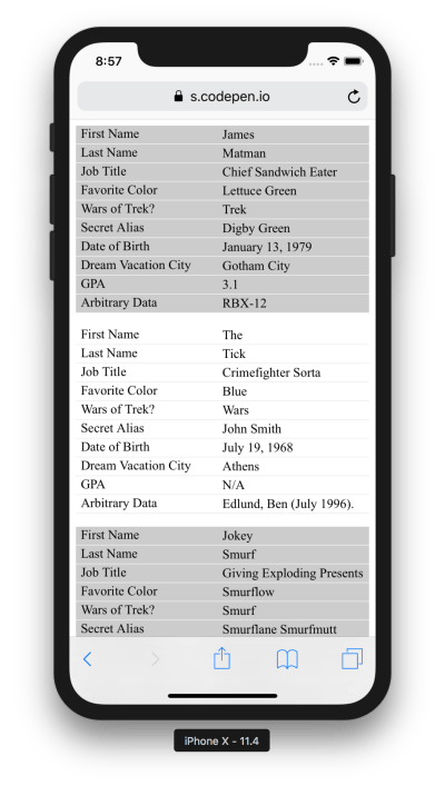
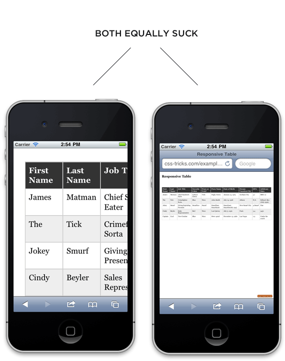
The small screen i.e the screen smaller than the desktop and/or laptop responsive stuff comes in now. We are aware that our minimum table width is about 760px so we will set up our media query to take effect if it is narrower than that. We will focus on iPads as they are right in that zone.
We are going to force the table not to behave as a table by setting every table-related element to be block-level. Then by placing the zebra striping, we have added, it is like each table row becomes a table in itself, and is as wide as the screen. There will be no more horizontal scrolling! For each “cell”, we’ll use CSS generated content (:before) to apply the label, so that we are aware of what each bit of data means.
/*
Max width before this PARTICULAR table gets nasty
This query will take effect for any screen smaller than 760px
and also iPads specifically.
*/
@media
only screen and (max-width: 760px),
(min-device-width: 768px) and (max-device-width: 1024px)  {

    /* Force table to not be like tables anymore */
    table, thead, tbody, th, td, tr {
        display: block;
    }

    /* Hide table headers (but not display: none;, for accessibility) */
    thead tr {
        position: absolute;
        top: -9999px;
        left: -9999px;
    }

    tr { border: 1px solid #ccc; }

    td {
        /* Behave  like a "row" */
        border: none;
        border-bottom: 1px solid #eee;
        position: relative;
        padding-left: 50%;
    }

    td:before {
        /* Now like a table header */
        position: absolute;
        /* Top/left values mimic padding */
        top: 6px;
        left: 6px;
        width: 45%;
        padding-right: 10px;
        white-space: nowrap;
    }

    /*
    Label the data
    */
    td:nth-of-type(1):before { content: "First Name"; }
    td:nth-of-type(2):before { content: "Last Name"; }
    td:nth-of-type(3):before { content: "Job Title"; }
    td:nth-of-type(4):before { content: "Favorite Color"; }
    td:nth-of-type(5):before { content: "Wars of Trek?"; }
    td:nth-of-type(6):before { content: "Secret Alias"; }
    td:nth-of-type(7):before { content: "Date of Birth"; }
    td:nth-of-type(8):before { content: "Dream Vacation City"; }
    td:nth-of-type(9):before { content: "GPA"; }
    td:nth-of-type(10):before { content: "Arbitrary Data"; }
}
And so, desktops and/ or laptops get the regular table experience. Whereas Mobiles and other smaller screens get reformatted and easier to explore table.