The Object getOwnPropertyDescriptors() method | JavaScript Object.getOwnPropertyDescriptors() Method Syntax with Example

The Object getOwnPropertyDescriptors() method

Object.getOwnPropertyDescriptors(obj) accepts an object, and returns a new object that provides a list of the descriptors. Also, this method states all own (non-inherited) properties descriptors of an object. Stay continue with this tutorial and get complete details about JavaScript Object.getOwnPropertyDescriptors() Method, declaration or syntax, parameters, description, example using getOwnPropertyDescriptors().

JavaScript Object.getOwnPropertyDescriptors() Method

The Object.getOwnPropertyDescriptors() method returns all own property descriptors of a given object. The getOwnPropertyDescriptors() method ignores symbolic properties so this is the biggest difference between getOwnPropertyDescriptors() and getOwnPropertyDescriptor() method.

Do Check: 

Syntax

The syntax of the JavaScript getOwnPropertyDescriptors() method is:

Object.getOwnPropertyDescriptors(obj)

The getOwnPropertyDescriptors()method, signifying a static method, is described applying the Object class name.

getOwnPropertyDescriptors() Parameters

ThegetOwnPropertyDescriptors()method needs in:

obj – It is the object for which to get all own property descriptors.

Return value from getOwnPropertyDescriptors()

JavaScript getOwnPropertyDescriptors() method returns an object containing all own property descriptors of an object. Also, it may return an empty object in case there are no properties.

Browser Support:

Firefox 50
Edge 15
Chrome 54
Opera 41

Example using JavaScript getOwnPropertyDescriptors() Method

let obj = {
  x: 10,
  get number() {
    return this.x;
  },
};

let value = Object.getOwnPropertyDescriptors(obj);
console.log(value);

// getOwnPropertyDescriptors() can be used for shallow clone
let cloneObj = Object.create(
  Object.getPrototypeOf(obj),
  Object.getOwnPropertyDescriptors(obj)
);

console.log(cloneObj); // { x: 10, number: [Getter] }

Output:

{
  x: { value: 10, writable: true, enumerable: true, configurable: true },
  number: {
    get: [Function: get number],
    set: undefined,
    enumerable: true,
    configurable: true
  }
}
{ x: 10, number: [Getter] }

Other Example on getOwnPropertyDescriptors() in JavaScript

const dog = {}
Object.defineProperties(dog, {
  breed: {
    value: 'Siberian Husky'
  }
})
Object.getOwnPropertyDescriptors(dog)
/*
{
  breed: {
    value: 'Siberian Husky',
    writable: false,
    enumerable: false,
    configurable: false
  }
}
*/

Use Case for Object.getOwnPropertyDescriptors() – Copying Properties into an object 

There is one use case that makes this property very useful. ES2015 gave us Object.assign(), which copies all enumerable own properties from one or more objects, and returns a new object. However, there is a problem with that, because it does not correctly copy properties with non-default attributes.

If an object for example has just a setter, it’s not correctly copied to a new object, using Object.assign(). For example with this object:

const person1 = {
  set name(newName) {
    console.log(newName)
  }
}

This copy attempt won’t work:

const person2 = {}
Object.assign(person2, person1)

But this will work and copy over the setter correctly:

const person3 = {}
Object.defineProperties(person3, Object.getOwnPropertyDescriptors(person1))

As you can see with a console test:

person1.name = 'x'
"x"
person2.name = 'x'
person3.name = 'x'
"x"

person2 misses the setter, it was not copied over.

The same limitation goes for shallow cloning objects with Object.create().

How to Replace all Occurrences of a String in JavaScript? | Using JavaScript RegEx(), Spilt() & Join() Methods

How to Replace all Occurrences of a String in JavaScript

From this tutorial, beginners or experienced programmers can easily gain complete knowledge on how to replace all occurrences of a string in javascript. Make use of these available direct links and directly jump into the respective stuff related to the Javascript program related to all Occurrences of a String.

How to Replace all Occurrences of a String in JavaScript?

There are two proper ways to replace all occurrences of a string in JavaScript. Below, we have described them neatly including an example program. Okay, Let’s have a look at these methods and learn the javascript program to replace all occurrences of a string.

  1. Using a Regular Expression (RegEx)
  2. Using JavaScript Split() and Join() method

Using a Regular Expression (RegEx)

String.replace(/<TERM>/g, '')

This works as a case sensitive substitution.

For example,

const phrase = "I love my dog! Dogs are great";
const stripped = phrase.replace(/dog/g, "");
console.log(stripped);

The output would be

I love my ! Dogs are great

To perform a case insensitive replacement, use the i option,

const phrase = "I love my dog! Dogs are great";
const stripped = phrase.replace(/dog/gi, "");
console.log(stripped);

The output would be

I love my ! s are great

NOTE: Remember that if the string contains some special characters, it won’t play well with regular expressions, so the suggestion is to escape the string using this function.

Do Check:

Using JavaScript Split() and Join() method

An alternative solution, albeit slower than the regex, is using two JavaScript functions.

The first is split(), which truncates a string when it finds a pattern (case sensitive), and returns an array with the tokens:

const phrase = "I love my dog! Dogs are great";
const tokens = phrase.split("dog").join();

console.log(tokens);

The final output would however be the same. (case sensitive)

I love my ! Dogs are great

React Native Vs Xamarin. What to choose for cross-platform app development?

INTRODUCTION

React Native and Xamarin are two of the top cross-platform frameworks for mobile app development. Cross-platform app development by itself is relevant in the industry because of how it allows businesses to build the same app for different OS platforms simultaneously. To help you make a better choice, I’ve compared React Native vs Xamarin in terms of how they fare in cross-platform application development services.

Businesses often get confused between the choice for cross-platform tools, as some are better for android app developers, while others are often preferred by iOS app developers. However, React Native and Xamarin are two of the best frameworks suited to both the categories, so long as businesses can hire expert iOS developers or those in the domain of android development.


Why do we need to compare React Native Vs Xamarin?

We need to compare React Native Vs Xamarin because making one choice out of either makes a significant difference in how your cross-platform app mobile application will be developed and deployed.

Your project may have specific requirements for which the only one of these frameworks might be suitable. Or perhaps your desired mobile app would need some specific functionalities that could only be delivered by either of the two.

About React Native

React Native is a cross-platform mobile app development framework based on the React library supported by Facebook. React Native uses the same fundamental UI blocks used in Android and iOS apps. So an app built with React Native would be way better than just a hybrid app or a mobile web app. Apps built using React Native uses a JavaScript codebase, but closely resemble native apps built with Swift (for iOS) and Java/Kotlin (for Android).


About Xamarin

Xamarin is a cross-platform mobile app development framework launched way back in 2011 by the company Xamarin. It was later acquired by Microsoft in 2013. Since then, Microsoft integrated Xamarin into its Visual Studio development interface. Xamarin uses the C# language as a base for app development and contains the underlying platform SDKs for both Android & iOS.


Comparison between React Native Vs Xamarin

So let’s get right into the comparison between React Native vs Xamarin. By the time you finish reading this, you’d have a clear idea which reaches among these would be perfect for your cross-platform mobile app!


React Native vs Xamarin: Availability

React Native: React Native is undoubtedly the winner here since it’s an open-source JavaScript-based framework and available for both iOS and Android platforms.

Xamarin: Xamarin too, like React native is open-source, but it wasn’t always so. Additionally, React native’s developer community is much larger compared to the former, so it gets outmatched here.

Winner- React Native

React Native vs Xamarin: Technology used

React Native is a JavaScript-based framework, so it leverages one of the most popular, the most commonly used languages in web development. This also means that developers with hands-on experience in JavaScript can easily get into mobile app development with React Native. For business, most importantly- it means a huge amount of developer applications to choose from, and no shortage of skilled coders.

The Xamarin platform uses C# programming language along with the .NET framework. Having support from Microsoft also means that it can be used within the Visual Studio environment. That offers developers some nifty tools such as a rich editor, native platform integration and a decent set of debugging tools.

Winner- Let’s call a draw on this one

React Native vs Xamarin: Popularity

Since we are in the digital world, the best metric for measuring popularity would be online search trends.

According to the statistical data and research on google, developers are looking to learn, or wanting to know about. They clearly tell me that people seem more interested in React Native as compared to Xamarin.

Winner- React Native

React Native vs Xamarin: Market Support

React Native: In a survey of over 90,000 developers by StackOverflow, React Native came to be the 6th most popular framework claiming 10.5% of the votes. It was also voted as 8th most loved cross-platform application development frameworks with a share of 62.5% of votes. Additionally, React Native was also voted as the 3rd most wanted framework with 13.1% of votes, and surprisingly also chosen as 11th most dreaded framework by 37.5% of developers.

Xamarin: Xamarin fares much terribly as compared to React Native in the above-mentioned Stack OverFlow survey. It was the 10th most popular cross-platform application development framework with 6.5% of votes, 4 ranks behind React Native. Xamarin was voted to be the 15th most loved framework with 48.3% of votes, once again 9 ranks behind its competitor here. With 4.9% votes, Xamarin secured the 11th position for the most wanted framework, yet again 8 positions behind React Native.

Most surprisingly though, Xamarin was considered the 5th most dreaded programming language by 51.7% developers. This time, it was 6 positions higher than React Native, but not exactly for a metric where one would want to rank at the top.

Winner- React Native

React Native vs Xamarin: Code Compilation

React Native: React native uses JIT (Just-in-time) compilation for Android app development. But for iOS apps, it has to directly interpret the JS code as Apple restricts execution of dynamically generated codes on its devices.

Xamarin: Things are a bit different in the case of Xamarin. The C# codebase of the framework makes use of JIT for android apps and has an even better alternative for iOS app development in the form of the AOT (Ahead-of-time) compiler for compiling managed codes. Since the AOT compiler is significantly better than JIT, Xamarin development is the preferred choice for both iOS app developers as well as android developers as far as code compilation is concerned.

Winner- Xamarin

React Native vs Xamarin: Available Components

React Native: It offers a diverse range of available components with adequate documentation to help developers utilize them. These tools include those useful for testing, user interface, type checking, networking, forms among other needs.

Xamarin: Xamarin, too has a broad range of components available at the Xamarin component store. The store, in my view, is better than what React Native offers, albeit with scope for improvement in documentation.

Winner- A Draw

React Native vs Xamarin: Development Environment

React Native: It is highly flexible in this regard and allows developers to use the text editor & IDE of their choice. The best feature by far is the Live Reload feature which lets developers see the effects of changes made to the code in real-time.

Xamarin: Xamarin has the friendlier development environment as it lets developers write code on Windows and even on an iPhone app. Eventually, the code can be compiled on a Mac as Apple doesn’t let developers do so any other way. Xamarin also leverages Microsoft’s Visual Studio and Apple’s XCode for application development.

Winner- Xamarin

React Native vs Xamarin: Cost

React Native: Since React Native is an open-source project, developers and businesses can use the framework and its libraries at absolutely no cost.

Xamarin: Through the Xamarin platform itself is open-source and available for free, but using the Visual Studio comes at a cost for enterprise users.

Winner- React Native

That’s it for the comparison. This comparison between React native vs Xamarin makes it clear that overall, React Native is a much better framework for cross-platform application development.

So let’s sum it up with a list of advantages of React Native vs Xamarin.

Advantages of React native For Cross-Platform App Development

1. Code-Reusability

React Native allows developers to use almost the same code for building both Android & iOS apps. A study estimates that over 80% of the code for a react native app can be reused for both Android & iOS. For a business, code reusability means less time taken for app development, which consequently saves money and resources.

2. The “Live Reload” feature

React Native has a distinguishing feature called “Live Reload”. It basically allows developers to view the changes made by code to the application in real-time! Take, for example- if a developer is using two monitors while working on react-native, they can make changes to the code on one screen and the other screen would instantly display the changes in the output.

Live Reload makes building an app much faster, fun, and enables developers to fix bugs at an unmatched pace.

3. Supportive developer Community

Being an open-source JavaScript framework built to meet a specific need, React Native enjoys incredible support from the developer community. Besides that, React Native also has complete support from Facebook, which makes things even better for the long run.

Advantages of Xamarin for cross-platform app development

1. Leveraging C#

C# is a modern-day, simple, object-oriented, type-safe programming language that is void of verbose or boilerplate type annotations. When combined with the .NET framework, c# provides an asynchronous development environment in the Visual Studio.

2. The Xamarin Component Store

The Xamarin Component store hosts tons of components, ranging from UI CONTROLS, third-party services, libraries to small apps for integration. It is built right into the Xamarin Studio, and available as Visual Studio extension.

React Native is the best choice for cross-platform app development

With its amazing market support from both developers and businesses, availability, popularity and cost-effectiveness, React native is undoubtedly a better choice for cross-platform app development in this comparison between React Native vs Xamarin.

However, Xamarin by itself is no slouch and has the C# language along with better code compilation and development environment that helps make a case for it as a great cross-platform app development framework.


Why Would You Implement A Backend For Your React App?

INTRODUCTION

A React app interacts with the user dynamically. It avoids interruptions of the user experience between successive pages. It rather appears to be a desktop application than a website.
You can do quite a lot with a React web-app. Even if it has no backend.


Why would your app need a backend?

Maybe you need to write your own web-services. Services that access your database. Services that cater to the specific needs of your app. Services that provide the exact data your app needs in the exact format your app needs.

Maybe you need to render your web-app at the server-side. Completely rendered HTML pages enable search engines to crawl the content of your app.

Maybe your app needs to open socket-communication to support real-time events.

There are plenty of good reasons, why your app needs a backend. If your app needs a backend to achieve its purpose, then go ahead.

There are some great backend options for React. Some reasons:

  1. Integration with other 3rd party systems

  2. Scalability

But what if your app does not yet really need a backend?

When you start coding your React app, you may not know for sure whether you would need a backend later.

This best practice in software development tells you to not add anything to your code until you actually need it. You implement the code you need to solve your problem at hand. Not more.

But a backend is nothing that adds to your app. It changes your app! For instance, whether you do client-side rendering or server-side rendering determines the whole architecture of your app. Changing it means rewriting large parts of your app.

One of the best implantation is integrating React with Django, which enhances the website’s look in ways that is just not possible via django. It worth both ways. So, particularly in this case backend needs React and not the other way around.

Another implementation when React does need backend is when using cloud storage such as Firebase for storing data securely.


CONCLUSION

If you don’t need a backend right now, then don’t implement it. And once you do, it is not too late to add it.


How to Create Horizontal Scrolling Containers

Making a scrollbar with or without using the in-built function of CSS is always a good challenge, and making a responsive horizontal scrollbar is taking it further towards perfection. In this blog, you will learn how to make a responsive scroll bar (slider) using CSS library. Let’s get started.

Creating Horizontal Scrolling Containers the Right Way

We all like learning how to make new designs using CSS, but still it is recommended to know some basics of CSS and HTML beforehand before progressing further towards our blog.

Note: There are two ways to make a horizontal scrollbar, one is using the webkit that is included in the CSS library, and the method that we are going to use, that is manual manipulation method using CSS properties as we are aiming on a responsive horizontal scrollbar.

But just for the sake of knowledge, here is the easy way to make a horizontal scrollbar presuming you have written a skeleton HTML code and assigned class(es).

::-webkit-scrollbar {
  width: 10px;
}


::-webkit-scrollbar-track {
  background: #f1f1f1;
}


::-webkit-scrollbar-thumb {
  background: #888;
}


::-webkit-scrollbar-thumb:hover {
  background: #555;
}

So, now getting this out of our way, let’s get started towards making our own.

Skelton HTML

First we shall create a basic HTML file where the CSS styling will be implemented, a skeleton design of a HTML file is more than enough to cater our needs.
I have made a section to keep the container component which is to be displayed on the page.

<section>
        <div class="card">
          <h2>Slider Content</h2>
          <p>
            Lorem ipsum dolor sit amet, consectetur adipiselisdo
            eiusmod tempor incididunt ut labore et dolorealienim
            ad minim veniam, quis nostrud exercitation nisi ut
            aliquip ex ea commodo consequat. Duis aute dolor in
            reprehenderit in voluptate velit esseu fugiat nulla
            pariatur. Excepteur sint occaecat cupidataprosunt in
            culpa qui officia deserunt mollit anim id laborum.
          </p>
        </div>
 </section>

This is just one section, but there are copies of many of the similar sections, to display while scrolling.

data-0="transform:translateX(0%)"
data-1000="transform:translateX(-300%)"

This is the code to make the animation smoother, I used skrollr.
Please refer to the documentation to the references link attached below.

Container Styling

.container {
  position: fixed;
  top: 0;
  left: 0;
  width: 100%;
  display: flex;
}

Making it a flex display with position fixed.

Section Styling

.container section {
  min-width: 100%;
  height: auto;
  display: flex;
  justify-content: center;
  align-items: center;
  height: 100vh;
  background-color: #fffee1;
}

Also flex sectional content with items on the center and height to fit the screen.

N-th Child Property

This is used for randomising the background without writing much code, as even and odd can differentiate and put the background accordingly. In our small project it is written as:

.container section:nth-child(odd) {
  background-color: #fffee1;
}
.container section:nth-child(even) {
  background-color: #fce8f4;
}

Heading and Content Styling

.card h2 {
  margin: 0 0 20px;
  padding: 0;
  font-size: 48px;
  text-transform: uppercase;
  color: #044463;
}

.card p {
  font-size: 20px;
  line-height: 1.4em;
  color: black;
}

This is basic CSS styling for the contents of the card component to scroll through.

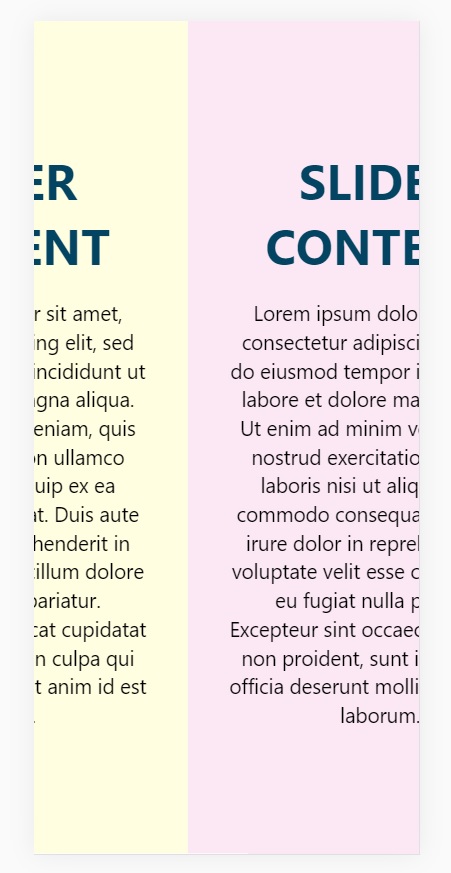
Responsive Design:

@media (max-width: 800px) {
  .container {
    position: absolute;
    display: flex;
    flex-direction: column;
    height: auto;
    transform: none !important;
  }
}

So that it is accessible via mobile/tablet devices also.

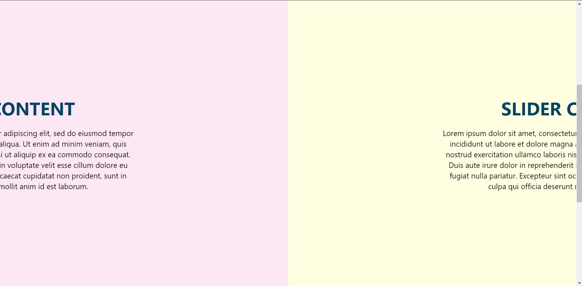
Result

Four ways to Style React Components

Styling Components in React

There are four ways to style React components. They are :

  • CSS StyleSheet
  • Inline Styling
  • CSS Modules
  • styled-components

CSS Stylesheet

When the program is big and complex, then you can use CSS Stylesheet with different className in the React file to keep it understandable and distinguishable. Here is an example below.

import React from 'react';
import './Style.css';

const Box = () => (
  <div className="container">
    <p className="content">Get started with CSS styling</p>
  </div>
);

export default DottedBox;

The above file is a ReactJS file, and below is the style.css file.

.container {
  margin: 40px;
  border: 5px dotted pink;
}

.content {
  font-size: 15px;
  text-align: center;
}

Inline Styling

In React inline styling is not specified as a string, instead they are specified with an object whose key is camelCased, version of style name and value is a string. The example is given below.

import React from 'react';

const divStyle = {
  margin: '40px',
  border: '5px solid gray'
};
const pStyle = {
  fontSize: '15px',
  textAlign: 'center'
};

const Box = () => (
  <div style={divStyle}>
    <p style={pStyle}>Inline style</p>
  </div>
);

export default Box;

The above file is the ReactJs file along with its inline styling. Also we could pass the values directly, as shown below.

import React from 'react';


const Box = () => (
  <div style={{margin: '40px',border: '5px solid pink'}>
    <p style={{fontSize: '15px',textAlign: 'center'}>Get started with inline style</p>
  </div>
);

export default Box;

CSS Modules

A CSS Module is a CSS file in which all class names and animation names are scoped locally by default.

import React from 'react';
import styles from './Style.css';

const Box = () => (
  <div className={styles.container}>
    <p className={styles.content}>Get started with CSS Modules style</p>
  </div>
);

export default Box;

After we import the styles.css file, we access className as we access an object.

:local(.container) {
  margin: 40px;
  border: 5px dashed pink;
}
:local(.content) {
  font-size: 15px;
  text-align: center;
}

To make CSS modules work with Webpack you only have to include the modules mentioned above and add the following loader to your webpack.config.js file

. . .
{
  test: /\.css$/,
  loader: 'style!css-loader?modules&importLoaders=1&localIdentName=[name]__[local]___[hash:base64:5]' 
}
. . .

Styled Components

Styled-components is a library for React and React Native that allows you to use component-level styles in your application that are written with a mixture of JavaScript and CSS. They are quite popular among developers and used a lot to avoid to make another .css file and it is to remove any cluster caused by inline styling if it is have many lines of code.

Steps to install and use before implementation:

  1. npm install styled-components
  2. create a variable by selecting a particular html element where we store our style keys 
  3. Then we use the name of our variable as a wrapper  kind of react component.
import React from 'react';
import styled from 'styled-components';

const Div = styled.div`
  margin: 40px;
  border: 5px outset gray;
  &:hover {
   background-color: yellow;
 }
`;

const Paragraph = styled.p`
  font-size: 15px;
  text-align: center;
`;

const Box= () => (
  <Div>
    <Paragraph> styled-components </Paragraph>
  </Div>
);

export default Box;

Conclusion

All these four styling options of React Components ultimately achieve the same results. All have its pros and cons. It all comes down to personal developer preference and the complexity of your application.

How to Make a Collapsible Menu using only CSS

There are many ways to design a menubar (or sometimes called as a navbar) with CSS, and it is quite simple and easy to understand. The requirements are that you should know the basic fundamentals of HTML and CSS and you are good to go with the article.

Implementing A Pure CSS Collapsible

In this article, I will show a simple way to make a collapsible menu bar using CSS

Skelton HTML

<div class="collapsible-menu">
    <div class="menu-content">
        <ul>
            <li><a href="#"></a>Home</li>
            <li><a href="#"></a>Services</li>
            <li><a href="#"></a>Projects</li>
            <li><a href="#"></a>About</li>
            <li><a href="#"></a>Blog</li>
            <li><a href="#"></a>Contacts</li>
         </ul>
     </div>
</div>

Next, we’ll add a checkbox with a label of Menu above the div that holds the menu content. We’ll style this later to trigger the opening and closing of the menu.

<body>
        <div class="collapsible-menu">
            <input type="checkbox" id="menu">
            <label for="menu">Menu</label>
            <div class="menu-content">
                <ul>
                    <li><a href="#"></a>Home</li>
                    <li><a href="#"></a>Services</li>
                    <li><a href="#"></a>Projects</li>
                    <li><a href="#"></a>About</li>
                    <li><a href="#"></a>Blog</li>
                    <li><a href="#"></a>Contacts</li>
                </ul>
            </div>
        </div>
    </body>

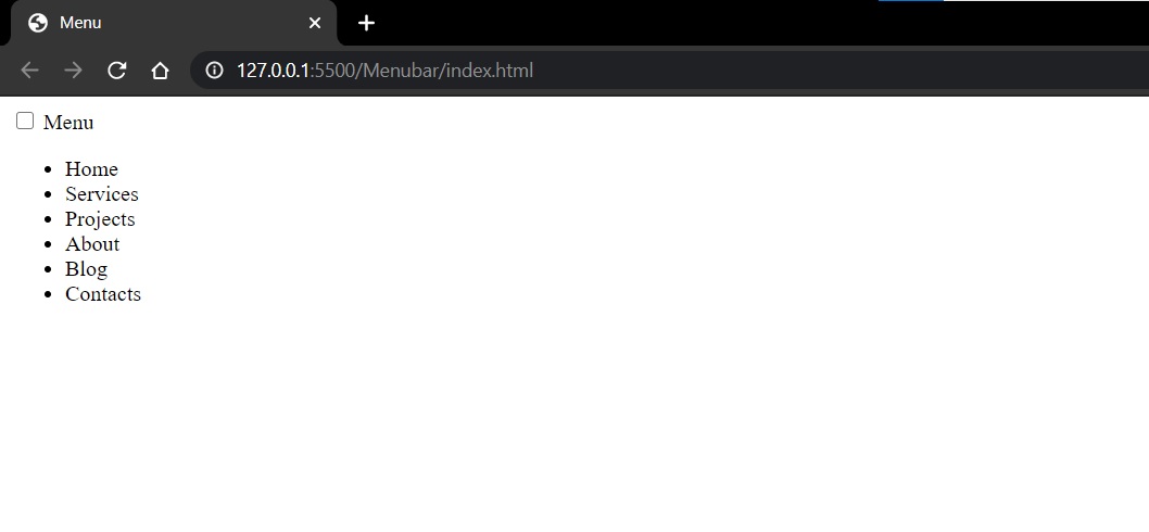
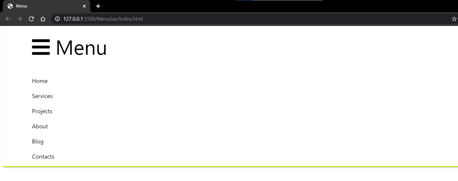
Here’s what the menu looks like without any style indented.

Let’s add some padding, borders and styles to look more like a menu.

.menu-content {
    font-family: -apple-system, BlinkMacSystemFont, "Segoe UI", Roboto, Oxygen,
         Ubuntu, Cantarell, "Open Sans", "Helvetica Neue", sans-serif;
    padding: 0 0 0 50px;
}
.collapsible-menu {
    background-color: rgb(255, 255, 255);
    padding: 0px 30px;
    border-bottom: 3px solid #CDE700;
    box-shadow: 1px 2px 3px rgba(0,0,0,0.2);
}
.collapsible-menu ul {
    list-style-type: none;
    padding: 0;
}
.collapsible-menu a {
    display:block;
    padding: 10px;
    text-decoration: none;
}

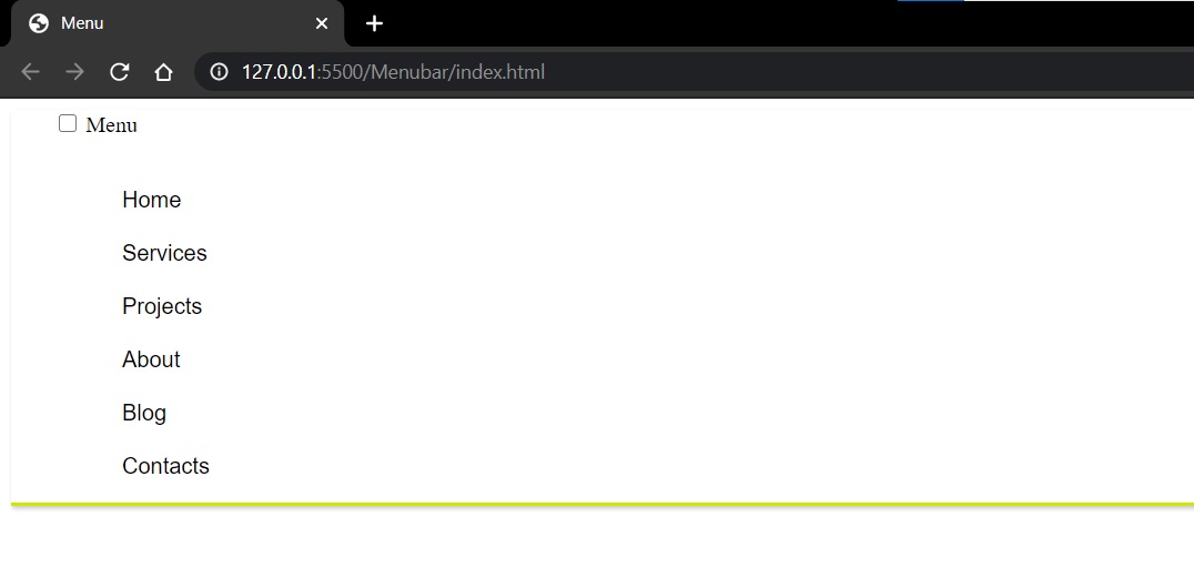
It looks similar to this

We’ll style the label for the checkbox by adding a background image for the hamburger menu. We also want to make the label look like it’s a link even though it’s not, so we’ll use . Lastly, we’ll hide the checkbox using .

.collapsible-menu label {
    font-family: -apple-system, BlinkMacSystemFont, "Segoe UI", Roboto, Oxygen,
     Ubuntu, Cantarell, "Open Sans", "Helvetica Neue", sans-serif;
    font-size: 56px;
    display: block;
    cursor: pointer;
    background: url(menu.png) no-repeat left center;
    padding: 10px 0 10px 50px;
}
input#menu {
    display: none;
}

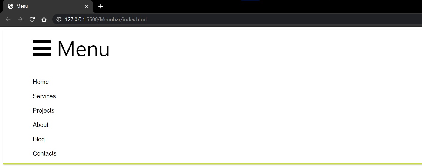
After implementation, the result will look similar to this.

NOTE: I have used the menu bar icon from font awesome CDN.

Collapse and Expand

Now we just have to set the default state of the menu to be collapsed when when checkbox is not checked. We do this by changing the max-height of  to , but have it display a  of  when the checkbox is checked.

.menu-content {
    max-height: 0;
    overflow: hidden;
    padding: 0 0 0 50px;
}
/* Toggle Effect */
input:checked ~ label {
}
input:checked ~ .menu-content {
    max-height: 100%;
}

Unchecked:


Checked:

Conclusion

That’s it! It’s a really quick and easy way to add a collapsible menubar using only HTML and CSS.


Props.children react – A quick intro to React’s props.children

INTRODUCTION

Props.children react: At the first sight, the this.props.children can be a bit overwhelming when studying class based components. As many developers and tutorials use React class based components as it gives access to state, it is very necessary to be familiar with props.children (if you are using stateless functional components) and this.props.children (if you are using class components)

What is ‘children’?

What this.props.children  does is that it displays whatever you include between the opening and closing tags when invoking a component.

A simple example

For example, in a class based component.

import React, { Component } from "react";

class Welcome extends Component {
  render(props) {
    return (
      <div>
        <p>Hello Class Component</p>
        <p>{this.props.children}</p>
      </div>
    );
  }
}
export default Welcome;

Here the component is receiving children from , say, app.js which can be passed in the manner shown below.

import Welcome from "./components/React/Welcome";

function App() {
  return (
    <>
      <div className="App">
        <Welcome children="I am a child" />
      </div>
    </>
  );
}

export default App;

As you can see, when the string “I am a child” is passed through to the Welcome component the output looks similar to what is shown below.

Hello Class Component.

I am a child 

Whenever this component is invoked {props.children} will also be displayed and this is just a reference to what is between the opening and closing tags of the component.


A complex example

I will now demonstrate an error solving method via this.props.children , where if there is an error in code it will display Something Went Wrong  or if it is error free code it will simply say Error Free Code

import React, { Component } from "react";

class ErrorBoundary extends Component {
  constructor(props) {
    super(props);

    this.state = {
      hasError: true,
    };
  }

  componentDidCatch(error, info) {
    console.log(error);
  }

    render() {
        if (this.state.hasError) {
        return <h1>Something Went Wrong</h1>;
        } else if (!this.state.hasError) {
        return (<>
                   <h1>Error Free Code</h1>
                   {this.props.children};
                </>);
        }
    }
    }
export default ErrorBoundary;

So, if there is error in the code, then the first return statement will be implemented and all others will be ignored. Or else, the this.props.children that is passed via another (parent) component will be displayed.


CONCLUSION

I hope this shed a little bit more light on React and how you can use props.children to help you customize your app’s content while still being able to reuse the same components in my case for error checking purposes.


First letter uppercase js – How to uppercase the first letter of a string in JavaScript? | JavaScript Program to Convert the First Letter of a String into UpperCase

How to Uppercase the first letter of a String in JavaScript

First letter uppercase js: In this tutorial, passionate learners can grab the opportunity to study and understand how to write a JavaScript program that converts the first letter of a string into uppercase. Here, we have used two approaches with neat examples and explained How to Capitalize the First Letter of a String in JavaScript. So, check out the below links directly and learn thoroughly.

How to Uppercase the first letter of a string in JavaScript?

How to uppercase first letter in javascript: JavaScript offers several methods to capitalize a string to make the first character uppercase. Discover what are the various ways, and also find out which one is best for using with plain JavaScript.

The most common operation with strings is to make the string capitalized: uppercase its first letter, and leave the rest of the string as-is.

The best way to do this is by a combination of two functions. One uppercases the first letter, and the second slices the string and returns it starting from the second character.

const name = "flavio";
const nameCapitalized = name.charAt(0).toUpperCase() + name.slice(1);
console.log(nameCapitalized);

You can extract that to a function, which also checks if the passed parameter is a string, and returns an empty string if not.

const capitalize = (s) => {
  if (typeof s !== 'string') return ''
  return s.charAt(0).toUpperCase() + s.slice(1)
}

capitalize('flavio') //'Flavio'
capitalize('f')      //'F'
capitalize(0)        //''
capitalize({})       //''

Instead of using s.charAt(0) you could also use string indexing (not supported in older IE versions): s[0].

Some solutions online advocate for adding the function to the String prototype.

String.prototype.capitalize = function() {
  return this.charAt(0).toUpperCase() + this.slice(1)
}

(we use a regular function to make use of this -arrow functions would fail in this case, as this in arrow functions does not reference the current object)

This solution is not ideal, because editing the prototype is not generally recommended, and it’s a much slower solution than having an independent function.

Don’t forget that if you just want to capitalize for presentational purposes on a Web Page, CSS might be a better solution, just add a capitalize class to your HTML paragraph and use:

p.capitalize {
  text-transform: capitalize;
}

Do Refer:

Example 1: Convert the First letter to UpperCase

Let’s see the below program on converting the first letter to uppercase. Here, the user is prompted to enter a string and that string is transferred into the capitalizeFirstLetter() function.

  • First and foremost, the string’s first character is extracted performing charAt() method. Here, str.charAt(0); gives p.
  • The toUpperCase() method changes the string to uppercase. Here, str.charAt(0).toUpperCase(); gives P.
  • The rest of the string is return by the slice() method. Here, str.slice(1); gives Programming
  • Finally, these two values are concatenated using the + operator.
// program to convert first letter of a string to uppercase
function capitalizeFirstLetter(str) {

    // converting first letter to uppercase
    const capitalized = str.charAt(0).toUpperCase() + str.slice(1);

    return capitalized;
}

// take input
const string = prompt('Enter a string: ');

const result = capitalizeFirstLetter(string);

console.log(result);

Output:

Enter a string: programming 
Programming

Example 2: Convert the First letter to UpperCase using Regex

Below the given program, convert the first letter of a string to uppercase by using the regular expression (regex).

  • The regex pattern is /^./ meets the first character of a string.
  • The toUpperCase() method changes the string to uppercase.
// program to convert first letter of a string to uppercase
function capitalizeFirstLetter(str) {

    // converting first letter to uppercase
    const capitalized = str.replace(/^./, str[0].toUpperCase());

    return capitalized;
}

// take input
const string = prompt('Enter a string: ');

const result = capitalizeFirstLetter(string);

console.log(result);

Output:

Enter a string: programming 
Programming

Embed responsive youtube video – Responsive YouTube Video Embeds | Embed Responsive YouTube Videos with Tailwind CSS, Flexbox

Responsive YouTube Video Embeds

Embed responsive youtube video: Are you wonder how to embed a YouTube video on your site and have it responsive, so that it scales down on a mobile device? Then, this page is the best choice. Here, we have shared the explanation about Responsive YouTube Video Embeds with Flexbox in HTML & CSS example codes. Look at this tutorial and make use of the code at the required time.

Embed Responsive YouTube Videos with Tailwind CSS

Embedding YouTube videos into your responsive website may be trouble. iframes are used by YouTube for their embeds and these iFrames require a fixed width and height specified. This is distant from ideal for responsive websites.

And Certainly, even in 2021 YouTube doesn’t provide a method to inevitably resize and scale their embeds, why don’t we take a glance at how we can fix this with Tailwind CSS.

The Aspect Ratio Plugin

May by you don’t have any idea about this but there is a way that you can extend Tailwind’s basic functionality with plugins. Simply install the wanted plugin with npm and insert it in your tailwind.config.js file. Make use of this official @tailwindcss/aspect-ratio plugin and do your YouTube embeds too.

npm install @tailwindcss/aspect-ratio@latest --save-dev

Afterward, enter it in our tailwind.config.js file.

// tailwind.config.js
module.exports = {
  theme: {
    // ...
  },
  plugins: [
    require('@tailwindcss/aspect-ratio'),
    // ...
  ],
}

The above code, provide us a whole set of aspect ratio width and height classes to work with. By default, there are 16 generated aspect-ratio classes. In case those 16 utility classes are not enough for you, you can always extend them.

Default aspect-ratio classes

Width Height
aspect-w-1 aspect-h-1
aspect-w-2 aspect-h-2
aspect-w-3 aspect-h-3
aspect-w-4 aspect-h-4
aspect-w-5 aspect-h-5
aspect-w-6 aspect-h-6
aspect-w-7 aspect-h-7
aspect-w-8 aspect-h-8
aspect-w-9 aspect-h-9
aspect-w-10 aspect-h-10
aspect-w-11 aspect-h-11
aspect-w-12 aspect-h-12
aspect-w-13 aspect-h-13
aspect-w-14 aspect-h-14
aspect-w-15 aspect-h-15
aspect-w-16 aspect-h-16

Responsive Youtube Video Embeds with Flexbox

HTML Code:

<div class="video-media-youtube">
              <ul class="video__container">
                  <li class="video__content">
                      <h2>Twin Souls</h2>
                      <ul class="video-media-youtube-inner">
      					<li class="media__embed">
        						<h3>Twin Souls - Autori - sesja poświęcona Miłości Absolutnej</h3>
        						<div class="video-media-youtube-inner-vi video-media-youtube-inner-vi--ratio">
          						<iframe src="https://www.youtube.com/embed/6iHarkg-SkM" frameborder="0" allow="autoplay; encrypted-media" allowfullscreen></iframe>
        						</div>
      					</li>
      
      					<li class="media__embed">
        						<h3>Twin Souls - Autori - Medytacji Miłości Płomieni </h3>
        						<div class="video-media-youtube-inner-vi video-media-youtube-inner-vi--ratio">
          						<iframe src="https://www.youtube.com/embed/L96UCc0RmdQ" frameborder="0" allow="autoplay; encrypted-media" allowfullscreen></iframe>
        						</div>
      					</li>
    					</ul> 
  				</li>
  
      			<li class="video__content">
    					<h2>Świadomość</h2>
    					<ul class="video-media-youtube-inner">
      					<li class="media__embed">
        						<h3>Siła spokoju</h3>
        						<div class="video-media-youtube-inner-vi video-media-youtube-inner-vi--ratio">
          						<iframe src="https://www.youtube.com/embed/63_lwapPTTY" frameborder="0" allow="autoplay; encrypted-media" allowfullscreen></iframe>
        						</div>
      					</li>
      
      					<li class="media__embed">
        						<h3>David Hawkins</h3>
        						<div class="video-media-youtube-inner-vi video-media-youtube-inner-vi--ratio">
          						<iframe src="https://www.youtube.com/embed/OnQc_GOa57Q?list=PLU6k1z0ryVkqISAOtWMUXm06ez3DmwU_l" frameborder="0" allow="autoplay; encrypted-media" allowfullscreen>
          						</iframe>
        						</div>
      					</li>
    					</ul> 
  				</li>

  				<li class="video__content">
                      <h2>Ciąg Fibonacciego</h2>
                        <ul class="video-media-youtube-inner">
      					<li class="media__embed">
        						<h3>Złota liczba. Boska proporcja</h3>
        						<div class="video-media-youtube-inner-vi video-media-youtube-inner-vi--ratio">
          						<iframe src="https://www.youtube.com/embed/wb7kPaM8cfg" frameborder="0" allow="autoplay; encrypted-media" allowfullscreen></iframe>
        						</div>
      					</li>
      
      					<li class="media__embed">
        						<h3>W naturze ...</h3>
        						<div class="video-media-youtube-inner-vi video-media-youtube-inner-vi--ratio">
          						<iframe src="https://www.youtube.com/embed/M16GINf8A50" frameborder="0" allow="autoplay; encrypted-media" allowfullscreen></iframe>
        						</div>
      					</li>
    					</ul> 
  				</li>

  				<li class="video__content">
            <h2>Medytacje video</h2>
                          <ul class="video-media-youtube-inner">
      					<li class="media__embed">
        						<h3>Zen Meditation Video Warm Japanese Pond</h3>
        						<div class="video-media-youtube-inner-vi video-media-youtube-inner-vi--ratio">
          						<iframe src="https://www.youtube.com/embed/Zawg8nmUpaw" frameborder="0" allow="autoplay; encrypted-media" allowfullscreen></iframe>
        						</div>
      					</li>
      
      					<li class="media__embed">
        						<h3>Sunrise Meditation Video Stunning Colours Mt Fuji</h3>
        						<div class="video-media-youtube-inner-vi video-media-youtube-inner-vi--ratio">
          						<iframe src="https://www.youtube.com/embed/9eRx_XowP1I" frameborder="0" allow="autoplay; encrypted-media" allowfullscreen></iframe>
        						</div>
      					</li>

      					<li class="media__embed">
        						<h3>The Light of The Soul</h3>
        						<div class="video-media-youtube-inner-vi video-media-youtube-inner-vi--ratio">
          						<iframe src="https://www.youtube.com/embed/-3bMgp11HGo" frameborder="0" allow="autoplay; encrypted-media" allowfullscreen></iframe>
        						</div>
      					</li>
      
      					<li class="media__embed">
        						<h3>Ho'oponopono medytacja</h3>
        						<div class="video-media-youtube-inner-vi video-media-youtube-inner-vi--ratio">
          						<iframe src="https://www.youtube.com/embed/2psxMTlFvlA" frameborder="0" allow="autoplay; encrypted-media" allowfullscreen></iframe>
        						</div>
      					</li>
    					</ul> 
  				</li>
                  
                  <li class="video__content">
                      <h2>Święta geometria</h2>
                      <ul class="video-media-youtube-inner">
      					<li class="media__embed">
        						<h3>Boska matematyka</h3>
        						<div class="video-media-youtube-inner-vi video-media-youtube-inner-vi--ratio">
          						<iframe src="https://www.youtube.com/embed/xjCBC-d3kdg?list=PLx9elHolWWO8QVH3EBr3xvyo2sefhocZz" frameborder="0" allow="autoplay; encrypted-media" allowfullscreen></iframe>
        						</div>
      					</li>
      
      					<li class="media__embed">
        						<h3>Wszechświat</h3>
        						<div class="video-media-youtube-inner-vi video-media-youtube-inner-vi--ratio">
          						<iframe src="https://www.youtube.com/embed/X97qVGsOW1Q" frameborder="0" allow="autoplay; encrypted-media" allowfullscreen></iframe>
        						</div>
      					</li>
    					</ul> 
  				</li>

                  <li class="video__content">
                      <h2>Gregg Braden - Przestrzeń Serca</h2>
                      <ul class="video-media-youtube-inner">
      					<li class="media__embed">
        						<h3>Inteligencja i Moc naszych Serc</h3>
        						<div class="video-media-youtube-inner-vi video-media-youtube-inner-vi--ratio">
          						<iframe src="https://www.youtube.com/embed/dw20FTLS8GI" frameborder="0" allow="autoplay; encrypted-media" allowfullscreen></iframe>
        						</div>
      					</li>
      
      					<li class="media__embed">
        						<h3>Serce ma mózg</h3>
        						<div class="video-media-youtube-inner-vi video-media-youtube-inner-vi--ratio">
          						<iframe src="https://www.youtube.com/embed/rZ2qrgdzkJ4" frameborder="0" allow="autoplay; encrypted-media" allowfullscreen></iframe>
        						</div>
      					</li>

      					<li class="media__embed">
        						<h3>Globalna Inicjatywa Koherencji</h3>
        						<div class="video-media-youtube-inner-vi video-media-youtube-inner-vi--ratio">
          						<iframe src="https://www.youtube.com/embed/pa0ML4w87yc?list=PLeYr3xi_RH075sYcxIdi1l7-vhK7IugRK" frameborder="0" allow="autoplay; encrypted-media" allowfullscreen></iframe>
        						</div>
      					</li>
    					</ul> 
  				</li>
				</ul>     
          </div>

CSS Code:

* {
  margin: 0;
  padding: 0;
  box-sizing: border-box;
}

*::before, *::after {
  box-sizing: border-box;
}

html, body {
  width: 100%;
  height: 100%; 
}

li {
  list-style: none;
}

.video-media-youtube {
  width: 100%;
  max-width: 1400px;
  margin: 0 auto;
}

.video__container {
  display: flex;
  flex-direction: column;
  width: 100%; 
  padding: 0 .9375rem;
}

.video__content {
  padding-bottom:  1.25rem;
}

h2 {
  width: 100%;
  text-transform: uppercase;
}

h3::before {
  content: "\f111";
  display: inline-block;
  font-family: 'Font Awesome 5 Free';
  font-size: .375rem;
  font-weight: 900;
  vertical-align: middle;
  transform: translateY(-.125rem);
  padding-right: .9375rem;
}

h3 {
  display: inline-block;
  padding: 20px 0;
}

.video-media-youtube-inner {
  display: flex;
  flex-direction: row;
  flex-wrap: wrap;
  justify-content: center;
  width: 100%;
}

.media__embed {
  flex-basis: 100%;
  padding-bottom: 1.25rem;
}

.video-media-youtube-inner-vi {
  display: block;
  overflow: hidden;
  position: relative;
  height: 0;
  padding: 0;
}

.video-media-youtube-inner-vi--ratio {
  padding-bottom: 75%;
}

.video-media-youtube-inner-vi iframe {
  position: absolute;
  top: 0;
  left: 0;
  bottom: 0;
  width: 100%;
  height: 100%;
}

@media only screen and (min-width: 1024px) {

  .video__container {
    padding: 0 1.25rem;
  }
  
  .video-media-youtube-inner {
    justify-content: space-between;
  }
  
  .media__embed {
    flex-basis: calc(50% - .9375rem);
    padding-bottom: 1.875rem;
  }
}

Responsive YouTube Video Embeds

The problem with embedding YouTube videos is that they are an iframe and iframes need to be given an exact height and width otherwise they will look funky.

And we need to keep the proportions, based on the video aspect ratio.

To have a YouTube video be displayed responsive in your page, first wrap it into a container div:

<div class="video-container">
  <iframe src="https://www.youtube.com/embed/klZNNUz4wPQ" frameborder="0" allow="accelerometer; autoplay; encrypted-media; gyroscope; picture-in-picture" allowfullscreen></iframe>
</div>
.video-container {
    overflow: hidden;
    position: relative;
    width:100%;
}

.video-container::after {
    padding-top: 56.25%;
    display: block;
    content: '';
}

.video-container iframe {
    position: absolute;
    top: 0;
    left: 0;
    width: 100%;
    height: 100%;
}

Calculating aspect ratios

See that magic number56.25%? That’s needed as padding when the aspect ratio of a video is 16:9. (9 is 56.25% of 16).

If your video is 4:3 for example, set it to 75%.

Categories CSS