How to write comments in css – CSS Comments | What You Need to Know About Comments in CSS | How to Work with it?

CSS Comments

How to write comments in css: Comments can assist you to explain and organize your CSS and manage which parts of your stylesheet get used on the front end. Discover how to add them to your code along with the definition, syntax and sample code on CSS Comments.

This Tutorial of CSS Comments includes the following:

Comments in CSS

CSS comments one line: A CSS comment is applied to attach explanatory notes to the code or to stop the browser from interpreting specific parts of the style sheet. By design, comments do not affect the layout of a document.

However, CSS is missing the “line comment” syntax that those languages have, where everything from // to the end of the line is commented out.

Syntax for CSS Comments

Comments can be located wherever white space is provided within a style sheet. They can be utilized on a single line, or traverse multiple lines.

/* Comment */

Example of Comments in Cascading Style Sheet (CSS)

/* A one-line comment */

/*
A comment
which stretches
over several
lines
*/

/* The comment below is used to
   disable specific styling */
/*
span {
  color: blue;
  font-size: 1.5em;
}
*/

Also Refer:

How to work with comments in CSS?

Comments are utilized to explain the code and may improve when you edit the source code at a later date.

Comments are neglected by browsers. A CSS comment is located inside the<style>element, and begins with /* and ends with */:

/* This is a single-line comment */
p {
  color: blue;
}
/* This is
a multi-line
comment */

p {
  color: blue;
}

HTML and CSS Comments

From the HTML tutorial, you studied that you can add comments to your HTML source by using the <!--...-->syntax.

In the below example, we use a mixture of HTML and CSS comments:

<!DOCTYPE html>
<html>
<head>
<style>
p {
  color: red; /* Set text color to red */
}
</style>
</head>
<body>

<h2>My Heading</h2>

<!-- These paragraphs will be red -->
<p>Hello World!</p>
<p>This paragraph is styled with CSS.</p>
<p>CSS comments are not shown in the output.</p>

</body>
</html>

Output:

My Heading

Hello World!

This paragraph is styled with CSS.

HTML and CSS comments are not shown in the output.
Categories CSS

Pre tag wrap – Responsive pre tags in CSS | How to Make Pre Tags 100% Responsive in CSS

Responsive pre tags in CSS

<pre>: The Preformatted Text element

Pre tag wrap: The “pre” of a <pre> tag actually signifies “preformatted text” – which doesn’t say anything regarding what that text is. A <code> tag, semantically, says the text within is code. The demo code of Pre tag using CSS is given below:

pre {
    font-size: .7rem;
    margin: 0;
}

Output:

  L          TE
    A       A
      C    V
       R A
       DOU
       LOU
      REUSE
      QUE TU
      PORTES
    ET QUI T'
    ORNE O CI
     VILISÉ
    OTE-  TU VEUX
     LA    BIEN
    SI      RESPI
            RER       - Apollinaire

Also, this tutorial covers the following stuff regarding Responsive pre tags in CSS:

Attributes of Pre Element

CSS preformatted: This preformatted element (Pre Tag) only involves the global attributes and they are as follows:

cols: Includes the preferred count of characters that a line should have. It was a non-standard synonym of width. To accomplish such an effect, use CSS width instead.
width: Holds the preferred count of characters that a line must-have. However, technically still implemented, this attribute has no visual effect; to accomplish such an effect, use CSS width instead.
wrap: Is a hint indicating how the overflow must happen. In modern browsers, this hint is neglected and no visual effect results in its presence; to achieve such an effect, use CSS white-space instead.

Example on Pre Tag using CSS

<p>Using CSS to change the font color is easy.</p>
<pre>
body {
  color: red;
}
</pre>

Result:

pre tag example result

Do Check:

How to Make Pre Tags 100% Responsive in CSS?

By default the CSS white-space property on the pre tag is set to normal, and to fix this problem we set it to pre-wrap:

pre {
  white-space: pre-wrap;
}

When some words are too long they can still break the layout. To fix this, also add:

pre {
  word-break: break-all;
}

Make “Pre” Text Wrap

By default, Text in <pre> tags doesn’t wrap. For instance, see the code snippet below! If this is making layout problems, one solution is to give the pre block an overflow property to cover the excess or make it scroll. Another solution is to have it wrap.

/* Browser specific (not valid) styles to make preformatted text wrap */		

pre {
 white-space: pre-wrap;       /* css-3 */
 white-space: -moz-pre-wrap;  /* Mozilla, since 1999 */
 white-space: -pre-wrap;      /* Opera 4-6 */
 white-space: -o-pre-wrap;    /* Opera 7 */
 word-wrap: break-word;       /* Internet Explorer 5.5+ */
}
Categories CSS

React bootstrap side navbar – How to Create a Navigation Bar and Sidebar Using React

INTRODUCTION

React bootstrap side navbar: The navbar I focus on will be a sidebar via React. I will guide you through the React project creation. Make sure you have node.js installed in your system.

  1. Make a workspace folder and name it.
  2. Use npx create-react-app navbar to create a new project in the directory.
  3. Navigate inside it by using cd navbar in your IDE, I would recommend using Visual Studio Code.
  4. npm start in terminal to start the localhost server in your browser, I would recommend using Google Chrome.


DEPENDENCIES REQUIRED

React sidebar navigation: Go into package.json file and paste these dependencies in there:

"bootstrap": "^4.3.1",
"react": "^16.10.2",
"react-bootstrap": "^1.0.0-beta.14",
"react-dom": "^16.10.2",
"react-router-dom": "^5.0.1",
"react-scripts": "3.1.1",
"styled-components": "^4.3.2"

Now actually install these dependencies by opening a terminal and typing:

npm install

Paste this CDN link in the <head> tag inside index.html. It is for Font Awesome icons.

<link rel="stylesheet" href="https://use.fontawesome.com/releases/v5.15.3/css/all.css" integrity="sha384-SZXxX4whJ79/gErwcOYf+zWLeJdY/qpuqC4cAa9rOGUstPomtqpuNWT9wdPEn2fk" crossorigin="anonymous">


MAKING COMPONENT STRUCTURE

React menu bar: Right click on the src folder and create a folder called components.

Right click on the components folder and create a Navbar.js file. Paste the code written below.

import React from "react";

export const NavigationBar = () => (
  <nav class="navbar navbar-expand-lg navbar-light bg-light">
    <div class="container-fluid">
      <a class="navbar-brand" href="#">
        Navbar
      </a>
      <button
        class="navbar-toggler"
        type="button"
        data-bs-toggle="collapse"
        data-bs-target="#navbarSupportedContent"
        aria-controls="navbarSupportedContent"
        aria-expanded="false"
        aria-label="Toggle navigation"
      >
        <span class="navbar-toggler-icon"></span>
      </button>
      <div class="collapse navbar-collapse" id="navbarSupportedContent">
        <ul class="navbar-nav me-auto mb-2 mb-lg-0">
          <li class="nav-item">
            <a class="nav-link active" aria-current="page" href="#">
              Home
            </a>
          </li>
          <li class="nav-item">
            <a class="nav-link" href="#">
              Link
            </a>
          </li>
          <li class="nav-item dropdown">
            <a
              class="nav-link dropdown-toggle"
              href="#"
              id="navbarDropdown"
              role="button"
              data-bs-toggle="dropdown"
              aria-expanded="false"
            >
              Dropdown
            </a>
          </li>
          <li class="nav-item">
            <a
              class="nav-link disabled"
              href="#"
              tabindex="-1"
              aria-disabled="true"
            >
              Disabled
            </a>
          </li>
        </ul>
        <form class="d-flex">
          <input
            class="form-control me-2"
            type="search"
            placeholder="Search"
            aria-label="Search"
          />
          <button class="btn btn-outline-success" type="submit">
            Search
          </button>
        </form>
      </div>
    </div>
  </nav>
);

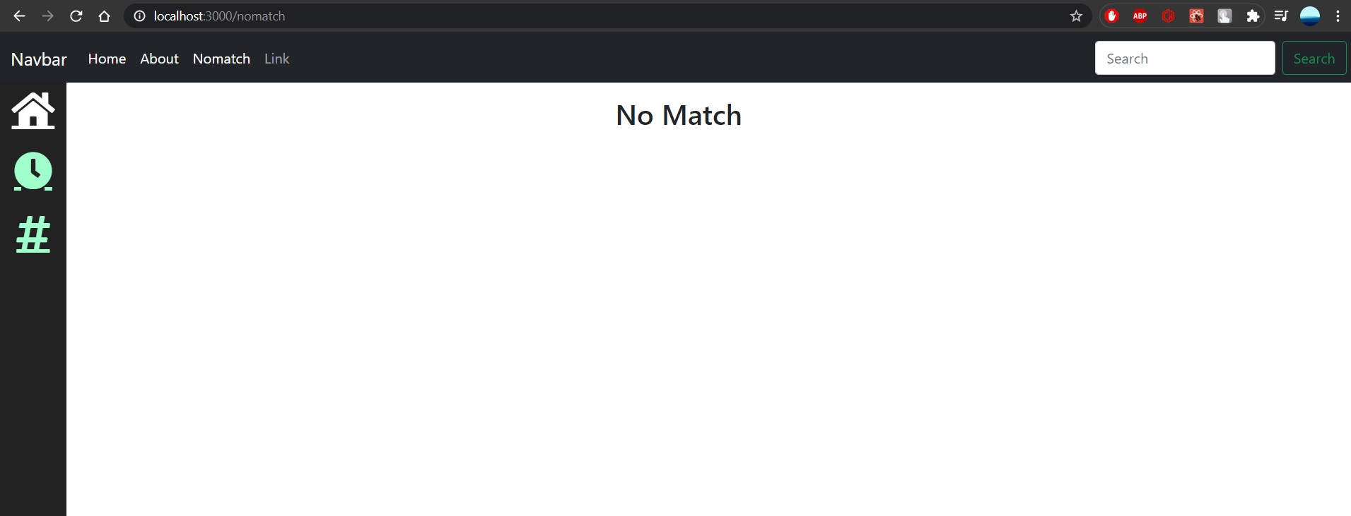
Now the header will look similar to the picture mentioned below.

Routing is how you get from page to page, so paste the code below inside <Router>. It basically says, if on this path, render this particular component:

<Switch>
  <Route exact path="/" component={Home} />
  <Route path="/about" component={About} />
  <Route component={NoMatch} />
</Switch>

This currently breaks the app because we do not have these components. So, let’s add these pages to make sure navigation will work.

Inside of src/components/Pages, create Home.js and paste this inside:

import React from "react";
import styled from "styled-components";
const GridWrapper = styled.div`
  display: grid;
  grid-gap: 10px;
  margin-top: 1em;
  margin-left: 6em;
  margin-right: 6em;
  grid-template-columns: repeat(12, 1fr);
  grid-auto-rows: minmax(25px, auto);
`;
export const Home = (props) => (
  <GridWrapper>
    <p>This is a paragraph and I am writing on the home page</p>
    <p>This is another paragraph, hi hey hello whatsup yo</p>
  </GridWrapper>
);

Inside of src/components/Pages, create About.js and paste this inside:

import React from "react";
import styled from "styled-components";
const GridWrapper = styled.div`
  display: grid;
  grid-gap: 10px;
  margin-top: 1em;
  margin-left: 6em;
  margin-right: 6em;
  grid-template-columns: repeat(12, 1fr);
  grid-auto-rows: minmax(25px, auto);
`;
export const About = () => (
  <GridWrapper>
    <h2>About Page</h2>
    <p>
      State at ceiling lay on arms while you're using the keyboard so this human
      feeds me.
    </p>
    <p>I am a kitty cat, sup, feed me, no cares in the world</p>
    <p>Meow meow, I tell my human purr for no reason but to chase after</p>
  </GridWrapper>
);

Inside of src/components/Pages, create Nomatch.js and paste this inside:

import React from 'react';
import styled from 'styled-components';
const Wrapper = styled.div`
  margin-top: 1em;
  margin-left: 6em;
  margin-right: 6em;
`;
export const NoMatch = () => (
  <Wrapper>
    <h2>No Match</h2>
  </Wrapper>
)

Do not forget to include the components in App.js file.

import { Home } from "./components/Pages/Home";
import { About } from "./components/Pages/About";
import { Nomatch } from "./components/Pages/Nomatch";

Alright, we can actually create the sidebar now.

Inside of components, create Sidebar.js

We know that we want to create a Sidebar component and export it for use inside of App.js. Put this inside Sidebar.js:

import React, { Component } from 'react'

export class Sidebar extends Component {
    render() {
        return (
            <div>
                
            </div>  
        )
    }
}

export default Sidebar

This basically is a class component, which renders a given code.

Then paste the code given below inside the return statement.

<SideNav></SideNav>

Now creating all the components required in separate files namely,  SideNav.js and NavItem.js.

NavItem.js

class NavItem extends React.Component {
  render() {
    return (
    );
  }
}

Inside of render, but above return, type:

const { active } = this.props;

This gets the active variable out of NavItem’s props. Now import the following

import { BrowserRouter as Router, Route, Link } from "react-router-dom";

Inside NavItem’s return, add this:

<StyledNavItem active={active}>
  <Link to={this.props.path} className={this.props.css} onClick={this.handleClick}>
    <NavIcon></NavIcon>
  </Link>
</StyledNavItem>

If you look at the props on <Link>, to is the path to go to, className passes in the CSS for the Font Awesome icon, and onClick will call the handleClick() method. Let’s create that method. Put it above render:

handleClick = () => {
  const { path, onItemClick } = this.props;
  onItemClick(path);
}

This arrow function gets path and onItemClick from NavItem’s props and then calls onItemClick().

Create StyledNavItem. The <Link> tag uses an anchor, so, the anchor selector is used. The only confusing part about the CSS is the part that uses props. It says: using the active prop, decide which of the colors to choose. So, if the home page is active, make the home page icon white:

const StyledNavItem = styled.div`
  height: 70px;
  width: 75px; /* width must be same size as NavBar to center */
  text-align: center; /* Aligns <a> inside of NavIcon div */
  margin-bottom: 0;   /* Puts space between NavItems */
  a {
    font-size: 2.7em;
    color: ${(props) => props.active ? "white" : "#9FFFCB"};
    :hover {
      opacity: 0.7;
      text-decoration: none; /* Gets rid of underlining of icons */
    }  
  }
`;


SideNav.js

Styled components used for styling the sidenav component.

const StyledSideNav = styled.div`
  position: fixed; /* Fixed Sidebar (stay in place on scroll and position relative to viewport) */
  height: 100%;
  width: 75px; /* Set the width of the sidebar */
  z-index: 1; /* Stay on top of everything */
  top: 3.4em; /* Stay at the top */
  background-color: #222; /* Black */
  overflow-x: hidden; /* Disable horizontal scroll */
  padding-top: 10px;
`;

We want SideNav to be a stateful component. This is because it needs to store what the current path is and based on that decide which icon should be selected and colored white.

Create a constructor. In there, create a state that holds the activePath, which we will set to the home path for now, and items that holds the information for our selectable icons

constructor(props) {
  super(props);
  this.state = {
    activePath: '/',
    items: [
      {
        path: '/', 
        name: 'Home',
        css: 'fa fa-fw fa-home',
        key: 1 
      },
      {
        path: '/about',
        name: 'About',
        css: 'fa fa-fw fa-clock',
        key: 2
      },
      {
        path: '/NoMatch',
        name: 'NoMatch',
        css: 'fas fa-hashtag',
        key: 3
      },
    ]
  }  
}
onItemClick = (path) => {
  this.setState({ activePath: path }); /* Sets activePath which causes rerender which causes CSS to change */
}

All this code says is change the activePath by setting the state. If you do not know, whenever you call setState(), React will rerender your component, which will render the change to show you selected a different icon.

Change your render to look like this:

render() {
  const { items, activePath } = this.state;
  return (
    <StyledSideNav>
      {
        /* items = just array AND map() loops thru that array AND item is param of that loop */
        items.map((item) => {
          /* Return however many NavItems in array to be rendered */
          return (
            <NavItem path={item.path} name={item.name} css={item.css} onItemClick={this.onItemClick} /* Simply passed an entire function to onClick prop */ active={item.path === activePath} key={item.key}/>
          )
        })
      }
    </StyledSideNav>
  );
}

Before return, items and activePath are retrieved from the state. In order to render out all NavItems, we loop through all of the items using map().


NOTE: Remember to import all required imports that are used in the files, specially the custom HTML tags.


What is i++ in javascript – JavaScript Increment ++ and Decrement —

What is i++ in javascript: The increment and decrement operators in JavaScript will add one (+1) or subtract one (-1), respectively, to their operand, and then return a value.

Increment & Decrement operators

SYNTAX: Consider ‘x’ to be a variable:

Then,
Increment:  — x++ or ++x
Decrement:  — x– or –x

#NAME?: In the syntax we can see that the — and ++ have been used before and after the variable, so in terms of code, it might look similar to :

// Increment
let a = 1;
a++;
++a;
// Decrement
let b = 1;
b--;
--b;

Using ++/– Before the Variable

i++ javascript: If you want to make the variable increment and decrement before using it, this is the way it has to be done, and in terms of code and example it is demonstrated below.

// Increment
let a = 1;
console.log(++a);    // 2
console.log(a);      // 2
// Decrement
let b = 1;
console.log(--b);    // 0
console.log(b);      // 0

As you can see, that the variable have been incremented/decremented before logging out the result in the first line.

Using ++/– After the Variable

x++ javascript: If you want to make the variable increment and decrement after using it, this is the way it has to be done, and in terms of code and example it is demonstrated below.

// Increment
let a = 1;
console.log(a++);    // 1
console.log(a);      // 2
// Decrement
let b = 1;
console.log(b--);    // 1
console.log(b);      // 0

As you can see, that the variable have been incremented/decremented after logging out the result in the first line.

Conclusion:

Hopefully, my article was helpful, and by now you are clear how the increment and decrement operators works in any programming language.


Background image opacity without affecting text – How to Change Background Image Opacity in CSS without Affecting Text | HTML/CSS

Background image opacity without affecting text: In today’s generation, when making a website, we need to have all the visual effects we can induce in it to make it look more presentable and pleasing to the eyes of all the users who access it. So here I will be writing a blog for developers who are looking to implement background image transparency using CSS and HTML.

CSS Background Opacity Without Affecting the Child Elements

CSS background image opacity without affecting text: We all like learning how to make new designs using CSS, but still, it is recommended to know some basics of CSS and HTML beforehand before progressing further towards our blog.

NOTE:

There is no CSS property that can be used to change the opacity ONLY of the background image.

background: url('img.jpeg');
opacity: 0.5;

The result will be similar to : (faded image)

If we try to use it then it produces blurred unpleasant views which are very displeasing to look at and not production ready. So to overcome it we have to manipulate it indirectly using other CSS properties described below. From the next steps we start designing the HTML and implementing the CSS on how we should do it.

Skelton HTML

Background image opacity without affecting text: First we shall create a basic HTML file where the CSS styling will be implemented, a skeleton design of a HTML file is more than enough to cater our needs. I have made a section to keep the box/card component which is to be displayed on the page.

<section>
      <div class="box">
        <h2>CSS Transparent Background</h2>
        <p>
          Lorem ipsum dolor sit amet, consectetur adipiscing elit, sed do
          eiusmod tempor incididunt ut labore et dolore magna aliquaenim ad
          minim veniam, quis nostrud exercitation ullamco laboris nisi ut
          aliquip ex ea commodo consequat. Duis aute irure dolor in
          reprehenderit in voluptate velit esse cillum dolore eu fuginulla
          pariatur. Excepteur sint occaecat cupidatat non proident, sunt in
          culpa qui officia deserunt mollit anim id est laborum.
        </p>
      </div>
  </section>

Section Styling

section {
  padding: 0, 100px;
  background: url("//some_image");
  height: 100vh;
  /* opacity: 0.25; */
  display: flex;
  justify-content: center;
  align-items: center;
}

Here we could have used opacity property to make it look opaque but we all have seen the discrepancies that it causes while using it directly (refer NOTE). We have made it a flex and justify-content: centre to highlight it with a background.
Moving on to the next section.

Box/Card Component Styling

.box {
  position: relative;
  max-width: 600px;
  padding: 50px;
  /* background: url("img.jpeg"); */
  /* opacity: 0.75; */
  background: rgba(255, 255, 255, 0.2);
  box-shadow: 12px 2px 30px 10px rgba(0, 0, 0, 0.77);
  -webkit-box-shadow: 12px 2px 30px 10px rgba(0, 0, 0, 0.77);
  -moz-box-shadow: 12px 2px 30px 10px rgba(0, 0, 0, 0.77);
}

.box h2 {
  margin: 0 0 20px;
  padding: 0;
  font-size: 48px;
  text-transform: uppercase;
  color: #044463;
}

The box-shadow property one or more shadows to the element.
The -WebKit-box-shadow applies a drop shadow effect to the border-box/card of an object.

In the .box section of the CSS, we use the transparency effect to counter the opacity effect of the overall background to make it look readable.

Conclusion

CSS background opacity without affecting text: This is, in my opinion, one of the best solutions to have a work around for not having a dedicated property for background image transparency (and or opacity).

BONUS: we also learned the box-shadowing property in CSS.