CSS Media Queries and Responsive Design | Responsive Web Design – Media Queries in CSS with Examples

CSS Media Queries and Responsive Design

Media and responsive queries matter as they can change the view of a website on a desktop platform and also in a mobile platform to use the viewport much better. Just follow the below-provided links and understand what are CSS Media Queries and Responsive Design.

CSS Media Queries

All the above rules we saw are applied to@importor to thelinkHTML tag can be used inside the CSS, too.

You should wrap them in a @media () {} structure.

Example:

@media screen and (max-width: 800px) {
  /* enter some CSS */
}

Moreover, this is the basis for responsive design.

Media queries can be pretty challenging. But this example implements the CSS only if it’s a screen device, the width is between 600 and 800 pixels, and the orientation is the landscape:

@media screen and (max-width: 800px) and (min-width: 600px) and (orientation: landscape) {
  /* enter some CSS */
}

Do Refer: 

How do you write media queries in CSS for Responsive design?

The syntax for CSS media queries relates to TestNG annotations which as a novice web developer, you will obtain a bit different & unique. The media query can be performed by the word “media” as shown below:

@media <media_type> connector ( <query> )

As an example:

@media only screen and (max-width: 480px) {
  /* CSS rules to apply /*
}

This media query will see for screens (“only screen” as addressed) with a max-width of 480px. If it attains one, the conditions will be performed and the changes will be addressed to the HTML code.

If we just use the media type and not the media expressions (queries), the following values are accepted:

  • all
  • print
  • screen
  • speech
@media print {
   .heading {
     font-size: 12px
   }
}

The above query will obtain the content with the class name heading to a font size of 12 pixels when the page wants to be printed.

Media types

In media queries and @import declarations, we can use media types that allow us to determine on which media a CSS file, or a piece of CSS, is loaded.

Media types are:

  • all means all the media
  • print used when printing
  • screen used when the page is presented on a screen (default)
  • speech used for screen readers

Example:

@import url(myfile.css) screen;
@import url(myfile-print.css) print;

/* OR */

@import url(myfile.css) screen, print;

It can also be used in the link tag of an HTML page, like:

<link rel="stylesheet" type="text/css" href="another.css" media="screen, print" />

Media feature descriptors

These additional keywords are used to express more conditionals. These are:

  • width
  • height
  • device-width
  • device-height
  • aspect-ratio
  • device-aspect-ratio
  • color
  • color-index
  • monochrome
  • resolution
  • orientation
  • scan
  • grid

They have a min-* and max-* property, like:

  • min-widthmax-width
  • min-device-widthmax-device-width

The values they consume are px, em, rem, or any length values.

Example:

@import url(myfile.css) screen and (max-width: 800px);

We can also specify the orientation of the device, like:

<link rel="stylesheet" type="text/css" href="myfile.css" media="screen and (orientation: portrait)" />

We can use the scam property to determine the types of screens. Acceptable values are progressive and interlaced.

The color CSS media feature can be used to test the number of bits per color component (red, green, blue) of the output device. This takes an integer value as input. Like this, there are other properties like gridcolor-indexmonochrome.

There are other values like aspect-ratio and device-aspect-ratio , that accept a ratio value representing the width to height viewport ratio, which is expressed as a fraction.

@import url(myfile.css) screen and (aspect-ratio: 4/3);

Also, there is resolution which represents the pixel density of the device, expressed in a resolution data type like dpi.

@import url(myfile.css) screen and (min-resolution: 100dpi);

Logic operators

We can combine multiple queries with logical operators like and, or(can use , instead) not.

Example:

/* and */
<link rel="stylesheet" type="text/css" href="myfile.css" media="screen and (max-width: 800px)" />

/* or */
@import url(myfile.css) screen, print;

/* not */
@import url(myfile.css) not screen;

CSS Feature Queries | CSS Supports Rule | How to Use Feature Queries in CSS?

CSS Feature Queries

Behold, the @supports rule. Moreover, known as Feature Queries in CSS. If you want to learn more about the supports CSS Feature Queries just go with the below links available in this tutorial.

Feature Queries in CSS

It is a recent addition to the CSS and also not very much used. We can check if a particular property supports in a particular browser by using the @supports property.

CSS Feature Queries permit authors to state rules on the basis of whether particular property declarations are supported in CSS using the @supports at-rule.

Do Refer: 

CSS Feature Query Examples

If a browser supports a grid then apply a particular style.

@supports (display: grid) {
  /* apply this CSS */
}

We can use@supportsfor any CSS property, to check any value.

Also, we can utilize logical operators such as and, or and not to create complex feature queries in CSS.

The following example verifies whether the browser supports both CSS Grid and Flexbox:

@supports (display: grid) and (display: flex) {
  /* apply this CSS */
}

New Image Effects Example using CSS Feature Queries

we have numerous new image effects that can be arranged with CSS. Browser support varies of course, but a few of these new effects are quite cool. Who would have imagined overlays weren’t simply a Photoshop layer anymore? Let’s have a glance at mix-blend modes and how they can be used to images when supported.

CSS Feature Queries are a tool for bundling collectively CSS declarations so that they’ll run as a group. The resulting example may look complicated, but once it is broken down, it will make more sense.

Let’s see the simple HTML snippet that has a class implemented on the<article>tag.

&amp;amp;amp;lt;article class=&amp;amp;quot;feature-img&amp;amp;quot;&amp;amp;amp;gt;
&amp;amp;amp;lt;img src=&amp;amp;quot;example-img.jpg&amp;amp;quot; /&amp;amp;amp;gt;
&amp;amp;amp;lt;/article&amp;amp;amp;gt;

The CSS:

@supports (mix-blend-mode: overlay) and ((background: linear-gradient(rgb(166, 80, 80), rgb(139, 0, 0))) or (background: -webkit-linear-gradient(rgb(166, 80, 80), rgb(139, 0, 0)))) {
 
.feature-img {
background: -webkit-linear-gradient(rgb(166, 80, 80), rgb(139, 0, 0));
background: linear-gradient(rgb(166, 80, 80), rgb(139, 0, 0));
}
.feature-img img {
mix-blend-mode: overlay;
}
}

Previously, we know that the condition should hold both a property and a value. In the above example, you’re checking for the mix-blend-mode property and the overlay value for that property. Clearly, this block is looking for browsers that allow for the mix-blend-mode of overlay and the ability to render a linear gradient. If this is supported, the image will have an overlay with a gradient applied to it, giving it a red color.

css feature queries new image effects output

However, for browsers that don’t have mix-blend-mode support, just apply this syntax with not. There may be some styles applied, but very limited in comparison to those in the above query.

@supports not(mix-blend-mode: overlay) {
.feature-img img {
opacity: 0.5;
filter: alpha(opacity=50);
}
}

Result:

output for supports css feature query example

Categories CSS

How to style lists using CSS | CSS Styling Lists | The list-style property in CSS

How to style lists using CSS

To show some data in web pages consists of showing a list altogether. We can override the default style for the list and put our style manually using CSS. Look at the links available here and learn how to style lists using CSS. Also, you may get an idea about the CSS Properties for styling lists from this tutorial.

Basic Styling in CSS

Colouring, padding, margin, and other basic styling can be used to the list and its items:

ul {
    background: #FF888E;
    padding: 25px;
}
ul li {
    background: #45597E;
    margin: 25px;
    color: #FFFFFF;
}

Output:

basic css styling example result

Do Refer:

How to style a list in CSS?

By following the three CSS properties shown here helps to modify the list:

  1. list-style-type
  2. list-style-image
  3. list-style-position

1. list-style-type Property

list-style-type is used to set a predefined marker to be used by the list:

li {
  list-style-type: square;
}

We can also use the disc, circle, or none in place of the square.

2. list-style-image Property

list-style-image is used to use a custom image as a marker, when a predefined marker is not appropriate:

li {
  list-style-image: url(list-image.png);
}

3. list-style-position Property

list-style-position lets us add the marker outside or inside of the list content, in the flow of the page rather than outside of it.

li {
  list-style-position: inside;
}

CSS list-style Property

The list-style lets you specify all the list properties into a single expression. These properties can perform in any order. We can use the shorthand property i.e list-style to specify all the properties altogether:

li {
  list-style: url(list-image.png) inside;
}

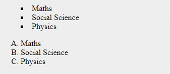
Check out the following example:

<html>
   <head>
   </head>
   
   <body>
      <ul style = "list-style: inside square;">
         <li>Maths</li>
         <li>Social Science</li>
         <li>Physics</li>
      </ul>
      
      <ol style = "list-style: outside upper-alpha;">
         <li>Maths</li>
         <li>Social Science</li>
         <li>Physics</li>
      </ol>
   </body>
</html>

Result:

list-style property example output

CSS marker-offset Property

The marker-offset property enables you to define the distance between the marker and the text concerning that marker. Regrettably, this property is not maintained in IE 6 or Netscape 7. Its value must be a length as shown in the below example −

<html>
   <head>
   </head>

   <body>
      <ul style = "list-style: inside square; marker-offset:2em;">
         <li>Maths</li>
         <li>Social Science</li>
         <li>Physics</li>
      </ul>
      
      <ol style = "list-style: outside upper-alpha; marker-offset:2cm;">
         <li>Maths</li>
         <li>Social Science</li>
         <li>Physics</li>
      </ol>
   </body>
</html>

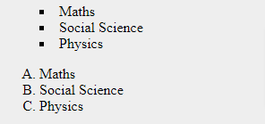
It will result like below:

css styling lists example output

CSS Vendor Prefixes | Definition, List of CSS Prefixes, Syntax & Sample Programs

CSS Vendor Prefixes

When CSS3 became popular, all sorts of new features started appearing. Unfortunately, not all of them were supported across all browsers. Vendor prefixes helped developers use those new features, and have them supported instantly without having to wait for each of them to become available for every browser. Let’s learn and understand what are vendor prefixes in CSS with examples from this tutorial.

What are CSS Vendor Prefixes?

CSS vendor prefixes are a string of characters concerning particular browser engines that we set before a CSS property name. They can have either of the resulting formats –

'-' + vendor identifier + '-' + meaningful name
'_' + vendor identifier + '-' + meaningful name

List of CSS Prefixes

Major browsers use the following prefixes:

  • -webkit- Chrome, Safari, newer versions of Opera, almost all iOS browsers.
  • -moz- Firefox.
  • -o- Old versions of Opera.
  • -ms- Microsoft Edge and Internet Explorer.

When using vendor prefixes, keep in mind that they are only temporary. A lot of properties that needed to have vendor prefixes attached to them are now fully supported and don’t need them.

Also Check:

How Should We Use Them?

Instead of using transition property, we can use:

.myElement {
    -webkit-transition: all 1s linear;
    -moz-transition: all 1s linear;
    -ms-transition: all 1s linear;
    -o-transition: all 1s linear;
    transition: all 1s linear;
}

Now, we use:

.myElement {
    transition: all 1s linear;
}

Since Opera and Edge are Chromium based, -o- and -ms- will probably go soon out of fashion. But as we said, vendor prefixes as a whole are going out of fashion, too.

Adding a Prefix

For instance, if you need to add a CSS3 transition to your document, you would use the transition property as given below:

-webkit-transition: all 4s ease;
-moz-transition: all 4s ease;
-ms-transition: all 4s ease;
-o-transition: all 4s ease;
transition: all 4s ease; 
Categories CSS

CSS Pseudo Classes | What are Pseudo Classes in CSS? | Syntax & Example Programs on Pseudo-classes

CSS Pseudo Classes

What are CSS Pseudo-classes?

Pseudo-classes are predefined keywords.

They are used to select an element based on its state or to target a specific child.

They start with a single colon :.

The most common use case is to style the visited and unvisited links. Also, focus or hover over an element.

The popular pseudo-classes are:

Classes Description
:active an element is activated by the user (e.g. clicked). Mostly used on links or buttons
:checked a checkbox, option, or radio input types that are enabled
:default the default in a set of choices (like an option in a select or radio buttons)
:disabled an element disabled
:empty an element with no children
:enabled an element that’s enabled (opposite to :disabled)
:first-child the first child of a group of siblings
:focus the element with focus
:hover an element hovered with the mouse
:last-child the last child of a group of siblings
:link a link that’s not been visited
:not() any element not matching the selector passed. E.g. :not(span)
:nth-child() an element matching the specified position
:nth-last-child() an element matching the specific position, starting from the end
:only-child an element without any siblings
:required a form element with the required attribute set
:root represents the html element. It’s like targeting html, but it’s more specific.
:target the element matching the current URL fragment (for inner navigation in the page)
:valid form elements that validated client-side successfully
:visited a link that’s been visited

Also Check:

The :hover pseudo-class

The below sample code shows how to use the :hover class to alter the color of links when we place a mouse pointer over that link. Feasible values could be any color name in any valid format.

<html>
   <head>
      <style type = "text/css">
         a:hover {color: #FFCC00}
      </style>
   </head>

   <body>
      <a href = "">Bring Mouse Here</a>
   </body>
</html>

CSS – The :lang Pseudo-class

The:langpseudo-class enables you to set special rules for various languages.

In the illustration below, :lang represents the quotation marks for <q> elements with lang=”no”:

<html>
<head>
<style>
q:lang(no) {
  quotes: "~" "~";
}
</style>
</head>
<body>

<p>Some text <q lang="no">A quote in a paragraph</q> Some text.</p>

</body>
</html>

The :visited pseudo-class

We want to make a link color yellow, before and after the visit:

a,
a:visited,
a:active {
  color: yellow;
}

The :nth-child pseudo-class

:nth-child() deserves a special mention. It can be used to target odd or even children with :nth-child(odd) and :nth-child(even).

It is commonly used in lists to color odd lines differently from even lines:

ul:nth-child(odd) {
  color: green;
    background-color: gray;
}

We can also use it to target the first 4 children of an element with :nth-child(-n+4). Or you can style 1 in every 7 elements with :nth-child(7n).

CSS classes and pseudo-classes

The classes in CSS can be connected with pseudo-classes. So, we can address it as-

Syntax

selector.class: pseudo-class {  
  property: value;  
}

Let’s see the following example to understand the working of it:

<!DOCTYPE html>
<html>
<head>
<style>
body{
text-align:center;
}
div.hello:hover {
  color: red;
  font-size:40px;
} 
</style>
</head>
<body>
<h1>CSS Classes and pseudo-classes</h1>
<h2>Move your cursor to the below text</h2>
<div class="hello">Hello World</p>

</body>
</html>

Output:

css classes and pseudo-classes example

CSS Pseudo Elements | What is Pseudo Element in CSS? | Syntax & Sample Example

CSS Pseudo Elements

What is CSS Pseudo-elements?

Pseudo-elements act in a similar way, but, they work as if you had added a whole new HTML element into the markup, in place of utilizing a class to existing elements. Pseudo-elements start with a double colon ::.

For instance, it can be applied to:

  • Style an element when a user mouses over it
  • Style visited and unvisited links differently
  • Style an element when it gets focus

They are used to style a specific part of an element and start with a :: .

We also use : as a pseudo-element for backward compatibility.

::before and ::after are probably the most used pseudo-elements. They are used to add content before or after an element, like icons for example.

The pseudo-elements are:

::after creates a pseudo-element after the element
::before creates a pseudo-element before the element
::first-letter can be used to style the first letter of a block of text
::first-line can be used to style the first line of a block of text
::selection targets the text selected by the user

Do Check:

Pseudo Element & Pseudo Class Syntax

The syntax of pseudo-element:

selector::pseudo-element {
  property: value;
}

The syntax of pseudo-classes:

selector:pseudo-class {
  property: value;
}

CSS classes can also be practiced with pseudo-elements −

selector.class:pseudo-element {property: value}

Examples of CSS Pseudo Elements

We want to make the font of the first line of the paragraph slightly bigger than the rest:

p::first-line {
  font-size: 1.5rem;
}

Or maybe we want the first letter to be bigger and bolder:

p::first-letter {
  font-weight: bolder;
  font-size: 2rem;
}

We can specify the content property to insert any kind of content like image, after or before an element:

p::before {
  content: url(/myimage.png);
}

.myElement::before {
    content: "Hey There!";
}

The :after pseudo-element

<html>
   <head>
      <style type = "text/css">
         p:after {
            content: url(/images/bullet.gif)
         }
      </style>
   </head>

   <body>
      <p> This line will be succeeded by a bullet.</p>
      <p> This line will be succeeded by a bullet.</p>
      <p> This line will be succeeded by a bullet.</p>
   </body>
</html>

Output:

pseudo elements in css example

The :before pseudo-element (Decorative example)

HTML Code:

<span class="ribbon">Notice where the orange box is.</span>

CSS Code:

.ribbon {
  background-color: #5BC8F7;
}

.ribbon::before {
  content: "Look at this orange box.";
  background-color: #FFBA10;
  border-color: black;
  border-style: dotted;
}

Output:

result of before pseudo element in css

The :first-line pseudo-element

<html>
   <head>
      <style type = "text/css">
         p:first-line { text-decoration: underline; }
         p.noline:first-line { text-decoration: none; }
      </style>
   </head>

   <body>
      <p class = "noline">
         This line would not have any underline because this belongs to nline class.
      </p>
      
      <p>
         The first line of this paragraph will be underlined as defined in the 
         CSS rule above. Rest of the lines in this paragraph will remain normal. 
         This example shows how to use :first-line pseduo element to give effect 
         to the first line of any HTML element.
      </p>
   </body>
</html>

Output:

css pseudo elements example result

The :first-letter pseudo-element

The resulting example proves how to use the :first-letter element to add unique effects to the first letter of elements in the document.

<html>
   <head>
      <style type = "text/css">
         p:first-letter { font-size: 5em; }
         p.normal:first-letter { font-size: 10px; }
      </style>
   </head>

   <body>
      <p class = "normal">
         First character of this paragraph will be normal and will have font size 10 px;
      </p>
      
      <p>
         The first character of this paragraph will be 5em big as defined in the 
         CSS rule above. Rest of the characters in this paragraph will remain 
         normal. This example shows how to use :first-letter pseduo element 
         to give effect to the first characters  of any HTML element.
      </p>
   </body>
</html>

Output:

example 1 output

The ::selection pseudo element

HTML Code:

This text has special styles when you highlight it.
<p>Also try selecting text in this paragraph.</p>

CSS Code:

/* Make selected text gold on a red background */
::selection {
  color: gold;
  background-color: red;
}

/* Make selected text in a paragraph white on a blue background */
p::selection {
  color: white;
  background-color: blue;
}

Output:

selection css pseudo element example output

The CSS Borders Tutorial | CSS border Property Definition & Syntax

The CSS Borders Tutorial

A border is a thin layer between padding and margin. Editing or creating the border you can make elements draw their area on the screen. Explore more about CSS Borders from this tutorial and make use of the border property in your codings.

CSS border Property

The shorthand of the below properties can simply be border.

  • border-style
  • border-color
  • border-width

Also, an image can be used as a border for the elements in the HTML using the border-image property and also with its specific properties like:

  • border-image-source
  • border-image-slice
  • border-image-width
  • border-image-outset
  • border-image-repeat

Okay, Let’s start with border-styleproperty:

CSS Border Style

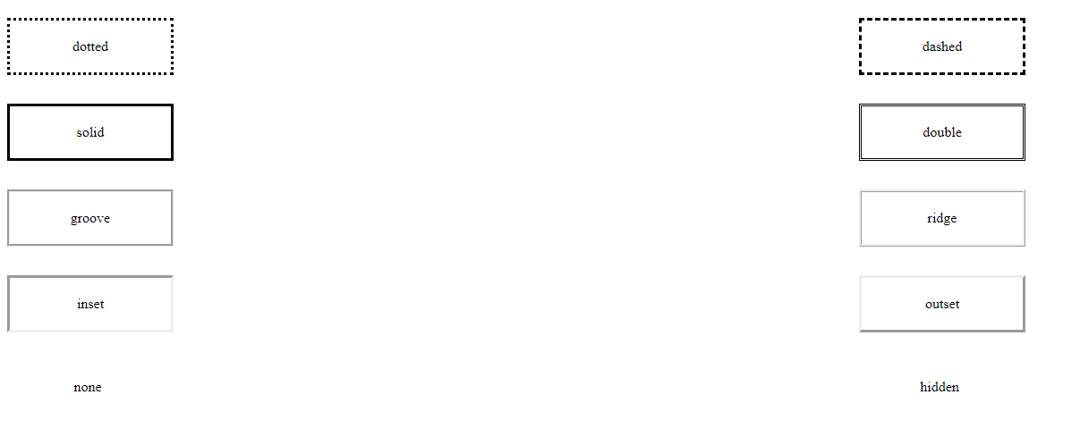
Border style can be of multiple types like:

  • dotted
  • dashed
  • solid
  • double
  • groove
  • ridge
  • inset
  • outset
  • none
  • hidden

border style

The default style is none, so to make the border appear on the screen we need to change its style to something different like solid.

Also, we can give border to a specific edge, like:

  • border-top-style
  • border-right-style
  • border-bottom-style
  • border-left-style

Or we can simply define that in border-style property, like

p {
  border-style: solid dotted solid dotted;
}

Do Refer:

The border width

We can set the width of the border using the border-width property by using predefined values like:

  • thin
  • medium (the default value)
  • thick

Or in pixels, rem, em :

p {
  border-width: 3px;
}

Also, we can define the width of each of the side differently, like:

p {
  border-width: 2px 1px 2px 1px;
}

CSS border-color Property

We can set the color of the borders using the border-color property.

If we don’t set a color, the border by default is colored using the color of the text in the element.

Example:

p {
  border-color: red;
}

Also, we can set different colors for the different edges.

Example:

p {
  border-color: green red yellow blue;
}

The border shorthand property

The 3 properties mentioned above, border-widthborder-style and border-color can be set using the shorthand property border.

For example:

p {
  border: 1px red dotted;
}

Or we can specify different edges:

p {
  border-left: 2px black solid;
  border-right: 3px red dashed;
}

The border radius

The border radius property is used to round off the corners of the actual borders. This CSS property holds the properties that are tabulated as follows:

Property Description
border-top-left-radius It is used to set the border radius for the top-left corner
border-top-right-radius It is used to set the border radius for the top-right corner
border-bottom-right-radius It is used to set the border radius for the bottom-right corner
border-bottom-left-radius It is used to set the border radius for the bottom-left corner

Example:

p {
  border-radius: 15%;
}
Categories CSS

Importing a CSS file using @import with Example Program | Definition & Syntax of CSS @import Property

Importing a CSS file using @import

Are you looking for the best ways to import another CSS file into CSS files? Then, you can simply use the CSS @import property. Want to know more about the property of CSS import? Just follow this tutorial till to the end and get information on Importing a CSS File using @import, etc.

CSS @import Property

The @import rule enables you to import a style sheet into another CSS style sheet. Also, it must be at the top of the document (but after any @charset declaration). Moreover, this helps media queries, so anyone can provide the import to be media-dependent. Look at the below sections and check out the syntax for importing.

Syntax

@import url;
@import url list-of-media-queries;
@import url supports( supports-query );
@import url supports( supports-query ) list-of-media-queries;

Property Values

where:

  • URL/string: <string> or <url>() represents the location of the resource to import. We can place absolute or relative URLs in the url() reference.
  • list-of-media-queries: This is a comma-separated list of media queries conditioning the application of the CSS rules defined in the linked URL. If the browser does not support any of these queries, it does not load the linked resource.
  • supports-query: Is either a <supports-condition> or a <declaration>.

Also Check: The CSS Backgrounds Tutorial

Formal syntax

@import [ <string> | <url> ] [ <media-query-list> ]?;
where 
<media-query-list> = <media-query>#

where 
<media-query> = <media-condition> | [ not | only ]? <media-type> [ and <media-condition-without-or> ]?

where 
<media-condition> = <media-not> | <media-and> | <media-or> | <media-in-parens>
<media-type> = <ident>
<media-condition-without-or> = <media-not> | <media-and> | <media-in-parens>

where 
<media-not> = not <media-in-parens>
<media-and> = <media-in-parens> [ and <media-in-parens> ]+
<media-or> = <media-in-parens> [ or <media-in-parens> ]+
<media-in-parens> = ( <media-condition> ) | <media-feature> | <general-enclosed>

where 
<media-feature> = ( [ <mf-plain> | <mf-boolean> | <mf-range> ] )
<general-enclosed> = [ <function-token> <any-value> ) ] | ( <ident> <any-value> )

where 
<mf-plain> = <mf-name> : <mf-value>
<mf-boolean> = <mf-name>
<mf-range> = <mf-name> [ '<' | '>' ]? '='? <mf-value> | <mf-value> [ '<' | '>' ]? '='? <mf-name> | <mf-value> '<' '='? <mf-name> '<' '='? <mf-value> | <mf-value> '>' '='? <mf-name> '>' '='? <mf-value>

where 
<mf-name> = <ident>
<mf-value> = <number> | <dimension> | <ident> | <ratio>

Example using @import CSS rules

@import 'custom.css';
@import url("chrome://communicator/skin/");

Importing CSS rules conditionally

@import url("fineprint.css") print;
@import url("bluish.css") speech;
@import "common.css" screen;
@import url('landscape.css') screen and (orientation:landscape);

How to include one CSS file in another?

Do you think it is not possible to import one CSS file into another? Then you are wrong. Because it is possible to include one CSS file in another using CSS @import rules. Also, it can be done various times in the main HTML file or in the main CSS Style sheets. Look at the below example using the @import keyword:

Example:

<!-- Including one css file into other -->
@import "style2.css";
   
 h1 {
     color:green;   
 }
   
.css1 {
     color:black;
     background-image: linear-gradient(to right, #DFF1DF, #11A00C);
     position:static;   
 }

One thing to keep in mind that, the @import statements should be placed at the top/beginning of the CSS file to stop being ignored.
We can also use descriptors along with the @import statements.
Example:

@import url(mystyle.css) all;
@import url(mystyle-screen.css) screen;
@import url(mystyle-print.css) print;
Categories CSS

The CSS z-index property | Definition, Syntax, Property Values, Example Code on z-index CSS Property

The CSS z-index property

The z-index CSS property estimates the z-order of a positioned element and its descendants or flex items. Look at the below sections to understand the concept of thez-index property thoroughly.

It’s very useful when you have multiple elements that overlap each other, and you need to decide which one is visible, as nearer to the user, and which one(s) should be hidden behind it.

This property takes a number (without decimals) and uses that number to calculate which elements appear nearer to the user, in the Z-axis.

Also Check: 

The higher the z-index value, the more an element is positioned nearer to the user.

When deciding which element should be visible and which one should be positioned behind it, the browser does a calculation on the z-index value.

CSS z-index Property

The z-indexproperty defines the stack order of an element. An element with a more comprehensive stack order is always ahead of an element with a lower stack order. Overlapping elements with a larger z-index defense those with a smaller one.

Remember: On all positioned elements (position: absolute, position: relative, position: fixed, or position: sticky) and flex items (elements that are direct children of display: flex elements), the z-index property only works.

Formal Definition of z-index CSS

Initial value auto
Applies to positioned elements
Inherited no
Computed value as specified
Animation type an integer
Creates stacking context yes

Syntax for z-index CSS Property

/* Keyword value */
z-index: auto;

/* <integer> values */
z-index: 0;
z-index: 3;
z-index: 289;
z-index: -1; /* Negative values to lower the priority */

/* Global values */
z-index: inherit;
z-index: initial;
z-index: unset;

The z-index property is defined as either the keywordauto or an<integer>.

auto:The box does not set a new local stacking context. The stack level of the created box in the current stacking context is 0.

<integer>:This <integer> is the stack level of the created box in the current stacking context. Also, the box builds a local stacking context. This implies that the z-indexes of descendants are not related to the z-indexes of elements outside this element.

Formal Syntax

auto | <integer>

CSS z-index Property Values

Value Description
auto Sets the stack order equal to its parents. This is default
number Sets the stack order of the element. Negative numbers are allowed
initial Sets this property to its default value.
inherit Inherits this property from its parent element.

Using CSS z-index Property

The default value isautoa special keyword. Using auto, the Z-axis order is determined by the position of the HTML element in the page – the last sibling appears first, as it’s defined last.

By default, elements havestaticvalue for thepositionproperty. In this case, thez-indexproperty does not make any difference – it must be set toabsoluterelative or fixed to work.

Example:

.my-first-div {
    position: absolute;
    top: 0;
    left: 0;
    width: 600px;
    height: 600px;
    z-index: 10;
}

.my-second-div {
    position: absolute;
    top: 0;
    left: 0;
    width: 500px;
    height: 500px;
    z-index: 20;
}

The element with class .my-second-div will be displayed, and behind it .my-first-div.

Here we used 10 and 20, but you can use any number. Negative numbers too. It’s common to pick non-consecutive numbers, so you can position elements in the middle. If you use consecutive numbers instead, you would need to re-calculate the z-index of each element involved in the positioning.

Example on Visually layering elements using CSS z-index Property

HTML

<div class="wrapper">
  <div class="dashed-box">Dashed box</div>
  <div class="gold-box">Gold box</div>
  <div class="green-box">Green box</div>
</div>

CSS

.wrapper {
  position: relative;
}

.dashed-box {
  position: relative;
  z-index: 1;
  border: dashed;
  height: 8em;
  margin-bottom: 1em;
  margin-top: 2em;
}
.gold-box {
  position: absolute;
  z-index: 3; /* put .gold-box above .green-box and .dashed-box */
  background: gold;
  width: 80%;
  left: 60px;
  top: 3em;
}
.green-box {
  position: absolute;
  z-index: 2; /* put .green-box above .dashed-box */
  background: lightgreen;
  width: 20%;
  left: 65%;
  top: -25px;
  height: 7em;
  opacity: 0.9;
}

Output:

z-index property example output

How to disable text selection using CSS | user-select Property Definition, Syntax, Values | Steps to Disable Text Selection

How to disable text selection using CSS

Texts are the most fundamental elements of any website or web page. In this tutorial, we have shared how to disable text selection highlighting using CSS? Along with the CSS user-select Property definition and usage, syntax, values,  supported browsers, Steps to disable the text selection with CSS, and Example Codes on How to disable text selection highlighting using CSS?

CSS user-select Property

Theuser-selectproperty defines whether the text of an element can be selected. In various web browsers, in case you double-click on some particular text it will be selected/highlighted. To be unselected or disabled, this property can be used.

Default value: auto
Inherited: no
Animatable: no.
Version: CSS3
JavaScript syntax: object.style.userSelect=”none”

CSS Syntax

user-select: auto|none|text|all;

Do Check:

user-select property values

user-select value description
none user cannot select the text
text user can select the text
all user can select the text with one click
auto user-select value depend upon its parent user-select option
contain selection will be bound to a particular element
element IE version of user-select contain.

How to disable text selection using CSS

By default browsers let us select the text in the browser using the keyboard, pressing the cmd-A combination on a Mac for example, or using the mouse.

How can you disable that, to make your web page behave more like an app and less like a document?

Use the user-select: none; CSS rule.

-webkit-touch-callout: none;
  -webkit-user-select: none;
   -khtml-user-select: none;
     -moz-user-select: none;
      -ms-user-select: none;
          user-select: none;

One thing I use sometimes is to make all the app interface unselectable applying user-select: none; on the body element, then I can re-enable it on specific elements, using:

user-select: text;

Also, observe what statements that we can use for different browsers to disable a selectivity of text.

  • Chrome, Opera: -webkit-user-select
  • Safari: -webkit-touch-callout
  • Mozilla: -moz-user-select
  • Internet Explorer: -ms-user-select

Example on How to disable text selection highlighting in the browsers using CSS?

At present, browsers only assist a small subset of CSS properties for::selection pseudo-element like color, background-color and text-shadow. Let’s see an example:

::selection {
    color: none;
    background: none;
}
/* For Mozilla Firefox */
::-moz-selection {
    color: none;
    background: none;
}

Steps to Disable Text Selection In WebPage Using CSS

There are two steps that should be followed to disable the text selection in webpage using CSS:

  1. Make a HTML file and determine markup for webpage
  2. Make a CSS file and specify styling to disable the text

Step 1: Make a HTML file and determine markup for webpage

<!DOCTYPE html>
<html>
<head>
  <link rel="stylesheet" type="text/css" href="disable_style.css">
</head>
<body>
  
<h1>Disable Text Selection In WebPage Using CSS</h1>
<p class="select">Select The Text In This Paragraph This Is Selectable Like Any Other Text</p>
<p class="no_select">Try To Select This Text You Are Not Able To Select This Text In Modern Browsers</p>

</body>
</html>

Step 2: Make a CSS file and specify styling to disable the text

In this step, we have used the user-select property to disable the text selection and also the cross-browser prefix to work in most of the browser and also with some old browsers.

body
{
    background-color:#EB99FF;
    font-family:helvetica;
    text-align:center;
    margin:0px auto;
    padding:0px;
}
h1
{
    margin-top:100px;
    color:#424242;
    font-size:40px;
}
h1 p
{
    margin:0px;
    font-size:18px;
    color:black;
    text-decoration:underline;
}
.select
{
    font-size:30px;
    font-weight:bold;
    color:#4000FF;
}
.no_select
{
    font-size:30px;
    font-weight:bold;
    color:#4000FF;
    -webkit-touch-callout: none;
    -webkit-user-select: none;
    -khtml-user-select: none;
    -moz-user-select: none;
    -ms-user-select: none;
    user-select: none;
}