
Plotting the data allows us to visualize it and have a better knowledge of the data points.
Here, we’ll use an excel sheet to plot data in Python programming using the pandas and matplotlib modules.
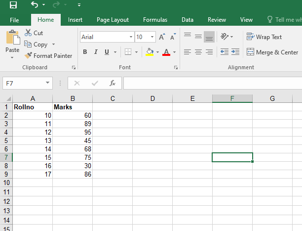
Let us take the below Excel sheet as an Example:
- Python Pandas DataFrame plot.line() Function
- Python Pandas DataFrame plot.bar() Function
- Python Pandas DataFrame plot.barh() Function
Program to Plot Data from Excel Sheet in Python
Below is the procedure to plot the data from the given Excel sheet in python:
1)Import Modules
Here we use the pandas and matplotlib modules Before we import and use the modules we should first install them.
Installation:
pip install pandas
pip install matplotlib
Importing:
# Import pandas module using the import keyword
import pandas as pd
# Import matplotlib module using the import keyword
import matplotlib.pyplot as plt
2)Load the Dataset
Pass the Excel sheet file path as an argument to the read_excel() function to load the ExcelFile(dataset) and Store it in a variable.
# Pass the Excel sheet file path as an argument to the read_excel()
# function to load the ExcelFile(dataset)
# Store it in a variable
xl_file = pd.read_excel("demo.xlsx")
print(xl_file)
3) Separate Rollno, Marks values
We now have two columns in the dataset, one for rollno data points and the other for marks data points. This is done after the first and second columns have been separated into independent variables.
roll_no = list(xl_file['Rollno'])
marks = list(xl_file['Marks'])
4)Plot a Scatter Plot
# Adjust the width and height of the plot size using the figure() function by
# passing figsize= width, height as arguments to it
plt.figure(figsize=(10,10))
# Pass 'seaborn' as an argument to the style.use() function to use the plot style of it
plt.style.use('seaborn')
# Pass the roll_no, marks, marker symbol, size, edgecolors, c(plot color)as arguments to
# the scatter function to get the plot of the Excel File
plt.scatter(roll_no, marks, marker=".", s=100, edgecolors="black",c="Red")
# Give the title of the plot(graph) using the title() function
plt.title("Rollno vs marks plot of the Excel File")
# Display the plot using the show() function
plt.show()
Full Implementation
Approach:
- Import pandas module using the import keyword.
- Import matplotlib module using the import keyword.
- Pass the Excel sheet file path as an argument to the read_excel() function to load the ExcelFile(dataset).
- Store it in a variable.
- Get the list of values of the Rollno column of the Excel file and store it in a variable.
- Get the list of values of the Marks column of the Excel file and store it in another variable.
- Adjust the width and height of the plot size using the figure() function by passing figsize= width, height as arguments to it.
- Pass ‘seaborn’ as an argument to the style.use() function to use the plot style of it.
- Pass the roll_no, marks, marker symbol, size, edgecolors, c(plot color)as arguments to the scatter() function to get the plot of the Excel File.
- Give the title of the plot(graph) using the title() function.
- Display the plot using the show() function.
- The Exit of the Program.
Below is the implementation:
# Import pandas module using the import keyword
import pandas as pd
# Import matplotlib module using the import keyword
import matplotlib.pyplot as plt
# Pass the Excel sheet file path as an argument to the read_excel()
# function to load the ExcelFile(dataset)
# Store it in a variable
xl_file = pd.read_excel("demo.xlsx")
# Get the list of values of the Rollno column of the Excel file
# and Store it in a variable
roll_no = list(xl_file['Rollno'])
# Get the list of values of the Marks column of the Excel file and
# Store it in another variable
marks = list(xl_file['Marks'])
# Adjust the width and height of the plot size using the figure() function by
# passing figsize= width, height as arguments to it
plt.figure(figsize=(10,10))
# Pass 'seaborn' as an argument to the style.use() function to use the plot style of it
plt.style.use('seaborn')
# Pass the roll_no, marks, marker symbol, size, edgecolors, c(plot color)as arguments to
# the scatter function to get the plot of the Excel File
plt.scatter(roll_no, marks, marker=".", s=100, edgecolors="black",c="Red")
# Give the title of the plot(graph) using the title() function
plt.title("Rollno vs marks plot of the Excel File")
# Display the plot using the show() function
plt.show()
Output:
