
Here is the complete tutorial on How to print your HTML with style using CSS. By viewing this page, you will get perfect knowledge on CSS printing, @media print rule, and many more concepts related to it. Just click on the links provided below and start learning regarding print CSS.
- CSS Printing
- CSS @media Print
- Page break properties
- Repeat table headings
- Adding or removing content
- Use emulate CSS media for the development.
- Orphans and Widows
- Advanced tip: the @page rule
CSS Printing
There is a possibility to use CSS for altering the appearance of your web page when it’s printed on paper. You can define one font for the screen version and another for the print version.
The following piece of code defines various font families for screen and print in CSS.
<link rel="stylesheet"
      src="print.css"
      type="text/css"
      media="print" />
CSS @media Print
If you’ve prepared any responsive design, you’ll then know about the@mediarule. As well as diverse screen sizes, @media also let you target “print” media. Here’s an example:
@media print {
  /* These styles will only be used when the page is printed or saved to PDF. */
  h1 { font-size: 16pt; }
}
Using this rule, you can define your standard CSS as normal and then join some custom styles that will only be utilized when printing.
p { margin: 1em 0; }

@media print {
  /* Hide related article links when printing. */
  .related-articles { display: none; }
}
If you want to “zero out” all your standard screen styles and begin from scratch, you can wrap your screen styles in another @media rule:
@media screen {
  /* standard styles here. */
}

@media print {
  /* print styles here. */
}
Do Read:
Page break properties
To ensure the content flows evenly over pages, you’ll require control when content gets split among pages. For instance, it looks awkward if a large heading resembles at the bottom of a page – you want it to commence on a new page rather. Likewise, you may want to evade a table spanning multiple pages if possible.
You can make this using page-break-before, page-break-after, and page-break-inside. Also, You can set the value for these properties to always or avoid.
h1 {
  /* h1 elements always start on the top of a new page. */
  page-break-before: always;
}

section.city-map {
  /* this section always occupies it's own page or pages. */
  page-break-before: always;
  page-break-after: always;
}

table {
  /* tables don't split across pages if possible. */
  page-break-inside: avoid;
}
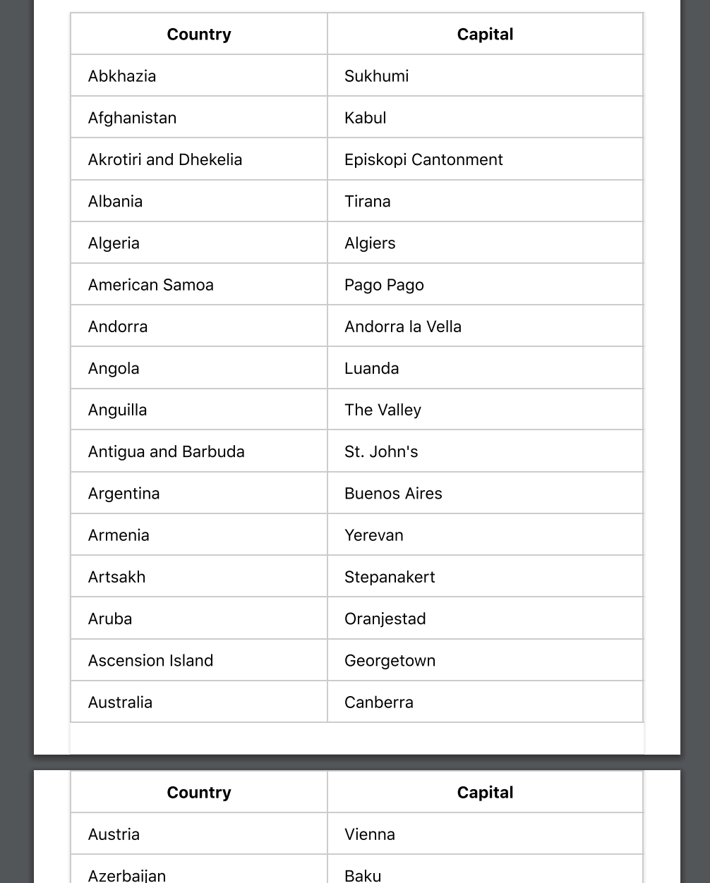
Repeat table headings
If your document has tables that span many pages, it’ll be difficult to read when printed except the table headers are repeated at the origin of each page. This is moderately easy to accomplish – simply use the thead and tbody elements in your table.
<table>
  <thead>
    <tr>
      <th>City</th>
      <th>Population</th>
  </thead>
  <tbody>
    <tr>
      <td>Sydney</td>
      <td>4.627 million (2018)</td>
    </tr>
  </tbody>
</table>
Adding or removing content
Sometimes you may require to add content that’s only displayed when printing. For instance- you might want to link URLs to be printed. You can accomplish this with the help of:after pseudo-element:
@media print {
  a[href]:after {
    content: " (" attr(href) ")";
  }
}
You may also desire to hide or show specific elements only when printing. By combining @media and display this can be made pretty quickly.
/* hide the watermark on screens. */
.watermark {
  display: none;
}

@media print {
  /* hide the navidation when printing. */
  nav {
    display: hide;
  }
  /* show the watermark when printing */
  .watermark {
    display: initial;
  }
}
Use emulate CSS media for the development.
In order to fasten up your feedback loop while developing, you can arrange your browser to display print styles. To perform this in Chrome on Mac, open developer tools, later use the command-shift-P shortcut for “Run Command” and search for “Emulate CSS print media type”.
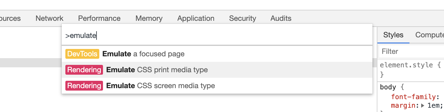
Other browsers will have a related feature in their dev tools.
Unfortunately, to view page breaks you’ll require to print to PDF manually every moment.
Orphans and Widows
The orphans and widows properties manage how the text in an element is split over pages. Sometimes tweaking these values can increase the readability of your printed document.
p {
  /* if there aren't at least three lines before the page
     break, move the element to the start of a new page. */
  orphans: 3;
}
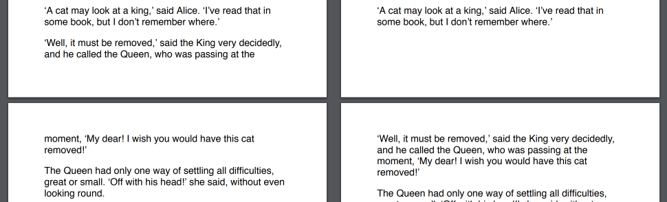
The below-left side orphans is set to 2, so the second paragraph starts before the page break. By settingorphansto 3, as on the right, the paragraph is taken down to the start of the next page.
The widows property is the inverse of orphans – it defines the minimum number of lines that can be at the origin of a new page.
Advanced tip: the @page rule
With the @page rule, you can tailor-made the page margin for particular pages.
@page:first {
  /* No margin on the first page. */
  margin: 0;
}

@page {
  /* Set a margin on all other pages. */
  margin: 2cm;
}
Unfortunately, browser support for this is currently a little inadequate and you can only use the :first, :last, :left, :right, and:blank pseudo-selectors to choose pages.